Friday, January 31, 2014

Winter 2014 Acrylic Class


Winter 2014 Acrylic Class
Project:Arizona Color
Week 1

The project we will be doing in class is called a “composite” because we are using more than one reference source to create our painting. As artists we have more options than a photographer who has to go into photo shop to try and duplicate what we can create with just a few strokes and it can take a lot more hours to get a photograph even close to what an artist can do, though not impossible in this day of computers, but as artists, we are the ultimate in photo shop.

I chose these 2 photos from my trip to Arizona because I liked them both but I didn’t think that either of them was a strong enough subject on its own but I like the idea of the two together because I could do reflections. Had there been someplace for me to get the right angle I could have gotten a photo very similar to what we will be painting but there just was no place for me to stand to get exactly what I wanted but my artist’s mind was already solving that problem coming up with this composition.

Having good reference material is essential to any artist and if you want to grow as an artist you need to start building your own “library” so you have material that you feel drawn to, not what someone else enjoys painting. Digital cameras make it simple to store your own photos and go through them to find subjects, or you can go online these days to “images” and search on any subject your heart’s desire. Or cut things out of the paper or magazines and keep folders and you can collect postcards to put in your files. A word of warning though: If you are using
someone else’s photograph, you cannot copy it straight out then sell the painting. For your own use it is fine or you can give it away, but if you intend to sell your work at some point, use these photos only for reference. This is why we use my photos in class for learning purposes, the photos and the drawing are still my “creation” and I hold the rights.

When I was planning this painting, while I liked the one photo of the trees, the sky was a bit blah and the distant mountain wasn’t very exciting of one but it was also a color that wasn’t going to be repeated anywhere else in my painting so I used my artistic license and changed both the sky and the mountain color to harmonize more with the rest of my painting. Using the warm colors of yellow and orange they not only went better with the rest of the painting but they also suggested the heat of the desert. You don’t always have to follow the photo exactly and you really shouldn’t anyway.

I was using my 2” blending brush, the one with the very soft bristles, to start this painting. The first thing I did was to spray my canvas with water and with the blending brush make sure the surface of the canvas was coated with water, then I picked up some gesso on my brush and coated the top half with gesso using a circular motion of my brush to make sure I had a nice even coat of paint. Since this is all wet into wet, you will need to work quickly so once you get your canvas coated with gesso, on one corner of your brush pick up a good amount of yellow and on the other a small (less than a quarter of what you have for your yellow), streak it horizontally across the top of your canvas to about half way across, then with long flat “X” strokes, using the full width of your brush so it covers the full 2”s (not using it on its horizontal axis but its vertical one) and very little pressure on your brush (the bristles will hardly bend if you are doing it correctly), blend these colors together then blend them down to the horizon. The paint will blend with the gesso on the canvas to create a graded sky area (darker at the top, lighter on the bottom), this is what you want.
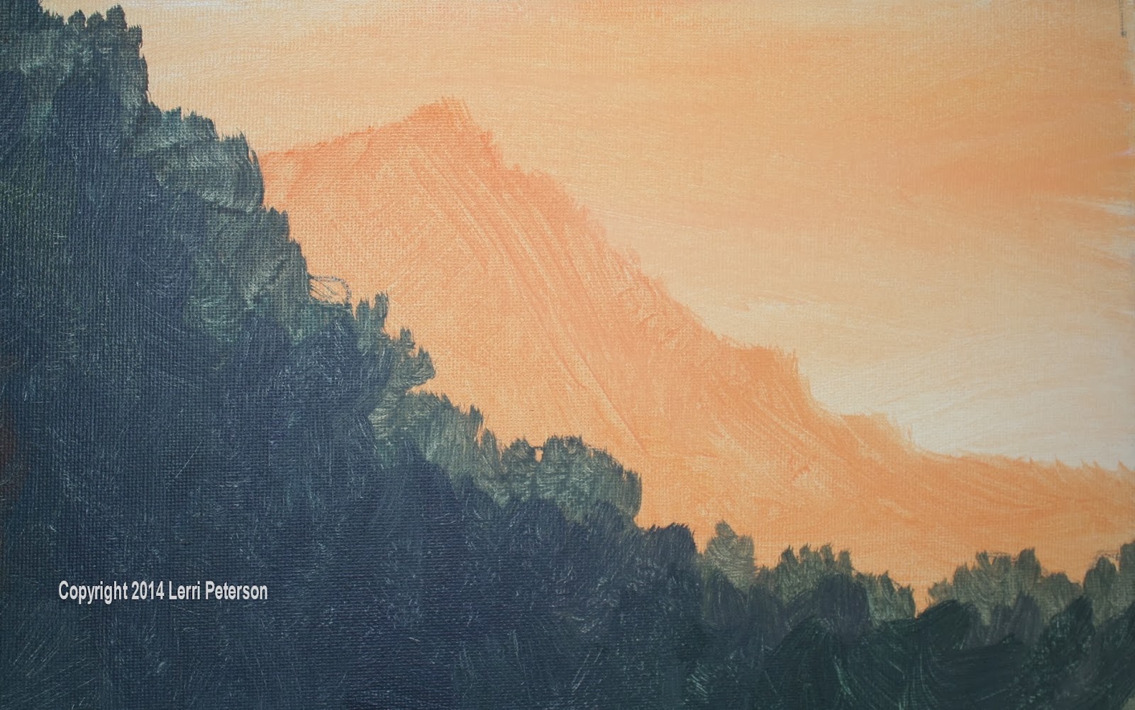
WHILE YOUR SKY IS STILL WET, pick up some more yellow and orange with maybe a tiny touch of sienna, this time mix on your palette to get an orange color that is just slightly darker than your sky (I was still using my blending brush). Using the full edge of the brush, I pulled down and created the edge of my mountain. Using the end of my brush and pulling in to the mountain creates a soft edge which is very important when you are trying to create distance, you can use any stroke to fill in the mountain but remember to keep your edges soft.

The sky, the mountain  and the gesso should still be wet if you want to switch to a #8 or #10 bristle brush you can but you still want to be working while the paint is wet on your canvas.

With my #10 bristle brush, I picked up my Hooker’s green, sienna, ultramarine blue almost any of my darker colors then stared blending them ON MY CANVAS not on the palette. This will create pockets of unmixed color that will look like rocks or bushes or whatever and that is a good thing for this area. When I get to the edge of that hillside, the wet sky and mountain color will mix with the paint on your brush to create a lighter color, that is a good thing also, it starts the highlighting process. Remember that the edge of the hillside is abunch of sagebrush, rocks and cactus not a manicured lawn, be sure to have an interesting shape creating the profile of the bushes and whatever else there might be. Look at the photo and see how much eye movement there is if you follow the edge of the hill.

Continue to paint the hillside with this dark color and use a variety of strokes, this is not a wall, you will want to keep in mind the rocks and bushes and cactus as you are painting. Most of the hillside is in shadow but we will be putting a few highlights where the sun maybe creeping over and hitting the tops of some of the taller brushes next week. This color should come down a bit below the center of your painting.
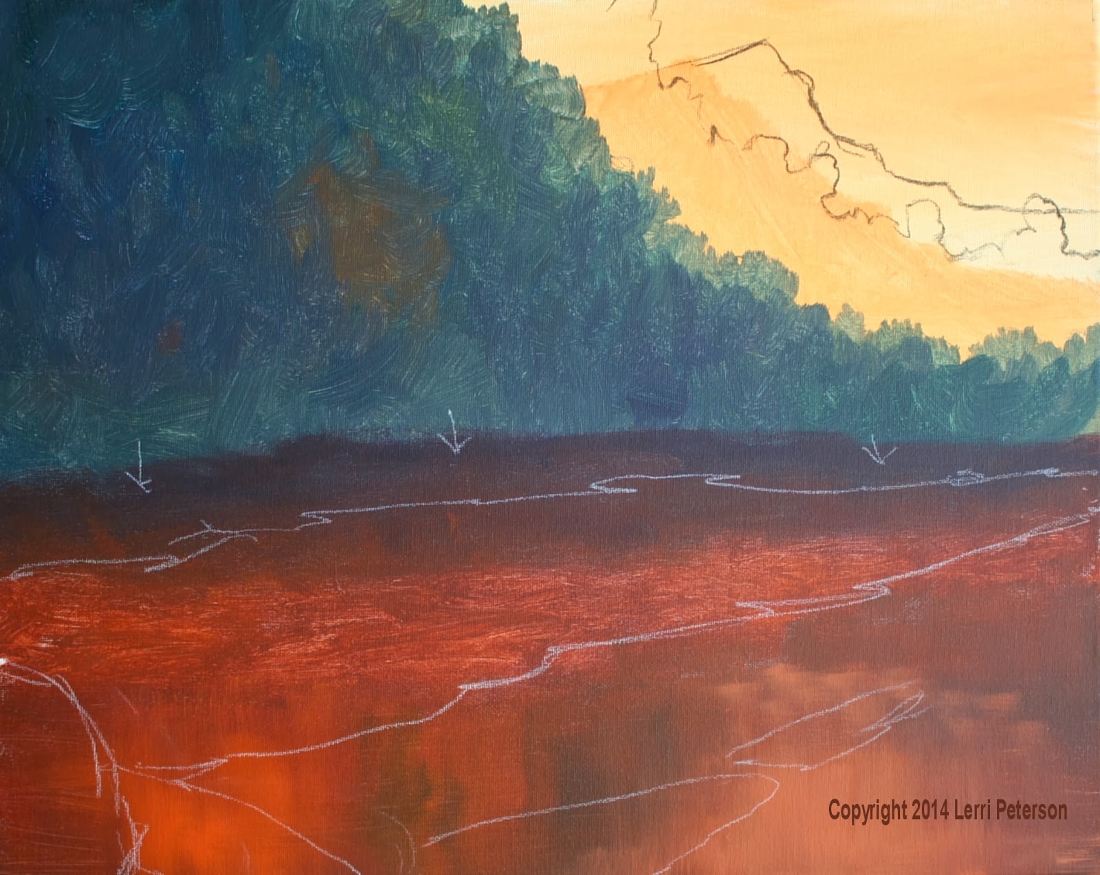

In class I stopped just the above the dirt and water so most of your canvases were dry when you started this next step, however, if I were painting this at home, I would have continued to paint and used the wet into wet to blend the bottom of my hillside into the shadow of the dirt along the river and finish with the under painting of the water. When you are comfortable with working wet into wet I hope you try to do as much as you can because in the long run, I think you will like the results better, plus you won’t be stopping as often, stopping and starting again breaks you concentration and your momentum that you have to get going when you start to paint again.

The dirt starts back at the bottom of the hillside in the shadows, so still using my #10 bristle brush, I picked up sienna, blue and purple, lightly mixed on my palette though I didn’t have to, using long flat strokes, I started painting the dark color up next to the dark green and lightly dry brushing some of this new dark color into the green and down a bit from the green, distance will vary depending on your painting so you will have to make a judgment call.

As I worked away from the green area I picked up more sienna and touches of orange that mixed with the colors that were still on my brush to create a lighter version of what I had before to finish the dirt before you get to the water.

The water is going to be similar colors but you are going to use just 2 strokes: either horizontal or vertical. Water can be tricky to make it look flat ad to it we are going to have reflections we need to be mindful of our strokes because they will tell the viewer the whole story of the water. The horizontal strokes keep the water flat, the vertical strokes help create the reflection.


Still using the #10 bristle brush with sienna, blue, purple and my horizontal strokes I start adding color to the water area. As I am adding these colors I also pick up other colors like orange or yellow of straight blue or green and lightly blend them in with the original color pulling across, then lightly pull down. When I say lightly I mean barely touching the canvas. While you want to blend the colors somewhat, you don’t want to totally blend them to create just one solid color, you want to see the variations which become the reflections or stuff under the water, this is also a good thing so even if the blending feels good, stop before you blend too much or you will have to start over again to create your reflections.

This is where we stopped so try to get your painting up to this point for next class. I will tell you as I sat and looked at my painting while I was writing this post, I saw a number of things I don’t like and need to fix so the beginning of the class I will be showing you how to fix things or change things that just don’t “feel” right, it happens in every painting and is nothing to panic about, you just fix it, so if you want to see how I handle the situation get to class early because I will have to fix things before I move on. See you all in class.


Saturday, January 18, 2014

Winter 2014 Acrylic Class

Exercise: Wet into Wet Blending.

As all of you found out wet into wet blending can be a challenge but it is a challenge you need to take up if you want your art to move on to the next level. It will bring a looseness that most artists crave as well as a more spontaneous look and feel to your art. Since all of my students this time are returning and you have a semester or more under your belt, it is time to step out of your comfort zone so you can grow as an artist.

We started with the basic sphere shape or more to the point, we started out with a circle and with shading we turned it into a sphere at least that was the goal. Many of you found it a bit harder than I made it look, remember, I am the teacher for a reason, I’ve been doing this for years and I understand what I have to do, for most of you, this is not the case. I can just paint because I know what I am doing, what my paints will do, what my brushes will do and how to use them, I don’t have to think, I just paint. As students you are thinking about EVERYTHING! The paint, the value, what brush, how much pressure to use, where is the light coming from? How much water do I use? What did she say again? All of these things are running through your head along with countless other worries and concerns, even a lot of second guessing, it makes it hard to paint. I know it is difficult but you need to shut the conversation down in your head. Look at your goal – the sphere – and break it down into workable pieces. The first thing you need to do is find a place to start.

I start with my circle. It does not need to be perfect, close enough will do. Next: Where is your light coming from and where will it hit on your circle? I had mine, for this demo. Coming in from the upper right, slightly forward, but practice this from different light angles because depending on what you are painting the light isn’t always going to be come from the same direction every time. You should also practice on different shapes circles get boring.

Now that you have your circle and know your light source, where do you start to paint? This comes down to a personal choice at some point so I will tell you my reasoning for starting this the way I did from dark to light. I can mix my dark (blue, burnt sienna or umber and a touch of purple) or, for this exercise, you can use black if you have it, and it will be pure dark with no contaminants from lighter colors, then into this dark I can add touches of white and blend to my lightest area and with planning and careful painting, I will have the complete value gradient from my darkest dark to my lightest light.

Each layer will be done exactly the same so I won’t repeat the description for each layer so just repeat as necessary. I was using a #6 bristle brush but I could use any brush, the #6 was a good size for the area I was working on. I do suggest that you use the biggest brush you can work comfortably with, put the small brushes away when you are working wet into wet, you want to work quickly, small brushes are for detail, we are not doing detail here.


I took the dark paint I mixed (see above, but you should know this by heart) and I started painting at the bottom of my circle and using strokes that followed the shape of the circle I painted about a third of the left hand side with the dark value almost to the top. I wiped my brush out, I DID NOT CLEAN IT and picked up some straight gesso (white will work as well), then starting just a little above my dark area, I added the white, which will turn a dark gray with the paint left from the dark in your brush and painted another quarter or so of the circle’s left side following the curve of the soon to be sphere. Wipe the brush out again to get out any excess paint, then go back to the space between the dark and the next value and work the two areas together: the dark into the gray, the gray into the dark, just be careful not to go all the way into the dark or all the way into the grey and watch the pressure you use on your brush, to get a nice blend you will need to use a very light pressure or even your finger so soften the two areas together.

Wipe your brush out well but you still don’t need to clean it, pick up some more white and repeat the process with your next layer. When you are at your lightest light area, then you can clean out your brush well then with straight white for the highlight, finish your sphere. If you have worked the paint and brushes correctly, there should be no real discernable line between each value change with a dark shadow and a light highlight and your circle should now look like a sphere. Start to finish should only take you 5 minutes or so. Practice.

The second exercise we did was using our 2” blending brushes. We haven’t use these much in the past but they are very handy brushes to have and can create skies and distant hills in a hurry so you can get on to the detail you all love J.

Some of you still do not have a proper blending brush, if the bristles are stiff like your bristle brushes, it will not work for this technique, the bristles need to be very soft, I think they are goat hair, it feels like a blush brush, it is so soft when you blend with it, it looks like you did it with an air brush. It is also called a “haki” (hookey) brush. Stiff bristles will leave streaks and marks you will never get rid of so be sure you have a blending brush and feel it before you buy it. Some of the TV artists like Jerry Yarnell, Bob Ross and the Jenkins have great blending brushes, if you can’t find them in the store, you can go on-line check the links on the side, Jerry Yarnell’s you can call and they will send it right out and their prices are competitive with Cheap Joe’s or Dick Blick. Check the web sites.

 When every your wet or rinse you blending brush be sure to dry it well. I will squeegee it through my fingers to get rid of the excess water AND use a paper towel because they will hold a lot of water and that will cause you problems with your paint and/or gesso being too thin and running. You want a damp brush not a wet one.

I use my spray bottle to wet the canvas then take my blending brush and make sure the water is spread across the area I want wet, check your brush to be sure it isn’t dripping then pick up some straight gesso on your brush and apply it to your canvas so you have a nice thin layer of gesso across what will be our sky. You can wipe your brush or not before you pick up a bit of yellow on one corner and a bit of red or orange on the other, then streak this horizontally across the bottom of your sky. Remember we are working wet into wet so the gesso should still be wet when you add the yellow and orange.

When you have your color on you will start the blending process by using big, overlapping, long “x” strokes and very little pressure on your brush. As the late Bob Ross would say “Three hairs and some air” and that about sums it up. You may want to stand because you simply cannot get the freeness in your arm if you are sitting down. If you need to sit push your chair back from the table so you are at arm’s length to give yourself more freedom of movement and it will get you away from your canvas which is a good thing. Work quickly.

When you have these colors on your canvas, rinse your brush well, be sure to dry it, then pick up blue on one corner and a touch of purple and maybe a touch of sienna on the other – mostly blue – and streak these colors across the TOP of the sky. With the same “X” stroke as above, blend the blue colors down to almost where the warm colors are, then clean your brush again to get out all the blue and purple, with your clean, dry brush, start in the warmer area, again with the big “x’s” and lightly blend up into the blue area and back down. Don’t go too far up into the blue area or it could become too light (remember the problems with the sphere). You will need to wipe your brush out often so your colors don’t get too muddy, keep your paper towel handy.

I do need to mention if your sky turns green, you may be using the wrong blue. I use ultramarine blue because it is student friendly when it comes to mixing, if you are using Pthalo (thalo) blue, which tends to be a bit on the green side anyway, you will get this lovely shade of brilliant green in your sky, pick up some red and work it in, that should neutralize the green but a little bit of green won’t hurt.

This should only have taken you less than 3 or 4 minutes and everything should still be wet. No, I am not joking. If you have to lightly spray your sky to keep it wet and workable, be sure to blend in the water so it doesn’t leave spots.

Still using the blending brush, I mixed a color with blue, purple, a touch of sienna and white that was just a shade darker than my sky. It should be a purplish/gray color, then pull your blending brush through it on both sides to create an edge on the bristles of the brush. Using this edge, create the tops of your distant mountains, this will give you a nice soft edge combined with the wet sky, it will create distance in your painting.


The next layer is done much the same but this time add a touch more sienna and blue but only change it a value or two, this is still the background. The next layer, to the same color you have been working in, add some green and create yet another layer of hills or mountains, this is still wet into wet. The more layers you make the more distance you create in your painting, the more distant something is the lighter and grayer it will be.

For closer trees add more green, but this time turn your brush sideways and pull down and overlap your strokes, make an interesting edge, higher, lower, it isn’t a hedge. Nearer trees can have more detail, they are darker and have more color but will still be a bit on the gray side. Start to finish on this exercise should take less than 10 minutes, the sky should still be a bit damp.

Practice these wet into wet techniques and you will build up your speed as it becomes more familiar to you and it will open up a whole new world of possibilities for you. If you want to be more impressionistic, this is where you start. Have fun, don’t sweat the small stuff and if worse comes to worse – I’m sure it will for a while – there is always gesso.

Be ready to work when we come back from MLK break and I will see you all soon.


Thursday, November 21, 2013

ACRYLIC CLASS FALL 2013

Acrylic Class Project:
Water Lily Week 8


This was the last class in instruction for the water lily but if you feel like you want to do more to finish it up, that is up to you. I may work on mine to finish it the way I want I just need to be careful not to overwork my painting. There is a big difference in refining one’s work and overworking a painting but it is a very thin line that can easily be crossed over if you are not careful. It is better to leave it a bit unfinished than to overwork and ruin your painting.

I know that many of you are tired of me saying that if you want to be a better painter you need to learn to draw. Even if you could get the basics of drawing down – basic shapes, perspective, shading from light to dark – would go a long way to improve you painting. I say this because the biggest problem I saw in class was the foreshortened front petals on the lily, most were usually too small and/or too short. The petals in front are the same size and shape as the back petals but because they are coming towards you it distorts the shape. Another thing about the petals is they are slightly wider than the back petals because they are closer to us visually. Again, perspective.

As an experiment, take a ruler and look at it straight across your field of vision so you and see all the numbers and hash marks. Now turn one end away from you so you are looking at the ruler from one end, raise the end that is away from you so you can see down the length of the ruler. What has changed? Instinctively you know that the ruler is still a foot long so the ruler hasn’t changed but what shape is it now? Can you still see the hash marks and if so how to they look compared to when you could see the length of the ruler? Yes, this is a rather simple exercise on perspective but most of us usually just take it as a given in our everyday life but when we actually have to draw or paint it, it becomes problematic.

If your petals don’t look “right” it is probably the foreshortened perspective of the petals. Look at your reference photo and try to determine where the differences occur and figure out the fix. Learning how to fix a problem is as important as learning to paint and will go a long way to stopping problems in future paintings before they begin.


Another thing I saw a lot of when I walked around was that most of you had your petals too dark to start with or too purple. Remember that the purple is a very potent color and a little goes a long way, but rather than painting it totally out, use a series of dry brush glazes to bring up the value. I had to do that to mine in places but using dry brush glazes lets some of that dark color come through and becomes shadows and texture so it may take more than one coat of glaze but will be worth it in the end.

The last problem area I saw was the petals that were almost touching the water and the one that goes into the water. Those petals are much darker than the rest of the flower which are up in the sun, even the highlights on these petals is much darker than the highlights that get direct light. They are also just slightly green. As with all the other petals I did for this flower, I was using the base color I started out with 8 weeks ago: the blue, sienna and gesso/white. To that I have added more blue or gesso as needed to change the value or to add it to a color when I needed to gray it slightly, there is a reason for my messy palette it has things I may need. Most of you go back and mix each time you think there is a color change, these petals were no different. I saw many that were way too light and way too green. You need to start with your base color you used to under paint the petals which should be just a value or two lighter than the water but not as light as the petals above it. To that mix add a tiny amount of sap green to TINT the color, it should have a slight green cast to the paint, if it is too green add just a touch (very, very tiny touch) of purple to grey it so it is a dirty green/gray color. This will be the base color that you add other lighter colors to when you highlight these lower petals or darker colors if you need to add shadows. By adding gesso or white will lighten, adding blue and very tiny amounts of purple it will darken this base color so mix enough when you start.

A special note regarding the petal that goes into the water: Because of the refraction of the water when the petal goes under the water it slightly offsets a bit. Leave a small gap between the part that is above water and the part that is below water, this will be the waterline, just don’t make it straight across, remember that the petal has bumps and ridges that the water will fill in around.

Theshadow/reflection under the flower is very dark you base color for the shadows will be blue, Hooker’s green, an touch of purple and maybe a touch of sienna if needed. To that as you paint you may add touches of green (sap or Hooker’s) and even touches of the grey color you used in the petals but start out very dark.

I used 2 different brushes when I did the shadows: My #4 flat bristle brush to scrub the bigger areas of the  shadow and my small round sable to get into the smaller areas around the petals and in some cases, down at the bases of a couple of the petals (look at the photo).

I started in the deepest part of the shadow which is underneath the flower with my darkest color, where possible I was using the bristle brush on its side using a horizontal scrubbing stroke. This keeps the edges soft because even still water has movement. As I worked out from under the flower and more to the ends I picked up little amounts of either the green or the grey on my dirty brush (I did not clean the brush) and worked the new color into the shadow color (wet into wet) to create soft blends.

The shadow that is on the petal that goes under water requires a bit of special attention because you can see a bit of the petal through the shadow. Right at that gap you left for the waterline, it is at its darkest on the petal be sure to wipe you brush out and lightly scrub the shadow color across the petal so you can still see the light color under the shadow color, when it is over water the color gets darker again (look at the reference photo).


As I said, you should finish up your flowers to meet your needs, however, if you are staring at you painting looking for something to do, you are probably finished. Set it aside for a few days, put it where you can look at it in passing or turn it upside down, if there is something major, it will jump out at you if it doesn’t it is done. I will see you in class.

Friday, November 15, 2013

FALL 2013 ACRYLIC CLASS

ACRYLIC PROJECT: Water Lily Week 7


We are getting near the end of our project which usually means detail and the more detailed you want to be the slower the process which is why we haven’t made as much progress the past couple weeks. I don’t want to rush you and there are things that need to be understood to get right, I do hope that with the long break that most of you were able to get caught up so we can finish up in the next class.

I did add in the front petals to the flower again using that base color from my water and just adding a bit of gesso/white to it to lighten it and I used my #10 flat sable to paint them in. A word of caution here: These petals are what is called “foreshortened” what that means is all or parts of the petal are coming straight at you which gives you a challenge with the perspective. Look at the petals very carefully BEFORE you paint them. You might want to do what I did and that is using your charcoal, sketch them in then check it against the photo of the real thing. Some of you got them too short others got them too long, this is a trick of your brain. It knows that all the petals should be about the same length but because of the foreshortened perspective it over compensates one way or the other.

Another thing to be aware of is even though the front petals have a different perspective the one thing that doesn’t change is that they all grow out from the center, so once again, you strokes need to follow that growth pattern and lead back to the center.

There is also the petal that goes under the water and it is a slightly different petal as well. I
believe that it was one of the outer petals that covered the whole bud before it opened so it is a bit larger and a bit thicker than the others not to mention a bit greener and darker in color, you will want to take the color you have for the other petals and add touches of sap green and a bit more blue so it is a gray green color.

Still using the #10 flat sable brush, I started up near the body of the flower and pulled down to the waterline. Because of the refraction of light through water, I skipped a little space and moved the brush over just a bit and finished the stroke to the end of the petal. I repeated this process until I got the whole petal painted in. Skipping that little space is important, however, if you painted it in one stroke not to worry it can be fixed.

I have not painted in the shadows yet but I do hope to get to them during the next class. The reason I waited to paint in the shadow reflection is I wanted to know exactly where my flower was going to be so I could paint the shadows to match the flower above it and not the other way around. I did notice that many of you skipped on ahead and tried to paint in the shadows and from what I saw the shadows/reflection had too hard of lines so if you look at your painting and your shadow lines are hard (sharp edges) you might want to paint them out and try again.


The shadows/reflections and the final highlights should finish this painting up so I hope that everyone will be there at our next session, there will only be one more week after the next class before we break for the holidays. See you all soon.

Sunday, November 3, 2013

FALL 2013 ACRYLIC CLASS

ACRYLIC CLASS PROJECT: Water Lily Week 6

When we get to this stage of our project I notice that the class is very scattered when it comes to where each student is in comparison to where I am. I try not to get too far ahead of where the majority of the class is so I don’t lose people along the way so it may not look like I did a whole lot last class but I didn’t want to leave the class in the dust.

I did paint in the center of the flower using my #6 flat SABLE brush (sable brushes are good when you get to detail and finishing), a mix of orange, and a touch of red or alizarin crimson for the under painting of the center. The paint should be creamy like soft butter so add water if you need to just don’t make it runny or it won’t cover. To load my brush I drug my brush through the paint on both sides to bring the flat edge to a sharp edge, then using my brush’s edge I pulled the center structures down and towards the center of the flower. Remember that all parts of the flower start from that center point so that is where your brush strokes need to end. Each time you reload your brush, reshape the sharp edge. Let this dry before adding highlights.

Using this same sable brush (you may need to use a smaller one or a round sable if you are
working on a smaller painting) I worked around my flower adding detail and shadow. When I say shadow in reference to this flower, with only a couple of exceptions we haven’t gotten to yet, these are not deep, dark black shadows, these are softer, slightly darker values of the original flower value. Flower petals are translucent so light can pass through them and add light into most shadows, the best way to avoid creating a color that is too dark is to have a pile of your base flower color (white/gesso, blue and a tiny touch of sienna to gray it slightly) then add touches of blue and or purple to slightly darken or you can add more white and touches of
yellow to lighten, this way you won’t stray too far from the original flower value (I am still using that base gray color I started with for the water, just added more white for the base flower color).

The highlights on the center of the flower are basically yellow but you will want to add a touch of gesso to it because yellow is very transparent and will disappear when it dries. Don’t cover up all the orange you put down because that is your shadow color and the lightest areas are on the top left-hand side and are done the same way as the orange color with the sharp edge of the sable brush. We still have the front petals of the flower to put in so some of this will be covered up, just paint them like those petals weren’t there.


I will go over more of this next class and I hope to get real close to finishing up this project. Do what you can at home if you have questions bring them to class I’m sure you are not the only one who will have questions. See you next class.

Friday, October 25, 2013

ACRYLIC CLASS PROJECT: Water Lily Week 5

The last class we finally got to add the actual water lily to our painting. While there wasn’t much instruction, it did take time and, for most of you, practice. While I really don’t want to say that something is “hard” because I do not want you to set up barriers before you even begin, getting the feel for creating the flower petals does take a certain skill, as many of you found out it isn’t as easy as I make it look but you must remember I’ve been doing this for a few years and, yes, I do practice it if I feel I need to refresh those skills.

The first thing I did was to add a bit of the sheen back on to the water that disappeared when I darkened the corners last week, again, this is a dry brush technique but this time I used the 2” haki/blending brush. I tried to keep most of the “sheen” near the center so I didn’t lighten my corners too much, however, notice I didn’t paint a visible ring around the center, it should just fade to the corners. I used the same color as before white/gesso with a touch of the gray color I still had from the water, I thinned it down with water, removed the excess water from my brush with a paper towel and lightly streaked it across my canvas. I had a damp paper towel handy to wipe the color off of areas where I didn’t want it, then let it dry for a few minutes.


For the flower, you do not need to draw on a detailed flower, if it makes you more comfortable then, yes, go ahead and do the detailed drawing with your charcoal but don’t be married to the drawing. With my photo in hand, I just did a simple shape where I needed my flower to be, keeping in mind that the flower is a slightly tilted cup shape, it faces back into the painting and that is important, you don’t want the flower looking out of the painting.

If you don’t have any of the gray from the water left you will need to mix up some more (gesso, blue and sienna keeping it to the blue side), if you still have some gray you will need to add more gesso/white and a touch more blue and enough water to make it a very creamy mixture but not runny. It should be a couple shades lighter than the water but not white, remember you need to have contrast so that white will look white and even though this is a white flower, if you look at it closely only the highlights are actually white all the rest of it is shades of gray.

For best results, you will need to have your sable brush. I was working on a large canvas so used my #10 (wished I had a #12 but made do). The first thing I did was to load my brush by running it back and forth across my paint to not only load paint on both sides but also to bring the end to a fine chisel edge. You do not want globs of paint but the brush needs to be well loaded. Start the stroke on that chisel edge and as you start to pull it is a combination twist and push motion. Many of you got the twist part down but didn’t get the push down part and your strokes looked like snakes so remember to push. Twist back up to the edge and lift to complete the petal. Remember that all the petals go to a central point in the flower so whichever side you are working on be sure that the petal ends in the same place.

I painted in the very outside petals first then to do the next row of petals I added a bit more white/gesso to my color to make the paint a bit lighter before adding the next layer. I only did the back and the sides of the flower, I will do the front after I add the yellow center.

I did do some shading to my flower and if you feel confident you can do it also, I just wanted to get some busy work done so the painting could progress, I will show this in class next time. The shading was the base gray color and I added a touch more blue and a tiny amount of purple. Starting between the petals near the base, I separated the petals by painting the petal BEHIND the other. This is called negative painting and while it is the bread and butter of watercolorists, it is also very useful in other mediums. The darkest part of any flower is going to be near the center and will fade as it comes into the light, just keep this in mind and PLEASE have you reference photo right in front of you as you are painting this, all the information you need is in the photo.


Do not worry about the shadow, I have not started it yet, we may get to it next class. Try to get your painting to this point and I will see you all soon.

Friday, October 18, 2013

Acrylic Class Project: Water Lily Week 4

This week we continued shaping our lily pads, the places where water comes up on the pads and creating the water edges around the pads. We also worked on the shadows under the pads, however, the first thing I wanted to do was to correct something that had been bothering me and that was my background water just seemed to even in value all across my canvas so I wanted to darken the corners of my canvas before I got too much further. It would be a bit harder to do this once I had the flower on so now was the time to fix this before I moved on.


This technique is a good one to use whether you need to darken a large area or lighten an area, if your water was too dark for instance, instead of using darker colors like I was using you would add lighter versions of the colors and instead of working from the corners inward like I did you would start from the center and fade to the corners. The important thing to remember is this is a dry brush technique and you want to blend so you can’t tell where you stopped with your new color.

With a #10 bristle brush and some of that mix I started with for the water (yes, I still have that color on my palette, it is very useful) that is blue, gesso and a touch of sienna keeping it to the blue side, and to that I added blue, purple and sienna to darken it. Through most of this process I just picked up color on my brush and mixed on my canvas blending as I went. My darker colors were in the corners and to that I would add touches of the grey mix or greens or whatever color was there originally to create a soft mottled color as I moved closer to the center. This created a slight vignette around the edges of my canvas.

Another thing when you have to do something like this, don’t worry about what is there, just keep a wet paper towel handy and just skim over the edges with the color and wipe it off with the wet paper towel or just repaint it later because if you try to paint around an object you can create halos and outlines that will make the object look either cartoonish or cut and pasted on to your canvas. Many of you are still worried about painting over something that is already there or leaving a space for another object in front, with acrylics it is just easier and better to paint over something no one will be hurt in the process and your painting will be better for it.


The amount of detail you want to put in is going to be up to you. If you want a lot of detail you will have to look at the photo to see what you need to do, if you don’t want a lot of detail stop when you are happy with the way it looks. This is a personal thing for all artists and you need to figure this out for yourself. I’m a bit of a middle ground sort of person leaning slightly towards the detail side, how detailed depends on what I am painting usually, this painting so I can show those who want detail will be a bit more detailed than if I were doing it on my own.

The yellow pads that are partially under water are a fun detail. With just a bit of paint and a touch of a finger you can make them look like old, dying pads. I was using a #4 round sable but any small brush will do, and any dark color will do for the spots. I had added some mustard color (yellow with a touch of green and the mud on my brush or off the palette) and tapped in some lighter color than what was there. While this was wet I too a dark color, sienna and green I think and just added random dots and splotches to the pad and while everything was still wet I smeared it with a light touch of my finger. You do not need to be exact but the quicker you can do this the better.

The highlights on the bronze part of the pads are another dry brush area. Dry brush means you have very little paint or water on your brush and it is especially important for these highlights you just want to skim the surface nothing more, don’t get heavy handed with either the paint or the pressure on your brush and you will be fine.

I used my #4 flat bristle, some more of that gray mix, a bit more gesso/white and a little touch of red. It will be a pinkish color and it goes on the very top pars to the bronze color. Be sure to wipe you brush before you start and use the side of the brush and FOLLOW THE CONTURES OF WHAT YOU ARE PAINTING. Many of you had stripes of the same size on your pads and while it might appear to be a bit that way but the highlights follow the high points of the pads. They fade to the sides they fade to the ends. They taper or spread out, you need to look at the photo very carefully to see where you are going before you start this process.

Look around you painting to be sure you have all your shadows and detail (shadow color is blue, purple and sienna) we will start on the flower in our next class which brings us to the final thing we did in class and that was to practice making the flower petals. As most of you found out it was harder than I make it look, it does take some practice so it doesn’t look like worms and it is better to do this on a scrap canvas rather than you painting. You will also need a flat sable brush if you have one like at least a #10, watercolor brushes will work if you don’t have an acrylic/oil brush but it still needs to be a ¾” even for those on smaller canvases.

To practice, the color does not matter just whatever you have on your palette. This technique is good for petals and leaves and ribbon or anything else that that is long and twisty.

To start, run your brush through the paint flipping it over a couple times to flatten the flat end of the brush into a nice chisel, this is an important step so don’t skip it. On your canvas put the end of the brush on the canvas, pull it a little then at the same time start to press down and twist. Pull it down a bit more then reverse the process. You should have a shape that is thin on the ends and fat in the middle. When you feel comfortable with that, try making a flower. All the petals curve in to a central point at the base of the flower, the key word is “curve”. Do not bring your petals in straight, it will not look natural. This does take practice. Don’t expect to do a couple of practice petals and think you have it down or you will be trying to fix your flower later and that will be much harder.


I will see you all in class.