skip to main |
skip to sidebar
Spring 2018 Acrylic Project: Magnolia Week 3
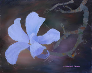
 This week we started adding some of the detail and brighter highlights to our flower and stems and it is really starting to take shape now. I should be finished with this in the next session or two but you take all the time you need to finish to your painting.
Just as I was doing last week I was using the center lavender and adding white to it to make a lighter color, I am STILL not using white, just a very, very light lavender.
With my reference photo in front of me (some of you are still not using your reference photo and it has all the information you need on it) and using my #4 flat bristle brush (it is old and looks more like a filbert with a rounded end), I start in the lightest area of a petal, such as the bump in the top petal, and blend using the dry brush technique (little paint or water on the brush and scrub it on). By lifting the brush to lighten the pressure I can control the amount of paint that comes off the brush so I can blend it into the darker parts of the petal.
The one thing you want to be aware of is you are not going to go over all of the petal with each new layer. What we did before becomes shadow and texture so you do want to save some of those colors to give you flower a 3rd dimension. Work you way around the petals this way starting in the light area and blending them into darker areas.
The light branch color has a bit of the lavender in it plus more sienna and white to crate a brighter highlight, this color goes on the top with slightly rounded strokes. the green is sap green, yellow and a touch of white and any mud on my brush and using rounded strokes when painting. the new growth is sienna, orange and yellow.
Try to get you painting to this point by next class because we are nearing the finish line and it will come faster than you think.
Keep painting and I will see you in class.
Spring 2018 Acrylic Project: Magnolia Week 2
I probably should have thought to show this last week but since I am still using this color, it is still relevant. Even though I am starting the highlighting process, I am not going to go straight to white. There is actually very little "pure" white on the flower.
The color in the middle is the base color for the flowers. I mixed white (gesso) with ultramarine blue and a little purple to make a soft lavender color. To make the dark color I added more blue and purple to make it lighter, I added white. I worked back and forth between these three variations of color as I added lighter areas and shadows.
Note: ALL shadows have blues and purples in them so when you are painting shadows you should add blue and/or purple to the color you are working with, it is it white, blue and purple or a cool grey will be the bulk of your painting for white so when you add the white, it will look white. If you are working from a photo remember the camera has limitations some of which are built in such as the UV filters that turn the cool shadows into shades of grey to black.
When you start doing detail you should have your photo in front of you where you can look at it often.
Look more to the shape and the value of that shape (light or dark) before you start painting. I was using my flat sable brush and the color you see above as I worked my way around the flower. There is no white on the flower yet but you can already see the dimensions coming out.
Remember to follow the direction of growth with your strokes, it will look like the veins in the petals if you do.
This is detail of the turned back petal with the other petal underneath it. I'm not sure this is correct but because it was so confusing I made as good of a guess as I could to sort that area out.
Still using the flat sable brush and rounded strokes, I started the highlighting of the branches as well.
I made a light grey using gesso, ultramarine blue and burnt sienna, same as the under painting but lighter. The shadows were just the blue and sienna with a little bit of the flower lavender to lighten it slightly, this should be a dark color.
I also added touches of green with a bit of orange or yellow and sienna alone to add texture and color variation to the branches. Near the ends of the ends where the buds are, the new growth is a reddish brown color so sienna with napthol for those parts and a mix or green (Hooker's or sap) with a touch of orange for the buds.
Another thing I did before stopping for the day was I needed to lighten some of the background so the branches would stand out from the back ground.
This time I used my flat bristle brush using the dry brush technique (very little water or paint) and used sienna, gesso, yellow green, using the side of the brush, making little circles with very little pressure on my brush, I added some lighter areas around the shadowed part of the branch near the flower but I blended it out into the existing area using less and less pressure until it faded out. I may need to do more later, but this is good for now.
This is where I stopped, try to get your painting close to this if possible, I will start getting more detail into the flower next class.
Keep painting and I will see you in class.
Spring 2018 Acrylic Project: Magnolia Week 1
This semester we will be learning about making a soft muddled background, negative space and creating the illusion of rounded tree branches.
Learning how to create a soft muddled background is very useful to any painter because many times you really do not want a busy background but you need something besides a stark white canvas. These kinds of backgrounds are good for still life, portrait even some landscapes need to have a soft out of focus background at times.
In acrylics we work from what is furthest away to what is closest. In this painting the out of focus tree branches, leaves and flowers are what is furthest away, that is where we start before we ever put a drawing on our canvas. You can paint right over acrylics so we do not need save areas like you would in watercolor or even oils, just paint all of the background.
You do need to work quickly to create this soft effect, to help keep your paints wet and to move them around the canvas, take your spray bottle and lightly spray the canvas, then, using a big brush such as a #12 flat bristle or your blending brush (we will use this brush shortly), pick up colors and start putting them on. I had my reference photo right in front of me so I could basically see where I had light and dark changes in the background and I loosely followed what I saw in the photo.
I am often ask "What colors will be be using?" to that I answer "All of them!" In the background you see above I think I used every color I had on my palette. I did use a lot of blue, bunt sienna or burnt umber for the dark areas, but I also used white (gesso), yellow, orange, red and green. Don't limit yourself when it comes to color, have all your colors out and ready to go when you start painting because you can save your paints from week to week if you store them properly, if you only put out what you think you might use, if you need something else, you won't stop to put it out, I know because I do it myself. Put out all your colors, problem solved.
Once you get the canvas covered - and it should all still be wet if you worked fast enough - get out your soft blending brush. You may want to lightly mist your canvas with water, just be sure that you work the mist in with your blending brush or you will get spots. Make sure that your blending brush is mostly dry if you have rinsed it out before using it on your painting. You will be making long crisscross strokes with your brush almost parallel to the canvas using very little pressure as you go.
Most students use their brush too upright with too much pressure and have problems making it work for them, you just want to skim the surface of the canvas, as the late Bob Ross would say "Three hairs and some air". Mist your paint if you need to, again, remember to work it in.
You can overwork this and end up with mud so stop when things look blurry, you are done. Let it dry then add your drawing. Because this is a dark background you can use white chalk so you can see it better, the chalk doesn't hurt anything.
Note that I have filled my canvas with the subject (see first image), I did this on purpose because it is the flower which is the most important, the branches are next, the background is just there for support. If I had made my design smaller the background, which is now the negative space, would over power what should be the most important part of my painting and make my painting much less interesting. By breaking the negative space up into interesting shapes with the flower and branches I use the negative space to my advantage,
 Now that the background is dry and I have my drawing on I can start the process of under painting the branches and the flower.
Using my #4 flat sable brush, I mixed a gray using my ultramarine blue, burnt sienna (burnt umber will also work) and white to change the value. I used the width of the brush to make a series of slightly rounded strokes to form my branches. This as opposed to one solid brush stroke which can leave hard lines and look flat.
You want to always follow the shape of the thing you are painting with your brush strokes, in this case rounded branches.
In the flower petals I drew lines on some of them to show the direction, and in some cases directions, of my brush strokes.
To under paint the flower I was still using my #4 flat sable brush and I mixed my ultramarine blue with a tiny touch of purple to get a lavender color and gesso to make it light for the base color. Where the petals go in towards the center of if they go behind another petal and are darker, I added just a bit more blue to darken the color right on my canvas then blended it in with the base color.
Like the branches above, I used the edge of my brush and pulled in from the petal edge to form the edge with a series of strokes, on the inside of the petal my strokes followed the curves of the petal.
Now it might seem strange to start out with this lavender color for a white flower but it needs to happen this way so you have someplace to go with your highlights. Whenever you are painting white, you should start out with some form of light blue, lavender or gray so when you start highlighting the lighter colors will look light and your subject will have shape so it doesn't look flat, there is actually very little actual white on a subject.
 Try to have your painting to this point for our next class if you can, I will be finishing up the under painting for the flower and branches then start working on some detail.
Keep painting and I will see you in class.
 This week we started adding some of the detail and brighter highlights to our flower and stems and it is really starting to take shape now. I should be finished with this in the next session or two but you take all the time you need to finish to your painting.


