Thursday, February 27, 2014

Winter 2014 Acrylic Project: Az Color
Week 4


This past week we worked on the river bank, the sand bars, the trees and the reflections by putting brighter highlights on them. One thing I do want to make clear is when you are putting layers of paint on your painting, you DO NOT cover up all of the under painting. The under painting becomes the subtleshadows or texture in your painting and it is the subtle things like this that help bring interest to your painting otherwise what you end up with is something very flat and lifeless. Protect and use your under painting to its best effect and your paintings will literally take on a different dimension.

When you highlight in acrylic, you will use a dry brush technique. That means there will be little paint on your brush and you will use little pressure on your brush. You will also use various parts of your brush from the long side to the flat edge so do not grip your brush like it was your life line, use an overhand grip and keep that brush moving from edge to side to edge again. My brush is constantly rolling between my fingers and I am holding it so lightly I have occasionally dropped it, as painters we are like sculptors only we sculpt paint instead of stone or clay.
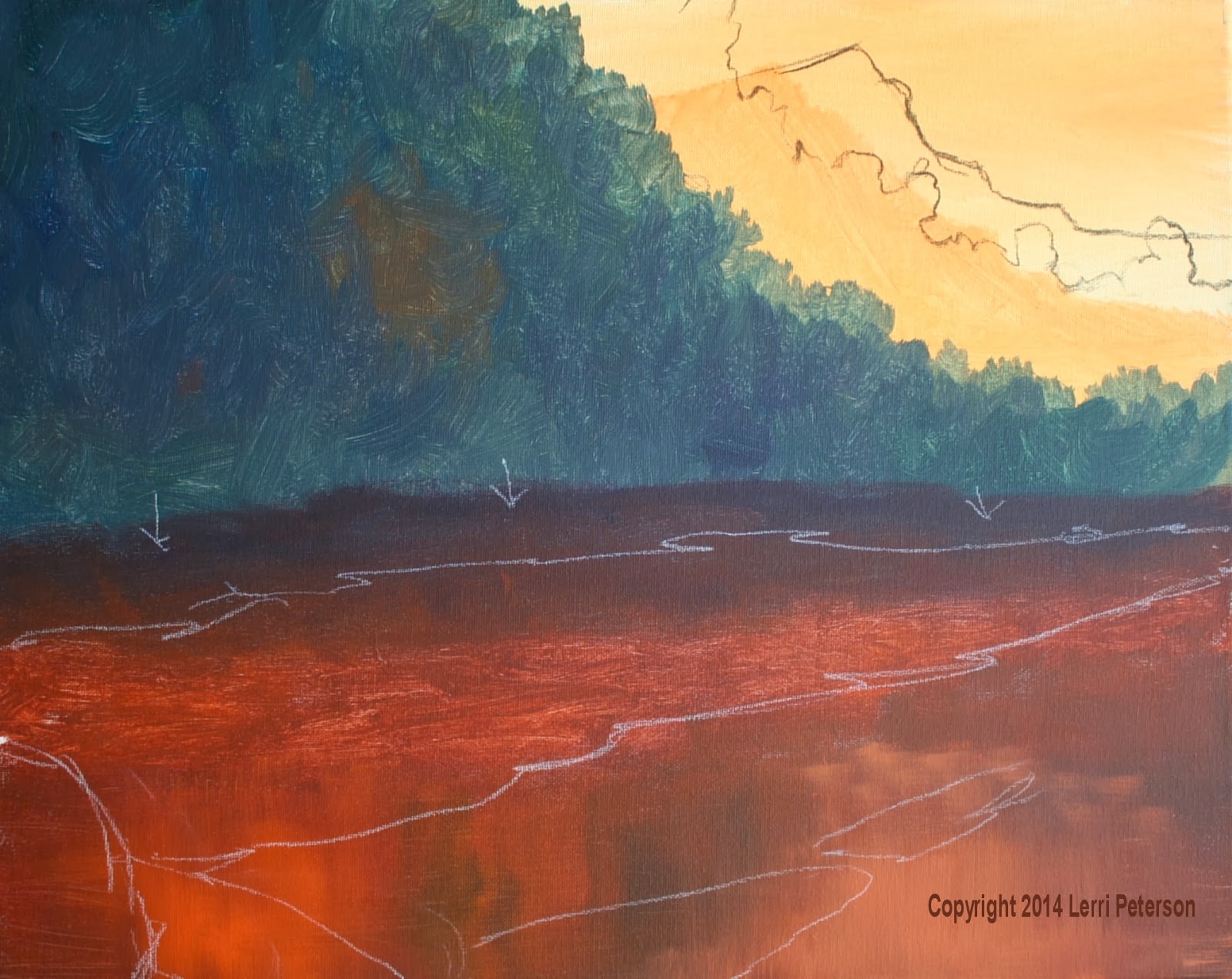
The highlight color for the river bank is white/gesso, cad yellow light, teeny, tiny touch of purple to grey it and a tiny touch of sienna to warm it. You should have a very light warm grey, like beach sand. Be sure to wipe off any excess paint from your brush (I was using my #4 flat bristle brush) and using the small side of the brush I lightly dry brushed on my highlights. Keep your strokes going mostly in a horizontal direction as you go from one side to the canvas to the other while making a series of overlapping, flat “u” shapes and upside down “u” shapes. Just like the water, when you want something to appear flat, your strokes need to be parallel to the top and bottom of your canvas. If you remember the old Etcha-Sketch you only had up and down or side to side, yet with a bit of patience and practice you could make a curved line using a series of parallel marks, that is kinda the same thing here except you can slightly curve your strokes. Remember to leave some of the under painting to create the texture of the sand/dirt.

The brightest part of the river bank is from just behind the trees to the water, when you go back towards the dark hillside, lighten the pressure on your brush even more and fade the color into the dark color, you will be letting a lot more of the under painting show and it will visually look like the sand is going back into the darkness. You can suggest shapes of rocks or paths or whatever, with just a few light strokes. One thing to be very aware of on both sides of the river bank is to not have straight lines, remember about being human, we want to have nice organized spaces the problem with that is it doesn’t look natural so be sure that you have a lot of variation to the edges where it goes into the dark hillside and also where it meets the water.

For the sand bars and the ends of the river bank, I added a bit more sienna to create a slightly darker color. On the river bank, I blended it into the lighter color so there was no abrupt color change and on the sand bars my strokes were mostly slightly rounded upside down “U” shapes so that the sand bars look like they are just above the water line.

The sun in this photo is behind and to the right of the trees so there is a lot of back lighting and light coming through the leaves to illuminate them so you can use pure color from your palette: Yellow, orange and even red or touches of green. Please note that I have NOT put in the trunks or the limbs at this point, I will do it next time, if you have already added your trunks and limbs, do not be afraid to paint over some of them because chances are you have not skipped areas that make it look like there are leaves in front of the branches so you will need to do that any way.

I switched to my #6 bristle brush because I wanted to cover the area quickly, however, if you are working on a smaller canvas you can stick with a #4. Don’t get too small with your brushes because you become too obsessed with it and your work will look overworked and you won’t be happy.

To load my brush I went straight into the paint and worked it into the bristles by jamming the bristles straight down on my palette. This is why we use bristle because they will take a lot of abuse to get the effects we want. The end of your brush should have and interesting – for lack of a better term – shape to it. You want this interesting shape so that your trees don’t have a cookie cutter look, one of the reasons I do not use a fan brush, it is way too easy to have trees with perfect little fan shapes all over rather than a more natural trees shape.

You want to tap the color straight on in slightly rounded shapes for these trees. Every tree has a unique shape but in general for these deciduous trees they will have a rounded “clump” look to them. The harder you tap, the more paint will come off your brush, the lighter you tap, less paint will come off so in areas where there is a lot of leaves, tap harder, around the edges tap lighter. Leave some of the under painting and keep the brightest colors to the outsides of the clumps. Keep an interesting shape to your trees and try not to fill them in. However, if you do manage to put too many leaves into your trees, do not panic!, Just mix a dark color similar to what you painted the hillside behind the trees with and just like you were adding the bright colors, tap some dark holes back into your trees.

While you have the bright colors on your brush, you need to scrub these colors into your water. Remember to scrub them in with horizontal and vertical strokes and PLEASE don’t try to go around the rocks you painted! Most of the rocks are under the water and they need to have these colors on top we will go back and bring some of these rocks out later but for now, just trust me and paint right over
them. Remember this is dry brush so you should still be able to see at least some of the rocks when you are done.

Try to get your painting up to this point by next class we only have 3 more weeks before the end of the semester. I will see you all in class.


Sunday, February 16, 2014

Winter 2014 Acrylic Project

This week we worked on the trees and the water after I fixed the problems I saw from the previous week when I was writing up the blog. Many of you also felt that you needed to change things in your own paintings and that is a good thing. This is paint and we can change things we don’t like or that just changing for whatever reason and it is good to see that you can just paint right over an area without having to first paint out then try to blend in the new with the old.

First the trees: You may want to take your charcoal or chalk and make a basic outline of your trees, mostly to get the size right and to give you some guidelines where to paint, please keep in mind these are only GUIDELINES they are not set in stone, they are chalk that can be erased and changed. When you are learning you often want to follow a drawing precisely and as a painter that makes your painting too stiff and overworked, create the shape with your brush, you will be a lot happier.


Whether you are drawing with your chalk or painting your brush, the most important thing to focus on it the negative shape around your tree. In acrylics we are usually painting the positive shape of something but that doesn’t mean that the space around whatever we are painting is any less important, creating interesting negative shapes makes what we are painting that much more interesting, these trees for example, need to have a lot of movement in their outside shape. Look at the reference photo and study the shapes of the trees. At his point that is all they are – Shapes. They are wild trees that get trimmed by the wind and water so their shapes are very irregular. Notice all the ins and outs along the edges of the tree and all the holes or spaces in the tree where you can see through to the dark hillside behind it. Really see these things BEFORE you start painting because these are the important things. You might want to practice on another canvas or piece of paper, no matter what medium you are using negative space is important and if you ever want to try watercolor, there can be more negative painting than positive painting because we paint from light to dark and it can be challenging.


Once you feel you understand how to draw the shape of the trees, locate them on your canvas. Blow off any excess chalk or charcoal dust before you start painting, it won’t hurt your paints but it can affect the color a bit.

I was using my #6 flat bristle brush, orange and a bit of burnt sienna to create a burnt orange color. There may have been some mud on my brush from what I was painting but that is not a problem, this is just the under painting for the leaves of the trees. You can even add touches of red if you want as you paint.

To load the brush and also to get it shaped right, I went straight down into the color and literally smashed the bristles into the paint. You want the end to be all fuzzed out and funky, this will give you interesting shapes when you are painting the shape of the trees. You NEVER want to do this with your good sable brushes because it will ruin them, bristle brushes are designed to take a lot of abuse and they are reasonable enough to be replaced when they are used up. Some people like to use a fan brush but I am not a fan of the fan, the reason being is it can make too regular of a shape and unless you are very careful when you are using a fan you will get a regular pattern going that is pretty hard to hide, to me, not worth the trouble but if you want you can give it a try, it is what works best for you and the overall look you are going for when you paint.

Once you have your brush loaded with paint you will be mostly using the very end of the brush and tapping and dabbing the color on where your shape is. Pressure is going to be very important when you are doing this step, if you tap hard, more paint will come off your brush, if you tap lightly you will see the individual bristle marks, one is good for more dense area and the other where the leaves are sparser. If you want to work in a small area use the corner of the brush, larger areas use the whole end of the brush. Remember to reshape your brush each time like I described above so you have irregular shapes.

Another thing to be aware of is the overlapping shapes within the branches of the tree. There are kinda rounded clumps but they will touch and overlap, if you have a bunch of clumps that aren’t touching or overlapping, you need to go in and connect some of those clumps, again, look at the reference photo or go out and look at trees.


While you have that color on your brush, down in the water you can lightly scrub that color horizontally into where your water will be. You will be going over some of your rocks and this process will make the rocks look like they are under the water so I emphasize the work LIGHTLY! Then lightly pull straight down using the flat end of your brush. When you are doing water it is good to remember “straight down and straight across” that will keep you water looking flat.

When you are done with the trees and the tree reflections, you will need to start adding some of the hill color that is behind the trees into the water and a bit of the sky color down in the lower right corner. It is the same thing: LIGHTLY scrub the color in horizontally, then lightly pull it straight down. You should get some streaks of dark going into the light and light going into the dark and that is a good thing. Each thing that we do to the water now will make the water look wetter and wetter, key here is not to put so much paint on that you cover up all your rock shapes, we can ass some of them back in if needed but if you can save yourself some work, that is a good thing.


Try to have your paintings up to the point where I stopped in class if you can. If you are having problems, wait and I can help you get through the rough patch, don’t keep working making it worse and worse. You have an extra week so no need to rush, I will see you all in class.


Wednesday, February 5, 2014

WINTER 2014 ACRYLIC CLASS

Acrylic Class Project:

This week I started out class showing how I could correct things about my painting I wasn’t pleased with. Because I have to paint from the side in class, I see a distorted view of my painting and often times I don’t really see what is wrong with it until I’m at home and not distracted with helping students. Unfortunately for my students, many of you were trying to get your own paintings to look like mine and many of you did which meant you also needed to make adjustments to you paintings, so most of our class time we spent making changes.
 
I marked all the changes I needed
to make.
Making changes is actually a good thing. You need to understand that if you are not happy with something in your painting, you can change or fix it and you don’t need to paint out whole areas to do it. I had to move my background peak over a bit as well as change the angle of the hillside both top and bottom. For the distant peak I mixed a color that was similar in value (light or dark) to what was there and used my #10 flat bristle to create the edge using the edge of the bristle to create the edge of the mountain, this is to keep the edge soft, you don’t want a hard line in the distance. Still using the #10 I mixed a color similar to the dark green I previously used for the hillside creating a new edge full of brush and wet into wet blending with the paint from the distant mountain.

I used the same dark paint (Hooker’s green, blue, sienna and a touch of purple) to fix the angle of the bottom of the hillside, I need it to angle down to the Left side about a quarter of the way from the bottom of the canvas to almost half way up the right side of the canvas. The river bank needs to also be changed the same way with a similar angle, using the same brush but with a sienna, orange and touch of purple mix of paint. I also used this color to add the sand bars in
the water, just be careful when you paint in the sand bars because you could end up with giant foot prints in the water so watch your shapes. This got me back to where I could move forward on my painting. Yes it took some time, but less time than if I had continued and had to fix even more is I was unhappy and a lot less frustration with my final results. Every artist finds things they want/need to change so you do need to know how to make those changes and not be afraid to do so.

The sun light in this painting is coming from the upper right hand side and slightly behind so that we will have a slightly backlit situation going on with our highlights. Look at the photo before you start this next process and notice where the highlights are on the hillside. They are right along the top right edge then it gets very dark in the main part of the hillside though the sun is hitting the trees and river creating dramatic light and contrast. However, look into the dark areas of the hillside and you will see that there are some bushes that stick out far enough to catch a bit of sunlight, these hints of lights add some interest into the dark and let the viewer know that there are bushes in the darkness.

Still using the #10 bristle brush, and a mix of green (Hooker’s or sap), a touch of blue, sienna and/or purple and a touch of white to lighten the color I mixed a very gray/green color for my first highlight. By using the brush so I am using a corner of the brush and a stippling-type stroke (touch and lift), I can create the top edges of highlight on my bushes. Same for the tips of the brush in the dark area, just little touches but please remember what you are painting as you paint: These are bushes, they have shapes and they may overlap each other, they will touch, they are not groomed plants in someone’s garden that are pruned to never come in contact, nature is sloppy.
 
Some of these rocks will be underwater.
Then there are the rocks. I debated about putting them in but I was watching an episode of “Paint This! with Jerry Yarnell” and he was doing a river with rocks in the water and I thought how cool the rocks looked under the water and if you are going to do landscape with any kind of water be it river, lake or ocean there will be rocks, so we are painting rocks! (Insert evil laugh)

Most of our rocks are going to be river-type rocks and most will end up under the water, this is very cool. I started out by making a dark color of sienna, purple and blue keeping it on the brown side, I used my #4 flat bristle or you can us a small flat sable brush, and I was using the side of my brush (remember that every brush is a multi-tool, use all sides),to create the shapes. Notice I didn’t say “rocks” because they are not rocks yet, they are only shapes and they are ALL KINDS OF SHAPES. Big, small, flat, round, odd shaped, dots, dashes, they overlap, they make clusters, they bunch up they do many things because they have been pushed there and their shapes were created by the water. What they do not do is line themselves all up in a row, they do not evenly space themselves out and have big round ones in the back and little ones in the front, they do not form clusters that look more like leopard spots, they do not repeat patterns, they are not all the same size especially from front to back. It doesn’t matter what it is, as it goes into the distance it gets smaller and closer together. If all your rocks are the same size from foreground to background, visually the ones in front will look like pebbles and the same size in the background will look like boulders. While there may be boulders in the back ground, they won’t all be boulders.

You also want to get enough in the water and on the banks to make it look like they belongs, one or two, here and there don’t have a natural look when doing landscapes, so get enough in especially in the foreground that it looks like river rocks.

You can let them dry for a few minutes then you will do your first highlight.

The highlights can start out by adding a bit of white (gesso) to the dark mix to make a gray
Highlights are quick shapes. Note the different colors.
color, what you don’t want to do is make all of them gray. Add touches of different colors such as orange or blue or red or green to the gray to change the “flavor”, these rocks have all kinds of minerals in them and can be almost any color of the rainbow. This first highlight will still be a dull color which is why I say mixt it into the gray, we will come back and brighten the highlights on some of them later, this is just the first step.

I switched to my #4 flat sable for this process because it gives me a bit more control and accuracy as the bristles will stay together rather than spread apart like the bristle brush. But like the bristle brush, I use all parts of my sable brush. The full chisel edge for wider areas, the corner and sides for smaller areas, I am constantly twisting  my brush to get the part I need to make the shape I want (still just a shape, no rocks yet).

When I make a highlight on a rock, I do it quickly and move on to the next one. I do not belabor each and every rock and pebble. If I have a big dark shape that I think needs to be smaller, I just make it into several smaller shapes. I will just put dashes or dots of this highlight color here and there even if there is no dark spot, maybe it is buried under the sand and all you see is the top. Remember that the sun is coming from the upper right of the painting, so it will be the top and right hand side of the rocks that get the highlight. Be very cautious not to keep repeating the same size, shape and angles, that is a very human thing to do and it can easily happen, then the next thing you know you have a herd of turtles instead of random rocks, working quickly can help prevent too much planning and thinking which causes the turtles to appear.


This is where we stopped so try to get caught up to this point, practice on another spare canvas if you need to, try not to over think or over work your rocks. I will see you next week.