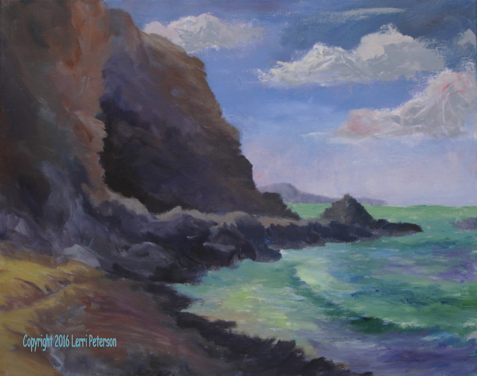
SUMMER 2016 ACRYLIC CLASS Project : Working the Steps Week 2/3
 |
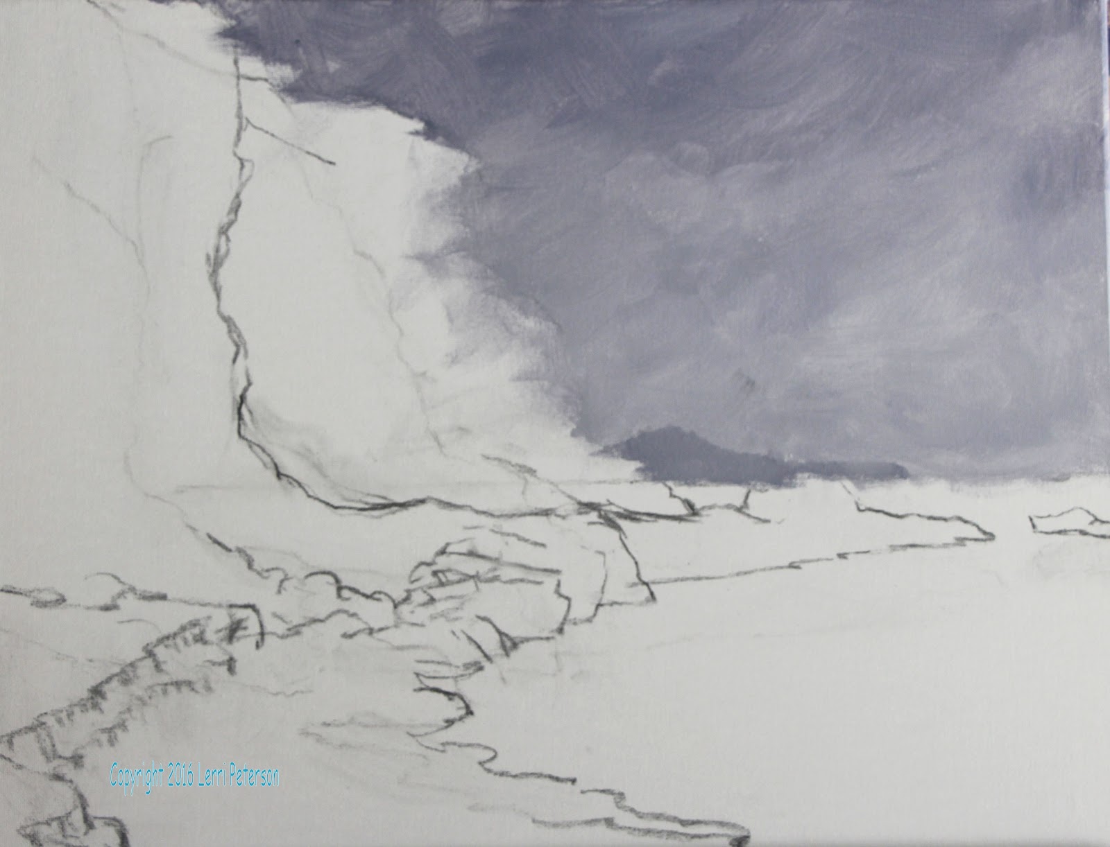
| I am painting right over my value underpainting. |
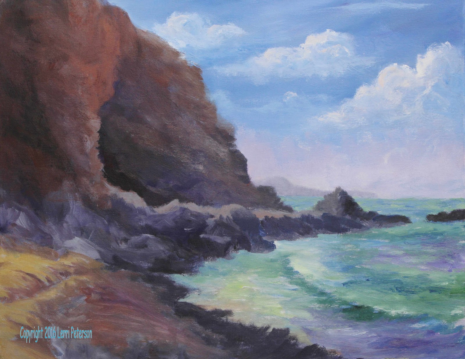
I started on my 16 by 20 canvas by putting down
a value scale underpainting of my subject using grey, which is a mixture of
ultramarine blue, burnt sienna, and white. To make the color darker I added
more blue and burnt sienna; to make it lighter I added more white. Once I had
my value underpainting down, I started working on the color starting with the
sky.
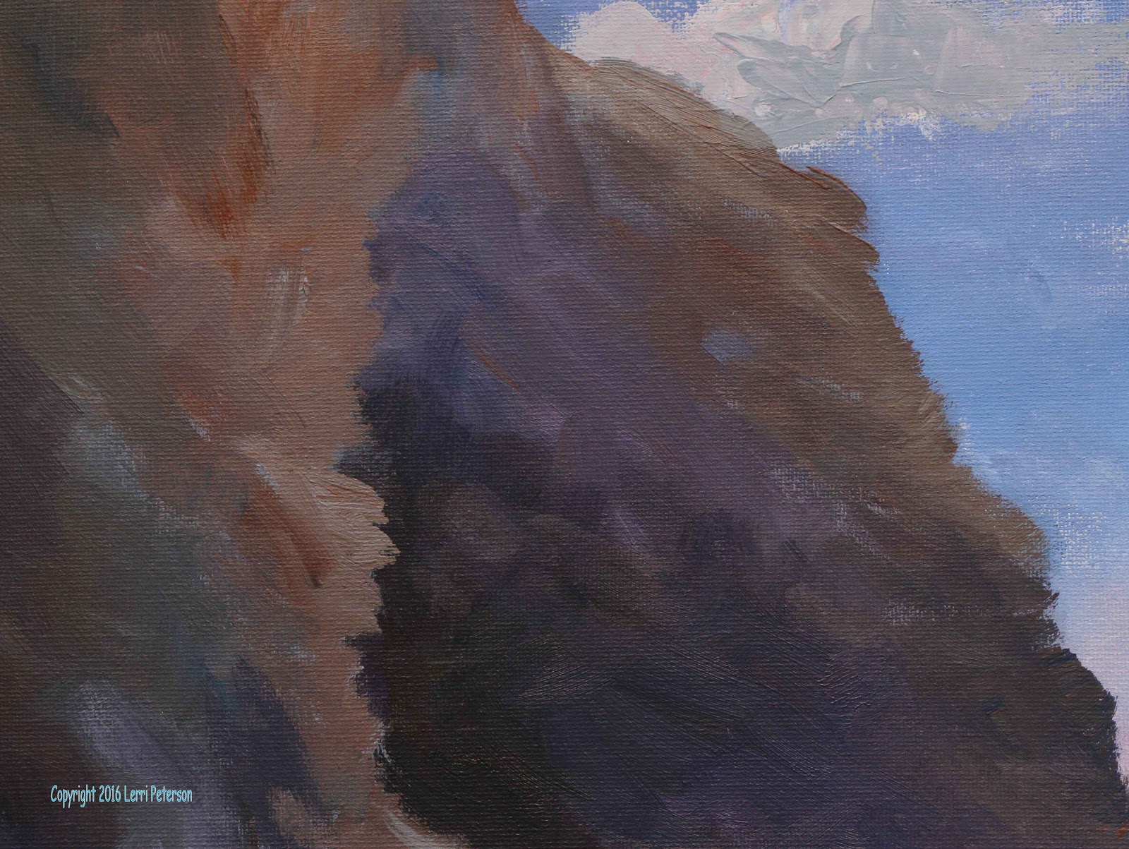
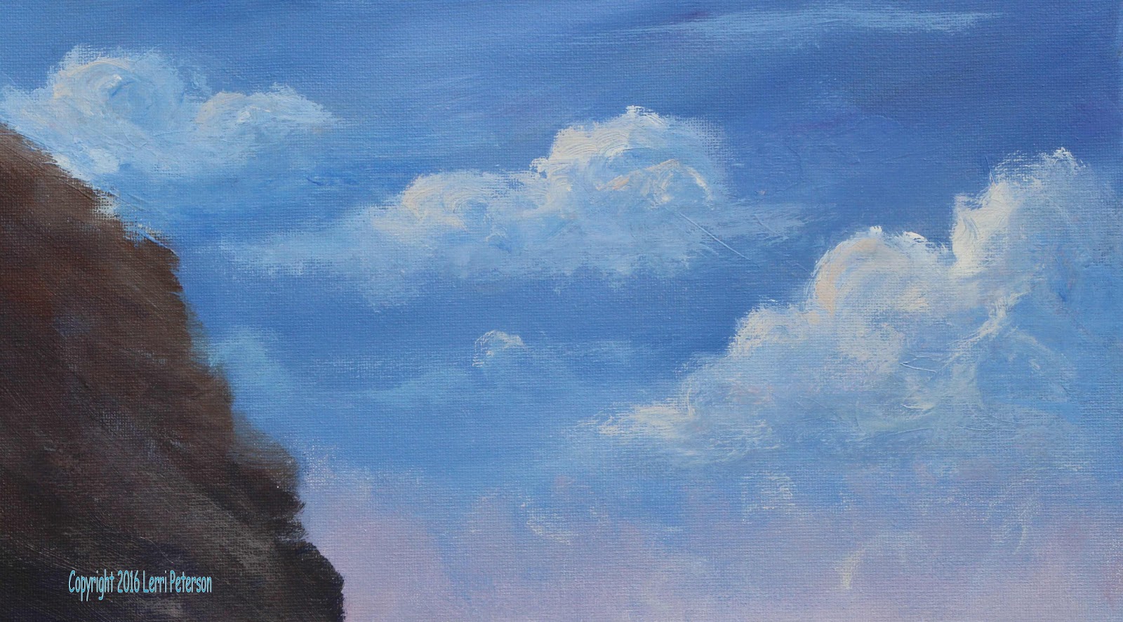
Using gesso, ultramarine blue, a tiny touch of
purple and a very little touch of the burnt sienna to grey the color, I started
at the top of the canvas with my #10 flat bristle brush and working down to create my sky. You want the upper part of
the sky darker than the bottom part, you use more of the blue mixture at the
top and as you work down the canvas you add more white or gesso. As I got close
to the horizon I added just a little touch of alizarin crimson to the white and
the blue on my brush to create a soft violet color starting from the horizon
and working up this time and using a circular motion of my brush I created what
looks like a bank of fog in the distance.
While the sky was still wet, I rinsed my brush
and made a mixture for the distant peninsula, again using my ultramarine blue,
a little touch of purple, sienna and enough white/gesso to create a color that
was just a little bit darker than of value the sky, with that color I created
the distant peninsula that is right along the horizon line. Use the flat edge
of your brush (change to a smaller brush if you need to) to create the top edge
of the peninsula pulling down, this creates a soft top edge, you do not want a
hard edge in the distance.
 |
| I put the clouds in with a palette knife in this version. |
My sky was still a little bit wet so I wanted to
add some clouds Clouds can be done in a couple of ways: if you are attempting
to use a palette knife you can use a palette knife to create the clouds or by
using your flat bristle brush you can also create some clouds, just remember
that clouds are water vapor that is bubbling and boiling in the atmosphere so
to create the sense of your clouds billowing in the sky you need to use your
brush or your palette knife in a circular type fashion to create the idea of clouds.
One of the things I didn't worry about was going
over the lines or edges of my cliffs or the horizon line because I can do
several things to fix it: I can either wipe out any paint that gets into and
area I don’t want by using a damp paper towel or just let them dry and paint
over it, it's one of the beauties of acrylic paintings that you can paint right
over something if you don't like it, so don't worry about painting around just
paint right over those lines and you will avoid getting a halo around your
objects or hard lines.
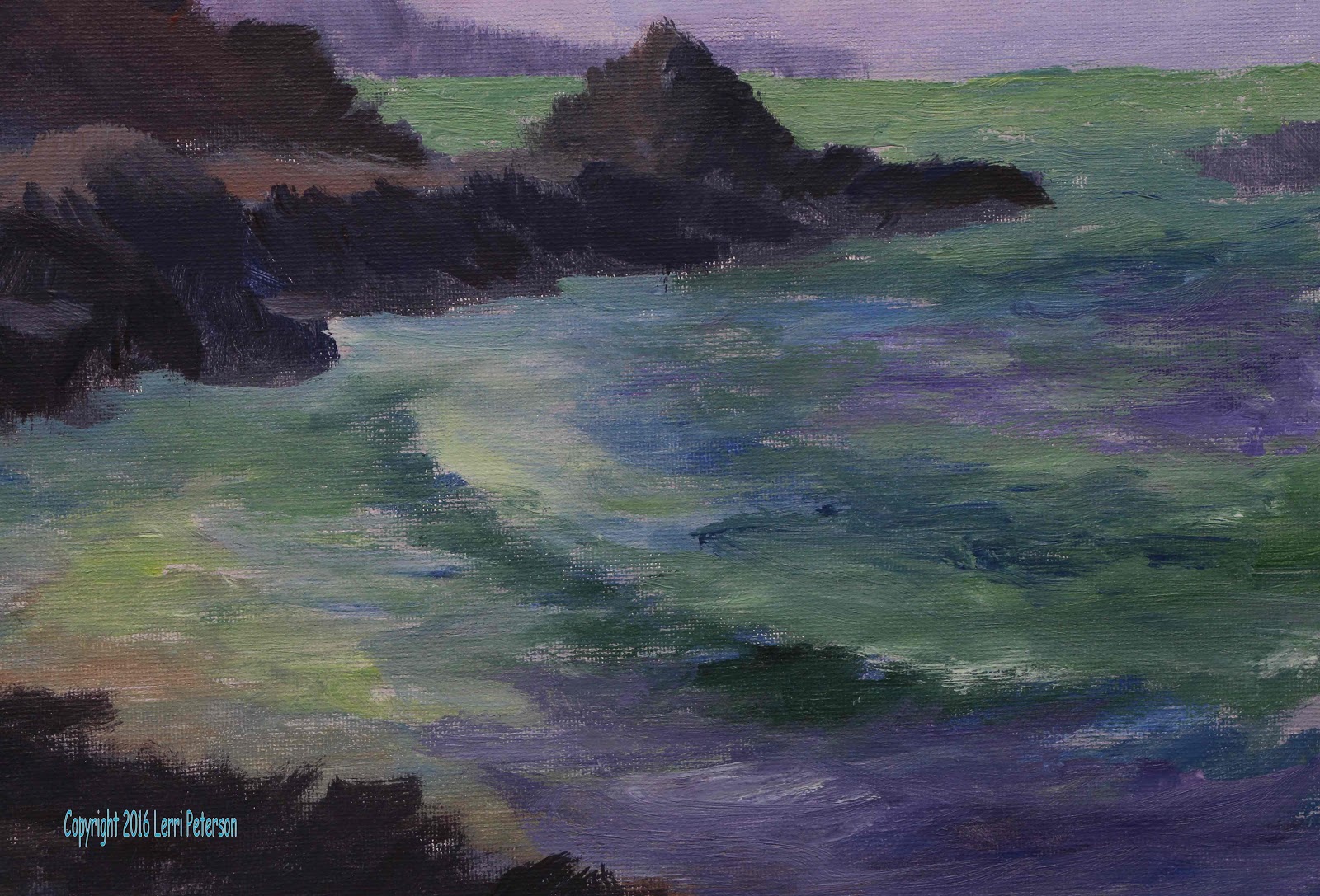
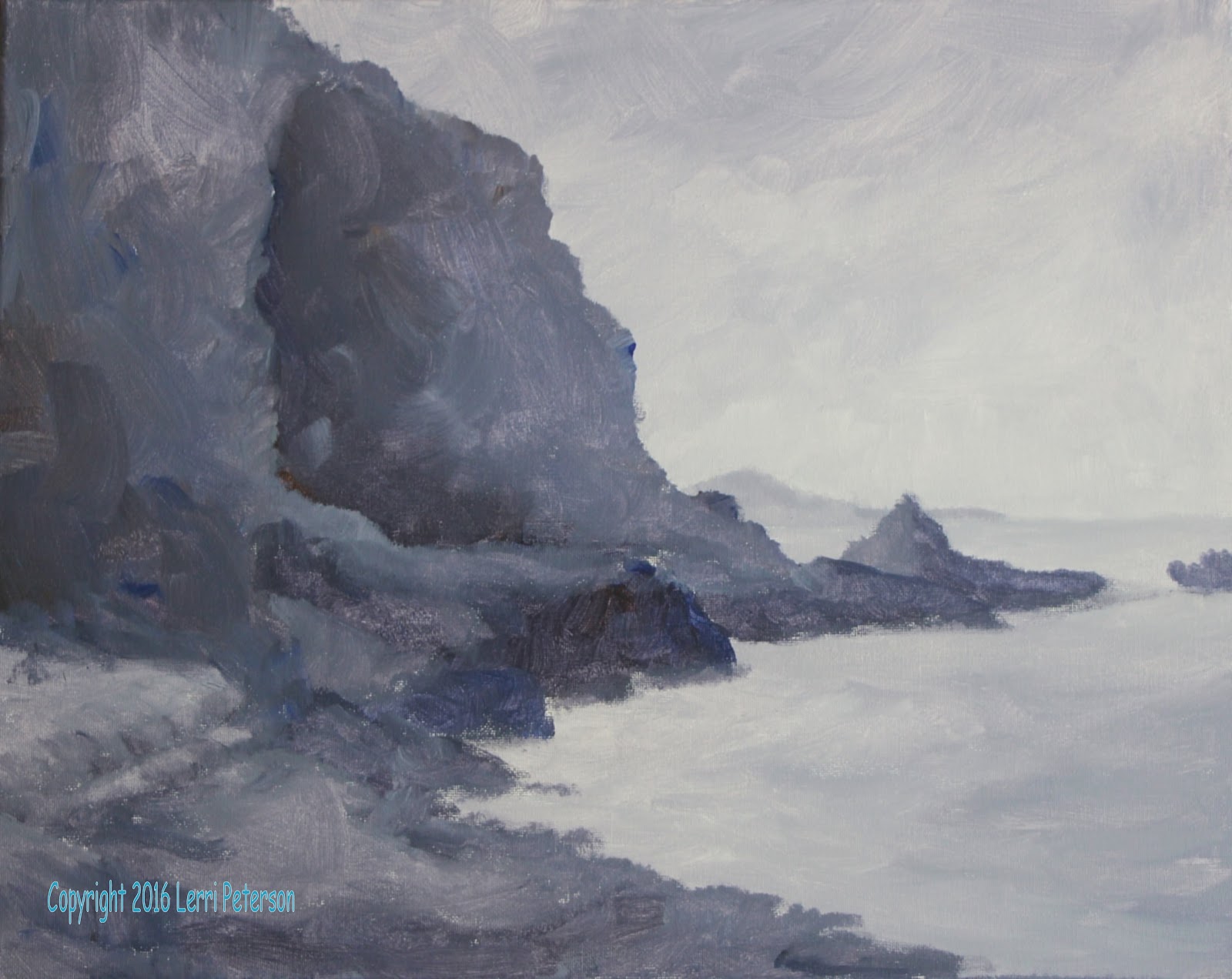
Once my sky was dry then I started working on my
distant water using my ultramarine blue and my hookers green with a little bit
of yellow and white I created a soft green, distant color. This won't be the
finished color but it is what I'm using for an underpainting. Be aware of the
values that you have already laid down those should be your guidelines to the
lightness or the darkness of your color, look at the color against the value
you have down, squint your eyes and if they are close in value they will kind
of disappear against each other, and then you know you have the correct value.
Using this blue green color, I painted this in
along the horizon using my finger to soften the
While I was waiting for the ocean to dry I
started working on the cliffs. When you are under painting you are painting a
darker version of the final color, so with my burnt sienna, blue, purple and a
touch of gesso, I created a soft cool brown tone, you can also use burnt umber
instead of sienna, you want it to be a medium dark color for the under painting.
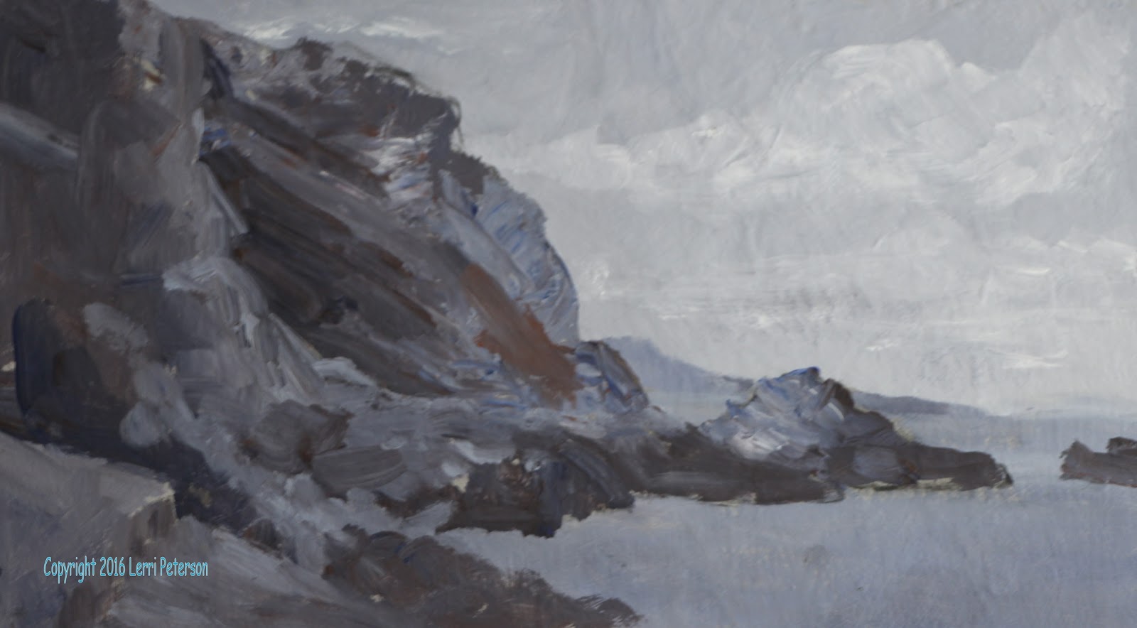
Starting at the edge of the cliff and pulling in
towards bulk of the cliff, using the flat end of my bristle brush I created the
edge of the cliff that is against the sky. Look at the reference photo, it's
not a smooth edge there are rocks and boulders and loose dirt and all kinds of
things going on with the edge of these cliffs so you want to create an uneven
edge to your cliffs. You can pull in using the flat part of your bristle brush
or to create little outcroppings using the corner and pulling in this is just
for the edge, on the interior of the cliff wall you will be doing what's called
a scumbling stroke which are strokes
that go in every direction, however, because these cliffs are made of sedimentary
type rock you want your strokes to slightly angled down top to bottom.
As you work your way closer to the darker area
you can add more blue, purple and sienna but no white to create the darker cave
area. Don't be afraid to add other colors like a little orange or yellow even
green and touches of white, just be sure that you have made a lot of different
strokes as you blend your colors because those strokes become the texture of
your rocks, remember you are not painting it like a wall, painted like a pile
of rocks which is what it is. Where the cave is the darkest, your color should
be a cool, charcoal grey meaning not quite a black color and should be on the
bluish side.
On the closer cliff wall you want to have a
little bit lighter color to go against the dark of the other cliff wall where
there's a cave, use the same colors the blue, sienna or umber, and little touch
of purple but add a little touch of orange or yellow and a little touch of
white to create a lighter color. The stroke is the same, the application is the
same to create the outside edge: with either the flat end of your brush or with
the corner to create the little ins and outs where rocks are poking out or
where they have fallen off. Use this color all the way down that front edge and
out to the little point then as you work back into the shadows and more of umber
or sienna or blue even purple, all the time you are scumbling and creating
different shapes with your strokes.
For the very dark color that is on the backside
of the little point and along the front edge of that half you will use blue and
umber or sienna with purple but no white to create a very dark color. Use this
dark color for the back side of the point and around to the front and along the
edge of the water. Remember that that water's edge is made up of stones and pebbles
so it is uneven, it's not a nice smooth arc, water comes in further and some
places and out further in others so make a very uneven edge.
For the sand path in the corner and the little
patch that is just above the water's edge you will start with yellow, gesso/white,
a little burnt sienna and a little, tiny touch of purple as your base to make
it lighter you will add some more gesso/white and yellow, add more sienna and
purple to make it darker. You will be creating the eroded edges of what used to
be a path or road, again your stroke is going to be very important these edges
are not hard, sharp edges but rounded and soft, so your strokes need to be
rounded to create that soft edge. If you want to add a little bit of purple and
sienna to part of the lighter color to have as a shadowed color ready as you
work and you can wet into wet to blend as you go. Start with the lighter color when
it goes into the shadow colors pick up some of the darker color for the shadows
and work back and forth to create a soft eroded edge.

The patch of sand that is showing in all the
rocks and pebbles is the darker shadow color you used for the eroded edges you
just painted. Be sure that you strokes angle down towards the water so the sand
looks a bit inclined.
The other rocks that are in the foreground can
be left grey if you still have some of your underpainting visible or we can
paint them in later at this point it isn't necessary to do this please try to
have your painting is close to this stage as possible we will continue to work
on this in our next class.
---------------------------------------------------
 |
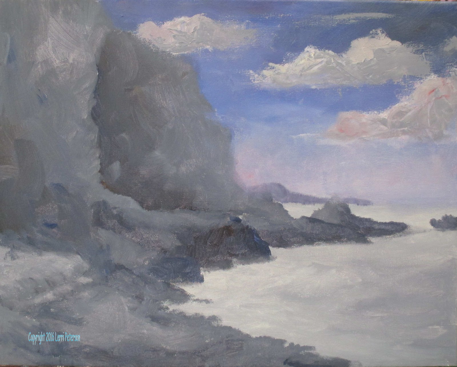
| I re-did my sky and put the clouds in with my brush. I like them better now. |
Keep painting and I will see you in class.