Friday, October 25, 2013

ACRYLIC CLASS PROJECT: Water Lily Week 5

The last class we finally got to add the actual water lily to our painting. While there wasn’t much instruction, it did take time and, for most of you, practice. While I really don’t want to say that something is “hard” because I do not want you to set up barriers before you even begin, getting the feel for creating the flower petals does take a certain skill, as many of you found out it isn’t as easy as I make it look but you must remember I’ve been doing this for a few years and, yes, I do practice it if I feel I need to refresh those skills.
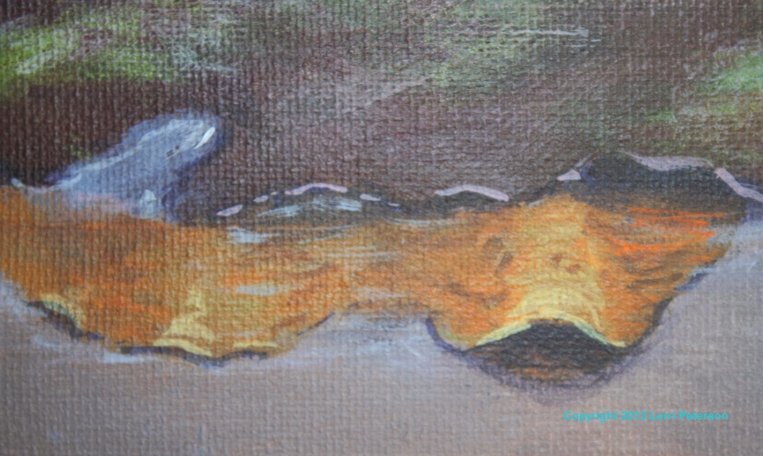
The first thing I did was to add a bit of the sheen back on to the water that disappeared when I darkened the corners last week, again, this is a dry brush technique but this time I used the 2” haki/blending brush. I tried to keep most of the “sheen” near the center so I didn’t lighten my corners too much, however, notice I didn’t paint a visible ring around the center, it should just fade to the corners. I used the same color as before white/gesso with a touch of the gray color I still had from the water, I thinned it down with water, removed the excess water from my brush with a paper towel and lightly streaked it across my canvas. I had a damp paper towel handy to wipe the color off of areas where I didn’t want it, then let it dry for a few minutes.
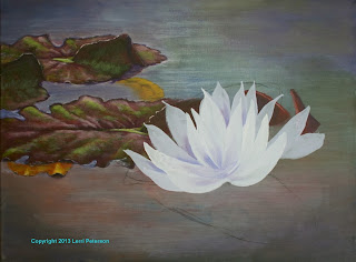

For the flower, you do not need to draw on a detailed flower, if it makes you more comfortable then, yes, go ahead and do the detailed drawing with your charcoal but don’t be married to the drawing. With my photo in hand, I just did a simple shape where I needed my flower to be, keeping in mind that the flower is a slightly tilted cup shape, it faces back into the painting and that is important, you don’t want the flower looking out of the painting.

If you don’t have any of the gray from the water left you will need to mix up some more (gesso, blue and sienna keeping it to the blue side), if you still have some gray you will need to add more gesso/white and a touch more blue and enough water to make it a very creamy mixture but not runny. It should be a couple shades lighter than the water but not white, remember you need to have contrast so that white will look white and even though this is a white flower, if you look at it closely only the highlights are actually white all the rest of it is shades of gray.

For best results, you will need to have your sable brush. I was working on a large canvas so used my #10 (wished I had a #12 but made do). The first thing I did was to load my brush by running it back and forth across my paint to not only load paint on both sides but also to bring the end to a fine chisel edge. You do not want globs of paint but the brush needs to be well loaded. Start the stroke on that chisel edge and as you start to pull it is a combination twist and push motion. Many of you got the twist part down but didn’t get the push down part and your strokes looked like snakes so remember to push. Twist back up to the edge and lift to complete the petal. Remember that all the petals go to a central point in the flower so whichever side you are working on be sure that the petal ends in the same place.

I painted in the very outside petals first then to do the next row of petals I added a bit more white/gesso to my color to make the paint a bit lighter before adding the next layer. I only did the back and the sides of the flower, I will do the front after I add the yellow center.

I did do some shading to my flower and if you feel confident you can do it also, I just wanted to get some busy work done so the painting could progress, I will show this in class next time. The shading was the base gray color and I added a touch more blue and a tiny amount of purple. Starting between the petals near the base, I separated the petals by painting the petal BEHIND the other. This is called negative painting and while it is the bread and butter of watercolorists, it is also very useful in other mediums. The darkest part of any flower is going to be near the center and will fade as it comes into the light, just keep this in mind and PLEASE have you reference photo right in front of you as you are painting this, all the information you need is in the photo.


Do not worry about the shadow, I have not started it yet, we may get to it next class. Try to get your painting to this point and I will see you all soon.

Friday, October 18, 2013

Acrylic Class Project: Water Lily Week 4

This week we continued shaping our lily pads, the places where water comes up on the pads and creating the water edges around the pads. We also worked on the shadows under the pads, however, the first thing I wanted to do was to correct something that had been bothering me and that was my background water just seemed to even in value all across my canvas so I wanted to darken the corners of my canvas before I got too much further. It would be a bit harder to do this once I had the flower on so now was the time to fix this before I moved on.


This technique is a good one to use whether you need to darken a large area or lighten an area, if your water was too dark for instance, instead of using darker colors like I was using you would add lighter versions of the colors and instead of working from the corners inward like I did you would start from the center and fade to the corners. The important thing to remember is this is a dry brush technique and you want to blend so you can’t tell where you stopped with your new color.

With a #10 bristle brush and some of that mix I started with for the water (yes, I still have that color on my palette, it is very useful) that is blue, gesso and a touch of sienna keeping it to the blue side, and to that I added blue, purple and sienna to darken it. Through most of this process I just picked up color on my brush and mixed on my canvas blending as I went. My darker colors were in the corners and to that I would add touches of the grey mix or greens or whatever color was there originally to create a soft mottled color as I moved closer to the center. This created a slight vignette around the edges of my canvas.

Another thing when you have to do something like this, don’t worry about what is there, just keep a wet paper towel handy and just skim over the edges with the color and wipe it off with the wet paper towel or just repaint it later because if you try to paint around an object you can create halos and outlines that will make the object look either cartoonish or cut and pasted on to your canvas. Many of you are still worried about painting over something that is already there or leaving a space for another object in front, with acrylics it is just easier and better to paint over something no one will be hurt in the process and your painting will be better for it.


The amount of detail you want to put in is going to be up to you. If you want a lot of detail you will have to look at the photo to see what you need to do, if you don’t want a lot of detail stop when you are happy with the way it looks. This is a personal thing for all artists and you need to figure this out for yourself. I’m a bit of a middle ground sort of person leaning slightly towards the detail side, how detailed depends on what I am painting usually, this painting so I can show those who want detail will be a bit more detailed than if I were doing it on my own.

The yellow pads that are partially under water are a fun detail. With just a bit of paint and a touch of a finger you can make them look like old, dying pads. I was using a #4 round sable but any small brush will do, and any dark color will do for the spots. I had added some mustard color (yellow with a touch of green and the mud on my brush or off the palette) and tapped in some lighter color than what was there. While this was wet I too a dark color, sienna and green I think and just added random dots and splotches to the pad and while everything was still wet I smeared it with a light touch of my finger. You do not need to be exact but the quicker you can do this the better.

The highlights on the bronze part of the pads are another dry brush area. Dry brush means you have very little paint or water on your brush and it is especially important for these highlights you just want to skim the surface nothing more, don’t get heavy handed with either the paint or the pressure on your brush and you will be fine.

I used my #4 flat bristle, some more of that gray mix, a bit more gesso/white and a little touch of red. It will be a pinkish color and it goes on the very top pars to the bronze color. Be sure to wipe you brush before you start and use the side of the brush and FOLLOW THE CONTURES OF WHAT YOU ARE PAINTING. Many of you had stripes of the same size on your pads and while it might appear to be a bit that way but the highlights follow the high points of the pads. They fade to the sides they fade to the ends. They taper or spread out, you need to look at the photo very carefully to see where you are going before you start this process.

Look around you painting to be sure you have all your shadows and detail (shadow color is blue, purple and sienna) we will start on the flower in our next class which brings us to the final thing we did in class and that was to practice making the flower petals. As most of you found out it was harder than I make it look, it does take some practice so it doesn’t look like worms and it is better to do this on a scrap canvas rather than you painting. You will also need a flat sable brush if you have one like at least a #10, watercolor brushes will work if you don’t have an acrylic/oil brush but it still needs to be a ¾” even for those on smaller canvases.

To practice, the color does not matter just whatever you have on your palette. This technique is good for petals and leaves and ribbon or anything else that that is long and twisty.

To start, run your brush through the paint flipping it over a couple times to flatten the flat end of the brush into a nice chisel, this is an important step so don’t skip it. On your canvas put the end of the brush on the canvas, pull it a little then at the same time start to press down and twist. Pull it down a bit more then reverse the process. You should have a shape that is thin on the ends and fat in the middle. When you feel comfortable with that, try making a flower. All the petals curve in to a central point at the base of the flower, the key word is “curve”. Do not bring your petals in straight, it will not look natural. This does take practice. Don’t expect to do a couple of practice petals and think you have it down or you will be trying to fix your flower later and that will be much harder.


I will see you all in class.

Saturday, October 12, 2013

ACRYLIC PROJECT: Water Lily Week 3

This will be a combined description of what we did in class for the past couple weeks so there will not be a separate blog for the week I miss posting due to the Studio Tour.

The first thing we did after getting our background in was to under paint the lily pads. Please note that we are looking at the pads from the side so they are not round circles but ellipses. The shape of your pads and the direction you put the veins and ridges are critical  to show the viewer that the pads are laying on the top of the water. If the pads are too round or if you bring the ridges too straight into the center vein, your pads will look like they are standing on edge. The direction of your brush strokes is very important and they give your viewer a lot of information about the subject.

I under painted the pads with a combination of burnt sienna and purple, keeping the mix to the sienna side, it is a fairly dark mix. I was using a #10 bristle brush but you need to use a brush that fits the size of the canvas you are working on but as always, use a large enough brush so you can work quickly at this stage, save the small brushes for detail.

Theselily pads have – for lack of a better term – a sail at the back end that forms a kind of tented structure at the back end of the pad. I don’t know what they are for but they do add some interest to the pad so don’t overlook them in the process. We will detail them out as we finish out the pads around them in watercolor we call this negative painting. Also be aware that there are ridges or ruffles in the pads so when you are drawing or painting the edges, don’t make the edges smooth give them some ups and downs (look at the reference photo).I also want to point out that many of you got right up to where the flower sits and stopped or tried to paint in between where you think the petals might be, this can cause you some problems when you do get to the flower it is better to just continue to paint as if the flower wasn’t there, the flower will cover over what is there but you will have color in the places between petals otherwise it can look very cut and past when you are done.

The yellow lily pads that are under water can be under painted with a bit of yellow, orange and the mud on your brush, you should have a dark mustard color, this is perfect.

When the pads are dry, now you are going to scumble in some green tones into the pads. Always have your reference photo in front of you when you are painting, while you don’t have to be exact in your rendering of the subject, the photo has a lot of information you need to paint a believable representation of the subject. I say this because I want you to see the green in the pads. It is not a solid green it is more of a variegation between the reddish color and the green. Also be aware of the ridges and their angles, draw them in with your charcoal or chalk if you need to, this is important to make the pad look flat on the water.

Still using my #10 bristle brush I used a mix of sap green and a bit of yellow and dry brushed it on the pads following the ridges and dips of the pad (this is not a wall it has shape so follow the shape). Refer to the photo often to see where it is the brightest, don’t forget the “sail” at the back, if you want or need to, add some of that sienna and purple back in you want soft edges
between the colors so you can’t tell where one starts and the other stops. If you need to lighten the color a bit, if you still have some of the blue gray we used for the water, use little touches of that rather than white (gesso) it will lighten a little not a lot like the white can and the white can make it look chalky.

When you are painting the ridges and dips on the pad, keep in mind your brush strokes. I know I sound like a broken record but most of you still have a problem with this and then wonder why you can’t get the right look you are going for. Your strokes need to follow the shape of the thing you are painting, if it is a ridge that is standing up your strokes should be like an inverted “U” shape if it is the dip between your strokes need to be a regular “U” shape. The taller/longer and skinner the “U” stroke the taller or narrower the ridge of dip. Shorter and flatter strokes will make the ridge or dip look flatter. You can practice this with a paper and pencil so you understand what is going on when you get to your canvas, the same goes with the direction of the angle of the ridges: If they stick straight in to the center vein all the way down, the pad will look like it is standing on edge, again try it on paper first.
You can see the dry brush and
all the different layers.

When you get this first layer of green down it will probably dry darker than you’d expect and you will most likely have to go back over it with a bit lighter green. Use the same color with a bit more yellow in it (sap green and cad yellow lt) but don’t go over all your green, usually just hitting the high spots like the tops of ridges will give those ridges more form. Let the sides of the “sail” stay dark because they are in shadow. We have a bit more to do on the pads to get some final highlights and detail then we will get to the flower.

The shadows and the areas where the water comes up on the pads is next, these you can do as you go as they are integrated with each other around the edges of the pads. The shadow color is going to be ultramarine blue and a touch of purple and the highlight color is going to be the water color (white with blue and sienna to gray it), if you have any of the water color left, just add a bit of white to lighten it. I was using a #2 round sable for this because it is detail.

Again,look at your photo. I have my photo taped just above my painting and my eyes are constantly going back and forth between the two before I ever put brush to canvas, I want to know what I am doing and why. I want you to notice that around the pad where the water
touches the pad or comes onto the pad there is a very dark shadow cast from the water, also notice that it varies in size and sometimes disappears altogether depending on how much water is covering the edge of the pad. I don’t want to see a solid outline of the same width all around the edge of the pad, this will make it look like a cartoon when what we are trying to do is create some depth and body of the edge of the water.

On the front edge of the pads not only do you have the edge of the water but there is also the shadows cast from the ridges that stand above the water and the shadow cast from the “sail”. The darkest part of the shadow is what is deepest under the pad so start you dark color there and work out. Look at the photo so see the shapes of these shadows BEFORE you paint them.

Now that you have your shadows for the water, you need the highlights to give it some depth. Using the light gray color and the same brush wherever you have a shadow for your water, there will be a bit of a highlight. Skip a sliver of the water color just above the shadow and add your highlight. Keep your strokes flat because water is flat and keep looking at that photo it gives you the best information.

This is what we did the past couple weeks, try to be caught up to this point for class and learn to be observant of the world around you and you will become a better painter.