Saturday, December 11, 2010

Homework Count.

Making Things Glow – The Power of Value


It is really hard to turn off the teacher mode when we have time off so I am keeping myself busy trying to keep you busy.


When all you have is black, white and shades of gray, value is all you have to convey to your viewer not only the shape of something but the mood of your subject so this is where the ability to see the subtle changes in value is critical.


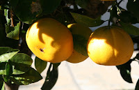
I decided to draw the oranges rather than paint them to see if I could create a sense of light or a "glow" that these oranges had and I kept my value scale handy and checked my reference photo often so I stayed on track. Drawing is good for my painting – if I decided to do this particular subject of any other - because it is forcing me to use value to create the subject, no using tricks of color give me the glow, just value.


I really hope that you are all trying to do some drawing and/or painting during this break, it will keep you at your best.

Saturday, December 4, 2010

Winter Break Assignemnt 2010

Homework

I don't know how many of you check this blog while on break, but for those who do, I have a bit of a homework assignment for you. I found a book given to me by a friend and it had a lot of great information I wanted to pass along, I will cover more in class but this will get you started. This assignment is one that can be done anywhere and every where and you do it every time you open your eyes and that is to "see".


I know that may sound silly but it really isn't from a teaching perspective. If you are going to improve as an artist you need to be able to look at your subject and see all the elements that make that subject appealing to you. Those things include shapes, color, light, arrangement (composition), texture, shadows and reflected light. There's probably something I'm missing but those are the important things that come to mind.


In the past, you have heard me harp on drawing and many of you have taken me to heart and have been working on improving your drawing skills (YEAH!) continue what you are doing because that will help you with this next task, looking for the light, shadows and reflected light in your subject. They all have shape and their shapes helps define your subject.


These oranges are a good example (I'm experimenting here posting picts to the blog). Yes, you see the oranges and the bright light and the shadows but do you see the reflected light? Do you see the change in color on the front orange under the leaf? Do you see the difference between the reflected light in the shadows of the front orange compared to the one behind?


Because of our atmosphere, light scatters. It will hit an object then bounce back and reflect a bit of the color from the thing it has bounced off from. In the front orange the reflected highlight is cooler than the reflected light on the one behind because the light is bouncing off the leaves on the front one whereas the light on the one behind is coming from the orange in front. There is also some orange color reflected into the leaves around the oranges. Yes, it is subtle but it is there and you need to see it.


There is also light coming thru the leaf and changing the color on the orange to a cool green color. It is more evident on the front orange but it also happens on the top of the behind orange.


Now look at the shape of the shadows themselves. Because they are falling on a round orange, they must follow the shape of the object they are falling on. This goes for all surfaces. Pay close attention to the way shadows fall and how the follow the contours of they fall on be it flat, round, bumpy, shiny, dull – what ever it falls on it will follow the shape.


Now look at the highlights. I want you to start at the brightest spot and follow the change of color around the orange. If you have your value scale get it out and note the change from the lightest area into the shadows. Not counting the cast shadows (shadows which are blocking the light) from the brightest highlight to the reflected light should be about 4 steps down or 40% darker than the highlight. Cast shadows are darker still and it depends on how much light is being blocked, some of the cast shadows may be from 50 - 80% darker or more.


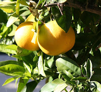
On this next picture, I want you to find these things. I do want you to note the difference in the temperature of the color between the back orange between the two front oranges. Color temperature is the difference between the colors that we associate with warm – red thru yellow – to those we associate with coolness – purple thru green.


Well, that is your assignment. It is all around you in every room in your house. It is outside in every sunlit patio or shaded woodland. We will be covering more of this in class but this should get you started.


Have a great holiday season, see you in the New Year.

Sunday, October 31, 2010

Fall 2010 Acrylic Class

Fall 2010 Acrylic Project – PV Eucalyptus Final Touches

Mostly what was left to do were some final touches. Some final highlights to brighten some areas, some shadows to give more form, some detail to define certain things…The detail and finishing of a painting becomes a personal preference: You can do a lot to make it more realistic or do nothing at all and give it a more impressionistic look, it is totally up to you at this point, I will run through what I did in class and what I did at home to finish the painting the way I wanted it to look.

In class, I did some more highlighting to the leaves of the tree. This was brighter than the first highlights using yellow, sap green and white on my #4 flat bristle brush occasionally adding touches of orange and or sienna to the mix and trying not to cover up everything I have done up to this point. The original under painting becomes shadowed leaves, the first highlight color becomes leaves that are closer to the ends of the branches and the final highlights become the leaves that are at the ends of the branches. All are important so leave some of each preceding color as you add the next.

The top and the left hand side are getting most of the light so as I moved around to the right side of the tree I lightened the pressure on my brush and faded the highlight colors so the tree looks rounded, leaving the shadowed side dark. Be very careful not to leave a line of demarcation on your tree. It is not light side vs dark side but a gradual transition from one to the other.

Using my liner brush, I mixed up a dark color using burnt sienna and blue and added in more tree limbs and branches. If you look at the reference photo you will see that the tree has a lot of branches just remember when you are adding the branches to make some of them go behind the leaves as well as in front. Look for some of your clumps that don't have any support, they are the ones to do first so the leaves don't look like they are suspended in air then in the spaces between the clumps where you can see sky, add branches.

To the very ends of some of the clumps I used my liner to makes some little squiggly lines to suggest individual leaves. I did this mostly at the outer edges and a few on some of the inner clumps. This helps to suggest the feeling of eucalyptus tree.

I brightened the trunk just a bit with white and a tiny touch of yellow – you only want a slight tint – and I kept this color on the lower part of the trunk as the branches probably have shadows on them. I also took my sienna and suggested some of the shedding bark on the tree in places and highlighted them with a touch of orange and yellow.

I brightened the sunny side of the road again using my #4 bristle brush (acrylics always dry a bit darker so you may have to go over something a couple time to get the look you want) and I also took my tooth brush and scattered some random colors on my road. When I finished that, I rinsed my brush and mixed a shadow color of blue, purple a touch of sienna and some water and using the dry brush technique, I suggested some shadows from the tree on the road. Don't loose all the highlights and it will give it a more "dappled" look.

Finally, using my liner, I added a touch of white to my shadow color to get a gray color and added some birds to my sky. Please note that the birds are small "V" shapes or some very flat "M" shapes of different sizes and going in different directions. This is where I finished in class but this is not how I wanted to finish it for myself so I added a few things.

First, I brightened the highlight on the house, on the road especially as it goes over the edge by the ocean and I brightened the very left side of the tree. I also darkened the corners of my sky using a darker glaze of blue, purple and sienna and a VERY dry brush. In the foreground, I added some more grasses and some dead bushes and I also darkened the corners a bit with the same color but a touch more sienna. And finally, I thought that there should be something on the path so I added a surfer headed down to catch a wave, but it could have been anything like a dog or horse or a couple walking, whatever you want to put in or leave as is, just be sure that if you do add something that it is in proportion to the tree in the foreground.

Next class bring in something that you want to get started on so you can get some help before we head for the holiday vacation break and on our final class, please bring in something for critique whether it is something we have done in class or what you've been working on at home or something you did a while ago and would like a second opinion on, you can learn a lot from what others see in your painting. See you in class.

Thursday, October 21, 2010

Fall 2010 Acrylic Class

Fall 2010 Acrylic Project – PV Eucalyptus Tree

We are winding down on this painting which means that we are up to the details so you can bring out your smaller brushes and your sable brushes. This is the time for those brushes unless you have been working on a very small canvas you want to save your smaller brushes and your sable brushes for the detail, using your larger bristle brushes as your work horses.

First thing is to work on the dirt path. I was using my #4 flat sable brush a lot at this point along with a smaller flat bristle brush later. With the sable brush, I mixed a very dark color using my blue, purple and sienna, I need to make a very dark shadow right under the bottom edge of the bushes on the left side of the road. This color will only be on the sides of the dirt that faces the viewer but it is important to give more depth to the bushes and settle them down into the dirt.

Many of you have problems making a very dark color and the problem can be two-fold. One, you have too much water on your brush and you are thinning the paint too much and it won't cover very well. The second problem could be that you are just trying to spread your paint too thin or a combination of both. After you rinse your brush and really you only need to rinse it when you are changing from dark to light paint, dry your brush COMPLETELY using your paper towel to squeeze out the water that hides up near the metal ferrule before you go into you paint. Another thing to be aware of is you can pick up water off your palette without even knowing it. If you pick up paint near the wet paper towels, your brush can act like a wick and suck up water as well as pick up paint so if you need the paint to be a thicker consistency, take if from the top of the pile and not the bottom. And please, put out paint! I know that we are all trying to save a buck by not throwing away perfectly good paint but if you keep your paints moist between uses, they will last a long time so put out enough so that you can cover your canvas and not stretch your paint so thin it is more like a watercolor wash than the technique we are using which is more like oils.

That is not to say you can't use your acrylics like watercolor but if you do, you will have to build up layers just like I do in watercolor applying wash after wash until I get the depth of color I'm looking for. Just be aware of this problem so you can work accordingly.

Back to the shadows. I pulled this dark color down starting at the bottom of the bushes and pulling down the eroded edge. This not only gives the weeds some depth but it creates some more texture in the edge. Remember – and this is always important – make you strokes go in the direction of the thing you are painting, in this case, the slightly curved edge of the path. When you get near the back, all you have to do is just touch the area under the bushes to suggest the shadow. I also just touched a bit of this dark color on the other side of the path but only where I thought there might be shadows, like the at the very base of some clumps.

Next I under painted some small rocks in the path. I don't know why, but rocks seem to intimidate people, I find them interesting and challenging. An important thing to remember when painting rocks is to vary the size and shape. As always, when you are painting something that is new to you, you might want to find photos or take your own or even go out and look at rocks and do some sketches so you understand the rocks. I've been doing rocks for a long time so I can visualize them enough that I can paint convincing rocks but I did have examples when I started and if I'm painting something specific, I use reference photos to get what I want. You need to do this as well, build up your reference files so you can find examples when you need them.

The rocks in the path are just small details so I didn't need to much in way of reference, I just made small blobs in varying sizes and shapes to fit my path. These aren't boulders these are those annoying rocks you stub your toe on when you are on a dirt path. I added some sienna and a touch more blue into that dark mix I was using to paint these shapes and that is all they are at this point – shapes. Some are flat some are rounded, some are big some are in groups some are along the edges of the path others are in the middle. The ones in the foreground are bigger than the ones in the background. But they are JUST SHAPES. Be careful not to make all the same size and shape or lining them up in rows or you will have what Jerry Yarnell calls "a herd of turtles". I let them dry before adding highlights.

While I was waiting for the rocks to dry, I started the highlighting of the trunk of the tree. The left side is where the sun will hit so the left side is going to be the brightest. Some eucalyptus have very light trunks that can be almost white to others that look like gold in the sun, if you have a favorite, you might want to get pictures to make it your own. I mixed white with touches of yellow and orange to make a golden color, using my #4 sable brush on its edge I pulled in from the edge of the trunk a bit then made short choppy strokes following the direction of growth down the length of the tree trunk and some of the major branches. As I got to the sides of the tree, I lightened the pressure on my brush so it was more like dry brush and leaving more of the under painting. On the back of the tree, I mixed in some blue and purple to make a medium light lavender color, this will be reflected light on the shadowed side of the trunk and parts of the main branches. Always follow the direction of the thing you are painting, it makes all the difference in the world to your finished painting.

Back to the rocks. Still in that lavender color and still using my #4 flat sable, I added more blue and sienna to the color to get a gray color. It needs to be lighter than the blobs you painted before but not so light that it looks like a bright highlight, this is mostly a form color or the base color of the rocks. Again, the light is coming from the left, I used quick strokes to suggest my rocks. You can make several small rocks out of a big blob or a big rock and several small ones, just keep your strokes quick and varied. This is a good color for the rocks in the shadows, but in all cases, don't cover up all of your dark under painting, you need it for shadows, cracks, texture and separation between other rocks. This color goes on all the rocks whether they are in the shade or sun.

For a brighter highlight for the rocks in the sun, you can use a similar color to what you used on the tree, mixing white with tiny touches of yellow and or orange. This color goes on only the rocks that might be getting sun in the middle of the path or on the sunny side of the path. Please do not paint over everything you just did, this color is just tiny touches on the very tops of the rocks, not the whole sunlit side.

Once you have your rocks highlighted, we need to put some more highlights on the path and to settle the rocks down into the dirt. Add some sienna and orange to your light color – same brush – "drift" some of this color up against the rocks that are in the sun and even up against the roots of the tree. This stroke is like a "u" on its side, you start at the rock or root, pull down a little then straighten out your stroke, this will settle things down into the dirt and make them look like they belong and not just sitting on top. In the shadowed side of the road mix in some sienna and purple to the mix, even some red and do a similar thing in the shadows.

I ended the days lesson with the first highlights of the tree leaves, this time I used my #4 flat bristle brush and just like I did when I was doing the under painting for the leaves mixing sap green with yellow and or orange, sometimes sienna to create a light highlight color for the sunny side of the tree. While I want to highlight, I don't want to cover up all of my under painting, this will give depth to the clumps of leaves. One problem I was still seeing was that a lot of you were still painting dots of color. LOOK at trees. Notice how parts overlap or combine clumps. Unless the tree guys have been there and just butchered the tree, the leaves and branches are going to connect visually and the eucalyptus is kind of like a willow in that it has long leaves that hang and droop so pull down with your stroke to give that droopy effect.

I still have some finishing touches to do to this painting however, you might want to think about something you want to paint and bring in a new canvas to get started.

Friday, October 15, 2010

Fall 2010 Acrylic Class

Fall 2010 Acrylic Project – PV Eucalyptus

I started the class by finishing up the palm trees in the background and any highlighting on the field or road I didn't do last week. I may do a bit more highlighting later but for now I need to wait until I'm on my finishing touches before doing any more.

The palm trees were done using my #4 flat sable brush for two reasons: one, it is a size that fits the thing I am working on and two it will give me more control of what I'm doing. The bristles are finer and they hold their shape a trait I will need for this step.

The palm tree right behind the house is very small and should be done very quickly. DO NOT spend too much time trying to create the perfect palm tree, it is too tiny. Using my sap green, a tiny touch of purple and some gesso (or you could use white if you want) I mixed a light gray green color. Remember, as things move into the distance they become smaller, less detailed and grayer in color. This is atmospheric perspective along with normal perspective, learn to see it as you drive around town.

I turned my brush sideways and using the width of the brush made a small "u" shaped stroke to start the trunk of the palm, then I made another right on top of that stroke to "stack" the strokes until I got the height I wanted for the trunk. For the fronds, I used the same color, this time using just the end of the brush to make small ribs for the fronds and off these ribs I made little "flicking" strokes to suggest the leaves coming off the ribs. Put enough in there to make it look natural. You might want to practice on a spare canvas with a bigger brush so you can see what you are doing. This was a problem for most of the class. Some had the ribs and no leaves, others had "stars on a stick" because they only made 5 leaves on the trees, others had scared palms because the fronds were sticking straight out from the tree so bend them, droop them, have them come from all directions from the center. Make small ones and long ones especially when you get to the closer palms because you will see a bit more detail. The closer ones were made the same way as the distant one except I added a bit of sienna to my color for the trunk and a bit more green for the fronds.

This is where I finally sketched in my eucalyptus tree with my vine charcoal. I leaned my tree into the picture and placed the trunk near the vertical third line and I took my tree off the top and the right side of my canvas, this will suggest that the tree is much bigger than the canvas can hold which is fine, the problem comes when you try to confine within the canvas so when it is framed it looks like it is stuck to the side of the frame. If it is going to go off the canvas anyway, make it look like you mean it.

Remember, this is just a sketch so avoid detail, you will do that with your brushes, all you need is a guide or suggestion of where the tree will be, how high it will be, and how far across your canvas it will come. You don't want to feel married to your sketch that can cause you problems when you go to paint your tree.

With my #6 flat bristle brush this time, first I added some dirt around the base of the tree. I painted right over some of my bushes but that is okay, I can fix the bushes later. I used a mix of sienna and a touch of purple for the patch of dirt under painting and will highlight it later.

For the tree I used the same brush and color but added a touch of white to gray the color a bit and touches of orange as well. Just like I started the palm trees, using the brush on its side for the edges of the trunk, I pulled in toward the center with a slight "u" shape. I do this so the edge of the tree isn't a hard line, the bristle ends will create a soft edge on the sides, the center of the trunk I used vertical strokes to fill up the space and to start the main branches. I will finish the branches and limbs with my liner brush.

If you don't have a liner, a round sable will work, just be sure it is one that comes to a nice point and whether it is a liner or a round you might want to practice on a piece of paper or a scrap canvas. Start your stroke at the bottom by pressing slightly, this will make a thicker line. As you pull up don't be afraid to wiggle or jerk your brush around a bit, your branches will be better for it but as you pull up to make the branch, also lift to make it thinner. To start another branch off of one you have just made, start the stroke in that existing branch then change direction to create a new branch. Trees have lots and lots of branches, limbs and twigs so don't do just a few, make interesting negative spaces between the branches and remember to overlap and cross over branches as well.

Next we will be adding the clumps of leaves to the tree but this is where I really need to get you to understand the importance of direction of your stroke. Our eyes pick up a lot of subtle detail that we may not be totally conscience of, it is how we tell people apart or can pick out our car in a parking lot full of cars, it is the same when you look at such ubiquitous scenes as driving down PV and you see all the trees. Most of us can spot the pine trees or the eucalyptus or palm trees. We know it without thinking, why? Because of their shape, their color and the way their leaves grow. As artists, we need to understand this so we can convince the view that what we are painting is a eucalyptus and not an oak, for instance. While they can be of similar size and some can be similar color – sort of a gray green – the shape of the leaves and the way they grow is totally different. Eucalyptus trees remind me of moss hanging off branches, they sort of dangle and drift in the breeze giving the tree a more graceful, flowing look. Keep this in mind as you are painting. I saw too many "oak" trees as I walked around class.

I was using my #6 flat brush still and I mixed a dark gray green color with Hooker's green and a touch of purple and a little white to slightly gray it. You want it to be dark so not too much white. Also as I painted I picked up touches or sienna and orange. The leaves on our trees grow in clumps that seem to drape over the branches, my stroke was to put the whole brush on the canvas, pull down, twist and lift. Get out your practice canvas so you know what you need to do. I did this rather quickly, creating clumps – this is called the mass color – leaving pockets of negative space in some places and overlapping and connecting clumps in others. I was also careful not to make the edges of my tree too symmetrical, lots of ins and outs.

When you are done, you should get the sense that the leaves are hanging down, if you don't, you will need to go back in and pull down on the edges of some of your clumps just remember to not fill in your tree completely, it needs some places where the birds can fly through.

Next time – with any luck – we may finish this painting, your homework is to look at eucalyptus trees and study them. Compare them to other trees and with each other. The more you know and understand your subject, the better off you will be.

Saturday, October 9, 2010

Fall 2010 Acrylic Class

Acrylic Project – PV Eucalyptus Week 2

The first thing we did was to add a few high clouds into our sky. While they are really necessary because out tree is going to take up a lot of our sky area, one, it is good practice, and two, it shows you how to "fix" little imperfections you may want to minimize like brush strokes or where the paint didn't cover well enough or if you have too hard a line between colors, clouds can soften and add interest as well.

The technique is called "dry brush" for my new students, it is how we blend using acrylics and it comes in very handy in a lot of situations and as the term sounds, the brush is only slightly damp – remember we have to wet the brush first before we go into our paint - it needs to be as dry and you can get it, then we load the brush with just a little paint, working it into the bristles of a flat bristle brush (you don't want to do this with a sable brush or you will ruin it), the lightly wipe the brush before going to the canvas. The things to remember are: Dry brush, little paint.

I picked up some white (or gesso will work) and a tiny touch of yellow or a tiny touch of red or orange, just something to tint the color, it should still look pretty white. Remember to wipe out any excess before starting these clouds because these are just feathery, high clouds not big puffy ones, we'll save those for another time. Using a circular motion, I started making my clouds. If you have loaded your brush correctly and if it is dry enough, you should be able to see the color under this new color. If it covers too well or if the paint looks "runny" you have either gotten too much paint on your brush or have too much water, respectively. If too much paint, wipe some out on your paper towel and try again, if too much water, use your paper towel to squeeze the bristles near the metal ferrule to get the water out before trying again. If your brush is loaded right you should be able to scrub pretty hard and still not get a lot of paint off at any one time.

Like everything else, this will take some practice but once you understand it, you can make some very convincing clouds.

I didn't spend too much time on the sky because it didn't need much, just enough to add some interest to the sky behind the tree we will eventually put in, for now, that is enough.

Next, I sketched in my house – or barn if you like – and the bushes just at the edge to the land area. These are in the distance so they don't need to be very detailed, but we do need them in now so we can start to highlight the field in front of them. If you don't want to put in a house, you can add more trees or a barn or a windmill, I'm just trying to keep this simple and only have one reference photo, if you want to put something else in, you will probably want to find your own reference photo for what ever it is.

When I sketched in my trees in, I kept in mind that they weren't well manicured trees so I varied the size and shape and gave them lots of "in's and out's". Remember that these are just sketches so you know where things are going and their basic shapes, you don't need to add a lot of detail, that – what there is of it – you will do with your brush. The palm trees can just be lines so you know where they need to go. Keep it simple so you don't overwhelm yourself with the drawing.

With my sketch drawn, I based in my house starting with the rood. As we do with everything, I started with a darker color, sienna and a touch of purple for my soon to be tile roof. I was using a smaller brush to fit the size of the area I was working in, a #4 works well here and my strokes followed the direction of my roof: Slanting down. Next I under painted the house itself with a mix of white, blue and sienna to give me a soft cool gray color. It is better to start with this cool grey than to start with white so you have some place to go with your color.

With my house based in, I switched to a #6 bristle brush and mixed a dark green color for the bushes and trees. It was a mis of Hooker's green, a touch of purple and a touch of sienna and to load my brush I was rather mean to it by smashing – for lack of a better term – it end first into my palette which does t a few things: One, it blends the colors together, two it loads the brush and three it splays the end of the bristles out so I can use the deformation to create my trees. Bristle brushes are designed to take abuse.

When my brush was loaded, using that smushed end of my brush, I tapped the shapes I wanted for my bushes and trees. I occasionally had to smash the brush into the palette to reform the end of the brush. The color should cover the area pretty solid near the base of the trees and have suggestions of leaves at the top so you will vary the pressure on your brush from heavy to light depending on where you are on the bush.

While the trees and house were drying, I under painted the road. I started on the left hand side and I wanted to suggest a little bit of an eroded drop off edge, still using a #6 bristle brush I mixed some burnt sienna with some purple to get a dark brown mix I applied the paint with an "L" shaped stroke. In other words, I was following the shape of the drop off which angled down from the grasses and when it got to where the flat of the road started, my stroke also flattened out. In the foreground the strokes were taller and wider and got smaller as they went into the distance but the always followed the shape to the ground I was painting. This darker color only went maybe a third to a quarter way across the road where I switched to a color that was more sienna than purple and added in touches of orange red and sometimes yellow. I was using the end of my brush and making small flat, overlapping "u" shapes. This color should run right up into the bushes on the other side.

Now we have most of our painting under painted so now we can start some highlighting. First the house. On the roof I used my #4 sable flat brush and mixed a bit of sienna, orange and white to make a sunshine color for the roof, then using the width of the brush made small strokes that followed the angle of the roof, leaving gaps of the under color to suggest the spaces between tiles. You just have to suggest this, your viewer's eyes will fill in the detail.

The sun in coming in from the left, so that is the side of the building that will be highlighted. I still had some of my white tinted with yellow from my sky on my palette, to that I added a touch more white and a bit of mud from my palette to slightly gray the color and applied this color where I thought the sun would be hitting. In the shadowed side, I mixed in some blue and purple to that color to get a darker color and painted in the shadows. Next I rinsed my brush and mixed a very dark color of blue, purple and a touch of sienna, this color I used directly under the eves of the roof and for the door and windows. The house is done.

Next, I put some highlight on the trees around the house and on the far side of the road. I used my #6 bristle brush again and loaded it just like I did when I was under painting but this time I used sap green, yellow and a touch of sienna or orange and just lightly tapped this color on the left hand side to create dimension and separate out limbs and other bushes/trees from the mass color. Don't get carried away or you will loose the dark and keep the lighter color to the top edges of the bushes/trees. Those are done.

I did a similar thing in the grassy field as I did with the trees, the technique it the same but this time I used yellow and white or yellow and sap green or orange and yellow, what ever bright colors I have on my palette to create some sunshine on the grassy field. Remember this is just highlighting so don't cover up all of your under painting, you need those darks and lights.

While we may still add a few more highlights to these areas, they are basically done, next week we will work on the road, maybe do a few rocks and maybe get started on the tree, in the mean time, I want you to look at eucalyptus in the area and be aware that they have a very unique look to their structure, to the way the leaves hand and to the color of the bark and leaves. The more you know about your subject the better off you will be when it comes to painting it. See you next time.

Thursday, September 30, 2010

Fall Acrylic Class 2010

Acrylic Project: PV Tree Week 1

As I mentioned in class when we start an acrylic painting, we don't need to draw a detailed sketch of our picture, we just need to draw what we need at the moment usually starting from what is furthest away, since this is a landscape, the sky is going to be the furthest thing so that is where we start, our sky.

First we need to determine our horizon. We do that by looking at our reference photo to see how far up from the bottom our horizon is. You can either "eyeball it" or you can use something to measure it and I don't mean a ruler necessarily. I use the end of my brush or a pencil or a chopstick, measure from the bottom of the picture to the edge of the horizon and mark the bottom of the photo with my thumbnail on my brush (or what ever I am using) the top of the brush will be on the horizon line. Then I move the brush up the picture until my thumbnail is on the horizon and mark the top of the brush with my other hand and so on until I run out of picture. This give you a rough estimate of proportion between the water/land area and the sky, in this case the land/sea area takes up just a bit more than a quarter way up the reference photo.

While this doesn't have to be extremely accurate when you transfer it to your canvas, getting the horizon straight is. After you make your first mark on your canvas with your charcoal, measure with your brush handle from the bottom of your canvas to the mark, you can move your whole hand up to the bottom of the canvas to set the distance, then move the brush across the bottom and make a few more marks for your horizon. This should give you a fairly straight line across the bottom of your canvas. If you need a straight edge you can use a ruler or another canvas to draw the line with your charcoal but this line needs to be parallel to the top and bottom of the canvas, it is isn't, your water will look like it is draining off to one side and it will be very visually distracting. One you have your line drawn, blow off the excess charcoal dust and you are ready for the next step.

In this next step you will need your gesso because we will be blending in to it. You will also need your blender brush. Blender brushes have very soft bristles that leave an almost airbrush quality when they are used correctly. If the bristles are stiff, they leave brush marks you may not want. Blenders feel like blush brushes.

Using my blender brush, I apply a liberal amount of gesso into my sky area. The stroke doesn't matter so much at this point as much as getting a nice even coat of gesso on your canvas. Gesso dries slower than your regular acrylics plus it is more opaque so it will allow us to blend and cover the canvas in one step. Be sure to cover the canvas past the horizon line you drew, you will be able to see it if you don't go over it too much.

Once you have your sky covered with gesso, wipe your brush off – you don't need to clean it at this point – and dip one corner into your red and the other into a touch of orange, then with your brush horizontal to the top/bottom of your canvas apply these colors just above your horizon line to get the paint on the canvas. Drag it from edge to edge.

After you have distributed the colors across the horizon, still using your blender and using a very light criss-cross stoke, blend these colors up into the sky. It is very important that your stroke be very light, you just barely want to touch the surface of the canvas. If your brush feels like it is dragging, the gesso and paint may be starting to set up, using your sprayer back about a foot from your canvas, lightly mist the area and quickly work the water in as you move the color up about a third of the way into the sky. The top edge of this color will be very light as it blends with the gesso and will disappear if you do it right.

When you have blended the horizon color up your canvas a bit, wipe out your brush to get the excess color off then pick up mostly blue on one corner of your blender, a touch of purple on the other and some burnt sienna, not much, you just want to gray the blue a bit. Streak this across the top of the sky just like you did the red and orange at the bottom of the sky and blend the colors down until you get close to the reddish color. Again, if it is hot and or dry, you may have to spray some water to keep painting. If it is too blue you can add more gesso, just blend it in until it seems right to you. Now wash your brush and dry it really good. With the clean dry blender, start in the pink area and blend up into the blue, then reverse the process and blend the blue into the pink. If you see marks left behind or streaks, you are probably hitting the canvas too hard with your brush, you should just barely notice your brush skimming over the surface if you are doing it the proper way.

Once your sky is blended to your satisfaction, you can turn your canvas upside down to do the water. Again, apply some gesso in the water area – and that should be most of the remaining unpainted canvas – when it is covered wipe out your brush pick up some blue and a touch of hookers green and streak it just across the water area of the canvas, just don't get too close to the horizon with the color. When you have applied the color you are going to blend it much the same as before but use a very flat, horizontal stroke, it is still a very light touch as you blend to the horizon but it needs to be kept very flat. Blend up to the horizon and fill up the rest of the blank canvas with this color we can paint over it later, when you think you've blended to suit you, clean your brush and dry it well, then lightly – very, very, lightly – using long "X" strokes, blend the sky and horizon together so you can just see where the two meet. Let your canvas dry at this point.

When your canvas is dry, use your charcoal to sketch in the road and the profile of the grass/bush area. We still are not up to the tree so don't sketch it in yet, we have more to do before we get to the tree.

Switching to a flat bristle brush (I used a #12 but if you are working on a smaller canvas an 8 or a 10 might work better for you), I triple loaded my brush with sienna, yellow and orange, then holding my brush almost parallel to the canvas using the wide side of the brush, I patted these colors on in a "down, push, lift" motion. I reloaded often picking up different colors from red to blue to green blending with this patting motion yet not blending so much that I lost the individual colors. Leaving some of the different colors show through makes the brushy area look more natural than if it was a solid color like green or yellow, that would be visually boring.

Next time we will get the road in and the building in the back and start some highlighting maybe even base in our tree. See you in class.

Monday, September 20, 2010

Acrylic class Fall 2010

Hi Everyone, here is the link to the picture page. http://picasaweb.google.com/artclasspics/Fall2010AcrylicAndWatercolorClasses#

Feel free to down load the photo (the one with the tree and the path) and also the drawing, you can use them for reference when we are painting but as I said in class, please don't do any sketching just yet, we will do that as we go.

See you in class.

Sunday, August 22, 2010

Summer 2010

Acrylic – Fabric


The mini demo for last class was about painting fabric but it could also be applied to any irregular surface like a crumpled piece of paper or a plowed field with rows the best instruction I can give you – which is what I always give you – is to be observant. It also helps to have some reference photos, even a paper towel can be a visual aid while you are learning to paint fabric.


When you are looking at your reference, be it photo, paper towel or the real thing, pay close attention to the lights and shadows these are a lot more subtle on undulating surfaces than they are on flat surfaces. Yes you will have light, dark and middle areas but you can also have in between values as well. The more you can see these changes in value and apply them to your painting the more realistic your fabric or field will become.


As always, when you are painting in acrylic it is best to start with a middle value, this gives you some place to go with your values and it is almost better to start out too dark than too light because most of you get scared when you have to go darker when you start out too light so it is usually easier for you to go lighter, it doesn't seem to have the same fear factor as going darker.


I do need to point out that the middle values for light colors are different than the middle values for darker colors. For instance: The middle values for white may be almost as light as the highlights for navy blue so the color of your subject will influence how you start painting it.


I started by painting a burgundy color for my red curtains with red and a touch of blue. For the shirt, I used ultra marine blue and a touch of purple for my under painting. Both were fairly dark but not my darkest dark.


The next step can be done a couple ways: you can put in the darkest shadows or you can mix a slightly lighter value than you just used and find your folds. Sometimes you can just use the color straight like using the red or the blue (my examples) by itself to find the folds just remember to not cover everything you just did because that becomes another value that you need. Look for the darkest folds and paint those in. Your darkest color will have blue and purple because they are your natural shadow colors plus what ever color your fabric is such as red or green. When you are painting lighter colors like yellow or orange, add sienna to the shadow color as well and remember that the dark shadows won't be as dark. If it is white, the blue/purple will only be slightly darker than what you started with. Very seldom will you see really dark shadows in a light/white object.


Always, ALWAYS soften the edges of your values when working on material. Even things like satin will have soft blends of values and color so either use a dry brush technique when adding your values or remember to soften with your finger but soften them.


When it comes to highlights, usually you can add white to lighten a color and it will work fine, red is a different animal. Adding white to red give you pink. Even a little white can change the red enough that what you wanted as red now looks like some variation of pink. Rather than adding white, instead use orange to lighten your red. For your very lightest highlights you will need to use white but that will be okay for the highlights to be a bit pink.


This lighter value is near the top of your folds it may also be the highlight for some of the smaller folds or these that may be in the shadows of others, look at your reference to see where you might use this color. Fabric has a lot of subtle changes the more of these you see the better. Using dry brush to add touches of color here and there can add another value without having to mix one, just use your brush very lightly and let a lot of the previous value show through.


I cannot stress enough to all of you that you need to take the time to learn to use your brushes so you can see how they work. Pressing hard will put more paint on your canvas, lessening the pressure will leave less paint and give you a softer blend. This is a common problem I see in class: Students struggling because they are stuck in one mode with their brush and it is usually being heavy handed. They get too much paint when trying to do dry brush because they are pressing too hard even if they have wiped out their brush of most paint. So practice barely touching to surface of your canvas it will help in may situations.


The final highlights are right along the tops of folds but please notice that they may not run the whole length of the fold. The folds on fabric start and stop. Some are higher some are lower, just pay attention and you should do okay.


The coming class will be the last for the semester. Be sure to bring in something for critique, either something you really like or something you need help with or both. Bring in several if you want. Critique is a good learning experience and you will be surprised to find that other people will have a better opinion of your work than you do. We are usually our own worst critic so it is always good to get a second opinion where art is concerned. See you in class.

Saturday, August 14, 2010

Acrylic Summer 2010

Acrylic – Glass and Metal Finishing Touches

For the most part, we were about finished with basing in our still life last week, all that is left are the finishing touches to make it come alive. The most important part of this process is putting in the shadows.

Shadows are often times neglected or put in as an afterthought by many artists beginning and advanced alike but they are the key to give your painting drama and a sense of light. You should look to see where you will have your shadows even in the planning stages and even if you are working from a photo that doesn't have shadows per se you need to figure out where exactly you need them for the best effect in your painting.

Another thing to remember is that you should only have one light source otherwise you will have light shadows going in several directions. While this might work well if you were doing dancers on a stage, in most other cases, it will work against you. This may take some practice on your part and maybe so be sketching so you know where you are going but eventually as you develop your skills, you can look at a flat lit scene (meaning that there is no distinct source of light) and decide for yourself where the light should be coming from and place your shadows accordingly.

My light on this still life came from the right so all of my shadows will go off to the left. Notice the shadow under the snuffer because the handle is propped up on the edge of the candle holder there is a gap between the handle and the table it is resting on. I used my charcoal to sketch this in and also the shadows under the bell of the snuffer, the holder, the candle and the bottle. I needed to get some dark behind my candle so using my artistic license, I imagined that the table was up against a wall and the shadow of the bottle runs up the wall behind the candle, this give me the darkness to make the candle stand out from the background.

Next I mixed a dark shadow color which consists mostly of ultra marine blue and purple with maybe the tiniest touch of sienna to darken it. This color should be very dark. It isn't, you have too much water in your paint, probably from your brush. Be sure to dry your brush well before you start to mix this color and squeeze it near the metal ferrule where water likes to hide.

With little paint on your brush, start scrubbing this color where your shadows will be. The edges of shadows are seldom hard except maybe right next to the object that is casting it so keep the edges soft, you can make them harder later if you feel you need to. Notice that under the holder, there are 2 shadows, one is very dark right under the rim the other is just slightly lighter, just be sure to get it dark enough under the holder you can even scrub over the one side of the foot of it creating a "lost and found" effect that can add interest. Get the area behind the candle fairly dark and in the area where it might be the shadow from the bottle, scrub a bit of green into it. Glass is transparent so some of the light comes through the glass and is in the shadow, however, this color should still be darker that the bottle as it has passed through it and has lost strength.

As the shadow of the bottle goes up the wall it changes from the blue/purple to a dark green because of the afore mentioned transparency of the glass so using the same dirty brush, I mixed a bit of Hooker's green into my brush and scrubbed in the shadow of the glass onto the wall occasionally picking up touches of sap green to make parts lighter or added blue to make it darker to suggest the varying thickness of the glass.

Once that was done, I thought that I needed to darken the edges of my painting to make it more dramatic. I went back to that dark blue/purple color and scrubbed in with a dry bristle brush more color. I started in the corners to get the darkest color and as I moved towards the subject, lightened the pressure on my brush to give a graded look to this glaze. I did this all around my painting.

To finish it I mixed a color similar to the table color and put the light holes back into the shadow of the handle of my snuffer and looked for any place else I thought needed more shadow or highlights. This is a personal preference though I do suggest that you quite while you are ahead. You can fiddle a painting very easily to being overworked so if you are looking for things to do: STOP! Let it sit for a few days and look at it with fresh eyes, you will probably find it looks okay as is so call it finished and put it in a frame.

This finished my demo as such. This wasn't intended to be more than a study however, if I was going to be doing this as a true painting, there were things I would have added and several of my students either asked or pointed out the need to make it finished so I made a few adjustments and it turned out to be a more satisfying finished product than just a study. Again, these are things that you as an artist need do decide for your self and can either put them in or leave them out, your choice.

First, I wanted to make it looked like a polished wooden table. Using my liner brush and mixing colors that were both lighter and darker than the table color I suggested wood grain in the table area. I didn't spend much time on this just light lines that could pass for grain. Next, I put in the reflections of the objects. Reflections are always a darker version of what they reflect and they reflect what is underneath them, it is like seeing what a mirror would see if it was on the ground, not on the wall. With the appropriate color and a very dry bristle brush, first I pulled this color straight down, then straight across. This takes a very light touch and you may need to build up to it but don't get heavy handed or you will have problems. This is reflections on a table, not on water which can appear more solid in color.

To the candle, I added a flame. First I took straight yellow and dry brushed in some yellow haze on the inside of the candle using a circular motion but my brush was very dry and my touch very light to give a slight glow on the inside and back edges of the candle, then with a round sable brush using orange and yellow (first orange then yellow) quickly added the flame. I also added these colors to the side of the bottle and smudged them with my finger. Notice I left a space to suggest the side of the candle o the bottle.

It was also suggested – and I agreed – that there was an empty space that needed "something". I am glad that my students are seeing these things because it isn't always easy to spot when the negative space is lacking and that negative space is as important as the rest of it, like supporting actors in a movie, it makes the painting more interesting so to finish my painting, I added a book.

We are done with the class project so you will need to bring in something of your own to work on. I will be doing a demo on how to finish a painting with varnish and I will demo creating fabric. We only have two more sessions and we will take a break. The next classes will start Sept 20th and registration for Torrance residents will start Aug 24th, non-residents on Aug 31st. Be sure to get registered in your classes as soon as you can so they don't close your class for lack of students, they usually close under enrolled classes a week before they start so don't get left out and encourage your friends to take classes as well. See you in class.

Sunday, August 8, 2010

Acrylic Summer 2010

Acrylic – Metal and Glass Still Life

This week we finished up our under painting so all that is left to do are the finishing touches.

Most beginning students do not understand the importance of the under painting or exactly what it is yet it is the basis for any good painting whether it is acrylic, pastel, oil or watercolor or any other paint based art form. It is the foundation which you build you finished painting, just like building a house if the foundation is solid the house will be solid. If your under painting is good your finished painting will be a success.

As you build these layers of paint during the under painting process, you do not cover up all of the work you did in a previous layer, you leave some of the previous layer for texture or shadow. It is why we use the dry brush technique so often so we can see the previous layer through the layer we are working on building upon what we had to create what we want. As you learn more and more about acrylics you will begin to see what I'm talking about, for now, you will have to trust me.

We left off with our background done and most of our bottle based in (under painted), now we need to finish getting in the candle and the snuffer.

The candle looks white or cream colored but we do not start there, if we did, we would have no place to go with our color. We start with a gray version of the color. Remembering that wax is translucent I don't want a real dark color as my under painting so I mixed white with a touch of blue, sienna and a tiny touch of red making a soft gray color that was not too light but a little lighter than a middle gray. Starting in the shadowed side of the candle I scrubbed this color in. At the edges of the candle, I used the end of my bristles and pulled in rather than pulling a straight line down the side. This keep the edges soft for now if I want a harder edge I can do it later but for now I want to avoid and ridges of paint that will be hard to get rid of once they dry. As I painted towards the lighter side I added touches of white and sometimes picked up red or orange to warm and lighten the gray just slightly.

I skipped and area where the rim of the candle was and went to the inside starting with the darker gray down along the bottom and again as I moved up the inside of the candle added a little white, red or orange. Keep in mind I don't want a RED or ORANGE candle, I just want to give the suggestion of color, the highlighting will come in the next steps, this just sets the tone.

The under painting for the candle holder is a mix of blue sienna and touches of yellow. The yellow will turn the color slightly green but this is okay it will give the appearance of tarnished brass in the end, with any luck at all. Just get the holder covered in the dark color and it will be much darker than the candle, we will give it shape and form later when we highlight.

The brass snuffer has a couple of sections, first the inside of the bell. Notice how dark it is, many of you struggle getting your color dark enough and usually the problems is either 1, you have too much water on your brush diluting the mix, 2, you aren't using enough paint and stretching it too thin or 3 a combination of 1 and 2. Before you pick up paint, if you have been using a light color you will want to rinse your brush well (guess there is a 4th, light color on your brush) just be sure to dry it well and get the water out from under the metal ferrule before you pick up paint. Remember, a little water will go a long way and it will thin your acrylics down so much they are transparent, it doesn't take much.

To get a dark color start with the ultra marine blue, sienna or burnt umber and a touch of purple. If it looks too brown add more blue. Ultra marine and sienna make a very nice dark gray adding the purple gives it life but it will be very dark. Start in the center that would be the very inside of the bell. Not only is there shadow but there is also soot so it will be very dark. Create the upper edge with this color and down the sides a bit. As this color comes out into the light, add a touch of white, not much just enough to make a nice dark gray and blend the light into the edges of the dark so there is no hard line, use your finger if you have to. I used a sable brush in this area because it helps me to make soft blends of color while the paint is still wet.

The brass on the snuffer is a bit redder that the holder so the color I mixed for its under painting was blue, orange and a touch of red, it should look like dark mustard. I painted in the all of the snuffer with this color.

The next step could have been done right after I did the background, but I waited until now so I knew where all of my elements were going to be and that is the table top. Remembering where my light was coming from, I started near the bottle with orange and sienna to give a warm glow around the bottle and the bell end of the snuffer and as I worked my way to the edge, using a horizontal scrubbing stroke with my bristle brush, I picked up some red and sienna, then sienna and purple and finally just purple and what mud I had on my brush to take it to the sides and corners. I am making a wooden table but this will work using any color you are using in your painting, just use colors you need and add blues and purples to make the corners darker.

I did start the highlighting process on the candle and snuffer, these aren't the final highlights these are more like giving the things shape. On the candle I mixed a lighter version of the gray I used before and scrubbed it on using a very dry brush. If you are doing this right, you should be able to see the under painting thru this layer. Again, I picked up touches of red or orange along with my gesso I was using for white and scrubbed on the color even along the rim area. When I had all of the area covered, I came back with more gesso and the mud on my brush and still using a dry brush scrubbed the light color on the lightest side of the candle and the top rim. I also looked for places that were lighter to give shape to the lumps and bumps.

The holder, I used yellow and the mud on my very dry brush and scrubbed this color in. It isn't a bright yellow, more a dirty yellow and looking at my subject lightened areas that might be getting some light. I used some of the dark shadow color under the top rim to create depth and to start to shape the stand it is on.

On the snuffer, I used yellow, orange and red and again using a dry brush, scrubbed this color on. It should be brighter than the under painting but don't cover up all of the under painting, it creates texture. I did use a dark color to add some shadows to the holes in the snuffer and along its edge.

We will finish the still life next session so please have something you want to start painting with you in class. Only a few more sessions left so best to get started now while you have time to ask questions.