skip to main |
skip to sidebar
Project: Alaskan Fishing Village Week 6
This is the last post for this project. We (I) finished the painting with all the necessary things then some added in some of the decorations to make the painting more to our individual liking. I will go over both.
Along the shore I pulled up some grasses using my #6 flat bristle brush. I used several shades of green using the sap green and adding yellow to make it lighter or a little orange to soften the color or a little blue to darken. I also used some orange and yellow with out the green. Grass is not just one color, it has many colors in it if you look closely to it and adding these colors makes your grass look more realistic.
The technique is a dry brush technique so after loading your brush with used your paper towel to squeeze by the metal ferrule to not only soak up some of the excess water in your brush but also to spread the bristles of your brush. Place the end of the brush where you want to start a clump of grass the "flip" it up with a quick snap of the wrist. Practice this before going to your painting if you are unsure and don't forget to over lap your strokes so it looks like a very grassy slope. Don't be afraid of pulling some of the grasses over the boat or the bottom of the posts of the building, this will settle them down into your painting.
On the other side of the painting I added a tree in front of the walkway so the straight line of the railing and walkway wouldn't take the viewer off the canvas.
I used the same brush and it is a dry brush technique but when I loaded the brush I pushed straight down into the paint to load the brush, this will force the bristles out in an irregular pattern, then, starting from the outside of the tree, I pulled in making clumps of leaves and giving the outside edge of the tree an interesting shape. It is not a Christmas tree, don't make it perfect.
First I used my Hooker's green and blue to make a dark green for the under painting and shaped my tree. Then into that same color, I added some yellow and a little touch of white to highlight the top edges of the branches doing wet into wet. the key here is not to lose all of the dark under painting - that becomes shadows and texture. Again practice on something else if you are unsure.
Don't forget to add the grasses to this side as well.
Finally, for those who want to stop and consider the painting done, I put a glaze on the water to give it a shimmer. This is done using the 2" blending brush and a very thin glaze.
Mixing the glaze you need a little white (gesso) and a touch of blue with a lot of water, you want this to be very transparent like skim milk.
Load the blending brush with this glaze then use your paper towel to such out most of the water on your brush, this is also a dry brush technique. With very little pressure on your brush - 3 hairs and some air as the late Bob Ross might say - go straight across the water are of your painting, slightly wiggling as you go. I may take 2 or 3 passes to cover all of the area but once you have it covered, let it dry before having a heart attack. It should look milky at this point but you should still be able to see what is underneath the glaze, if the glaze you put on has obscured the reflections you may need to lightly wipe off some of the glaze but wipe it off going straight across with a slightly damp paper towel, this should be enough without having to do it over again.
When this glaze dries, it should look like a shimmer on the water just remember to use a lot of water when mixing the color and using a very light stroke when applying the color.
I also used a thicker mix of the white and blue to add some "dots and dashes" to the shoreline right where the land and water meet to make a sparkle like rocks and sticks that pile up at the waterline.
This is where you can stop if you want the following is what I did to finish my painting.
I added the phone poles using similar colors I used in the house, a light gray for some of the fixtures on the poles and the wires and and even lighter gray for the smoke.
Dry brush again with the bristle brush, using little circles around the top of the smoke stack then little circles and less pressure as I made the smoke rise and disappear into the sky. I repeated this in the water. I also added the ladder you can see in other photos above and the final image below.
This is the final post for this project, from what I heard in class everyone was having fun and learned a lot which is always my goal. Until next time Keep painting and I will see you in class.
Project: Alaskan Fishing Village Week 5
We are getting closer to the details so we need to start finishing things
 like the boats. The little rowboat had some negative painting done on it. First I mixed a medium gray - burnt sienna and ultramarine blue and white (gesso) - This will be a base color that I add more blue and sienna for a darker color (keep the color on the blue side) or gesso to lighten it.
Use the darker gray to make the shadows under the front of the boat. Remember that the sides of the boat are curved so you brush strokes need to also curve as you do anything on the sides. Use a lighter gray for the seats, the top part of the bow and the back of the boat. A bit darker for the outside side of the boat and a lighter gray for the inside side of the boat. Remember to follow the curve of the boa especially on the inside.
I also want you so note as you follow along here that my strokes are basically one and done. Don't over think what you are doing just put down the color and leave it alone.
You can use that same shades of gray on the bigger boat on the side of the building to, again quick strokes, don't fuss. The blue was just blue, white and what mud (gray) was in my brush so it wasn't too bright a blue.
I also added some more posts under the house using yet again the gray I started out with.
I did brighten the mud color with sienna, a touch of orange and white and dry brushed on the highlight with the same comma strokes I used to under paint.
I added windows to the buildings first by under painting with a dark color (blue and burnt sienna) using my #4 sable brush. When it was dry and with the same brush, I first put in the curtains in the front windows. That was just some of the lighter gray I have been using and dry brushing it on to look like curtains. Leave some of the dark to make the curtains looks partially open.
Next, same brush and a light gray - again - I used the very end edge of the brush to add the frames around the windows and to suggest panes of glass by just touching the brush to the canvas to form the windows.
I also used the same technique to add some molding boards to the corners of the building using a slightly darker version of the gray.
I also added the smokestack with again - you guessed it - gray and the sable brush.
I used the same dark color for the window in the door of the red house and a very light gray for the corner molding and frame around the door and window.
The little man was just the dark color for the legs and head, those were just a line for the legs and a rectangular-kinda shape for the head. Don't make heads round or they won't look like people. The shirt was yellow and orange put on with a quick stroke. I used the #4 flat sable for the entire person and with a little luck, the way the bristles were shaped the guy looks like he has one hand on his hip, the other on the rail looking down at the blue boat. Sometimes you get lucky.
The railing was sienna, orange and white same brush, same technique as the molding.
Remember when you reflect the windows and the smokestack in the water to wiggle you vertical or horizontal strokes as you paint them in. It is moving water, nothing is straight.
Last but not least, I pulled up some dark right along the edges of where the grasses meet the mud. Notice it is not a solid line because some of the grass my be in front of the grass as it wanders around the mud.
I hope that we will finish up the project next week so please try to have yours to this point when we meet. We have some grasses to put in and some bushes along with some detail and we can call this done.
Keep painting and I will see you in class.
Project: Alaskan Fishing Village Week 4
In our last class, I wanted to get the trees behind the buildings a bit more finished and/or defined before working on the buildings.
The little deciduous tree behind the red house was done with a flat sable brush, sap green some yellow and orange for the brighter highlights and on the shadowed side I added some blue and a little gesso to make a cool green.
I was using the very edge of the brush and lightly taping with it rather than drawing with it because the tapping will leave a mark that will be a bit fuzzy like the leaves on the branches. Don't paint over all of the dark because that is your shadow in the tree but do tap the brush in all directions to the branches look like they are coming out on all sides of the tree.
Once your trees are to your liking, it is time to work on the roofs. The first color I mixed was white (gesso) with a touch of burnt sienna, orange and a little mud (gray) that was on my pallet already to get a light dirty orange color. I was using my #6 flat sable again because I have a bit more control with it for edges but this was a dry brush technique so each time I picked up paint, I needed to use my paper towel to squeeze the back part of the bristles to dry them and separate the bristles before I went to the roof. This will give me streaks if I lightly skim the surface of my canvas. I followed the angle of the roof as I pulled my brush down the roof. Be careful you don't go straight down or across, while that is what we will do in the water, it will make your roof look very weird so follow the angle.
The rust stains can go on while the first color is still wet or you can wait if you are concerned you will blend too much, either is acceptable, I went over it while it was still wet and as long as you go over it lightly and leave it alone you should be okay.
The stains were one, straight burnt sienna, the darker stain was the sienna with blue, not white.
The second house, I used the same light color on the roof but with a bit more blue and white.
One thing I noticed when I got home was I think both roofs are a bit too light, I will show you how to correct that in class next time.
Most of the time when I am working on something of similar color, I will mix a bigger pile of it then add colors to parts of it to make it lighter or darker, slightly different color etc., so on the front building I was working out of that first color I mixed for the roof, the light color. I also switched to a smaller, #4, flat sable so I could get into tighter areas. All of this is also dry brush to watch the water in your brush and spread the bristle before you paint.
To that light color I added more sienna and a touch more orange for the hanging door, it just needs to be a bit darker than the roof.
For the light gray on the side facing you, I added more blue and burnt sienna it is more on the blue side, add a little white if it is too dark. Watch the direction of your strokes, these boards were put on lengthwise.
Some of that light gray color can be used on the vertical part of the front of the building at the bottom, you don't have to keep remixing colors unless you run out, many color in a painting will repeat or can repeat, it help unify your painting.
The dark gray on the peak of the building was just more blue and sienna I used it in that vertical panel below as well as straight burnt sienna and using a dry brush.
On the little red building a was still using the #4 flat sable brush but I mix the red (napthol or cad red light) with a little burnt sienna and dry brushed over the front of the building.
Notice I have not added in the windows or any of the detail to my buildings, this makes it a ton easier to get the building in first then just paint the detail later so you aren't trying to paint around all these little areas afraid to screw up your beautiful windows. Save 'em for later.
You can drag some of the colors you have been working with into the reflections and long as they aren't too light and you add them with either straight down or straight across strokes.
This is where we left off we will pick up here next time so try to get your paintings to this point we only have 3 weeks to finish this project.
Keep painting and I will see you in class.
Project: Alaskan Fishing Village Week 3
In our last class, we started under painting some of what will be detail in our painting.
Be sure that you have a dark area under the buildings, that can bee green with blue and purple, before you add the posts. Nothing needs to be perfectly straight on these buildings.
I also added some shore line using burnt sienna a little blue and gesso (white) to make a warm mid-tone gray and right along some of the shoreline (look at the photo), I pulled down some muddy areas.This stroke is like a comma that starts down, the curves into the water. The direction of your strokes is important so it looks like sloping mud.
I also used the mud color with a bit more blue to make a gray and white to change the value to under paint the boats and the pilings, adding touches of the three colors to change either color or value. Also, look at the photo, you will see that the big boat by the side of the brown building can be seen through the pilings.
We spent a lot of our time adding the reflections of the building into the water. This is challenging because we want to paint it just like we did above but it isn't. It isn't as defined as the house above and the water's movement blurs the edges and any detail. Key thing to remember when painting reflections: Straight down and straight across.
The red house isn't straight red, mix either cad red or napthol with some burnt sienna to "muddy" the color for the under painting, it will still look red because of all the green around it but it won't look so bright. The other building is the same colors as you used to under paint the land version.
Our paintings are stating to take shape and we are entering the detail phase so get ready to watch this really change in the next couple of weeks.
Keep painting and I will see you in class.
Project: Alaskan Fishing Village Week 2
In our first class, we put our sky and distant mountains in then added the darker under painting for the trees and the grassy area near the water, in our last class we started adding detail to the trees and reflections in the water and the under painting for the buildings.
The first thing I did was suggest some detail in the trees behind the buildings. It is always good form to do the things that are behind other things first so you don't have to try and paint around the things that are in front.
I was using my #4 flat bristle brush, with a medium value green - Hooker's with a little yellow and orange to soften the green and occasionally some blue to change the color. The stroke I used was just like the one I used to create the trees in the first place but I did try and leave some of that darker green for the shadows. Study the reference photo before you start painting the trees and notice the light and dark areas. the light areas are where the ends of branches and the dark areas are deep inside the tree, so don't lose those dark areas and be sure that your branches look like they are coming out from around the trees and not just the sides like fish bones.
You can also start the reflections in the water at the same time but the technique is a bit different. When you do water it seems to work best if you pull your brush straight down when adding a color then lightly go straight across.
I was using the Hooker's, ultramarine blue for the dark and touches of yellow and green for the lighter greens and blue and a little gesso (white) for the patch of sky but all of those color I pulled straight down then lightly across so you need to work fast to keep the paint wet to blend.
When the background was dry,I added my sketch.
Again, LOOK AT THE REFERENCE PHOTO. The brown building is at a slight angle away from you so don't make it flat on to the viewer. Don't worry about absolute perfect lines, these are old building and I doubt there is a straight line in them, but perspective is important.
The red building isn't red yet. While that looks red it is actually napthol or cad red with burnt sienna in it.
The brown/gray building is under painted with a warm gray. My basic gray color is ultramarine blue and burnt sienna with white to change the value. I wanted a warmer gray so there is more burnt sienna than blue.
The important factor in painting these buildings is to be aware of the direction there different parts are going. I keep repeating this because it is important: Look at your reference photo. The roofs are at a slant, follow that slant with your brush strokes. The front side of the brown building and the top part of the front of the building, the boards are horizontal, make your strokes horizontal. The lower part of the front of the building is vertical, make your strokes vertical. This is important because your eyes pick up on the slightest things so paying attention to direction is important.
This is where we left off and will pick up in our next class.
Keep painting.
Acrylic Project: Alaska Fishing Village Week 1
Starting this project I am working on a 16 x 20 gallery wrapped canvas that I have painted with 2 coats of black gesso, using it in the portrait or vertical position. I must stress, you DO NOT have to work on a black canvas if you don't want to, I just like to show the class variations and options so each student can make up their own mind. This will work on a white canvas or toned canvas as well, it is up to you.
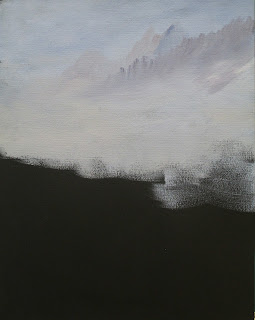
That said, I started out with what is the furthest away, which is the sky. I didn't want it as dull gray as the photo so I created a mix of white (I use gesso for white), ultramarine blue and a tiny touch of burnt sienna to slightly gray the blue. I want the sky to be a bright overcast color but not real brilliant blue.
Starting at the top with my #10 flat bristle brush, I used a series of crisscross strokes and worked my way across and down about half way down the canvas. I picked up touches of blue and gesso as I worked my way down the canvas, blending some but not blending completely so it looked like the sky was clearing.

While the sky was still wet,I added some distant mountains. I added more blue and a bit more sienna to the sky mix so that it was just a bit darker than the sky, using the same brush but using the end of the brush and pulling down, I created the top edges of the mountains, then blended the bottom of the mountains into the sky color. The next closer mountain was done the same way by adding more blue and a touch more sienna to make the color a bit darker than the previous mountains, this time I used the brush vertically to use the end to make the top ridge of the mountain so I could get an uneven edge. This will look like crags an tree tops which is more natural than just a smooth curve. Again I blended the bottom of the mountain into the sky color but I was following the lay of the land,these are mountains not walls.
I let the background dry before I added the trees.
It is important when you are painting a wild landscape to not line everything up in nice neat rows, that is a very human thing to do but Nature isn't like that, Nature is random and chaotic. If you look at the photo, you will see that the treeline has trees of all sizes and shapes, that is what you need to aim for in your own painting. You can start out by using your charcoal and just drawing lines where you want your trees to be, use the photo as a guide. Make some so tall they go off the canvas, others as smaller, some are behind and they all over lap each other, it is a forest there are a lot of trees.
I used the same brush (#10 flat bristle brush) and mixed sap green (you can use Hooker's, which ever is darker), some ultramarine blue and a touch of purple (a touch is a very small amount or the purple will rule your world) to get a very dark forest green, this is the under painting for the trees and becomes the shadows of the trees.
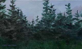 I shaped the end of my brush by dragging it through the paint on both sides to bring the bristles together, then using the end of the brush vertically, I touched the place I wanted to start the top of the tree to create a line. Do this a couple of times to make a line, then use the corner of the brush starting down a bit from the top of that line and "flip" the brush out to create the branches. Short "flips" create smaller branches, longer more drag and flip create longer, bigger branches. You might want to practice this before you try it on your painting.
Don't be afraid to overlap and congest the branches.If you look at the reference photo, you will see that the trees get very dense near the bottom but it is okay to leave "sky holes" in some of the middle and top parts.
The last thing we did in class was under paint the grasses along the shore. I had used my chalk to suggest the shoreline before I started painting so I would know where to stop adding grass.
You might notice that there are no buildings or boats or anything else to suggest a village, those things come later after we get in all the surrounding trees and bushes this way you avoid "halos" around structures because you are afraid of painting over the building you worked so hard on. We will get there, be patient.
To create the grasses, I am still using the #10 flat bristle brush, this time I will be using the flat side of the brush. I load the brush with sap green and yellow, then with the flat side of my brush almost parallel to the canvas, it is sort of a "pat and scoop" motion. You press the brush onto the canvas, then push and lift in one stroke. I was picking up green on my brush along with yellow and touches or orange and blending them on the canvas so it wasn't just one solid color, you want variations. Remember this is just under painting but it is important, think of it as the foundation of a house, without it you will struggle to make it work.
I stopped there, we will continue on from this point when we meet again. Keep painting and I will see you in class.
Project: Apple Turnover Revisited Week 7
This was the final day for our project and the end of the semester but we got it done and that's what counts. Everyone did a wonderful job on their own versions of this project and I was going to post photos of it but I have lost my camera =-( If I find it again, I may update this post but under current circumstances, I just want you to all know what a great job you did on a challenging project.
To finish up our apples, we did do a few things, first, we added leaves to the branches we put in last week. I was using my #6 flat sable brush and I mixed a color for the leaves using Hooker's green (you can use sap green just add more blue), ultramarine blue, a little sienna and a little white. The sienna will gray the color and the white changes the value, for this stage you want a medium dark color on the blue side. This is the under painting for the leaves.
Creating the leaves is a bit tricky but with a bit of practice before hand, you will get the hang of it. Load the brush and bring the edge of the brush to a nice chisel so the end is nice and sharp. Start on that edge, holding the brush perpendicular to the canvas. Start to drag the brush then twist, press and pull, the twist back and lift. You should have a leaf shape that starts thin, gets wider, then ends thin again. Like I said, practice.
To make the highlights add more white and a touch of yellow to the darker mixture and highlight a few of the leaves especially around the table. The brightest highlights are white with just a touch of the same blue/green mix to tint the white and I used my liner brush to just hit a few of the edges of the leaves.
The shadows on the table are a mix of ultramarine blue, a touch or purple and a touch of white to make a cool lavender color. I used my #4 flat bristle and scumbled on the suggestion of shadows using flat strokes to make the shadows look like they were on the table and I only suggested the shape of some of the leaves. You do n't need to spell out the leaf shadows.
I also added leaves to the table using the previous technique and brush, just remember to add a darker shadow under the leaves to set them down on the table.
To some of the apples I added leaves (see above) remember to add shadows from the leaves, this will also help give dimension to your apples.
This is the final result of all our hard work. I hope that you learned a lot and apply what you learned to your own paintings. Until next class, keep painting.
I found my camera! So as promised here are the photos of what you did in class. I am so very proud of you.
Project: Apple Turnover Revised Week 6
In our last class, I started the finishing detail to my painting and will finish it up next week.
This week we worked on the finishing details to make our paintings come alive.
First we worked on adding the final highlights to our apples. For the green apples I used a mixture of yellow, white and a tiny touch of sap green. I wanted a bright yellow green.
I was using a #4 flat bristle brush and tapping this color on, starting in the brightest area of the apple. This is NOT the final highlight or the shine, this is next level down and shows up mostly around the tops of the apples.
Tapping allows you to gradually blend it into the mid-tones of the apple, use your fingers to soften between the light and darker areas. If you reload, start in a bright area around the top and work down. Remember the lighter the pressure you put on your brush, the less paint comes off, this is how you blend.
Once that area is dry, you can take a little bit of pure white and lightly tap where the sparkle is, just remember to tap and not dab or paint a circle of white or it will look fake.
For the highlight areas on the red apples, I used orange, yellow and white and the occasional cad red or napthol red depending on the apple (have your photo in front of you), again, I was tapping on the color, some blending with my fingers and using the white after the area was dry.
I brightened the highlights on my basket again because acrylics do dry lighter and I wanted the sun lit areas to have a bit of sparkle, it also helps define the weave of the basket.
I worked a bit on the table adding cracks and chips. The cracks need to have some blue and/or purple in them because they are usually in shadow and usually where you have a crack, the edges of the crack are a bit higher so catch a bit more light so will need a bit of highlight, I used white with a touch or orange and sienna. I was using my liner brush.
Finally, using my liner brush I added some tree branches and twigs to give me an idea where my leaves will be. This is not the finished product and that white smudge will go away, this is just the framework for what I will be doing in our next and final class.
Be ready to work, I am hoping that we will be able to have a show and tell by the end of class so we can see how we all did. It won't be as painful as it sounds, I think you will be pretty impressed, I know I am, you are all doing great.
Keep painting.
Project: Apple Turnover Revised Week 5
In our last class we started working on the detail to finish our painting. Be sure to have any corrections you see that bother you done before you start detailing your painting, it will save you time and frustration in the long run and, hopefully, any corrections you do see will only be minor ones.
I wanted to do a demo on just one apple so you could see the process. The apples in the painting are small and hard to see unless you are the one painting them. I used the previous demo for the under painting of the green apple and just to be clear, the techniques I use are the same regardless of the color of the apple, I just use different colors.
I started in the highlight area with my #4 flat sable brush. I am using the sable brush to detail because I have more control over it and the ends don't frizz out.
I started with cad yellow and added a touch of sap green and a little gesso to make a light yellow/green. I use a series of short curved strokes to add this color to the apple, starting in the brightest area, so have your reference photo where you can see it. In the red apples use the napthol red or cad red with orange and/or yellow to make a light color with only a small touch of gesso only to give the color more body. If you use too much gesso it will turn the color pink and that's not what you want.
Be sure to make your strokes follow the curves of the apple and you can brush mix (adding color to your painting and mixing on the canvas) doing wet into wet as the curves of the apple get darker by adding more sap green then sap green and blue as you go into the shadows. Or, you can take part of the light color you mixed and on one side mix a medium green with the sap green and a little blue and in another part of that light color have a darker version with more blue and a little green. You should end up with 3 values (light to dark) of apple green, you can do this will the red as well. You have
another green apple to do so you may want to use this technique if you are worried about matching colors.
You can also clean up edges and define shapes better at this point as well.
Inside the basket, don't get too bright with the apples. The basket is casting a shadow on them so you won't see but a few with bright highlights. I have also made one of the apples in the back a green apple just using the dark version of the green I mixed.
The basket also needs to have some highlights, shadows and detail added but you really need to pay close attention to the weave of the basket. I saw many of you just doing your own thing and, while I don't want to discourage originality, I know you want it to look like a basket. Look at the area you are going to paint in the photo. If you are doing the handle, note how it twists and spirals around and how the spirals change as they go from one side to the other. Or if you are ding the basket, look how one reed twist as it goes over and under others. These can be simple marks you can make with the end of the flat sable or if you feel more comfortable using a round sable, use that, just be aware of the shape of both the light and the shadows as you make them.
The highlight on the basked was white (gesso) a tiny touch of orange and a tiny touch of sienna. You just want to tint the white. In the mid tone colors of the basket I added more orange and sienna and in the shadows I added more blue to this same color. Again, I can have several values of a color on my pallet so I can go back and forth between them though I usually start in the lightest area so my color stays clean.
This is where I left off in class. I am hoping that I can finish up this project at our next meeting as we only have 2 more classes to the semester. While this project looked simple - apples in a basket on a table - I think you have learned the lesson of looks can be deceiving but if you take it one step at a time you can work your way through even the most challenging project.
Try to have your paintings to this point by next class, keep painting and I will will see you in class.
Project: Apple Turnover Revised - Week 4
I started out the last class by correcting things that were bothering me. When I am sitting here writing the blog posts, I see things in my own painting I don't like, it isn't easy to talk and paint at the same time, but rather than correcting them at home I correct them in class so my students can see that no one died and yes, you can just paint over things you don't like about your painting and the art police won't come take you away.
I say that in jest but often times I find that beginners, in any medium, think that every stroke has to be perfect and it is isn't your painting and world are doomed. Far from the truth, every artist makes changes when things aren't working out the way they hoped because what you see in your head isn't always what ends up on the canvas so we need to make changes.
The thing that bothered me most was I hadn't made the basked and apples big enough for the size of the canvas. I had a lot of doing nothing negative space (anything that isn't the basket or apples) that was just unappealing to the eye. So I needed to make the basked bigger first using the same colors I used before (see previous posts). I expanded the size of the basket and had to redo some of the handle.
Next, I made some of the apples, particularly the ones on the table, larger.
I made the front green apple larger and more in front of the red one but it looks like I still need to shape the red one a bit bit I am happier with my design now though I am still going to add some things at the end to break up those large areas of negative space.
Next I got to work on the detail of the basket. Be sure that you have your reference photo in front of you so you can check the shapes and directions of the weave of the reeds of the basket. Look at how they spiral around the handle, or how they form lazy "S's" around the top of the basked and "U's" along the sides. See how they change directions as the go around the basket or handle. See these things firs BEFORE you start to paint, it will save time in the long run.
I used my #4 flat sable brush because it has a nice sharp edge that I can control better than a bristle, you can also used a round sable brush if you don't have a flat one. I mixed a light color of yellow, a tiny touch of purple and white to lighten, this is my base color. To this color I added orange and sienna when I needed it to be darker and warmer like inside the basket (look at the photo you will see how warm the weave of the interior is). This is not my final highlight I am just getting started.
With the sharp edge of the flat brush, I used it to make the weave of the basket, referring to the photo almost every stroke for color and shape. I also mixed a dark color of ultramarine blue, sienna and a touch of white to add the shadows to give the weave more depth. I was careful to lightly blend light and shadow to avoid hard lines.
I also used that dark color to add the separations between the slats of the table using the same brush. Also by just tapping the edge of the brush I can start to add some of the cracks in the table but we will do more of that in the next couple weeks as we finish up this painting.
This is where I finished up last class so I hope that everyone who is painting along can get caught up to this point. We only have a couple weeks left in the semester so we need to buckle down and get this finished.
So keep painting and I will see you in class.


