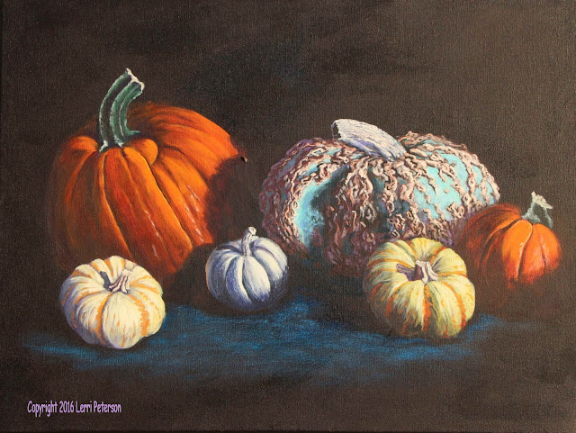
Acrylic Class Project: Parade of Pumpkins Final
I am sorry that there is a bit of a gap between what was previously posted and the finished piece, I didn't have my camera set right when I took the photos then didn't download until I had finished the painting, photographed it then saw all the dark images! I will try to give enough narrative that you should be able to figure out what needs to be done.
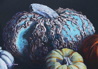
I am going to start with the blue one first because all those bumps look complicated but really it is just a bunch of smudges. The critical thing to remember is to follow the shape of the pumpkin's surface, these are not straight lines but curved ones, then just wiggle your brush and make interesting shapes. Keep the photo handy so you can see patterns, it doesn't have to be exact but you want to get enough in to give it interest.
The under painting was a mix of burnt sienna, touch of purple and white. You want a medium, dark tan color. You may even want to add a touch of orange to the color if it is too cold. I used a #4 flat bristle for the under painting then switched to a #4 flat sable brush for the details.
The intermediate highlights are the same color with a bit more white and maybe a touch of yellow, final highlights, which are your brightest highlights on the right hand side, are white with a little touch of orange to tint the color. just hit the highest points of the ridges with this color.
The shadow colors are two-fold: There are the dark shadows cast by the ridges and there are some reflected shadows that hit the tops of some of the ridges in the shadows. The darkest color is a mix of either burnt umber or sienna, with blue and a touch of purple (be sure your brush is clean so you don't add any white to this mix), it will be very dark. With either a #4 sable or a small round sable brush you can add your shadows and dark detail. Again, have your photo in front of your so you know where to put these darks.
The reflected highlights are important because they help create shape and a sense of light to your painting. Light bounces around in our atmosphere so even shadows will have some detail. The color you will use is ultramarine blue, a touch of purple and a little touch of white to get a lavender blue color it should be just a bit lighter than your the medium dark color you used to under paint the ridges. In the shadows this reflected highlight is all you need to show shapes in the shadows, just don't get carried away with it. Look at the image above and your reference photo BEFORE you start the highlight process.
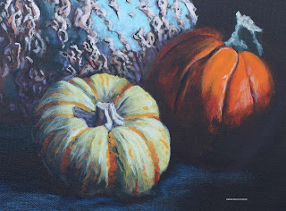
On the two smaller pumpkins that had the stripes on them, I got all my shading and shadows in first before I worried about the stripes. The stripes are easy but if you are trying to paint around them to get highlight and shadows in the lighter color, they become obstacles.
The stripes were variations of orange. Yes that sounds obvious but it is important to adjust the color as it goes from light to shadow. Orange is the color that is in that transition area between light and shadow. Orange with yellow and a little touch of white is used in the light areas and orange with a touch of alizarin as the stripes go into the shadows. Also note that the stripes and not solid lines but more a zig zag line and there a little dots and dashes in between the lines. You can use your sable brushes for the detail.
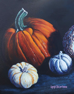
On the large and the smaller orange pumpkins be sure that you add other colors to your orange to produce a rounded shape. As the orange goes into the shadows add red to the color, cad red light then alizarin and finally some burnt sienna and blue for darker shadows. In the light areas, add yellow instead of white because the white will give the orange a milky look.
The stems on the two stripped and one small white pumpkin can be the same color you used on the ribbing for the blue pumpkin and the same applies for the highlights and shadows. The cast shadows from the stem can be that color you used for the reflected highlights of the blue pumpkin.
Highlights on the 3 lighter pumpkins will be white with a tiny touch of yellow, just enough to tint the white and this goes where the light is hitting directly on the pumpkins. Look at the photo.
The green stems gave me a bit of a problem trying to get the correct color but using the ultramarine blue, hooker's green and purple as a base and the shadow color, then adding touches of white to lighten for the mid range color and blue and white for the ridges, I came close. The top and near the base was a little bit of white with a touch or sienna in it.
In front of the pumpkins to suggest that they are sitting on a table or surface I used pthalo blue with a touch of white - you can use the ultramarine blue or any darker color with a touch of white - then lightly with the side of my #6 flat bristle brush, using the dry brush technique (very little paint or water), I skimmed the surface to suggest the surface. Do this lightly and leave the black canvas as your shadows. Watch the direction of the light so your shadows fall in the right direction and that should finish up this project.
I had a lot of fun with this one, it was a challenge but everyone did a great job! next semester because it has a couple of holidays in it making it a shorter session, I thought that we would do a series of studies. You can learn a lot from these studies and I think too often as beginners we don't see the advantage of studies but they will help you in the long run. Paint out old canvases or get smaller ones for class, just keep painting and I will see you in class.
Monday, December 12, 2016
Subscribe to:
Posts (Atom)


