Acrylic
Class Project:
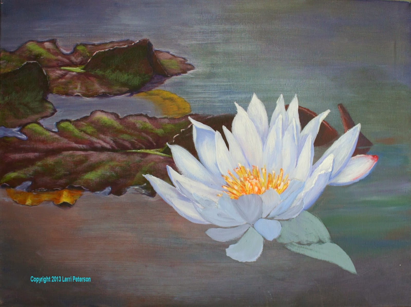
This
was the last class in instruction for the water lily but if you feel like you
want to do more to finish it up, that is up to you. I may work on mine to
finish it the way I want I just need to be careful not to overwork my painting.
There is a big difference in refining one’s work and overworking a painting but
it is a very thin line that can easily be crossed over if you are not careful.
It is better to leave it a bit unfinished than to overwork and ruin your painting.
I
know that many of you are tired of me saying that if you want to be a better
painter you need to learn to draw. Even if you could get the basics of drawing
down – basic shapes, perspective, shading from light to dark – would go a long
way to improve you painting. I say this because the biggest problem I saw in
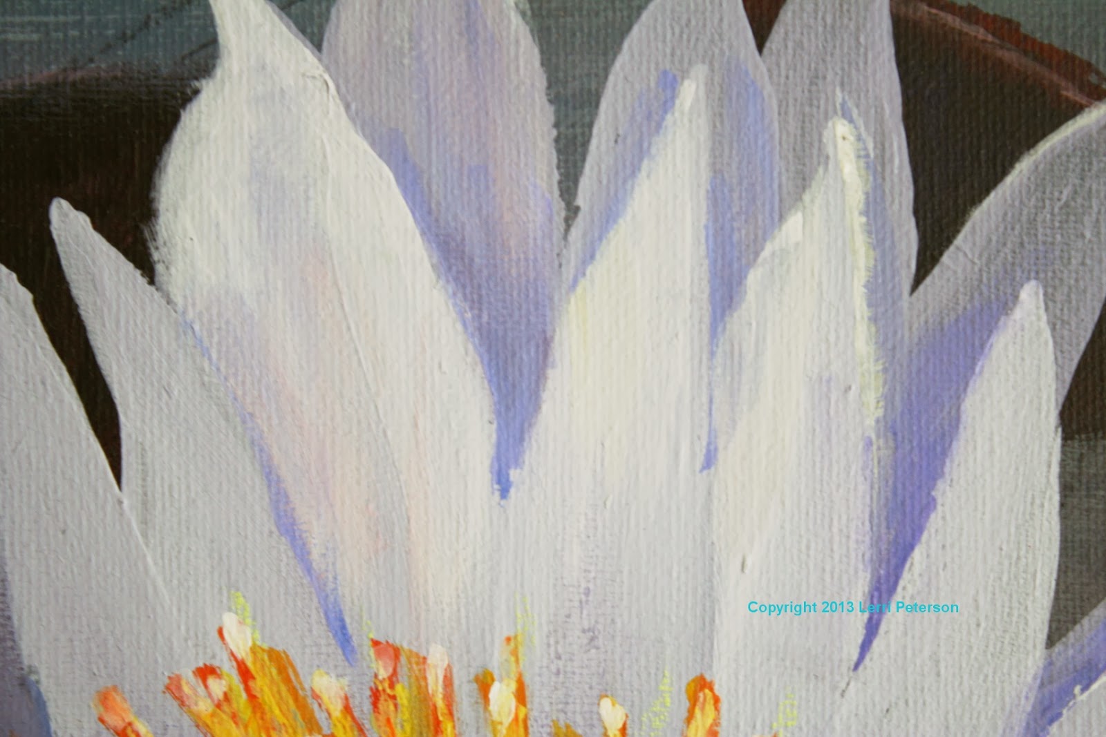
class was the foreshortened front petals on the lily, most were usually too
small and/or too short. The petals in front are the same size and shape as the
back petals but because they are coming towards you it distorts the shape. Another
thing about the petals is they are slightly wider than the back petals because
they are closer to us visually. Again, perspective.
As
an experiment, take a ruler and look at it straight across your field of vision
so you and see all the numbers and hash marks. Now turn one end away from you
so you are looking at the ruler from one end, raise the end that is away from
you so you can see down the length of the ruler. What has changed?
Instinctively you know that the ruler is still a foot long so the ruler hasn’t
changed but what shape is it now? Can you still see the hash marks and if so
how to they look compared to when you could see the length of the ruler? Yes,
this is a rather simple exercise on perspective but most of us usually just
take it as a given in our everyday life but when we actually have to draw or
paint it, it becomes problematic.
If
your petals don’t look “right” it is probably the foreshortened perspective of
the petals. Look at your reference photo and try to determine where the
differences occur and figure out the fix. Learning how to fix a problem is as
important as learning to paint and will go a long way to stopping problems in
future paintings before they begin.
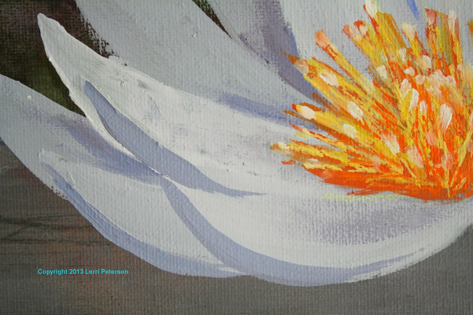
Another
thing I saw a lot of when I walked around was that most of you had your petals
too dark to start with or too purple. Remember that the purple is a very potent
color and a little goes a long way, but rather than painting it totally out,
use a series of dry brush glazes to bring up the value. I had to do that to
mine in places but using dry brush glazes lets some of that dark color come
through and becomes shadows and texture so it may take more than one coat of
glaze but will be worth it in the end.
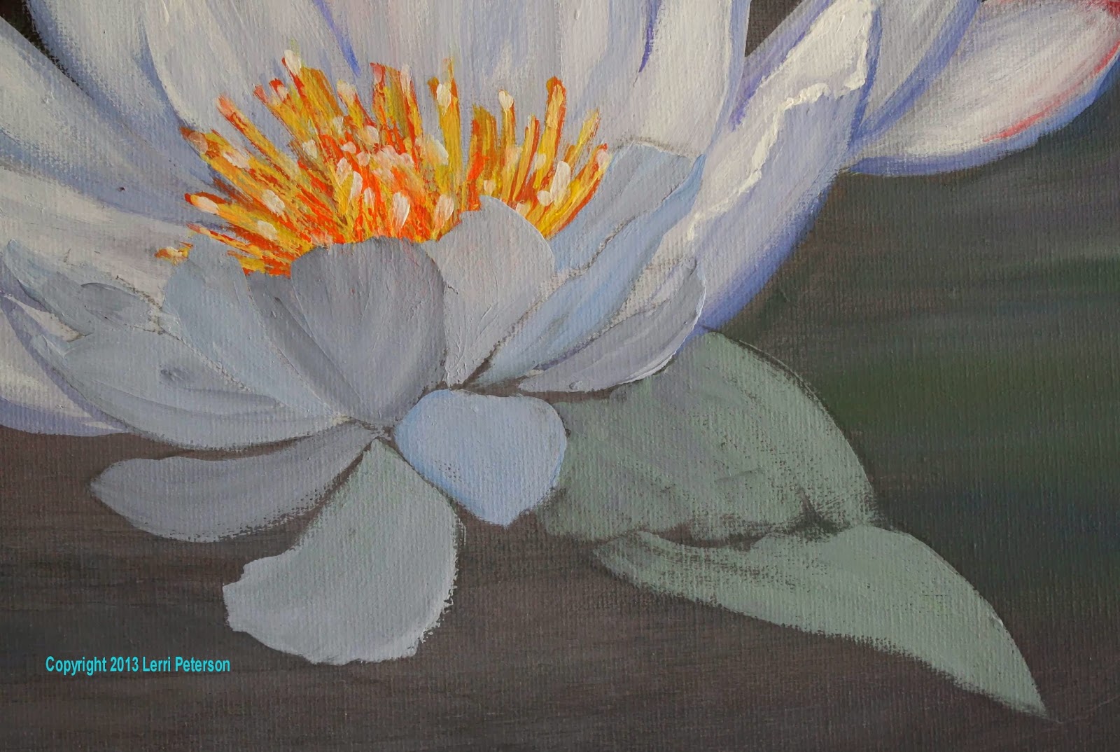
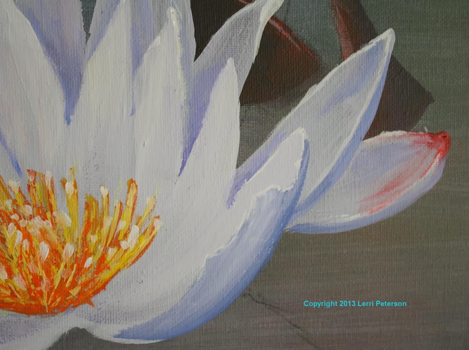
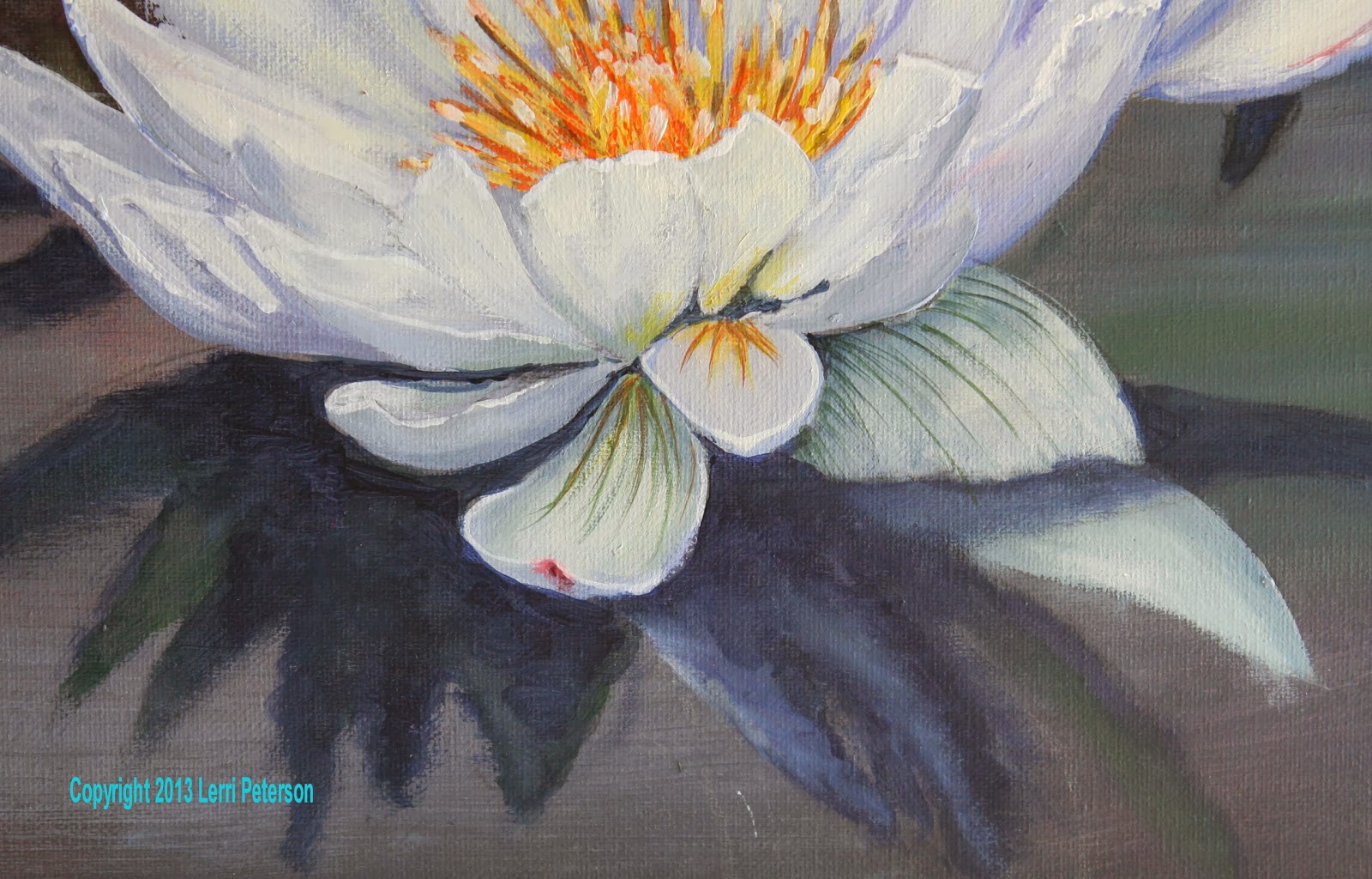
The
last problem area I saw was the petals that were almost touching the water and
the one that goes into the water. Those petals are much darker than the rest of
the flower which are up in the sun, even the highlights on these petals is much
darker than the highlights that get direct light. They are also just slightly green. As with all the other
petals I did for this flower, I was using the base color I started out with 8
weeks ago: the blue, sienna and gesso/white. To that I have added more blue or
gesso as needed to change the value or to add it to a color when I needed to
gray it slightly, there is a reason for my messy palette it has things I may
need. Most of you go back and mix each time you think there is a color change,
these petals were no different. I saw many that were way too light and way too
green. You need to start with your base color you used to under paint the
petals which should be just a value or two lighter than the water but not as
light as the petals above it. To that mix add a tiny amount of sap green to
TINT the color, it should have a slight green cast to the paint, if it is too
green add just a touch (very, very tiny touch) of purple to grey it so it is a
dirty green/gray color. This will be the base color that you add other lighter colors
to when you highlight these lower petals or darker colors if you need to add
shadows. By adding gesso or white will lighten, adding blue and very tiny
amounts of purple it will darken this base color so mix enough when you start.
A
special note regarding the petal that goes into the water: Because of the
refraction of the water when the petal goes under the water it slightly offsets
a bit. Leave a small gap between the part that is above water and the part that
is below water, this will be the waterline, just don’t make it straight across,
remember that the petal has bumps and ridges that the water will fill in
around.
Theshadow/reflection under the flower is very dark you base color for the shadows
will be blue, Hooker’s green, an touch of purple and maybe a touch of sienna if
needed. To that as you paint you may add touches of green (sap or Hooker’s) and
even touches of the grey color you used in the petals but start out very dark.
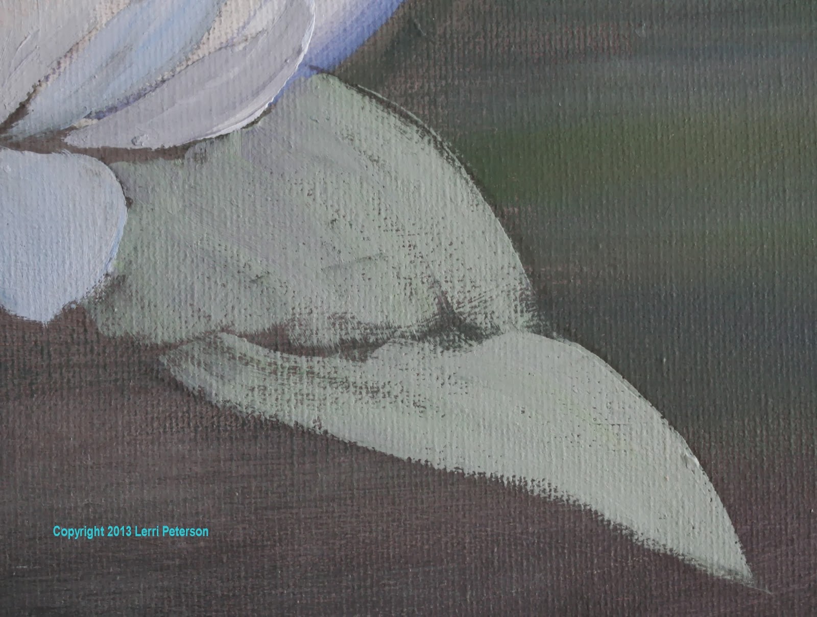
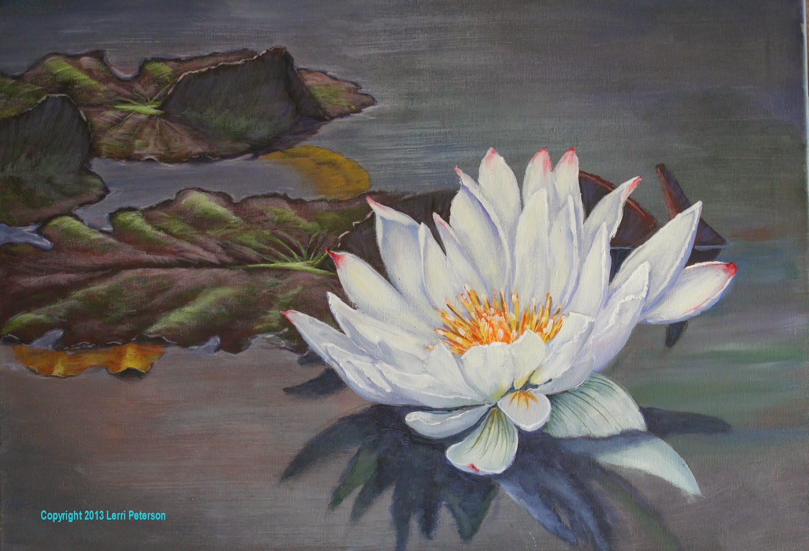
I
used 2 different brushes when I did the shadows: My #4 flat bristle brush to
scrub the bigger areas of the shadow and
my small round sable to get into the smaller areas around the petals and in
some cases, down at the bases of a couple of the petals (look at the photo).
I
started in the deepest part of the shadow which is underneath the flower with
my darkest color, where possible I was using the bristle brush on its side
using a horizontal scrubbing stroke. This keeps the edges soft because even
still water has movement. As I worked out from under the flower and more to the
ends I picked up little amounts of either the green or the grey on my dirty
brush (I did not clean the brush) and worked the new color into the shadow
color (wet into wet) to create soft blends.
The
shadow that is on the petal that goes under water requires a bit of special
attention because you can see a bit of the petal through the shadow. Right at
that gap you left for the waterline, it is at its darkest on the petal be sure
to wipe you brush out and lightly scrub the shadow color across the petal so
you can still see the light color under the shadow color, when it is over water
the color gets darker again (look at the reference photo).
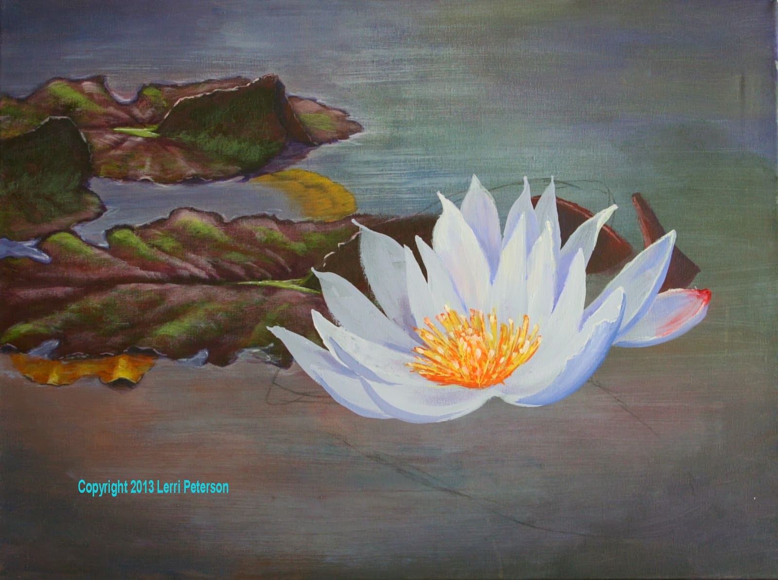
As
I said, you should finish up your flowers to meet your needs, however, if you
are staring at you painting looking for something to do, you are probably
finished. Set it aside for a few days, put it where you can look at it in
passing or turn it upside down, if there is something major, it will jump out
at you if it doesn’t it is done. I will see you in class.