Saturday, April 25, 2015

Acrylic Spring 20015 Classes

Acrylics 101 Dry Brush Blending

Last week we went over how to do brush blending or wet into wet blending, this week we covered dry brush blending. Dry brush is probably the more useful technique when it comes to blending acrylics you will use it all the time so it is important that you practice and understand how to do it.

You want to use your bristle brushes for most of the dry brush techniques though there are some that you can use you sable brushes and not ruin them just remember that the key to dry brush blending or any other dry brush technique is literally a dry brush. Of course you will have to rinse your brush occasionally but when you do make sure that you have your paper towels handy and you dry your brush completely, you don't want any excess moisture in your brush.

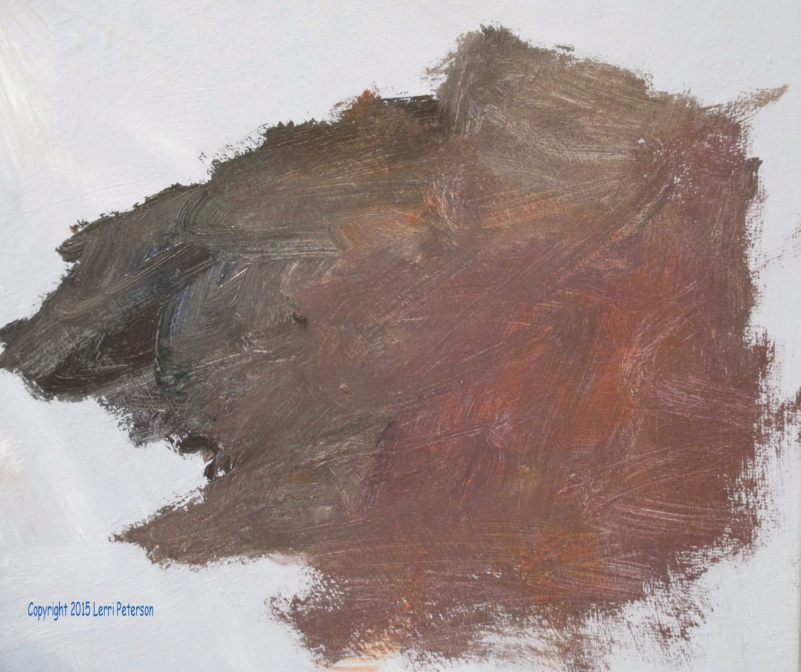
The next thing you need to remember is not to have a lot of paint on your brush. When you load your brush with paint you want to lightly wipe off the excess from the outside of the brush so that when you go to paint you will not have big gobs of paint coming off your brush.

In the last thing you need to remember is the pressure you apply to your brush when you're doing your dry brush. If you press hard you will get more paint out of your brush if you have very little pressure on your brush very little paint will come off your brush and this is important, you want to be able to go from an almost solid color to a color that barely covers the canvas underneath, if you are doing this correctly you will see the canvas or the color underneath the new color you put on (look close you should see the pattern of the canvas created with the dry brush). Because acrylics dry so quickly knowing how to blend colors with a dry brush is very important and can be used in many different ways and techniques.


To practice your drybrush blending rinse you (bristle) brush and dry as completely as you can. Load paint onto your brush then lightly wipe the outside for excess paint. On your canvas start by pressing hard (I was using the narrow side of my brush) and try to go from a solid color to a vague color just by decreasing the pressure you apply to the brush. You should be able to see the canvas underneath when you get to the lightest pressure. Remember that the brush is a tool and it can rotate in your hand like a baton. My brush is constantly moving from the narrow side to the wide flat side to the tip and back again depending on what look I am trying to get or the spaces I am trying to get into.

If you are lightening your pressure and you are still getting too much color or it looks very transparent and/or runny you may still have too much water in your brush. The paint should look very scratchy if you are applying it with the correct amount of water in your brush. Dry your brush again and try it again you have to learn just how much water you can use in the different situations.


Once you feel you understand how to do the dry brush there are several things that you can practice one is to shade the ball like we did last week starting with the dark on the underside and then light pressure until you get to the top where it should be light then you can try other techniques dry brush can be used for wood grain it can be used to create hair and fur it can create a waterfall it can create bushes and grass it can create fog and mist and dust it is a very useful technique to learn.

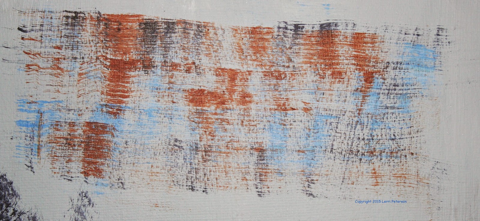
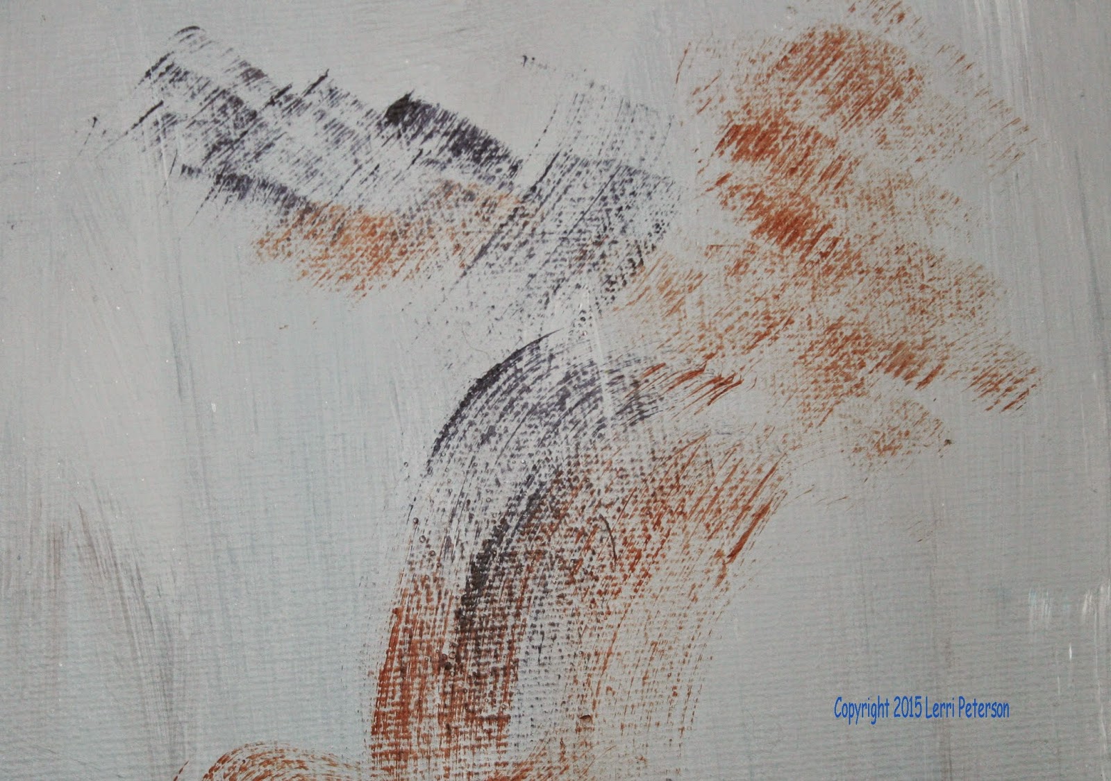
I ended the class by demonstrating how I could under paint with the wet into wet technique, I let it dry and then with the dry brush technique I created old wood. This is a fun thing to do and when you have success at doing it you will know that you can do anything! Keep painting and I will see you in class.


Acrylic Garden Fantasy Week 3

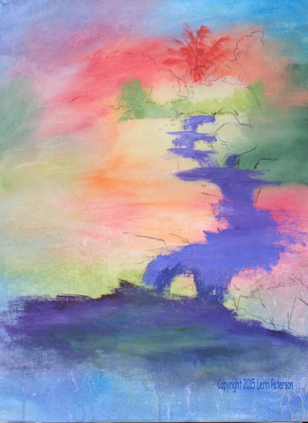
This week I wanted to get as much of my background bushes and trees in before I painted my pagoda.

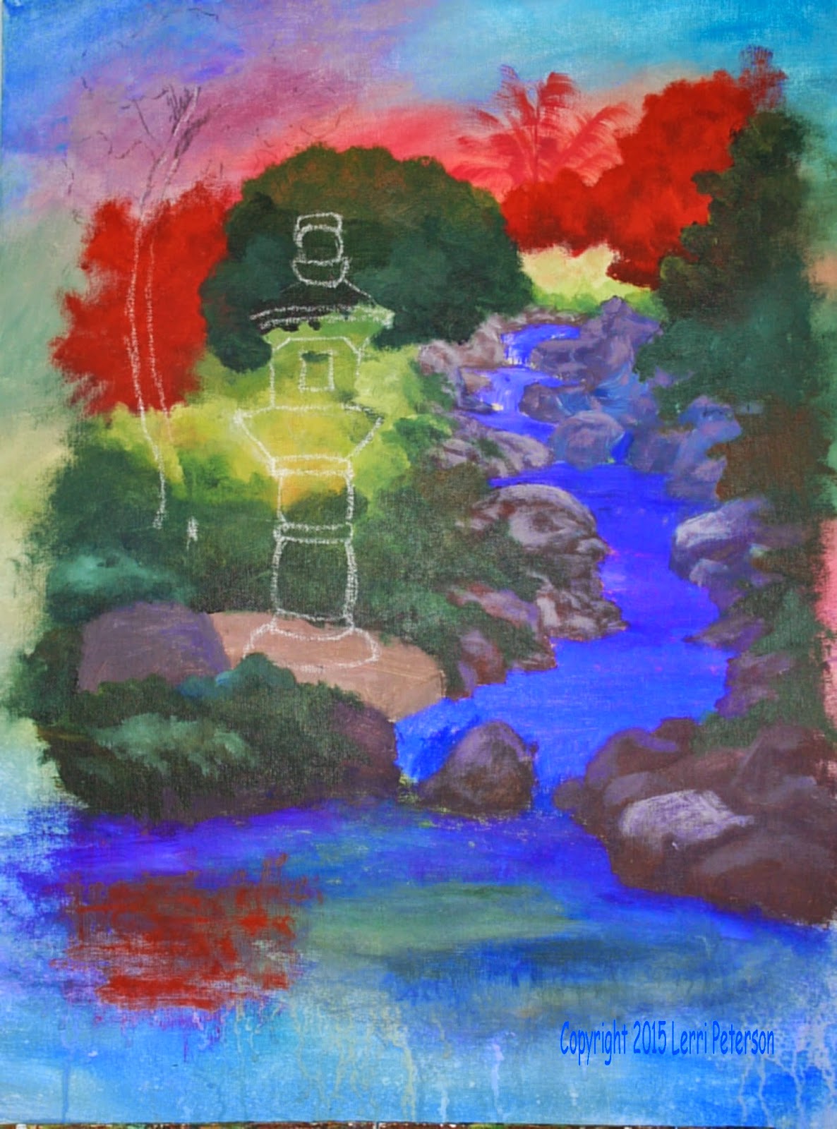
Have your reference photos of the pagoda and the stream from the Botanic Garden in front of you when you are painting, this this will give you all the visual information you will need if you just look to see where the different plants have their light and shadow, also, you want to get as much dark behind the pagoda area as you can so that when we put the pagoda in it will look very outstanding against the dark background. There will be a few light areas behind the pagoda around the middle of the pagoda and dark areas around the top and the bottom if you get carried away one way or the other we can correct it once you get the pagoda sketched in. You can always make corrections.

I under painted my trees and my ground cover using my hooker’s green, a touch of blue and purple - sometimes it was more to the blue side and other times it was more to the green side - vary your colors it will make your painting more interesting. I also used gesso (white) or yellow to change the value (light or dark) of my color. I was working wet into wet and by adding lighter colors towards the top of a bush or tree and darker colors to the bottom this starts the shading process.

When you are painting the ground cover be sure that you get the ground cover in and around the rocks some of the ground cover almost completely covers the rocks near the stream this will make your stream look more natural and soften the edges of your rocks so don't be afraid to go over some of your rocks to bring this ground cover over it or behind it or in front of it this is why we put the rocks in first.

I also repeated a color that I had in the background which was an orange red. It's not in the photographs, however, because I put it in before, I wanted to repeat the color so it is not a unique color and I will probably add it again someplace else in my painting.

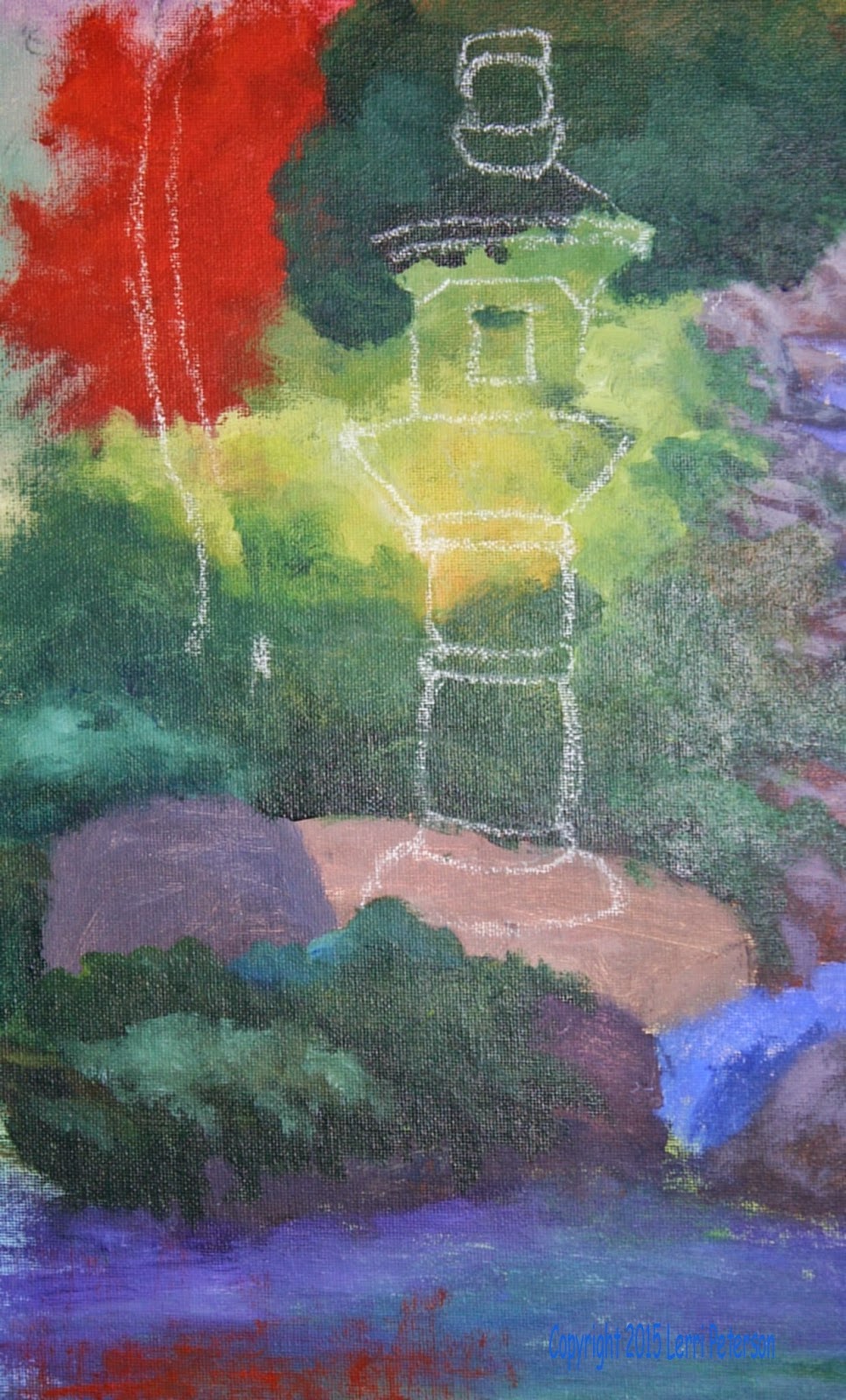
I did sketch in the pagoda and the trunk of the pine tree but I did not paint them in yet, I want to see if there is any more background I can put in before under painting them.

Try to get your painting up to the same place as I have mine so that we can continue to work on this and finish it within the next couple weeks we are getting down to the final stages and we will be starting on details soon, also, have an extra canvas something you can practice on because we will be doing some work with our liner brushes and most of you need practice before working on your painting. Keep painting and I will see you in class.


Sunday, April 19, 2015

Acrylics 101 Wet intoWet

Another name for wet into wet is brush blending, it is when you blend colors on your canvas and not on your palate. In our last class we learned how to mix a dark color by mixing ultramarine blue, burnt sienna and purple to create a very dark color. We did not mix any white into this color this time because for our lesson we mixed this dark color with white on the canvas to create shades of grey.

Because I have used my canvas often for demonstrations I paint it out so I can use it over again and when I do very often I will add a color to it so my canvas is blue to start which meant I had to paint both circles white so you could see the demos. If your canvas is white you do not need to paint it blue or any other color you just need to draw two circles. If your canvas is repainted and you have added some color you may need to paint one of those circles white with your gesso. The circle needs to be dry for the next technique I will show you.

On 1 of my circles I took my dark color and I painted the bottom the right side with the dark color about a 1/4th of the circle following the shape or curves of my circle, then I picked up some white (gesso) and going just inside the margin of the dark, not all the way to the bottom, I started painting another band of color. I did not rinse my brush so I had dark color on my brush when I picked up the white and I blended these colors together at the overlap and blended the color up to about third of a circle. I wiped my brush a little bit, picked up some more white went into the top part of this new grey color I just painted and blended the new lighter color together where they over lapped and painted up about to the 2/3rds point of the circle. Now I rinsed my brush before I picked up white, which is my gesso, then starting at the top of the circle away from the last color I painted, because I want my white to stay clean. I painted down to the last color and then blended the colors together at the margins.

What you are trying to achieve is a smooth transition between the colors so that you do not see we're one color starts and the other one stops, this takes practice so don't be discouraged if you don't do it on the first time. The key to this is to not go all the way back into the previous color, you're just blending the margins of the colors together where they overlap leaving some of the original color so that your dark area stays dark and that your lightest light stays light but you have a nice graded color in between.

Wet into wet blending is what oil painters must do all the time but it is a good technique or acrylic painters to create color that isn't so even. This technique creates colors that you can see bits and pieces of the colors that are making up the blended color in this case you might see bits of white or bits of dark it is a wonderful technique for many parts of your painting.

The last thing we did before the end of class was to practice using the brush blending -  or wet into wet - to work on some clouds. Clouds are very fluid, if you watch the news when they have the time lapse clouds and you will see that they bubble and boil as they grow and dissipate so working wet into wet can create the look of clouds.

Practice this at home and try it with other colors see if you can create circles that end up looking like rounded objects or see if you can make clouds that go from dark to light to dark. Also, I want you to study things: look at clouds, take pictures of clouds have them for reference later on. Look at objects see where the sun is and see where the shadows are and see what happens between the lightest part and the darkest part of the thing you are looking at. The more you can see the better your painting will be.

In our next class we will be using that second circle for dry brush blending because acrylics dry so fast we need to have a way to blend them when the paint has dried so be sure to have your bristle brushes with you because dry brush blending is very hard on the brush so you do not want to use your sable brushes or you could ruin them. Keep painting and I will see you in class.

Acrylics Garden Fantasy week 2

This week we under painted the rocks around our waterfall. The key to creating interesting
rocks is painting in a mass color underneath with a scumbling stroke using various dark colors. Don't worry about the individual rocks yet they all need to be under painted, we will come back later and find the individual rocks with lighter colors right now what you need to do is create interesting shapes with in that dark color to give texture and it will also help you find rocks within the strokes. I used my basic blue, sienna, purple and white as the base of my rocks.

Be sure when you are creating your rock shapes that you remember the rocks contain the water. They need to look like they come in front of some of the water especially the water in the pool areas and along the sides otherwise the water doesn't look like it is contained and should be spilling out all over the rocks.

This underpainting color shouldn’t one color it can be shades of grey shades or brown or both, it just needs to be a darker version of the final rocks. You can even add other colors like green or blue reds and yellows or oranges and blend them into the grey or brown colors. Look at rocks and you will see the even a rock that is basically grey has many colors in it so don't be afraid to add other colors. Also paint this area a bit larger than it appears in the drawing we can paint over the rocks to make them smaller with bushes but when we do paint over them if some shows through it will look like the rocks are behind plants that we put there and we won't have gaps we need to fill in.

Once you have this underpainting in let it dry. Be sure that you have the reference photos before you start the highlighting process you need to see the actual rocks not what I have done on my painting because that could change if I think I need to change it.

Now you need to mix a lighter color use the same colors as you did for your rocks but this time add some white to it. You do not want a bright white color yet this is just part of the highlighting process this gives the rocks shape and form and it starts the process of defining individual rocks.

The lighting in thereference photo is very subtle however, it looks like it is coming from the upper left hand side of the photo, this means that your brightest highlights will be on the top left side of your rocks so this is where you need to concentrate your highlighting of your rocks. I did a separate demo on rocks showing how to take a mass of color and add highlights to create individual rocks with in pile of rocks it's not difficult but it does take some
practice so you might want to take another canvas and practice your rocks before you start working on your painting.

Because rocks always tend to be challenge for students this is as far as we got in the last class we have more to do on our rocks so if you are struggling I will go over it again in class. I still have not really put in much of my drawing that will come later for now I'm just concerned about the underpainting the first highlighting of the rocks. Do the best you can, keep painting and I will see you in class.


Saturday, April 11, 2015

Spring 2015 Acrylic Classes Week 1

Monday Acrylic Class your blog post will follow the beginning class’s post. Some of you who are newer might like to review the 101 class notes for a better understanding of the medium.

Acrylics 101 – Brushesand Gray

In a first class we learned about brushes and the difference between bristle brushes and sable brushes. The bristle brushes are the workhorse in acrylic painting while the sable brushes are for the detail and fine work of our paintings.

We also learned about the properties of acrylic paints. I had sphere already on my canvas and I showed how I could change that from a sphere to a cube to a rock to a turtle without ever having to paint it out and starting over again. Acrylic paints will cover what is already there completely if you take the time and use enough paint and a little gesso you won't have to start over.


We also learned about the color wheel and the primary colors which are blue, yellow, and red. The secondary colors are a combination of two primary colors. These are green orange purple. When these colors are placed on a circle with blue yellow and red being at the 8 (blue), noon (yellow), and five (red) positions and the green, orange, and purple being at the 10, 2, and 6 positions respectively you have a color wheel. The colors that are opposite of each other on the color wheel are called complementary colors this is important to remember because it is always good to add the complimentary to color of the dominant color in your painting to create harmony and pleasing accents in your paintings.

Also knowing your complimentary colors if you need to tone down a color you add its complement or a form of its complement to soften the color. For instance: if you wanted to tone down red you would add some form of green to soften or modify the red. What this means is you are adding the other two primary colors, blue and yellow, in the form of green, to change the red to a softer grayer color. Some teachers only use red, yellow and blue in their class because in theory, you should be able to mix all colors using just those 3 colors and it is good to understand this aspect of color.

We also learned how to mix gray as opposed to making mud.  In both cases you have to have all three primary colors present but gray is usually a color you want and mud isn’t. My general formulation for creating gray is ultramarine blue, burnt sienna, and a touch of purple using gesso to change the value (lightness or darkness of the color). Using blue, Sienna and purple makes a very dark color which is why I don't have black on my palette, there are also other combinations that will make a nice dark color without having to use black because black out of the tube is a dead color and will deaden the colors it is mixed with so try to avoid using it if possible.

Learning to mix gray in all its forms is a good thing because we use gray to modify our colors. When we are painting landscapes for instance, we need to have soft grays in the distance to create the illusion of distance and knowing how to mix that soft gray color will help with you create that depth in your landscapes but it is not just landscapes that we use gray we use it in everything so learning how to mix gray and how to gray a color is very important. If you can learn to mix the Basic Gray above and then practice mixing different forms of gray with the other colors as you advance in your painting skills you will see how this will help you.

Next are values. We use white or gesso to change the value of your color. Value is the lightness or the darkness of your color so black is your deepest darkest color and white is your very lightest color and the grays are the values in between white and black or dark. Value is different than intensity of a color which means how much color is present. You can have a very pale yellow and a very intense yellow yet the value on the gray scale is virtually non-existent. Other colors will increase in value as their color intensifies such as a pale blue to a rich blue but even then they may not be too far from each other on the value/gray scale. I know it is confusing but it will come.

Practice mixing your colors and changing the value and we will start working on brushstrokes next time.

Acrylic Class: Garden Fantasy Week 1

I am working on an 18 by 24 Canvas long or portrait direction. I started with my gesso and a touch of yellow in the area where I want most of my light to be, I was looking at my reference photo so, for me, the light area is in the upper right quarter of my canvas. With my gesso and a touch of yellow I started mixing the color on the canvas with my number 12 bristle brush. I am using my large brush so that I can work quickly to cover all of my canvas before all of the paint has dried. I kept my spray bottle handy to keep my canvas moist but just remember to only spray lightly and quickly mix the water into your paint or it will cause spotting.

As I worked my way out from the light area I use gesso along with my orange and red. By adding gessoor white as I went along I kept my colors on the lighter side so that when I put my garden in front of it there will be contrast between the darker colors of the garden and the lighter colors of the background. As I moved around my canvas I added other colors such as my ultramarine blue, purple, I have (p)thalo blue, as well as my sap green and my Hooker’s green, but to all of these I blended them with the white/gesso to soften and lighten the color. When I got through covering my canvas with these colors I took my blending brush and very lightly blended the colors. You want to lighty skim the surface of the canvas with long flat crisscross strokes, this creates a soft mottled background. Also while my paint was still wet, just along the bottom where I know I'm going to have water, I lightly spritzed the canvas with my spray bottle this caused the paint to slightly run to give a drippy affect.

After my background had dried I lightly sketch on some of my drawing. I was only interested where the waterfall was going to be so all I sketched in were the back trees and the waterfall with some of the rocks, I had both my drawing and my reference photos where I could see them when I was doing my sketch. I will sketch the rest of my drawing later as I still have some under painting to do.

Once I had my waterfall sketched in, I used my number 6 flat, bristle brush to mix color for the under painting of the water. This color is a mix of my ultramarine blue, a little touch of purple, and a little white to lighten the color slightly, with that on my brush I painted in the water. When you were painting in your water be sure that your brush strokes follow the water. What I mean by that is if the water is in a pool it will be lying flat your brush strokes should be flat (horizontal) however, when it falls down one of the waterfalls your brush strokes will follow the water down the waterfall that will give visual clues to your viewer that the water appears to be falling over rocks, brushstrokes are important be aware of them.

I brought this color all the way down into the pond in the front but I did not bring it all the way to the bottom of the canvas I want that color to fade out before it gets to the bottom so the background shows I also sprayed this so the colors would run.


In the area above the top of the waterfall I painted in the suggestion of a palm tree and since this is a fantasy and not reality I used an orange red for my palm tree it matches some of the
colors that are around that area. I also painted in some of the bushes that are behind the stream and I under painted those with some light green which will be sap green, a little touch of white and a little touch of yellow or orange. Along the side I also added some blue to that color and just scrubbed in some green for some future bushes that will be by the stream.


This is where I stopped for the day try to have your painting up to this point and if you want to you can draw on the rest of your sketch. Be sure if you are doing the background that you are using white or gesso to make the colors lighter this will give contrast when you put your garden in front of it. Keep painting and I will see you in class.