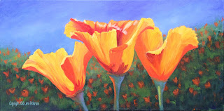
This week was just finishing up the project and that is more of a personal choice depending on how you liked your own painting, I will show you the things I did to finish my painting and if you like the way it looks you might want to try it on your own painting, however, if you like what you see on your painting you do not need to do anything else to it just because I did, you might want to live with your painting for a few days or weeks before calling it done - many artists do this - the beauty of acrylic is you can go back in and make adjustments any time.
(Just a note: My #4 flat bristle brush has been worn down so it has a point, it is really more of a Filbert, if you are having trouble with your flat brush on it's corner, you might want to switch to a small round bristle brush. DO NOT use your sables to do this kind of dry brush or you will ruin them.)
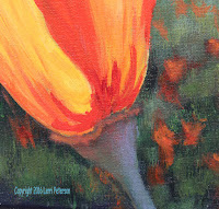
This is detail of the left side poppy. The shadows from the inside structure were done with an orange red and dry brushed on with my #4 flat bristle so there are no hard lines. To that color, I added a touch of burnt sienna for the light on the top of the pod structure under the flower. Look at the reference photo carefully BEFORE you start painting. I also put a soft lavender reflected highlight on the shadowed side of the pod using blue,a tiny touch of purple and white still using my #4 flat bristle brush and the dry brush technique but doing a small, circular motion to create a soft blend. Remember that pressure is important when doing detail so use very little pressure and very little paint when you do this.
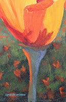
This is the center flower, this one has a beautiful glow from light passing through its neighbor. This glow looks deceptive because it looks very bright but if you look at the reference photo you will see it is not as bright as you think, it is really about the middle orange red color that you used in the poppy above, it just looks brighter because of the cool darks around it. Again I used a circular motion and dry brush to apply the glow and the lavender reflected light in the shadow. The shadows of the interior structure on the petals had just a bit more red in it than the first poppy.
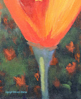
The highlight is Hooker's green, a touch of yellow and white and a little "mud" from your palette, you don't want it too bright the little "mud" is just enough to mute the color, not take over the color. I added just a touch of the "mud" to the lavender to also mute that before I added it to the stem. Note that the shadows on the petals they are almost straight orange with maybe just a touch of yellow.
The highlight on the flower is just a series of quick strokes following the way the flower grows. You can still use the bristle brush or a sable to make the quick strokes but do not use pure white, add a touch of yellow to the color first.
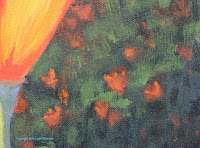
Last, the background. I went in and added some similar but slightly brighter highlights to suggest the tops of plants. These highlights are not strong, bright colors, just lighter, muted highlights to keep them in the background, this was Hooker's green, yellow and a bit of white to lighten it but also some of the orange I had on my palette. You start with a weaker, color in the back and as you come forward add little touches of green and yellow to slightly brighten the color, just not too bright. You can also add some deeper shadows up at the bottom using the Hooker's green, and blue on your dirty brush. The stroke is a quick upward dry brush stroke, using the small side of you bristle brush.
I also added some poppy SHAPES adding orange to some mud from my palette to dull the orange and quickly added the suggestion of distant poppies. Try to keep them random, don't line them up like orange dots, don't be afraid to overlap shapes and remember things in the distance are small, closer together, less defined and greyer in color.
This is the final result of the four weeks we spent on our project, please have something you want to do ready so if you need help, I can get you started and do demos along the way.
Keep painting and I will see you in class.
