Saturday, March 28, 2015

Acrylic Class Project – Safe Harbor Final

Since we didn’t get a chance to finish this project in class I wanted to at least get mine to where I would call it done and show you what I did in case you were stuck on what you needed to do to finish your own. This isn’t to say you have to have yours exactly like mine and I encourage all of you to try and do things on your own, but I wanted to be sure you had enough information to finish your projects if you were so inclined.

Finishing and adding detail is a very personal thing with artists and if you are happy with you painting you DO NOT NEED TO ADD OR CHANGE ANYTHING just because mine may be different and I may change mine after I have lived with it for a while and that is okay. You are the artist and you can change anything you want at any time you want because we paint for ourselves not the teacher, not the spouse, not the kids…No one else matters except you as the artist.
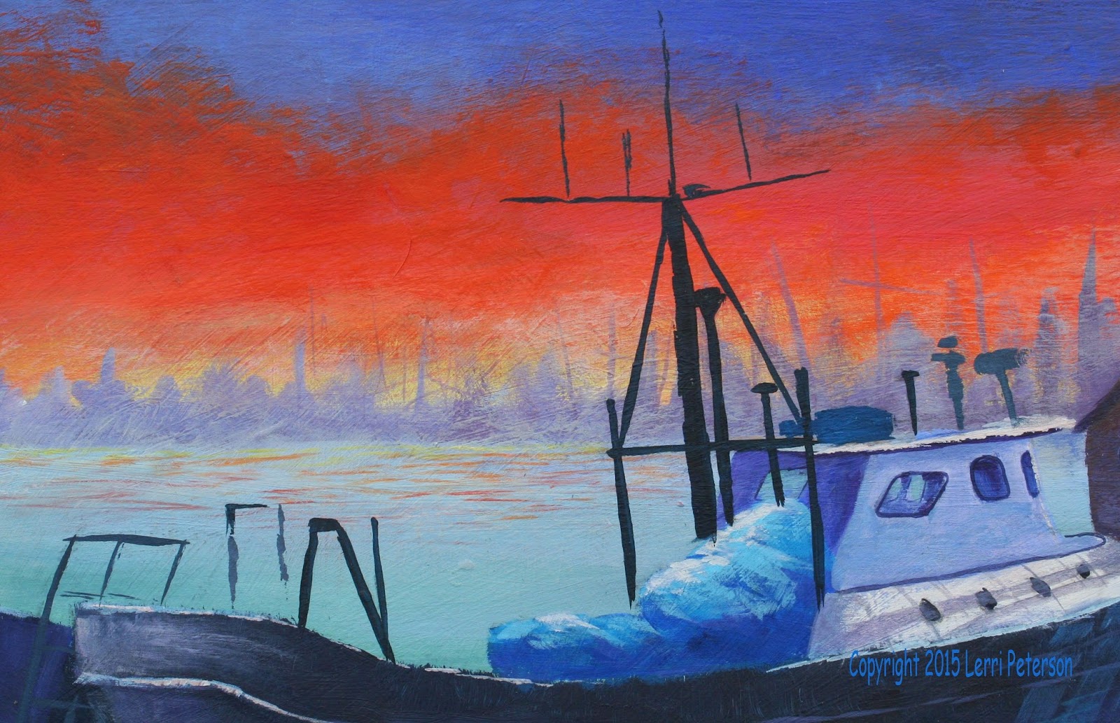


I really only had detail do to when we last met: The crab pots, the netting,ropes, the railing on the boat, highlights, just a ton of little stuff that I will have photos for examples, and a worked a bit more on my water and while I’m not quite happy with it, I think it may just be me because I have fussed with it for so long so I’m just going to live with it for a while before I attempt to “improve” it some more.

I am sure that most of you spent a considerable amount of time doing the netting and the crab pots when they could have been done in a matter of a few seconds using a larger bristle brush and a dry brush technique. Yes, it is that simple. 
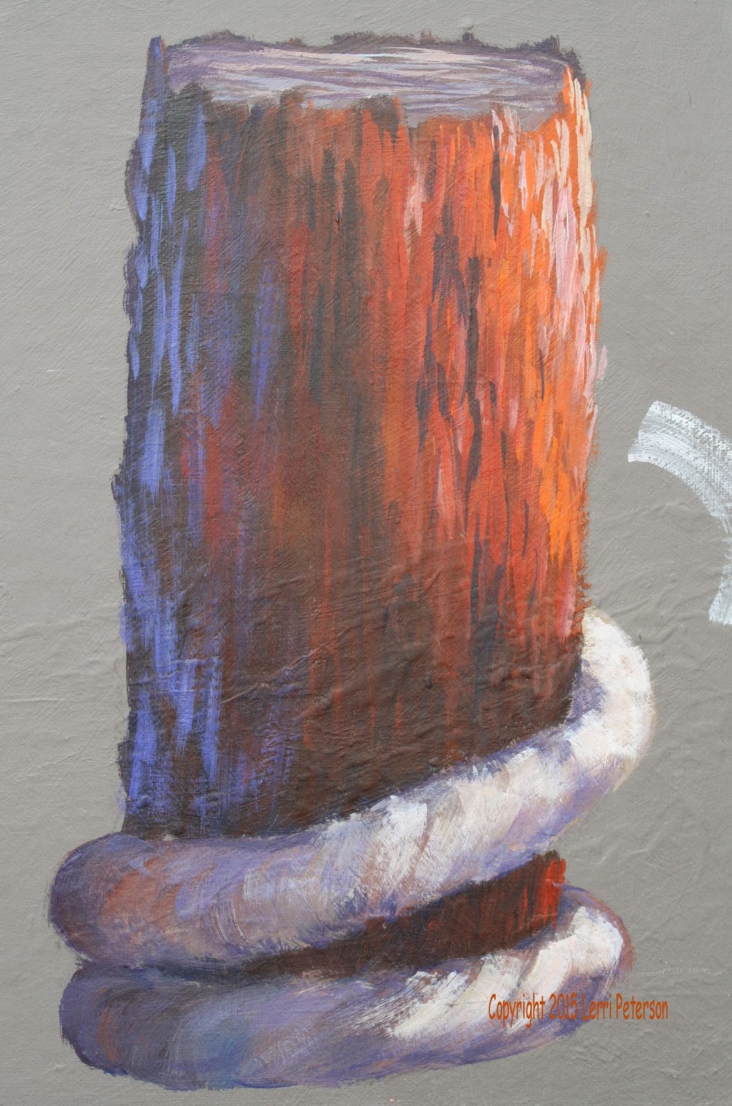
First I sketched in my pots and the netting on my boat so I knew where I was going to paint the pots and the netting, then with a #10 flat bristle brush and I mixed a medium light gray. This is dry brush so once I loaded my brush, I wiped most of it out so there was very little paint or water in the brush and with very light pressure on the brush I skimmed across the sides of the pots with diagonal strokes first one direction starting in one corner then the other direction from the other corner to get a cross hatch type effect with the dry brush. I let it dry and with a lighter gray, I highlighted parts – not all – of the pot netting just the same way as I did the darker gray. I came back later with my liner brush and with some very quick, sketchy diagonal lines, I added a bit of detail with a much darker color. The frames of the pots were first done in a dark gray with lighter highlights.
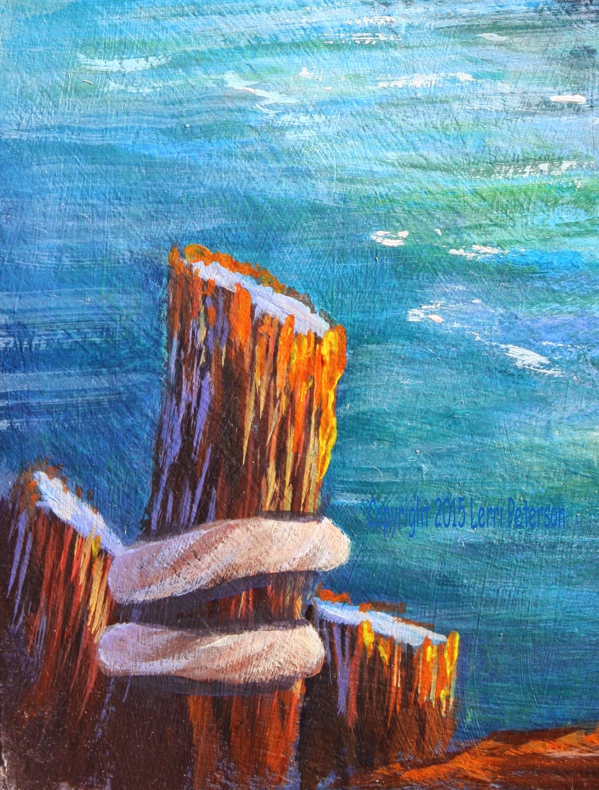
When you are doing these pots, remember they ae not the focus of the painting so they will look better and do their job if they aren’t as precisely done as you think they should be, they just need to be there as stage dressing so don’t overdo the detail and hard lines. Less is definitely more in this case.
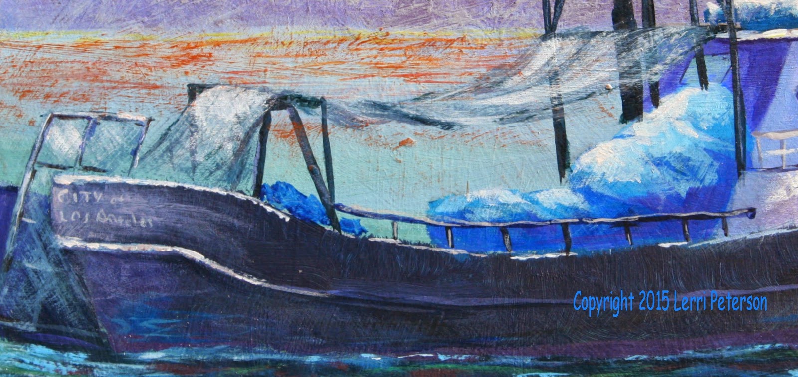
The netting on the boat was handled in a similar way with the same brush and colors but my dry brush strokes followed the length of the netting using the full width of the end of my brush. To make it look like there is a bunch folded up I turned my brush so the thinner side was the lead, then twisted it back for the wider areas. Highlights were done the same way in select areas.
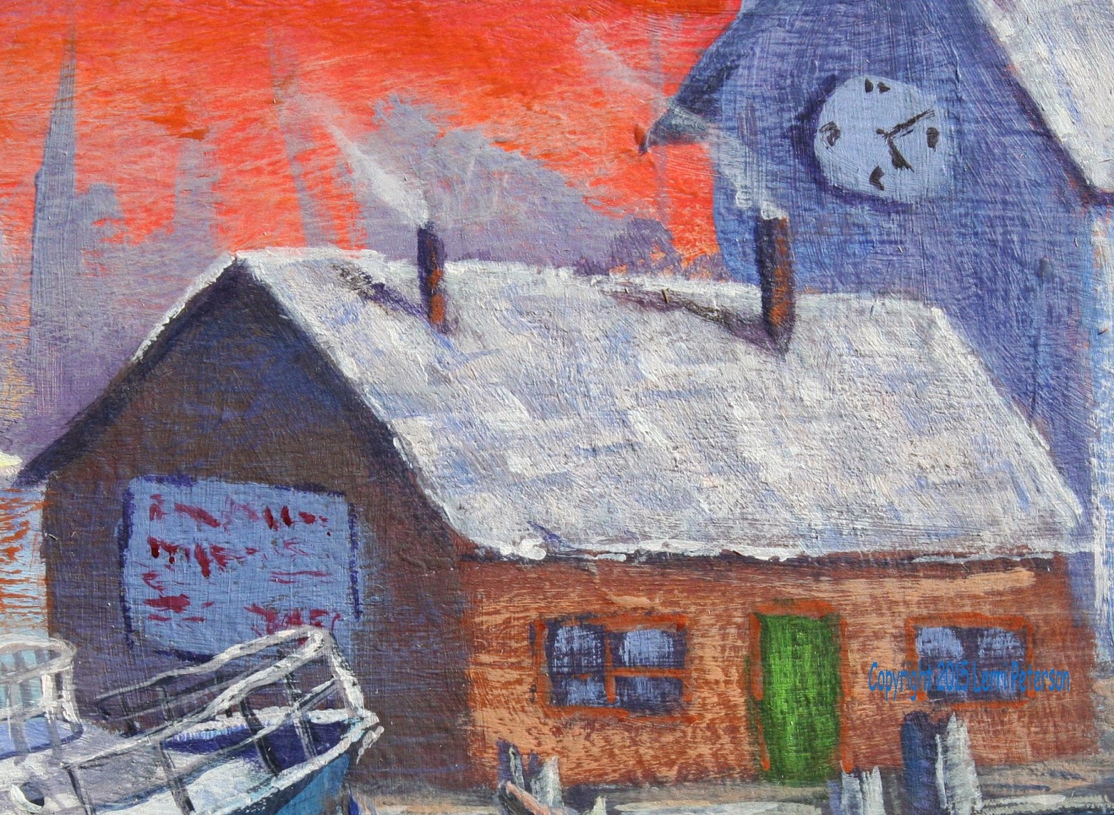
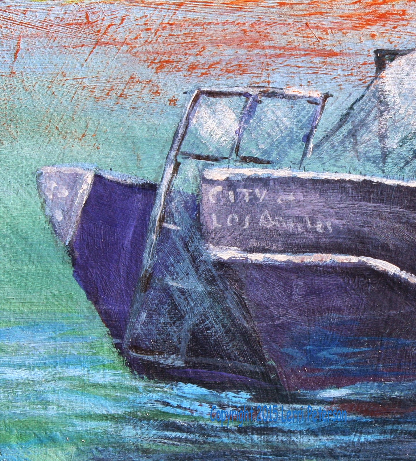
If you want to add a name to the boat or letters on the billboard on the building you literally do not need to spell it out. All you have to do is put in some scribbles that look like words and you are good, as you will see on my billboard. For the boat’s name, I did actually spell out the name with a small round brush but I left it very sketchy looking so it will look like it hasn’t 
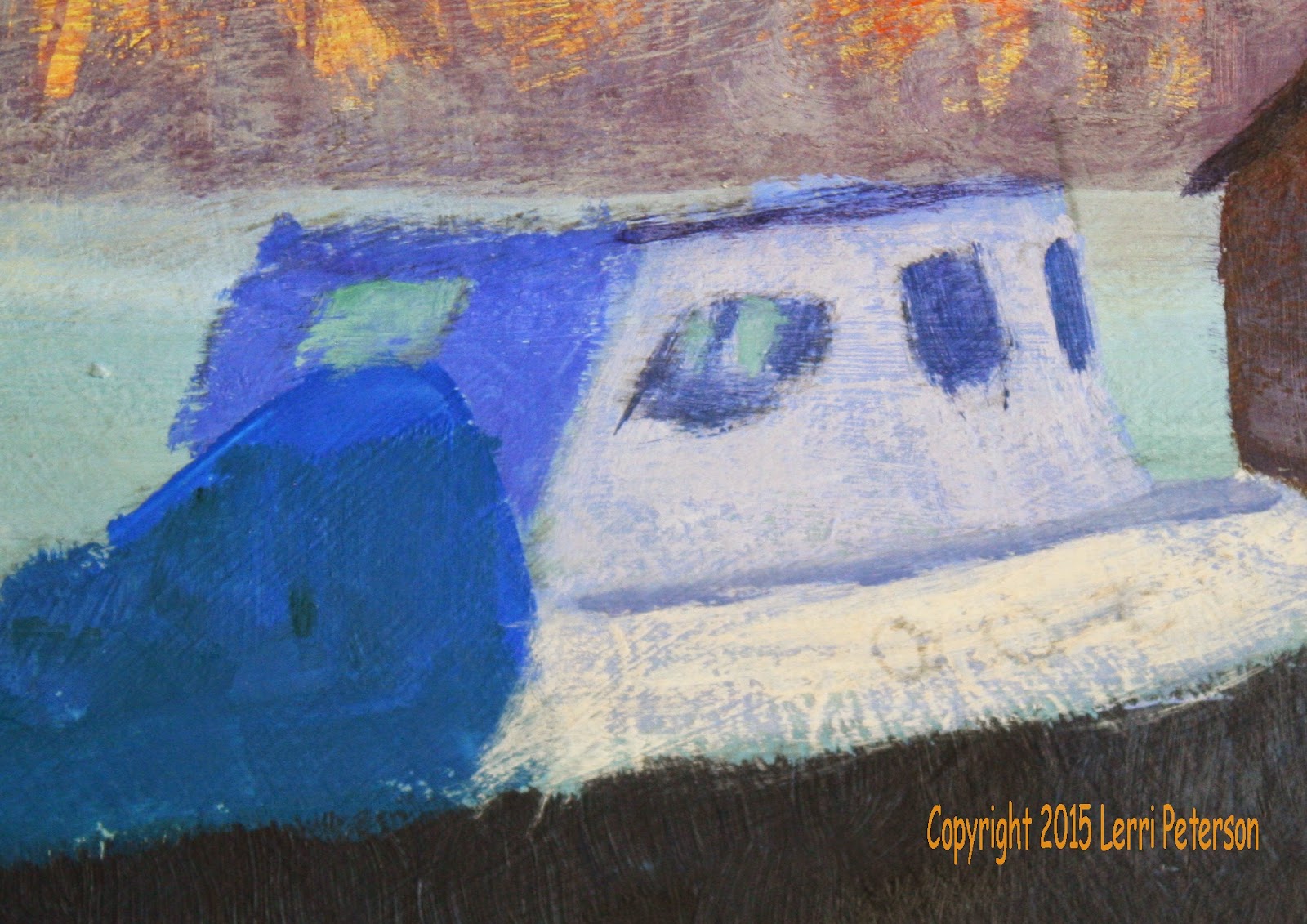
been repainted since the boat was new. Keep it simple and vague.

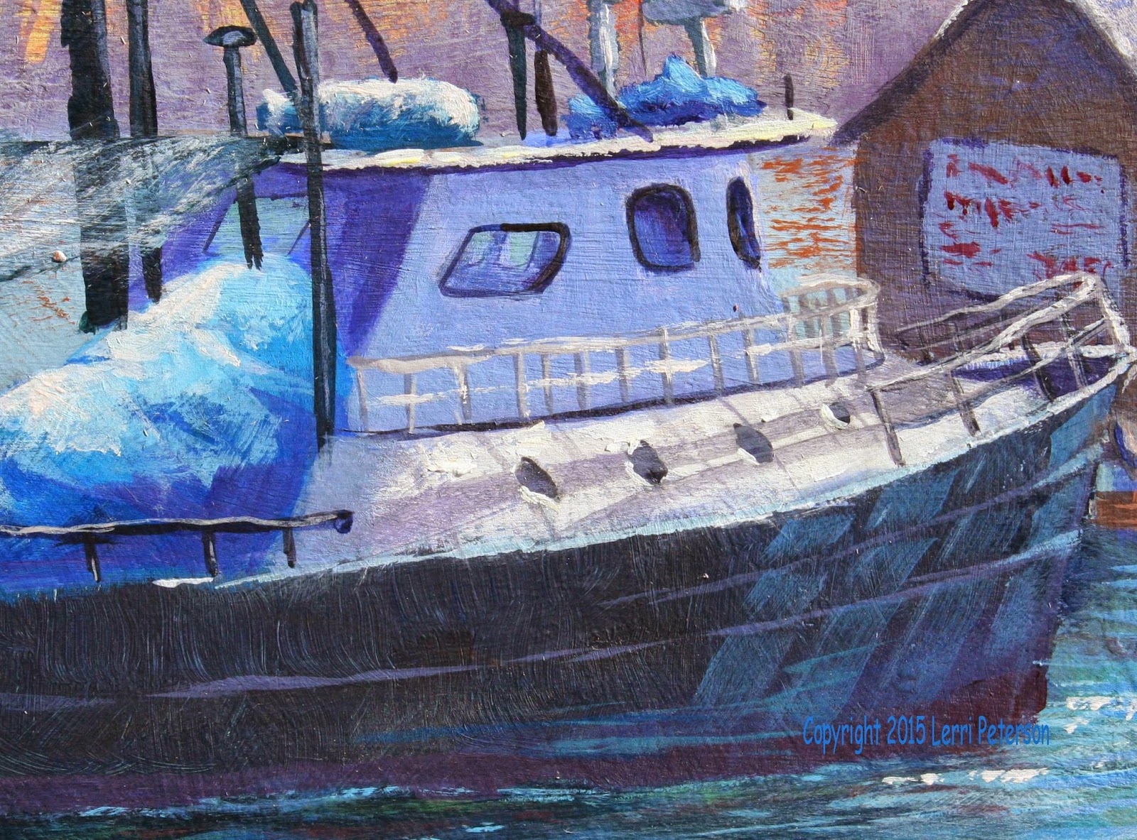
The railings were done with my liner brush as were some of the antennas on the boat and some of the detail around the windows.
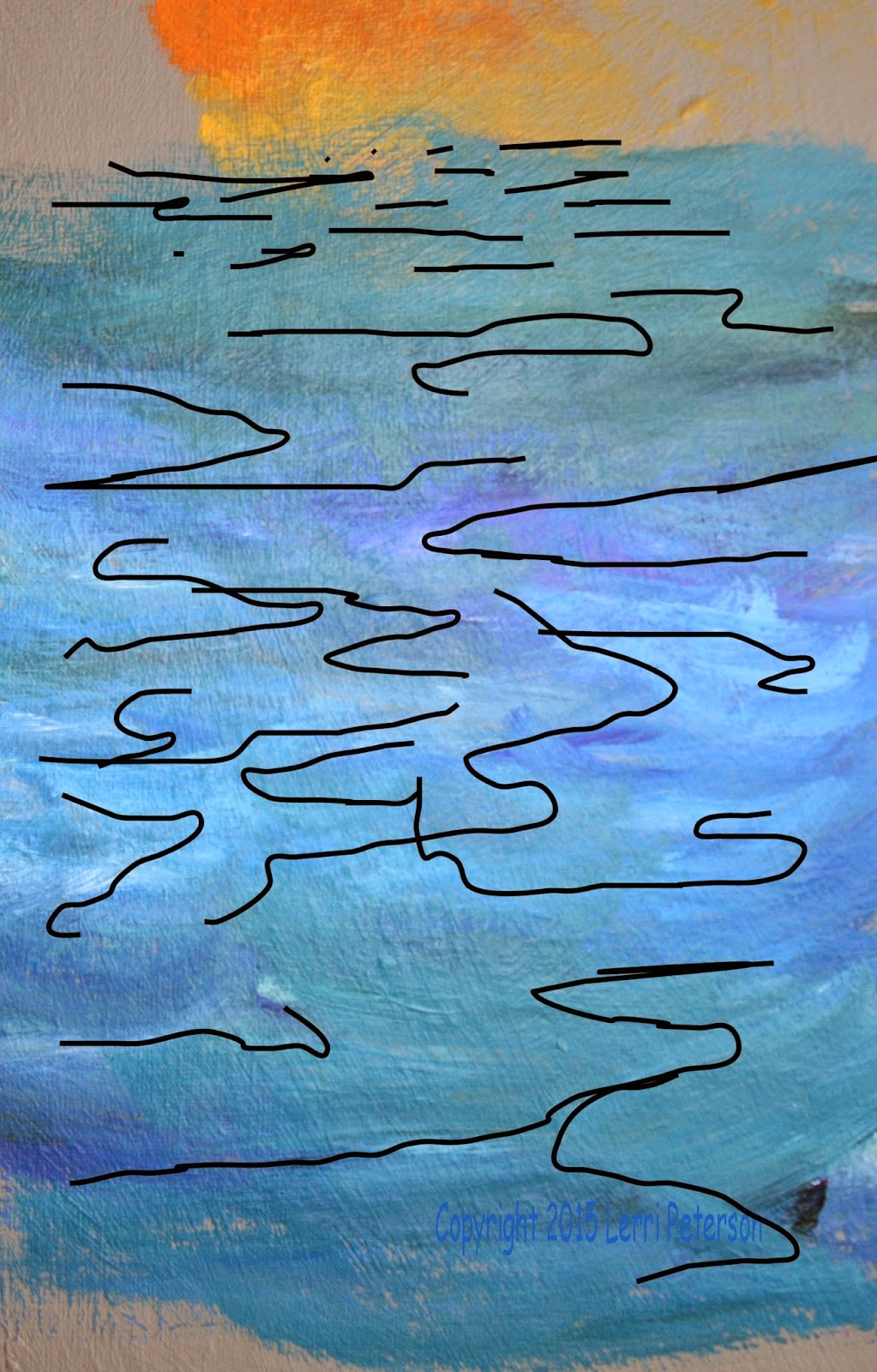
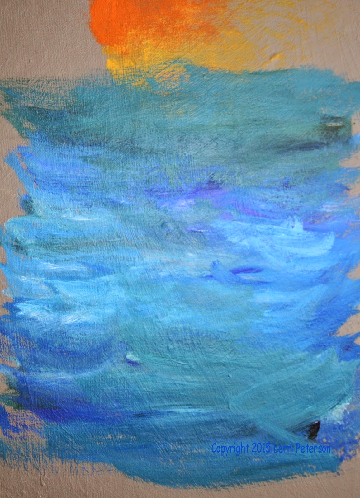
I put a glaze on the water using my #10 bristle brush again and mixing a very thin mix of white and a bit of mud from my palette and once again, dry brushing it across with horizontal strokes over the top of the for ground water. You don’t need to do this if you don’t want to. I also toned down my sky a bit by making that mix a bit more blue gray and lightly scrubbing in a glaze across the sky to tone it down so it wasn’t so brilliant, again, you do not have to do this if you like your sky.

The sparkles on the water were the last things I did and I used my gesso with a very tiny amount of yellow in it just to slightly tint the white and I used a small round brush to just dot the surface.


This is where I will call it done for class and, like I said, will live with it for a while before I decide if I want to do anything else to it. I will bring it to class for those who are taking my class again so you can see it in person, so to speak, if you have questions feel free to ask. I had fun doing this painting and I was very happy with all the work my students did on their boats. This was a complicated subject but if you break things down into manageable steps, you can do most anything. Keep painting and I will see you in class.


Thursday, March 12, 2015

Winter Acrylic Week 7


ACRYLIC – Safe Harbor Week 6

By this time you should all have your under painting complete and should be working on finishing up this painting. We have one more week and still have a ways to go so if you can work on your painting before next class I encourage you to do so.

We are down to doing detail and this can be a very personal process so I do want to remind you if you are happy with your painting at any point and feel it is as done as you would like it then stop! You do not have to do as much detail as I put in some of which I am doing for the benefit of my students not necessarily how I would finish if it were just a painting I was doing, do not feel that you must put in everything I do, stop when you feel you are done.

I did a couple of side demos so I could make the image bigger so you could see the process one of them was the piling with the rope. I had under painted it at home so I could show the process of highlighting but I do want to stress that the process is the same if you have not under painted your pilings or are having trouble with them, it will benefit you to use a scrap canvas and practice this technique on a larger scale like I did so you know what to do on the smaller one of your painting, check the previous post on how I blended wet into wet to do the under painting.

The highlight for the post I started on the sunlit side picking up a bit of the tinted white
(gesso with a touch of orange), some yellow and orange on my flat sable brush (a good bristle brush will work but it needs to come to a good edge) and using the flat chisel end of the brush I made a series of vertical, overlapping strokes starting on the top edge and working a ways down and about an a quarter over lightening the pressure on the brush and picking up touches of sienna and mixing on the piling to get a graded color. I may have to brighten the edge of the piling again but for now it is okay.

 As I work my way around the piling I want to fade it into what is already there so I will be leaving some of that under painting as the texture and shadows, I did pick up some sienna with touches of red and orange to finish off the highlighting of the front to the side of the piling.

There is also something called a “reflected highlight” if you look you will see it on almost everything but especially round things like tree trunks or rocks, also if there is some reflective surface nearby like water, snow or buildings you will see a more pronounced reflected highlight in the shadows. This is a good thing to put in your paintings to help bring life to your shadows and to make round things look round. You will have to trust me on this because it is a bit scary the first few times you do this, you will probably hear your little voice screaming at you “DON’T DO IT!” but do it any way. If you really don’t like it you can paint it out but if you do it correctly, you won’t even notice it when it is done but you will notice a difference in the quality of your painting.

A reflected highlight is made up of scattered light and the last colors of light to be absorbed are the blues and purples so you start with your blue and a touch of purple and a little touch of white to make a soft lavender color. With the same brush you have been using to do the highlights, you will do a similar stroke in the shadowed side of the post. Keep it choppy and come around about a third of the way around the piling leaving a lot of the under painting showing. You’re done.

The top of the piling is just a light grey color and when it is dry, just suggest some texture with a bit lighter color. Don’t make it too detailed because you won’t see that much to worry about it, just suggest it’s there.

The rope can also be painted wet into wet using the flat sable brush which will give you a bit more control if you have one, the colors will just be a bit different. I tend to work in the same pile of paint on my palette unless there is a reason I need to avoid it but when I have a color that needs to be dirty any way – and these ropes are far from clean – I just add color to where I was working to get that muddied color, so I don’t have an exact mix but I do know I started with some of the tinted white, yellow, a touch of orange and purple to get the base color for the rope, it should be a dirty yellow grey. To make it cooler like in the shadows, I added more purple and touches of blue, to make it warmer I added more of the white and touches of yellow and even a bit of sienna. This color doesn’t have to be perfect and the less perfect the better, mixing in the colors on the canvas will give you texture, you just need to show a change in value from the shadowed side to the light side.

The most important part of painting the rope is the stroke you use. The rope is round so your strokes need to be curved or they can follow the twists in the rope which are more of a lazy “S” shape, still following the curves of the rope.


To start the finishing process of the water, you can still use the flat sable brush or a flat bristle brush the color will be the same colors you have been using in the water just lighter. You will use the flat edge of the end of the brush keeping it parallel to the top and bottom of your canvas as you make a series of strokes. Before you start this process, look and the patterns you have in your water area and try to use those patterns to guide you to hit the tops of lighter areas with the lighter colors. You can connect your strokes, overlap them, have short ones and long ones but try to keep the flat edge parallel to the top and bottom while you are doing this. It takes practice so you might want to practice on a separate canvas first. If you do this correctly, your water should look like still water with a bit of movement.

I also based in the masts and poles and “stuff” that are on the boat. Have your reference photo of the actual boat to sketch them in with charcoal before you paint them in. They all lean slightly to the back of the boat, just don’t overdo it. Mix a dark color using your blues, purple, sienna or burnt umber and a good brush like a flat or a round sable because it will give you more control than a bristle brush. If you feel more comfortable using a smaller brush, now is one of the times you can break it out just double check the photo before you start and keep a wet paper towel handy in case you don’t like what you have put down, just let it dry before you try again because the paint will fuzz out if it hits canvas that is too wet.

I will work on mine a bit before next time so I can get some of the detail in that is too small for you to see like the ropes, I will work on the larger sample for the demo. Try to get as much done as you can, the next class will be our last for this project and the semester. Keep painting and I will see you soon.


Saturday, March 7, 2015

Acrylic Project: Safe Harbor Week 5

I hope that everyone can get caught up to where I am in class by next week as we only have 2 more weeks left in this semester and we have a lot of work to do to finish.

This week I wanted to get more color and movement into the water in front of the boat as well as blocking in the pier in the foreground. I also defined the reflection of the boat in the water.

I am going to mention this now because there were some of you that wanted to work ahead of where I am – and that is okay – however, you need to really look at the reference material for your guide and those who were, weren’t. Case in point the windows and the portholes of the boat. Many of you still don’t think about what you are painting and just paint. Color, value, tone and shape mean everything when you are creating something that is more true to life and you need to be aware of it as an artist.

Shadows must be cool in color. Period. Some of you are still using shades of brown or some other warm dark color for your shadows then wonder why they don’t look right. Especially if you are working on something that is basically white such as the cabin and the wheelhouse of the boat, the shadow colors are going to be some form of blue/purple even on the inside of the wheelhouse. The windows need to be a bluish color because there is dark shadow behind them and windows will reflect light usually in the blue range.

Shape is also important for the portholes. These portholes on the side of the cabin ARE NOT ROUND. You are seeing them from an angle and the cabin wall is also at a slight angle so the holes “lean” a bit so when you draw them in they should be leaning ovals and don’t make them too big. This will help give visual clues to the viewer about the shape of the cabin. I will get to the windows next class if you have any questions. If you want to work ahead, have your reference photo in front of you.

Back to the water.

I used the same colors I was using before – ultramarine blue, Hooker’s and sap green, touches of purple along with white to lighten the color – using my #4 flat bristle brush I wanted to make the water in front of the boat a bit lighter (I may make some of it lighter still but later) but not go over everything I already have. Your under painting becomes the shadows and leaving some of it showing is a good thing. Adding lighter colors but leaving some of the darker values will create movement in your water. Keep your brush strokes like long flat bananas if they get too “U” shaped the water will look choppy, remember the flatter your brush strokes the smoother your water will look.

The reflection of the boat is going to be dark. That is your blue, purple and a touch of sienna or umber and if you have some left, a little touch or grey to slightly lighten it  or a tiny
amount of white, it should look like a cool (towards the blue side) charcoal grey. Scrub this color into the water and remember that the edges will not be smooth and straight because the water is moving there are ripples that will break up the outside edges of the boat reflection. Make it wiggly, in other words.

I had used white chalk to sketch in where I wanted my front pier, the pilings and the crab pots but basically ignored them as I was painting my water because it is much easier to re-sketch those things then it is to try and fix the problems caused by painting around things in your painting.

I under painted the pier deck and the pilings with blue, sienna and purple on my brush and instead of mixing them on my palette, I just mixed them on my canvas, this is called brush mixing. This is a very effective way to cover an area because it gives you variations in the color and value which is a much more natural look to things especially something old and beat up like the wood of this pier. On the deck of the pier my strokes were very horizontal so the pier will look flat but on the pilings I did something a bit different. You can use a flat sable brush for this like I did or a flat bristle but you will be using the very end of the brush and making short, choppy, overlapping, vertical strokes.

Again, I loaded my brush with blue, sienna and a touch of purple and starting in the shadowed side make a series of these choppy vertical strokes. Blend the colors with this
stroke by going up and down the post as well as back and forth about a third of the way around the post. Add the colors as you do this as needed but don’t try to make a nice homogenous color, you want some of the different colors to show, this creates texture. When you have filled in a third of the post, wipe out your brush and pick up some straight sienna and a touch of orange then start just outside the previous area then work a little way in and out to blend always using the short choppy strokes. Fill in another third or a little more and on the very outside edge where the sun will be hitting the post – no need to clean your brush this time – pick up some orange and a little yellow to finish off the post working those colors in just the same way you did the previous colors. This is just an under painting but you should be able to see a shadowed side and a lighter side we will do more highlighting later.

Please try to get your painting up to this point. I may break my rule about working on my version between classes but we have so much to do in the next couple weeks I do want to get my painting to a point where you can see how the finished piece will look but don’t worry, I will show you everything you need to know to finish your painting as well, it is just some of this is so repetitive it takes time out of class that would be better spent showing you how to finish your paintings.

Keep Painting and I will see you in class.