Thursday, February 26, 2015

ACRYLIC – Project: Safe Harbor


I started out this last class by fixing something I wasn’t happy with and that was the area under the pier. I felt I had it too dark and I wanted to see some light from the other side of the pier.

I was using a #4 bristle brush but you can use a similar size sable if it works better for you.

I mixed a color similar to the color of the water behind the boat, it does not have to be an exact match, just similar in color and value, value being the more important of the two. I used white with a touch of blue and green and only applied it in a couple of small dabs near the end of the pier next to the bow of the boat. It doesn’t take much to suggest the other side of the pier so do not get carried away.


I also changed the color of the water under the pier by mixing more blue, a touch of purple and a little green and a little that color I just mixed to slightly lighten it because I wanted the color a lot darker but not as dark as I had it and more on the blue/green side. Remembering it is water, I used horizontal strokes to apply the color to the area.

I also worked on the building on the pier adding light to the sunny sides and some texture to the shadows. Since your buildings might be other colors from mine, you will use a lighter warmer color than the color you have on your building, for instance: My brown building in the front I mixed yellow with a touch of orange or sienna then I dry brushed the color onto my building. Dry brush means that not only have you dried the brush to get out all of the water from cleaning it, but after you load it with paint you lightly wipe off any excess paint and water you might have picked up when loading the brush, then with very light pressure on the brush, apply the paint. This technique is great for creating texture because if you have loaded your brush correctly and use the right amount of pressure, you should be able to see little hints of the underpainting showing through, if you can you either have too much paint, too much water or are using too much pressure. Practice on another scrap canvas if you are unsure you should be able to see the canvas if you are doing it right on the scrap canvas.

The shadowed sides of the buildings I mixed a lavender color of blue, purple and a touch of white to create a reflected light color to add the same way to the shadowed sides. You will always have some kind of a reflected light in the shadows especially around bodies of water, snow, ice or anything else that light can easily bounce off of and getting this color into your shadows will make your shadows look more natural.
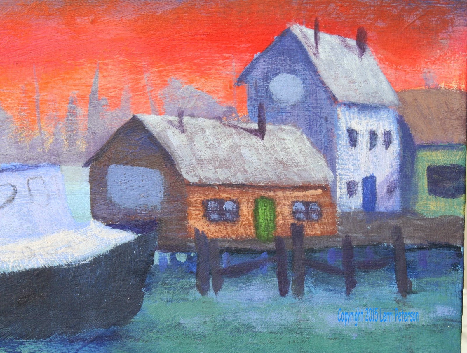
I also added light to the roofs of the buildings again, it was a lighter, warmer version of the under painting. I loaded my brush like I did for the previous dry brush but this time instead of trying to create wood grain for the walls, I wanted to create the SUGGESTION of shingles. Using the full width of my brush and FOLLOWING THE ANGLE OF THE ROOF I made a series of choppy strokes. These buildings are too far away to do much detail work and you do not need to spell out everything to your viewer, just suggest. I will show you how to do some subtle detail later if we have time.

Under all the eaves I used a dark mix of blue and purple to create the cast shadows from the overhangs of the roof. Cast shadows are darker than form shadows because they block the light and putting these shadows under the eaves will give dimension to the roofs and buildings. I also used this dark color to block in some windows and doors.

On the cabin below the wheelhouse of the boat I needed to add some sunshine. I used white with just a tiny amount of orange to slightly tint the color. White can look chalky by itself so tinting it helps avoid this and also will allow you to add pure white later one for the sparkly white highlights just be careful when adding the orange because a tiny amount will go a long way, you just want to TINT the white.


I added this color using the dry brush technique to the cabin part of the boat. The wheelhouse is recessed from the cabin below it and there is a roof that blocks the sun so it is in shadow.

Try to get your paintings to this point by next week and also try to have your near dock and crab pots blocked in as well as the windows and port holes on the boat. We have a lot to do so let’s be ready to get started as quickly as possible.


Keep painting and I will see you in class.

Saturday, February 14, 2015

Acrylic Safe Harbor Week 3

You should have all of your water under painted and the buildings on pier in the back under painted as well.


I have said many times in class when I'm looking at my painting when I bring it home I see things I don't really care for and in this painting I was looking at the sky and I really didn't like the blue part of the sky so before I got started on painting in the boat or anything else, I wanted to correct the things that were bothering me.

I took some ultramarine blue, a little touch of white or gesso and a tiny touch of purple (should be a medium dark blue) and using my #4 flat bristle brush and the dry brush technique I scrubbed in the medium blue. Now this blue is not a light blue it's still dark but it is more blue than what was there and I liked it a lot better, I also went back over the tops of the red orange clouds and scumbled some color into the sky to soften any hard edges.

Another thing I wanted to do was to soften that horizon line. I thought what I had was too dark and rather than paint it out and do it again, instead, I used the dry brush technique with my bristle brush, I mixed a little white touch with a touch of yellow and a little mud from my palate with water to make a thin wash, then I worked this color into my brush but before going to my canvas, I wiped most of it out of my brush. Using the small side of my brush in a circular motion and lightly scrubbing this thin, light color across the horizon line, I covered the shapes that were there, softening them and lightening them as well. I also went down into the water to create a bit of atmosphere between the boat in front and the background, this is a very useful technique it creates dust, it creates mist, it can create fog or clouds so it is something you should learn and practice.


And yet another thing I had noticed was that my buildings were not straight so I needed to correct those before I got to the boat. When you are painting a building, the horizontal lines can be going in at angles but the vertical lines need to be parallel to the sides of your canvas otherwise your buildings look like they're falling down. This rule goes for any vertical lines such as windows, doors, poles, columns - anything that is going to be vertical.

Once I had all my corrections made then I wanted to paint in the under painting for the boat. I checked my drawing and with my number four bristle brush I mixed blue, sienna, a little touch purple and a tiny touch of white to create a very dark, gray color. I used this to under paint the hull of the boat. There were a couple of places - mostly at the back of the boat, where there is a space for that gray panel that is darker than the rest of the boat, so to that same dark color I added a little more blue, a little more sienna and a little tiny touch of purple to create a darker version of the color and that works as the shadow in that area.


While you have this dark color on your brush, very lightly with horizontal strokes go across the water with this color for the reflection. When I say lightly, you should be able to see bits and pieces of the underpainting show through and the edges are going to be very soft and uneven. Be sure that when you get to the ends of the boat where the bow, stern and top edge that the angles go in the same direction as the object above it. For example, bow of the boat goes to the right of the picture the reflection will also go to the right it just will have a soft, uneven edge. We will be doing more on the reflection to make the water look more like water, this is just a start. I'm also not worried that the bottom of my boat is not flat there could be waves and swells that come in and it is basically horizontal and that is all I need to suggest that the boat is sitting in the water.

The cabin of the boat is white but when we paint white first we need to under paint the area with a soft blue grey. This can be on the blue side or little on the lavender side but whenever you are painting white you need to start with a blue grey. I used white, a little touch of the ultramarine blue and tiny touch of the purple and the color I was looking for should be bit darker then the water behind the cabin. This color goes on the outside part of the cabin, for the inside of the cabin which is in shadow, add more blue more purple and make a color that is 1 to 2 values darker for the inside of the cabin.

These lighter colors you can also reflect into the water. One way to see how much will show is to measure the area with a brush or your fingers and measured top to bottom of the cabin area move the top measure down to the bottom of the cabin area and the bottom mark you measured where it comes to in the water is where the top will show in the water. It won't be much because the reflection in the water is looking up and part of the boat is going to be getting in the way but you can suggest some of that lighter color. Remember to keep your strokes horizontal when you're in the water.

The tarp on the back of the boat I don't know what it is or what its covering and that is unimportant all that matters is the color that is there and the shape of the color, Again use your blue, a touch of white and to that you can add little touches of green or purple you want it just a bit darker then the inside of the cabin.


I also took some of the dark boat color and put it under the dock because it will be very dark under there, however, again I got home and I'm not happy with it so I will probably change it first off when we meet again, remember we are not meeting next week because of Presidents Day so you have plenty of time to get caught up.

When you come to class please be sure to have the actual reference photo with you, that is what we are working from for the boat, the other images from the watercolor sample I made or the previous week's class are irrelevant. It’s okay to have them but please don't work from them and I will see you in a couple week's, keep painting.


Saturday, February 7, 2015

Acrylic Safe Harbor: Week 2

This week we started working on the water and on the buildings on the pier. The first thing we need to do is to get the water in because the water will go behind the buildings and behind the boat and we need to put the things that are behind in first so that when we do put the boat in and the buildings they will look like they belong there and not just cut out and stuck on.

Starting at the horizon we need to create a soft blue color we do that by using our ultramarine blue and gesso and run it along the horizon line being mindful that the horizon must be parallel to the top and bottom of the canvas. Any time you have a body of water like a lake or an ocean the water level needs to be parallel to the top and bottom of the canvas so that it looks like its flat if it is angled it will look like its running downhill so be sure that your horizon line is flat work your across your canvas and that your brush strokes are horizontal as you work your way down your canvas.

Using the blue and the white to start you can then add touches of sap green or Hookers Green and the gesso as you work your way down the canvas to about where the top of the boat is going to be then start adding more color and less white continue working down towards the bottom of your canvas adding in more blue, more greens and adding touches of purple, however, if it gets too dark you can add some white it would not hurt if you add other colors into the foreground water, such as burnt sienna, touches of other blues if you have them even, touches of orange or yellow lightly blended in, this is up to you as the artist, just be sure that you blend your colors so that they have no hard lines and there is a gradual transition from the soft gray color in the background to the more intense colors in the foreground, this will suggest there is distance in your painting and when you are doing landscapes or seascapes you need to create the illusion of distance.

Let your water dry. Once you painting is dry then you can sketch on the buildings and the boat if you want to we covered various techniques of getting your sketch on your canvas so look in the sidebar and you will find the pages and go to the one that says transferring your design all you need right now really is the buildings on the dock behind the boat once you have those sketched in you need to choose a color for your buildings.


Your buildings can be any color you want, it’s totally up to you but what you will do is under paint them with a darker version of the final color. For instance, my buildings are going to be red, blue and green so I am under painting with darker versions of the color that I want them to be. For the red building I used burnt sienna and a touch of purple for the shadowed side of the front building, then into that mixture I added orange and a bit of yellow for the sunny side of the building. For the roof I just added some mud that was on my pallet and some white to make a warm gray and I based in the roofs of the buildings. The blue building was under painted with a blue grey and that was my blue with a touch of purple and a little white and the mud on my brush. I then added a little more white to the mix for the lighter side of the building. For the green building I added more purple and some Hooker’s green to blue mixture for the shadowed side and added more white and yellow for the sunny side.

This is where I left off for the week. Please try to get your painting to this point before class and have the basic outline of the boat on your canvas you and have your reference photo of the boat, not the finished watercolor from the picture page. You don't need to have all the netting or masts or pipes sketched in, just the boat and we will start from there be sure to have your reference photos with you because you do need them at this point in the painting. Keep painting and I will see you in class.