(Sorry I didn't do the posts for a few weeks, the death of my Dusty hit me hard. I will catch up from week 5 - the final week 7)
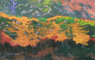
The first thing I did was to put a glaze over the distant hill. This is a good technique to remember when you need to create more distance in your painting or to just add some atmosphere like dust or haze.
The key to this technique is dry brush, meaning very little water or paint on your brush. Use a bristle brush or you will destroy your sable brushes
I made a mix of my gesso (white) with a tiny touch of orange to warm it up. This is just a tint so the white doesn't look so cold. I also added quite a bit of water so it was very thin. Work this thin mix into your brush then wipe most of it off with a paper towel, this will actually go a lot further than you think. I used the side of my brush and starting down where the distant hill meed the middle ground ridge, lightly scrub this glaze on with a series of circular strokes. If you press too hard more paint will come off your brush so use very little pressure. Cover the entire hillside using this technique.
Notice how the background hill looks further away after I added the glaze? This is a good thing.
I also fixed that ridge I talked about last time. It was too straight so I changed the top to curve around to the next hill and put a bump in the slope.
I started adding some of the mustard on the center ridge. Remember to follow the shape of the terrain you are painting. Hills are rounded and have gullies, slopes and cliffs the things growing on them need to follow those curves otherwise it will look like a green wall.
I also added the poppy area behind where the woman will be. I was using the same colors and mixes as before but I was using less white so the colors would be brighter. I will need to get the area behind her a bit darker so when she will stand out against it. I also started the darker under painting for the foreground. The foreground is where you will have your darkest darks, lightest lights and your brightest colors and detail so you don't need to add white to your dark colors like we have to this point.
This was where we left off on week 5.
Week 6 was mostly finishing the background ridge behind the woman, getting the under painting done for the foreground plants and paths. Notice how dark the under painting for the plants is, I did not add any white to these colors so they are very dark. I was using my #4 flat bristle and lightly tapping my brush to create the shapes of the plants with the corner of my brush.
When my background was done behind the woman, I sketched her in using charcoal. Side note: Once I got her in and got her home, I realized I had screwed up her position and the angle of the umbrella but didn't have the time to get it fixed in the time I had left in class, but did fix it later (keep reading).
I under painted the woman's dress - all of it - with a light lavender made with white (gesso), a tiny touch of blue, purple and sienna just to tint it gray using a small round sable brush so I could control what I was doing better than with a bristle brush. I will highlight it later when this color is dry with white with a tiny amount of orange to warm the white. I had to put several layers on because the white dried dull. The shadows were based on the light lavender but with added blue,purple and sienna to slightly darken the color to add the suggestion of shadows on the front of her dress and left arm, the sun is coming from the left side.
Her skin is a mix of sap green, yellow and crimson with white to lighten and blue to darken. The hat was this color with more white in it. Her hair and band around the hat was just sienna,and blue to make a dark color.
The umbrella and purse were white with napthol red with a touch of blue. I did most of the blending on the canvas putting the darker pink color down then with white, blending it towards the center of the umbrella. Remember to angle all your strokes towards the center of the umbrella and it will naturally make the suggestion of the ribs of the umbrella.
This was all we had time for in week 6. The grand finale is coming...
My goal for the last day was to give you enough information so you could finish your painting at home if you needed to so I was a bit rushed to get it all in or at least most of it.
Once I had my woman on the ridge I stared adding the mid tones and highlights to the plants and add the flowers.
I was using my #4 flat bristle brush for the highlights just the same as when I added the under painting which will now become the shadows.
The green highlights were Hooker's green with blue and white for the cooler looking highlights and for the greener looking highlights I added yellow to that mix.
The mustard was the cad yellow with a tiny touch of sap green and I was lightly dabbing with the corner of my bristle brush, for brighter highlights I used yellow with a touch of white. The blue flowers were also done with the bristle brush and were a combination of blue and purple, to make lighter colors add white. The poppies were almost straight orange and I was using a small round brush. I would add a touch of napthol red for darker poppies and yellow for lighter poppies depending on sun light or shadow
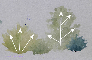
 Those bushes need shapes so don't go making straight lines, they are fan shaped, here is an example from my watercolor class but the idea is the same. A lot of these bushes come up from a central area at the bottom and create rounded clumps, other plants grow from a central stem and branch out like a tree but none of them look like fence posts. Look before you paint, everything has it's own shape.
This is where I had to finish in class, it was okay and I did manage to get you all the information you needed so you could finish up on your own but I was not satisfied so below is what I did when I got it home and spend a couple hours getting it the way I wanted. You have this option too to change the things that bother you, acrylics are easy to fix.
The first thing I did was to paint out the woman and redo the area behind her before trying her again.
I took special care to get her sketched in the way I wanted her before I repainted her using the same technique as above thought I did use a different red (quinacridone red) that I had at home which I felt was closer to what I wanted.
I also worked on my flowers. When I see several students make the same mistake such as pointed flower shapes, I have to take a more critical look at my own work and sure enough, my foreground mustard was a bit pointy so I "fluffed" out the tops a bit to get rid of the points.
I also added some haze to the middle ground ridge just like I did on the distant ridge but I only did it right behind where the foreground starts to slope down, this grays the area behind the foreground and lets the flowers on the top of the ridge stand out more.
I added more flowers well as highlights, shadows and rocks to my paths, I also pulled up some grasses in the open areas with a bit of yellow, orange and white on my bristle brush.
If you do your flowers, you can add a few more detailed ones in the very foreground but leave them as blobs of color as they go back because they get too big and will look out of place, you just need to suggest the ones further away.
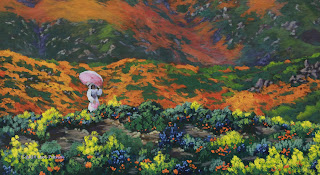
This is my final painting - I think. I will live with it for a while before calling it good but I am happier with it now than when I was in class because I didn't have to talk as I was rushing to finish the painting and could concentrate on what I needed to do.
Keep painting and I hope to see you in class.


