Sunday, August 13, 2017

Summer 2017 Acrylic Class

Acrylic Class Project: Summer Fun Week 6

This was the last week I worked on my project. Remember this wasn't about having a photo-realistic painting at the end but to explore and experiment. Mine is more a fantasy or dream like  painting and while I am not sure I will keep it as is, I am not unhappy with it. It is very different from the way I usually paint and it was fun to do which was the whole purpose: To have fun and cross personal boundaries if for no other reason than to give yourself permission to explore.

 I started out finishing up the highlights and shadows on the tower as well as a bit of detail like the bolt heads, the sign on the back and the wires to the window shutters.
I also highlighted the edge of the roof and tops of rails using a mix of white (gesso) and a tiny touch of yellow to warm it up and tint the white.


I also made the tracks in the sand look less high by breaking up the ridges and flattening out the spaces in between. I alternated between a medium sand color and the highlight color to create more texture in the sand.


Finally I got to the drips. I had to add a bit more water to my paint so it was like a thick ink and I kept applying it until it ran, tilting my canvas to control the direction of the drips. I wanted to repeat colors I had in the sky but there is no rhyme or reason for why I put them where I did, it's all made up anyway.


This is the final stage of this painting and I hope that it gave you the courage to try something different. Until next time, keep painting and I will see you in class.


Sunday, August 6, 2017

Summer 2017 Acrylic Class

Acrylic Class Project: Summer Fun Week 5

As I have said before, if you see something you don't like fix it! When I looked at my sand from the previous week I realized I had a small mountain range rather than truck ruts in the sand. My strokes were too steep and the ridges too sharp so I went in with 2 versions of the sand color on just a bit darker that the other and broke up some of the ridges and made the height less  by steep with shorter gentler strokes. I also added in the float.

Because the float is so small in the painting, I did a larger version to show what I was doing on the smaller one as a demo.

These floats are plastic so some light will pass through them and their shadows won't be as deep so for the shadow areas I used my alizarin crimson then blended in some of my napthol red as I moved into lighter areas, working wet into wet with a sable brush. From the napthol red I added orange and for the highlight I moved to yellow, all the time working quickly so I could work into the wet previous color.

One of the things about the warm colors, particularly red, they tend to lose their vibrancy. Reds become pink and orange become dull and muddy when you add white so instead of adding white add orange or yellow to those colors they will keep their vibrant color while also showing light and shadow.

I also started doing some detail on the tower. I added what looks like roof tiles mixing a dark color (blue, umber or sienna and purple make a good dark or any dark colors you have) then using a small flat sable brush, I touched the edge of the brush to the roof line with a series of uneven, overlapping shapes so that it looks like the edges of tiles. 

The other thing I did was put the frames around the windows. contrary to what you might think, the windows are not white because they are in the shadow of the roof so they will be a cool gray color. If you have some mud on your brush or palette, mix in a bit of gesso(white) to get a gray color. I used the same small flat sable brush to make the window frames as I did with the roof tiles.

I also started to add more color, highlights and shadows to parts of the tower, I haven't finished with it yet because acrylic dries darker and what looked good in class dulled down later, so I will continue to add more color with variations of the tower color - darks and lights - until I am satisfied with my efforts. I will also add a few simple touches of shadow in places to separate out overlapping boards to give them dimension.

Where things come together there is usually a dark shadow. By adding even some simple shadows you create depth, dimension, and separation between objects.


This is where I left off at the end of class with a bit of what I am going to do along the bottom of my painting. I have some final highlights and detail work to do but I should finish it up  in our next class.


Keep painting and I will see you in class.

Saturday, July 29, 2017

Summer 2017 Acrylic class

Acrylic Class Project: Summer Fun Week 4

Last time I mentioned that I didn't like my sand and was going to change it, which is where I started this week. To be clear, if you like your sand or anything else you do not need to change it just because I did, all this is showing you is that you can paint right over something you don't like, you aren't stuck with it. While I like this better color-wise, I still need to make it so the truck tracks don't look like mountain ranges but this is better.


The other thing I did was to add some dark color to the bottom of the canvas before I did the darker sand under painting. The dark color was ultramarine blue, a touch of purple and sienna, I was using my #4 flat bristle brush. Many pointed out that the darker sand color (sienna, blue and white) looks like it is spilling over into an abyss, good catch! A lesson I try to explain often but this accidental "lesson" points out perfectly what I mean when I tell you that your brush strokes matter and they should follow the form of the thing you are painting. The sand looks flat because my brush strokes are flatish slightly curved up on the ends flat strokes, the edges I put in look like they are going over a cliff because the strokes curve abruptly, I did this on purpose because of the way I want to finish the bottom. Remember that I am just playing and experimenting, I want to bring some of the sky colors down to the bottom and this is part of my plan - at least for now, it could change.

I started working on the lifeguard tower to get some of the the railings and posts in. I switched to my #4 flat SABLE brush to do this detail. the sable brush gives you more control and finer brush strokes. 

I am using a turquoise color and lighten it with white, you can also use pthalo blue or ultramarine or whatever blue you have, to lighten it use white/gesso to darken add a touch of purple.

I will be doing more on my highlights, this is just the beginning.

One thing I do want to point out for my beginning students - because I saw several of you doing this - in acrylics we work from our mid-tones to our lightest lights and to our darkest darks, we don't start at the finished color because all the layers are important, they become the texture and form of the thing you are painting and the mid-tones are more dominant than the darks or the lights. I heard one instructor pass on some words of wisdom he had learned  from his teacher when it comes to value range: If you were going to a paint store you would buy a gallon of mid-tone, a quart of dark and a pint of highlights. Start with the mid-tones and you will have more success in the long run.

Overall, I think my painting is coming together, I should finish this maybe next week but more likely the following week. 

Keep painting and I will see you in class.

Saturday, July 22, 2017

Summer 2017 Acrylic Class

Acrylic Project: Summer Fun Week 3

This week I finally added the lifeguard tower. I was using my #6 flat sable brush this time because it is a lot easier to do the detail with the sable brushes than with a bristle brush. If you don't have a flat sable a round one will also work.

I mixed a dark blue gray using the ultramarine blue, a touch or purple (you can add alizarin crimson instead), a tiny touch of burnt sienna and white to lighten the value. If you notice in the picture here there are at least 3 values of this blue gray and I have not yet added the railings across the sides yet, that comes later.

The windows in the tower were done with just the blue and white and the mud on my brush. Use the white or gesso to lighten the color and add blue to darken it.

Notice I have not yet put the frames around the windows and I have just painted shapes of color. You are only suggesting that there are things inside the tower, you don't need to spell them out.


I also decided that I wanted to put in the tire tracks using a #4 flat bristle brush and using gesso, sienna and orange for the light color and adding blue for a darker color.

If you study this image you will see that the ruts are made with a series of comma strokes to create the illusion of depth. The comma stroke starts up then flattens out at the bottom, this helps the tracks look flat on the ground whereas just painting a curved line will not. 

Unfortunately, I am not happy with my tracks so I may paint them out or do something else with them but remember that we are experimenting with this project so don't be afraid to try things because you can always paint over them.

This is where I left off last class. I still have a lot to do and as I said, I want to change things as well. You will start to see this come together in the next week or so and I am hoping that I can finish this up in the next 2 weeks.

Keep painting and I will see you in class.

Sunday, July 16, 2017

Summer 2017 Acrylic Class

Acrylic Project: Summer Fun Week 2

In our last class I worked on several things: One was pushing the peninsula back a bit and working on the sand.

One of the things I discovered when I went to add the tower to my canvas was I didn't have the sand high enough on the right side so I did raise that as well as repeating some of the sky colors into the corners. Remember, I am just experimenting with this, if I don't like it I can change it, acrylic is very forgiving.


One of the things about acrylics that can be a bit annoying is that they dry darker. What looked to be the right value when you put it on looks much darker when you look at it later. This can cause problems when you are working on the background and you want it to stay in the back, the darker something is the closer it looks so there are times when you need to push your background back. You can do this with a dry brush wash. What that means is you used a very thin (watered down) lighter color - gesso with a tint of color, in this case purple - and after you load your brush, wipe it on a paper towel to get excess moisture out of the brush, then using very light pressure on your bristle brush make small circles over the area you want to lighten. this not only lightens and area but it also obscures any hard lines or shapes because it is it in the background you won't see hard lines or distinct shapes. I only went over this once but sometimes you may need to go over it again to get the desired effect. This can also be used to create fog and dust.

This is where I had to raise the level of my sand but instead of working on dry under paint, I did what is call "wet into wet" to save some time. The effect is similar to wet on dry you just have to be careful not to over blend because you want the light and dark to create texture.


I just started to add some of the sky colors into the corners using flat "U" strokes that over lapped. Will it stay this way? the jury is still out, I will decide as I get further along.

Try to have the drawing on your canvas for class on Monday. I want to get the tower under painted so we can start working on getting in some details.

Keep painting and I will see you in class.

Sunday, July 9, 2017

Acrylic Class Summer 2017

Acrylic Class Project: Summer Fun Week 1

Every so often all artists should break out of their comfort zone and try something different. We all get stuck in ruts, myself included, then the thing that should be fun - painting - feels more like a chore. Whether it is a challenging painting or using colors in a different way or using textures... Whatever it is you try, you will gain knowledge and skills as well as face your fears.

Yes, fears.

As adults we have been conditioned to conform which isn't necessarily a good thing for an artist. We are afraid of making a mistake no matter how small and we feel that the world is judging us when in reality, we are the only ones judging ourselves. Artists are their own worst critics. So what if what you end up with is horrible, that is why we have gesso. Paint it out and start again but don't give up trying new things, just do them different.

The lifeguard tower can easily be done just as the photo shows or you can throw caution to the wind and try something way out of the box. I needed to do something different for a change so I chose to use bright colors and some splattering to start my painting.


I will do more later and I can change the whole thing if I want to which is one of the beauties of acrylic, you can paint right over something you don't like.

I used my warm colors in the sky (red, yellow and orange) along with a bit of gesso where I wanted it lighter, and I covered my whole canvas. I was using my #12 flat bristle brush but you could also do this with the 2" blending brush, in any case, use the biggest brush you have to cover the canvas quickly.

Next, starting with the PV peninsula, I took my #12 flat bristle, some sienna, a touch of blue and gesso to lighten the color and made quick little curved strokes to put in the dirt part of the cliffs. To that same color, I added my Hooker's Green and more gesso to make a gray green then using the end of the flat brush and pulling down formed the top edge of the peninsula covered in trees. Using the end of the flat brush keep the edge soft, this is in the distance so you do not want a hard edge. After you get the top edge in you can scrub in the rest of the color for the trees.


In acrylics, we can work from back to front doing what is furthest away first then nearer things later because we can paint right over the background. This prevents the "halo" effect when you are trying to not paint into an area where something else needs to be so you don't need to leave a place for the lifeguard tower we will just paint right over what we have.

Also, this layer is just under painting we will do highlights and add color then this layer becomes the shadows and texture, so this is not the final look for our background.

The water was a mix of ultramarine blue, a bit of gesso to lighten and I think I also added some purple, usually by brush mixing on the canvas not in my palette. Still using my #12 flat bristle brush I applied it with long, flat, horizontal strokes. That was the only brush I used to get this started.

The sand color was a mix of yellow, gesso and little touches of purple. and applied ti using a combination of scrubbing and "U" shaped strokes. To get the top edge of the sand I did the same thing as I did for the top of PV, I used the edge of the brush and pulled down to form the edge the rest was as I said above.


This is our basic under painting for this project so try to get your painting to this point if you can for class. I still have some work to do before starting the lifeguard tower. Acrylics dry darker but don't let that worry you we will be adding highlights and even more color as we go, this is just your foundation. Keep painting and I will see you in class.

Saturday, January 28, 2017

Winter 2017 Acrylic Class

Acrylic Class Project: Flower Study

I want to remind everyone that what we are doing this time in class is a series of studies to focus on learning to see value and shapes. We will only be taking one week on each study so if you do not get finished in class, you will need to finish at home. These don't have to be perfect, it is more important that you understand the values and how to use shapes to create a painting rather than to have a perfectly rendered piece on your canvas.

This week we start with a simple white flower - or so it seems. One of the aspects of painting I want you to understand is that your brain will lie to you. Your eyes see the subject as it is supposed to be but the filters in your brain tell you something different. You see a white flower but if you listed to your brain, your flower will have no depth or texture it will be flat and lifeless. As an artist, you need to see through those filters to see what is really in front of you.

When ever you paint white you are going to start out with some form of gray or blue gray or lavender gray depending on the light and the subject. I mixed a gray that was about the medium gray I saw on the flower using ultramarine blue, a little touch of burnt sienna (the sienna can easily over power the blue so tiny amounts) and white to change the value to the medium light gray I wanted. I checked this by holding my value scale over my paint and squinting through the hole. I f the color disappears against the shade I gray on the scale then tat is my base gray. I made enough for the flower and then some, you use a lot of gray in painting so having a pallet that will keep my paint fresh is handy.

Have your photo and your value scales out, you will be using them for this painting.

I under painted all of the petals with this light gray which was just a little bit darker than the first gray past the white on my gray scale. None of the flower petals gets much darker than about a 4 on the scale, even the darkest parts. Only the yellow center gets to about a 5 on the scale.

To create lighter and darker shades of gray for my flowers texture and wrinkles starting with some of the gray I had already mixed to make it darker I added a bit more blue and sienna to darken it (check it with your value scale) and with my gesso (I use for my white) to make a lighter version of the gray.

For the very whitest white - and there are only a very few places that are really bright white - I didn't use the pure white gesso because that can make the white look too cold, I took a bit of the gesso and added a very tiny - I mean tiny - touch of orange to lightly tint the gesso to warm it up just a bit.
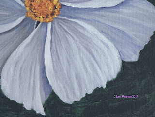
I used a lot of dry brush (very little water or paint on my brush) to get some details in looking to see that the darkest parts of the flower were at the center and where they went under another petal. Always follow the shape of the thing you are painting, look at the wrinkles they are not straight they are curved and the start and stop.

I wan't too worried about the outside edges of the petals because I knew I was going to come back in with a dark color to go around the flower so I could use this dark color to shape my petals better and give them that irregular ragged shape on the edge.

Another thing adding a dark background helped do is to make the flower look white even though it is mostly shades of gray, using the contrast behind the flower creates the optical illusion that it is much lighter.

I had to finish my painting at home to show you what the finished study should look like. the center was under painted with sienna and orange then finished with a mix or cad yellow light and a touch of orange and just tapped on with some sienna and blue for the dark spots.

Next week we will be doing the leaf so please try to get your leaf on your canvas before class, I will show how to transfer a drawing done on paper to the canvas for those who are having trouble.

Keep painting and I will see you in class.
