Sunday, February 20, 2011

Winter 2011 - Brushstrokes

Acrylic Class Winter 2011 - Demo Brushstrokes

Torrance Class – First off, there will be no class on Monday, it is President's Day.

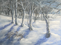
We finished our snow scene at least as much as we could get done by the end of class. If you feel that you need to do more, you can finish it how ever you need to, the key thing is to brighten the foreground trees and snow and be sure that when you do your shadows that they follow the terrain they are falling on, they don't necessarily go out straight from the bottom of the tree, they will go up and over or down and around depending on where they fall, this also gives your snow more interest. Don't forget to put some in for the branches up in the trees, they don't have to match exactly but it will look more natural if you include some of them.

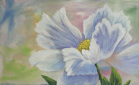
Please have the poppy picture with you when we come back to class in a couple of weeks.

PV class – I am going to write up the different strokes we covered in class for the blog I am also going to create a page so you don't have to go through all the archives if you need to review (I tried to find the last time I did this demo and couldn't so I know you would have problems). I also re-did most of the strokes so they would photograph better but the technique is still the same. Hope this will come in handy, the link will be on the side bar.

Also note: Blogger makes it very difficult for me to insert pictures I am constantly having to move and edit the format just to add one picture! So until I can get the stroke page set up, if you want to see examples of the strokes, just click on the slide show in the side bar and it will take you to the picture page. Sorry about that, but this has taken days to try and get right without success and this needs posting.

Acrylic Brush Strokes

Some basics before we get into techniques: A brush is NOT a pen or a pencil, you hold it in your hand so you can get the job done sometimes that means being able to roll it in your fingers or scrub away. We also use all surfaces of the brush not just the tip or end of the brush, this goes for all brushes whether they are flat or round, bristle or sable though I don't recommend using your sable brushes to do any scrubbing where you are really abusing the brush. It is also good practice to hole the brush back at least mid way and better yet to hold it at the end not up by the metal ferrule, this will give you brush more action and your painting won't look as tight. Save that for the final details.

Also, keep your brush relatively dry. If you rinse it, wipe it out with a paper towel to get rid of any excess water which can flow down off your brush and thin your paint so that it won't cover the way you thought it would.

Brush strokes matter. They can tell your viewer a lot about the texture or the terrain even the direction or the shape of something, think about what you are painting and what you can do to make it look more authentic.

Dry Brush – of all the strokes, this one is probably the most used to get the type of blending we need to do in acrylics, it is well worth the practice. Key things to remember are: Dry Brush means DRY BRUSH! If you rinse your brush be sure you have dried the brush so there is no water visible when you squeeze the bristles, water will hide up near the metal ferrule so be sure to dry the whole bristle area. It also means that there is little paint on those dry bristles so after you load your brush be sure that there are no globs of paint on the ends or sides, wipe it on a paper towel if you have to, to avoid having too much paint.

The other thing to keep in mind is pressure. If you press down hard on your brush, more paint will come off and fill in the area, the lighter you press down, the brush will only hit the high spots on the canvas leaving little "holes" so you can see the under painting showing through.

Depending on what you are painting at the time dry brush can be used to scrub in some color with a scumbling (every-which-way) stroke, circular if you are doing clouds, mist or dust, when you are making waterfalls or the glimmer on the ocean.

Stippling – This is a good stroke when you are leafing out trees or creating bushes or distant flowers or even adding some texture, the pressure rule applies here as well but you can have more paint on your brush.

I use a flat bristle brush for this technique. When I pick up paint I take my brush, on my palette I tap the end of my brush straight down on the mixing area, not so much to mix the paint if I have more than one color but more to "fuzz up" the end of the brush so it spreads out and looks all twisted, this is great for trees and bushes because it creates a random look to the area. I apply the paint by touching the end of the brush straight on to create the tree or bush or texture I need. Remember that the amount of pressure you use on your brush will determine how much paint comes off your brush. If the area is too congested with paint, you are too heavy handed. I have literally had the brush fall out of my hand because I was holding it so lightly when doing this technique.

Impasto – This is an oil technique but it can give you a very impressionistic look, I will give some advice here: the more you fiddle with it the muddier it will become, this is one of those techniques where you put the paint down and leave it alone. You can use either sable or bristle brushes because there will be no scrubbing, you scoop up the paint – there will be globs – and you lay it on your canvas almost like using a trowel. This can also be done with a palette knife. Just put it down and only lightly blend the next color into it. You might want to use an extender or the new "Open" acrylics to give you more time to work the paint o you can blend by gently mixing the colors on the canvas, just don't over mix or you will get mud.

Scumbling – This is just a bunch of strokes that go any which way you can make your brush go. You can use this doing dry brush or impasto or anywhere in-between. This is a great stroke when you are under painting areas with lots of rocks or rocky cliffs because the visual movement that is left will give the viewer the sense of the jumble of rocks because of the texture. I like to mix my colors as I go on the canvas when doing scumbling because that will enhance the movement and the texture.

"U" shaped strokes – This is a very good stroke when you are under painting things with texture like dirt, snow or water. When I say "U" what I mean is that the strokes go up on the ends. The closer together the ends of the strokes the rougher the texture; the longer and flatter the strokes, the smoother the texture will look. You can use this stroke if you are using a lot of paint in your under painting or use it with a dry brush if you are highlighting. The basic "U" shape can look like a dip or a pit in the dirt or snow, for instance, if you turn that "U" over, it can become a rise or a hump so you can create different terrain just by changing up your stroke.

"X" Strokes – This is another very useful stroke when you need to get an area covered, I use it a lot when I am doing my skies with the hake brush. The Hake or blender brush has very soft hairs so if you are soft enough with your stroke, using the big "X"s with this brush you can create soft blends that almost look like airbrush. It does that practice because you barely touch the canvas – "Three hairs and some air" as the late Bob Ross would say – and most beginners are a bit heavy handed in most of what they do.

I'm not sure what to call this next stroke but it is great when you are doing a large field of grass. I usually use a flat bristle brush for this but a flat sable will work, I don't think a round brush would be very affective.

First I load my brush with a lot of paint, next I hold the flat side of my brush almost parallel to the canvas then pat, push and lift the brush, it is almost a scooping motion. If you are doing it right, you should get fuzzy edges and a lot of texture. I like to blend in other colors using this stroke in my grassy areas so that I can see the different colors I have used. This gives a very textured look when done but you will need to reload often so that the paint will leave little peaks when you lift the brush.

Flat or Round Sable brush - You can create leaf shapes by loading your brush with a good amount of paint but it should be worked into the bristles then start by touching the edge (flat brush) or the end (round brush) then as you move the brush press and twist then twist and lift to finish. You can create all shapes of leaves and grasses using this stroke but it does take some practice.

The Liner Brush – This little brush makes great trees, branches, weeds, grass, fence wire, boat rigging…Any where you need a nice thin line the liner is the brush to use. It does take practice to master and mixing the right consistency of your paint is half the battle. The paint needs to be very ink-like. If you tip your palette it should run. Next you need to load it fully, really work the paint into your brush and as you lift it off your palette, roll it in your fingers.

Hold this brush as far back on the handle as you can and hold the tip slightly down so the paint will flow. If you are doing trees or branches, the harder you press the thicker the line, lift as you come up to get a thinner line and wiggle your brush a little to give the tree/branch/weed some character.

When doing grass, get your hand and brush moving in a circular motion before you get to the canvas, when you get the rhythm, touch the canvas on the upstroke. Big circles = tall grass, little circles – short grass.

These are just some basic strokes that should keep you busy. You will use all or most of them in almost every painting and many of these can be used in other media such as oils and even watercolor. Once they become part of you, through practice and experience, you will use them without thinking that is when you are painting for the art. Good luck and happy painting.

Saturday, February 12, 2011

Acrylic 2011 Winter Class

ACRYLIC CLASS WINTER 2011 – Week 5

Torrance class: I didn't quite finish the winter scene so there is still a bit of work left to do, I am hoping that we can get it finished and start on the poppy next class. Please get your paintings up to the point I have mine – trees with branches are based in, mid ground snow is highlighted and you have the mid-ground undergrowth the way you want it. We will start there and finish this up – I hope ;-)


PVAC class – We started a water picture using a photo I took along the PV cliffs near Lanada Bay. The water was clear and calm so you could see to the bottom close to shore. Each situation – calm or choppy, few waves or big crashers – poses it's own set of problems but the first one may seem like a no-brainer but you would be surprised at how easy it is to do (I saw it in class even after I explained it) and that is to have a horizontal horizon line. That means that it needs to be parallel to the top and the bottom of the canvas. Use a ruler if you have to but please, make the horizon line straight when there is water involved. This holds true for oceans, lakes, ponds, fish tanks or glasses of wine, anytime you have a liquid involved it is going to be level otherwise it will look like it is spilling and we don't want that especially when large bodies of water are concerned.


Since this was a demo on water, I will focus on the water aspect more so than the rest of the painting but will do some brief descriptions of what I did in those areas.


The sky was simple; first I coated the area with gesso then used mostly blue with touches of sienna and purple streaked across the top and blended down just past the horizon.


Next I started in the water area the same way by first coating the area with gesso and using touches of blue and sienna to get a light blue gray, I used horizontal strokes starting at the horizon line and working my way down. I don't worry about my sketch I just paint over the bluff so my water will look like it is going behind it, I can always draw it back in later.


ALWAYS throughout this part of the under painting I keep my strokes horizontal and used a dry brush (not much paint or water).


As I work my way down I use less sienna and gesso so it becomes bluer in color but still enough gesso to keep it to a mid-value, it shouldn't be too dark at this point.


Just past the end of the bluffs, I stared adding touches of Hooker's green to the blue and gesso until down near the front corner it was mostly the H-green and a little gesso with what blue is left in the brush.


Without cleaning my brush I picked up sienna and gesso and starting in the sandy area, I dry brushed that color in and gently blended it into the blue/green color. This should be the under painting for the water and you will need to let it dry before proceeding.


If you want, at this point you can start the bluffs and sand. I just took color on my brush – by color I mean just about anything on my palette but mostly the sienna, blue, purple and orange with touches of red – and just dragged the color down the bluffs. As always, think about what you are painting, these bluffs are rugged and rocky as well as eroded so try to create that with your brush. Dirt comes down at an angle as it slides, so should your brush, some places are steeper some places are more inclined, think abut this as you paint.


The sand is under painted with sienna, gesso and touches pf purple. It shouldn't be too dark but near mid range. The strokes here are important as well, they should angle down towards the water because this sand has been washed up by the tides and waves.

Back to the water.


The area near the horizon should stay a soft gray/blue color as it comes forward it will get bluer, just add touches of blue into the gray/blue color for a gradual blend. I used gesso, blue and a little sienna to create the gray/blue color start down a bit from the very horizon and using the flat end of your bristle brush with little paint on your brush, touch the surface with overlapping, horizontal strokes and work your way down towards the point adding touches of blue along the way. Around the point there is some calm water with just a few dark areas and around the rocks at the point it is pretty blue, just keep your strokes horizontal.


As you come into the area past the point, closer to shore, add in some Hooker's green and a touch of gesso, now you can use the flat side of your brush but it is still dry brush (little paint) and horizontal strokes. You need to use a dry brush because you don't want to cover up everything you did before. Just like the snow, the different values will create depth and movement in your water so it is important to let some of the under painting show through.


Next to the bluff, there is a reflection from the bluff and a bit of a shadow as well in the water so it is very dark. Just note the shape of that dark area, it is kinda wedge shaped but the edge that represents the end of the bluff is NOT a straight line, it is a very fuzzy line because of the movement of the water, there are also some places in the water where you can see some of the dirt reflected for that I used a mix of sienna and a touch of the Hooker's green to darken it, it should still look brownish. The dark blue area was blue, H-green and a tiny touch of purple. All of this was done with my flat bristle brush using horizontal, dry brush strokes.


Some of this you are doing to have to adjust to your own satisfaction, just pay attention to the photo and work accordingly.


There are some rocks and kelp along the shallow bottom of the water, I used a mix of the H-green, sienna and a touch of blue and gesso to make a soft dark color and tapped this in with the end of my brush. Remember the more pressure you use on your brush, the more paint will come off so if you want just little shapes barely touch the canvas. Those are just dark shapes, do waste too much time on them.


Waves have crests and valleys, the crests are lighter because they are up in the sun and the valleys are darker because the light is being blocked by the waves, keep this in mind when creating the swells.


The crests were done with a smaller bristle brush and a mix of gesso, and just enough blue and H-green to tint the color. Again I used the dry brush technique and in an inverted "U" shaped stroke. Waves are rounded so I want my brushstrokes to follow the shape of the thing I am painting. The same is true for the valleys between the waves except it was a regular "U" shape and a darker color – blue and H-green.


To finish up the water I put a glaze over it. Glazing can be very effective when you want to subtly change that you have and can be used in many situations, here I just wanted to tie the water together. With my #12 bristle brush, I took my blue and H-green and a lot of water to make a very thin mix of paint and still keeping my strokes horizontal I went over all of the water area with this glaze. This will help that shallow area look like it is under water. You may have to go back over your wave crests again but that is okay.


When your glaze is dry, you can paint the white foam by first under painting with a light blue/purple color then come back with straight white and touch parts of that color to create the white foam. This is about where I finished the water, the rest was the land area and the rocks around the shoreline.


Highlights for the sand were gesso, a touch of yellow and a bit of purple.


The rocks were blue, sienna, a touch of purple and a touch of gesso.


The trees were under painted with H-green and blue, highlighted with sap green and yellow.


Next class I will be going over brush strokes so have a canvas ready.

Saturday, February 5, 2011

Winter 2011 Acrylic Class

ACRYLIC – Week 4

Torrance class: The instructions for your class are a couple of weeks back so check the archives. I do want to point out if you want to make that little path like I have in mine, you will need to get the perspective of the trees. The ones that are closer are bigger, darker and have a bit more detail. Also, make your trees different sizes and shapes, it is the variety that will create the interest in your painting.


Poppy – PV


The first thing I want to do is create a soft diffused background. These types of backgrounds can come in handy for a lot of different kinds of paintings: Landscapes, still life, portrait…Anywhere you need a soft background to compliment your subject.

I used my #12 bristle brush, my gesso and all the colors of my palette except burnt sienna, I didn't need it for this painting. Using a lot of gesso and touches of different colors, I scumbled the colors together (scumbling is a term for the brush going every which way). I was careful not to mix them too well or I would get mud. Have a good time with this step, the only way you can go wrong is too much mixing of color will create muddy colors, just use gesso to gently blend between the different colors so they are soft and diffused.


When I had my colors down, I took my blending brush and very lightly – "three hairs and some air" as the late Bob Ross would say – and softened the colors even more so I didn't have any hard lines or transitions. Then it has to dry.


I want to get this point across so you understand how this part of composition works: Just because a photo may have the subject small and in the middle, doesn't mean that you as an artist have to paint it that way, if you want your painting to be interesting, you need to make your subject bigger on your canvas, simplify the scene and keep the bulk of your subject out of the center. There are always exceptions to the rules, but first you need to learn them so you know when you can break them.


I had my reference photo in front of me so I could see the shapes of my flower then took my soft vine charcoal and sketched in my flower over my background. My flower take up almost 2/3s of the canvas and it even goes off the page in a couple of places. One thing I did keep in mind when sketching this is if it was going to go into a frame I have to watch my design. A frame will cut off about ¼ + or – of your picture so you want to keep the ends of things at least a ½" from the edge or make sure that it looks like you purposely went off the page as I did. Otherwise, it can look like the subject is stuck to the edge of the frame visually and can distract from your painting.


I also didn't put in all the leaves, only a few because they weren't the subject but were supportive of the flower.


When my sketch was done, I blew off the chalk dust before I began and I switched to my #8 bright (it is a flat brush with shorter bristles). I mixed my gesso with touches of blue and purple but kept it in the soft lavender shade, this is what I use in all my areas that were sunlit.


THIS IS IMPORTANT: Your strokes should follow the direction of growth when you are doing flowers and the strokes should follow the shapes of the petals or flower parts. What this means is that all petals, stamens and pestles go back to a central point where they meet the stem but the petals (stamens, pestles) themselves have shapes such as angles, folds or wrinkles or dips and curves so just like when we were making the snow, we have to be aware that while our strokes need to go towards the stem, they also need to go over bumps, down curves, stop at wrinkles or folds…It is not as hard as it sounds, just takes a lot of words to convey a simple idea. Go out and look at flowers and pay attention to the shapes that make the petals have dimension.


The first thing I painted was the yellow center of the flower. I used yellow with a tiny touch of purple – its compliment – and using the end edge of the brush, pulled a fuzzy edge down towards the center. The stamens and pestles radiate out from the center so any stroke that isn't in the center needs to angle in to create that rounded look. While it was still a bit wet, I took straight yellow and did the same kind of stroke but kept that color near the top of the center. Then I started painting the petals starting with the sunlit areas first.


One of the things I tried to do with flower is to leave some of the background color showing through so I used a dry brush technique: a little paint on the brush and I didn't press down very hard. You should see the under painting through the paint you apply. I also just used this color mix only in the sunlit areas. Flowers are translucent – light shines through them – but we still need some dark to show light.


For the shadow areas I used the same colors – white (gesso), blue and purple – but this time less white more blue and purple. Be careful not to go too dark, it just needs to be a shade or two darker than the color you just used and I actually just mix in the same pile of paint, I just make it a bit darker. This is what I used in the shadow areas again following the shapes of the petals and using a dry brush so some of the under painting color showed through.


When you start the detail have your reference photo in front of you, it does you no good if it is in your bag or under something, this is your guide, your road map. Have it, use it.


I switched to my #6 flat sable brush for the highlighting of my flower. A sable brush gives a smother stroke, and I want that at this point. I used gesso to start the highlighting and switched to titanium for my final highlight. First, I used my gesso with a tiny touch of yellow to slightly tint it. Starting at the edge of my flower in the sunlit area and using the end of my brush I highlighted the edges by putting the paint on a bit heavier on the edges and dry brushing as I moved away from the edge, still following the shape of the petal I am painting. My final highlights were just the titanium white and only along the edges in the brightest parts of the petals.


In the shadows, I used a mix of gesso with just a touch of blue using a combination of streaking the color forming ridges in the shadows and dry brushing the color to soften the darker shadow. You are going to have to play around with this and finish it in a way that satisfies you. It will take time and experience for this to make sense, so the more you practice, the sooner you will understand.


Final touches: The leaves and stems I under painted using sap green and a touch of blue to give me a dark color. Just like the petals my strokes followed the way the leaves grow. To highlight the leaves, I used sap green and yellow, for the veins I added a bit more yellow and used my liner brush.


Next week we will do some water, a value scale and go over brush strokes so have a blank canvas either new or one you gesso over, this will be practice not a project. See you soon.

Friday, January 28, 2011

Winter 2011 Acrylic Class

ACRYLIC CLASS Week 3 – Snow Demo


Torrance students please go back to the blog from a couple of weeks ago for the instructions. I will post a picture of the one I am doing in your class but all the techniques are basically the same. If I think of anything I didn't cover in class, I will mention it, right now you need to get your distant trees in and the rest of your canvas covered in a soft blue gray.

This was the final week for our snow/white painting, the main point to this exercise is no matter what the subject is if it is white you need to have dark to show it off. It doesn't matter whether it is snow, lace, fur or whatever, if you want it to have depth and texture you need to have the contrast in values to show the white off. You can see this in the everyday things around you and in the works of other artists, the more you look for these things the more you will understand them.


I finished the middle ground trees by adding a few more branches also some touches of white tinted with a touch of orange on my flat bristle brush to suggest snow in the tops of the trees, I did this by taping straight on with my brush very lightly. Remember the harder to press down on your brush – any brush – the more paint will come off it, if you don't want a lot of paint you don't press too hard.


On the snow in front of the trees, I dry brushed in some more highlight. Again it is white with just a tiny touch of orange to slightly tint it. White can look too chalky by itself so we limit using pure white until the very final highlights. Do not cover up all of what you have down, just add to it , you need those previous layers to show depth, contour and texture.

When that was dry, I used my charcoal to sketch in my foreground trees and a few of the main branches. This is where your artistic license comes in. You can move, remove, add or subtract elements as you see fit, it is your right and sometimes, duty, as an artist. Your utmost concern is for the composition of the painting so you do what ever it takes to make the best painting you can. I thought that the trees in the picture were 1, too small and 2, were in too straight and horizontal of a line so I made them bigger and changed the angle slightly to make it more pleasant a composition. I also sketched the snow drifted up against the bottoms of the trees.


I based in the trees with a medium grey color (blue, sienna and white, touch of purple) and I used a smaller bristle brush. When I was forming my tree trunks, in the larger parts of the trunks I started on an outside edge with the end of the brush on that edge and made small "u" shaped strokes to create the trunks. A tree is not flat, it is usually a rounded shape. The brush strokes you use can be critical in explaining to your viewer that it is a 3 dimensional object. Your brush strokes have meaning and are an important element to the successful completion of your painting.


I also started highlighting the snow in the foreground around the trees again with the white and a touch of orange on my bristle brush and the dry brush stroke. Keep in mind what you are trying to do which is to suggest snow that has fallen over a field that could be full of rocks, logs, clumps of grass or what ever you might find in a field so again, don't cover up all of the under painting you did it becomes the dips and the texture you will need in the snow. You may have to go over the snow several times to get the brightest areas to be as light as you want them but each time you go over, leave some of what you did before to make your snow more interesting.


When you are doing this highlighting, don't worry about going over the edges of your trees you are still working on them anyway, the problem occurs when you try to avoid something then you end up with a halo around it. With acrylics you can always paint it back, no problem.


When I started highlighting the trees, I wanted a color that was just a shade or two lighter than the first gray color so if you have some gray on your palette, add some white and a touch of orange to it or just mix some of the mud on your palette to get a light color. Same little "U" stroke but this time it only goes about half way around the trunk all the way up.


This next step may sound a bit strange to new or beginning students, you will just have to trust me on this for now, but on the back side I took my blue and purple and a little white to make a lavender color and with the same "U" stroke I put this in the shadowed side. Purple is your natural shadow color because it is what is left of the spectrum of light as it is scattered and absorbed by things in the real world. This is especially true when there is snow, water or white buildings nearby. Other colors can reflect in the shadows but you will always find blues and purples. It helps your trees look round.


At this point I went in with my liner brush and the gray I used for the trunks and added in all my branches. Look at the photo, you will see A LOT of branches and twigs of all sizes, dark and light and coming from all directions. You will have problems if you don't put enough of these in. When you start our branch, start back in part of the tree then "branch off". This will give a more natural look to the branch rather than starting at the edge of the trunk or branch.


When I got all my branches in, I did some more highlighting on the trees and branches. This time it was mostly white with a touch of orange, smaller "u" shapes and I think I was using my #4 flat sable brush, it gives me a bit more control. I added some of the scaring you see on the trunks by using a dark color (blue, sienna and purple, little or no white) and I dry brushed some shapes and lines on the trunks. Remember the trunks are round so any horizontal lines on the trunks need to be slightly curved.


The trees are also casting shadows which we need to get in. Using just the blue and purple and enough water to thin it down to create a wash (very thin paint), the shadow will start at the base of the tree and angle off to the left. Here is the thing to watch out for: you must remember that the shadows follow the terrain so they are not nice straight shadows they may go up and over something or down a depression so with this thin paint dry brush this color onto the snow for your shadows.


The rest is adjustments and detail. You can add in the dead grasses in the foreground and more highlights to make the trees and snow stand out. You can use pure white for the very final highlights on the tree trunks and for some of the snow, but really finishing it is up to you as to how much detail you want. If you are looking for something to do it is probably finished. Stop. You can fiddle a painting to death trying to make it perfect. It is better to leave it for a few days then go back and look at it, if it is something glaring, it will jump out at you, if it doesn't, you were done.


Next class I will be doing another demo on white, but in a different way so if you want to give it a try you will need another canvas or you can work on your own project. If you want to follow along, please download and print out the poppy picture from the picture page for this exercise. I will be doing demos in class for the rest of the semester so you might want to have a canvas just for practice. See you all soon.

Friday, January 21, 2011

Winter 2011 Acrylic Class

Acrylic Week 2 – Snow Demo


This week we got started on our project which I will get into later, I do want to mention a bit more about the tree stump and snow to finish it up and to detail the use of the liner brush.


To remind the new students: Acrylic dry darker. This can be a bit annoying when you think you are done and come back 20 minutes later and all your highlights are gone, you just need to understand this is the nature of the beast so you may have to apply a couple layers to get the results you want.

When highlighting the snow around my tree, I kept in mind a couple things: First that it is snow. I know that it may seem an obvious statement but sometimes we get so wrapped up in painting we forget exactly what it is we ARE painting. Snow is soft and fluffy and has no hard edges; it clumps up and drifts over things which brings me to the next thing I want to keep in mind is what is underneath the snow. There could be rocks, roots, grasses…anything you can think of that might have been there before the snow started to fall. Make up stories in you mind about what is there so as you are painting the highlights you remember that the top of something gets more light and the space between stays in shadow. This also affects the strokes you make: If it is going over the top of something the stroke will be convex (upside down "U" shape), if the stroke is going down the side or in a depression, it is going to be a convex stroke ("U" shaped stroke). Our brush strokes tell our viewer a lot of information so they shouldn't be taken for granted.


With this in mind, using my #10 bristle brush I mixed white with just a touch of orange to warm it and using what is called the dry brush technique, which means that I have thoroughly dried my brush, loaded it with paint but have wiped the excess paint out before going to my canvas. Then using either the flat side of the brush, I start in the area where there would be the strongest light and scrub in this color. The harder you scrub, the more filled in the area will become, this is good to know when you are shading so you can get a nice graded look to your transitions from dark to light.


Another thing that I need the new students to understand is you don't want to cover up all of the under painting you just did. That under painting becomes the depth and texture of the snow so if you see pockets of the layer you just did, that is a good things, leave it, don't try to cover it all up. We mush have dark to show light if we cover all the dark we loose the contrast..

The liner brush will be used in a bit but I want to go over it now so you have a chance to practice with it. This little brush can be a blessing and a curse and that just depends on how much practice you have with it so take the time to get comfortable with it before you use it on your "masterpiece".


Your first hurdle with this brush is loading it. Most of the time you will here be admonish you not to get too much water mixed into your paint, with this little brush it is just the opposite: You need a lot of water to make it work correctly. The paint should be the consistency of ink. If you tip your palette it should slightly run. Next is loading the brush. You want it full of paint so really work all of it into the paint not just the tip. As you lift it off your palette, roll it in your fingers to create a point. Hold the brush at the back of the handle and the bristles pointed slightly down so the paint will flow, now you are ready to start.

To create a thicker line, you press harder and are on more of the bristles, for smaller lines you lift the brush to the tip. This is how you start a tree. Press, pull, lift and drag. If your hand is a bit nervous you have an advantage when making trees because trees have all kinds of bumps and twists, these aren't fishing poles, these are tree branches and twigs. To make branches off other branches it is easier to start within the tree or a branch then "branch off" with a new branch or twig.

When you are making grasses the process is much the same but when you get to the canvas, this time you want to start by making circles in the air using your whole wrist, when you have your rhythm down, on the up-stroke touch the tip of the brush to the canvas. Be sure you are holding the brush at the back, believe it or not, you have more control holding it like there. Big circles create tall grasses, small circles create short grass. Practice, practice, practice!

Now to our project. If you have chosen to paint something other than one of the two photos I posted, you will have to adjust what I am saying to fit your picture, however, everything I am saying about how to paint white can be applied to all subjects that are white.


The first thing I did was determine where my horizon should be, which was about a quarter way down from the top of the canvas. With my soft vine charcoal I drew a line across the canvas at that point but I didn't get out a ruler, there was no need, but that was as much drawing as I needed to do at this point.


Next I applied gesso to what will be the sky area – that quarter space at the top of the canvas. I was using a #10 bristle brush to apply the gesso and the gesso should be thick enough that when you touch the canvas your finger tip is well covered, we are going to mix into this so before it dries, on the same brush, on one corner pick up some blue and on the other corner a little burnt sienna and streak it across the top of your canvas. Once the paint is on, use big "X" stokes to work it down to the horizon, the color should lighten as it gets near the horizon and that is what you want. I did switch to my soft blending or haki (pronounced Hockey) brush to finish blending the sky because the soft bristles don't leave as many marks as the hard bristles. Make sure that you have squeezed all the water out of this brush because it can hold a lot of water. I use the big X stroke with this brush as well but I was barely touching the canvas. Again, practice.


While the sky is still wet I did the distant trees. I went back to the #10 flat bristle brush and on my palette mixed white with touches of blue and tiny touches of sienna to make a cool gray color which was slightly darker than the sky behind the trees. To load the brush I tapped it straight down onto the palette rather hard so that the end got really scrunched up. If you look ant the end it should be a twisted and funky, great for making tree tops. Right along the horizon I gently tapped this color into the wet paint of the sky varying the size and shape of my brush strokes all along the length of the horizon. This color shouldn't bee too dark, if it is pick up a little white or gesso on your brush and just work it into the tree line.


Next I under painted the rest of the snow area using the same brush, same colors and starting right under the tree line, I scrubbed in this color with a scumbling stroke. You can do what is called "brush mixing" by picking up the different colors of paint on your brush and mixing them on your canvas. This is actually much better than mixing on the palette because it gives more variation in the color which is a good thing. As you come into the foreground, use less white – don't eliminate it just use less – and add more blue, with touches of brown and purple. The corners can be the darkest areas just be sure to cover the canvas well. Now it all needs to dry for a few minutes so now is a good time to practice your trees which are coming up.


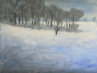
When this under painting was dry, I needed to start highlighting it. On my palette I was still using my #10 brush but if you feel more comfortable with a #6 or # 4 for this it is okay, I mixed my white with a tiny touch of orange just enough to tint the white. Always make sure that your brush is free of excess water before you start mixing color or the color can become too thin and won't cover. I wiped the excess paint from my brush and just under that line of trees in the distance, I dry brushed this highlight color on to the snow area. Remember you don't want to cover it all up and think mounded snow so make little slightly, rounded strokes. As you come forward, lighten the pressure, more canvas will show and that is what you want to suggest a hillside.


Notice the pockets of the blue under painting showing through.


If you need to sketch in the area for the middle ground tree tops, use your soft vine charcoal to indicate where you will be painting. This is just a suggestion so no detail and blow off the excess charcoal dust when you are done. If you need to make changes, use a wet paper towel to wipe it off.


Still using my #10 flat brush, I wanted to mix a darker, grayer color so again I used my blue and sienna and enough white to gray it and like the background trees I loaded my brush up by tapping straight down to mess up the end and using a similar tapping created the tops of the trees and also the bushes and bramble at the bottom of the trees. Be very conscious of the fact that all of these are natural trees and they grow at different rates so are different sizes, same with the under growth, vary the sizes and shapes. Also note that in the upper left hand corner the trees go off the canvas so it can be filled in pretty solid.


While that was drying, I started highlighting the area just in front of the middle ground trees. Again with the same brush and mixing the white with a touch of orange, I dry brushed in my first layer of highlight. I didn't come too far forward, I will do that later when I dt my other main trees in but I needed to get it started.


Now for the tree trunks and branches. If you don't want to do the very distant trees, that would be okay, if you do, with your script brush you will mix a blue/gray color that is just slightly darker than the color that is there (white, blue and sienna), remember lots of water and just suggest the trees trunks and a few major branches, they are too far in the distance to see much detail.


In the middle ground trees you will use a much darker color. Little or no white, blue sienna and a touch of purple this time to make a dark color. If it seems too dark, add a little gray from your palette rather than dipping into the white or you could get lighter than you wanted.


When you are making your trees remember to vary the size, the shape and the placement. Thick trees next to small trees. Trees that lean. Trees by them selves. And also that they are all behind and in the undergrowth. Don't forget the branches and don't get carried away. It can get to feeling so good that you do more than you should, you want to see some of the snowy hillside behind this clump of trees, it will give depth to your painting. Change the color as well by adding touches of white to make grayer tree trunks or branches. When you are done, go back to the bristle brush, add a touch of white to the color you were just using to make a lighter gray and similar to the technique you used to apply the darker grey, lightly tap over some of the branches and trunks. Note the words "lightly" and "some" this is just to make the trees look like they belong in that clump and the gray color is part of them. I also added a bit more white with my liner to make the brambles of the undergrowth and some of the snow covered branches of bigger trees.


Depending on how fast the class works next week, we should get this done during the class time so start looking for something you want to work on, I will give demos on various things in the coming weeks and some of what I demo depends on what I see you working on. Keep painting and Ill see you in class.

Friday, January 14, 2011

Winter 2011 Week 1

ACRYLIC SNOW DEMO

This project is really an exercise in how to paint white. It won't make any difference whether it is snow, a white cat, a table cloth, a wedding dress or any other thing that is basically white, everything we will be painting for the snow is applicable to any other white subject you might paint so even if you really aren't interested in snow – and with it being so cold lately I don't blame you – these demos and projects are designed to give you information and practice painting a variety of things so that when you go to paint your "masterpiece" you will have the knowledge and the skill to accomplish your goal.


A basic mistake that a lot of beginners make is starting out trying to paint white with white. A blank canvas could be titled "Polar Bear in a Snow Storm" because that is about as much success as you will have when you paint white on white. A key thing to remember in all your paintings is: You must have dark to show light. This is part of the value system and values are the lightness or the darkness of a color.


Some colors like yellow will never get very dark on a scale of 1 – 10, 1 being the lightest; yellow might get to a 4 if the color is straight out of the tube. On-the-other-hand, blue can get all the way to a 10 depending how much white you have put into it and the hue or color of blue. I think we will do a value scale next week so you can see what I'm talking about. Again, not the most exciting thing in the world but value is so important for you as beginners to understand and for any one who is trying to be a better artist. Value lets you create depth in your painting, it can also creates excitement in your painting so it shouldn't be overlooked.


That said, the first thing I need to do is make the background darker. In class I had a canvas that I had already toned with a grey/blue color however, I showed how to mix colors on your canvas to cover the white to create a darker background so your white will show up later. What I may not have explained as well as I should have, was direction of brush strokes. The direction of your brush strokes are so important in acrylics, oils, pastels and to a lesser extent, watercolor because as subtle as they are, our eyes pick up on the movement of those brush strokes and can send conflicting messages to the viewer. Trees grow vertically so we want our brush strokes to be mostly vertical (up and down) as opposed to horizontal (side to side). As the different paint colors mix on your canvas, those vertical strokes can suggest a forest of trees without you ever thinking about it; keep this in mind when you are painting your background. Think about what you are painting and how your strokes can mimic the texture or direction of the thing you are painting.


I used my #10 flat bristle brush, some ultramarine blue (since this is the only blue I use I will just call it blue from now on), some burnt sienna (sienna) white (either titanium or gesso will work, my gesso has gone bad so I used titanium this time) and a bit of the dioxizine purple (purple). Rather than mixing a homogeneous color on my palette, I "brush mixed" on the canvas picking up paint as I went along, using vertical strokes and a "scrubbing" action and the flat side of my brush (I was pressing pretty hard on my brush so I could get the paint into all the texture of the canvas). I ended up with a medium dark blue/gray color. I also showed how you can lift out some shapes of trees using the same brush by first cleaning it then wiping out all the excess water and using just the edge into the still wet paint and "lifting" out tree shapes. This is more a watercolor technique but it will work in acrylics as long as the paint is still wet.


Once the background is dry, using my soft vine charcoal, I made a simple sketch of a tree trunk with the snow piled up around it. You do not need a detailed sketch, just some guide lines, also I should mention that we usually sketch as we go so don't draw an elaborate sketch on your canvas before you start because we are going to paint over most of it.


Once I had my sketch on, I had to determine where my light source was coming from. This is important because it is how we determine what gets highlights and what gets shadows. I selected my light coming in from the upper right hand side of the canvas. Now I know which side will be lighter and warmer and where my cool colors will be.


Still using the #10 bristle brush, I picked up some orange and sienna and holding the brush perpendicular to the canvas and the edge of the brush was vertical, I used short choppy strokes along the right edge of the tree. Again, I am thinking of what I am painting: Rough tree bark that runs vertically up the tree, so my brush strokes need to mimic the way the bark grows. As my brush moves away from the light source, I pick up just the sienna (I'm about in the middle of the trunk now), work it in to the lighter color a little bit, still using the short choppy stroke. When I get to about ¾ around from the light, I pick up some blue along with my sienna and a tiny touch of purple to finish off the tree trunk. There is also a part of a tree root that you can use this same color on just remember to follow the direction it is growing because it is not vertical but at an angle with a bit of a curve.


The under painting for the snow is next and while the base color will be white, we will be adding mostly blue with touches of sienna to gray it and touches of purple. Depending on how dark your background is, you will want the first color for your snow to be maybe a shade or so lighter than the background (values again). Still using the same brush but this time on its flat side using a stroke called scumbling, which is basically any and all directions, start scrubbing this color into the snow area.


While this scumbling stroke is kinda wild, you should remember the "rule" about direction of your stroke. This snow is piled up over the roots and there may be rocks under it and there may be depressions between the roots so when you are going over a root this stroke can be an upside down "U" shape, in the depressions a regular "U" shape. It may not show it now, but in the next layers you will start to see how effective this is, it is also good to "get in the habit" of thinking about what you are painting and the goal you are trying to reach.


I think I did another layer on the tree to give it a bit of detail, still using the same brush and the same stroke I used orange with a touch of white again starting on the sun lit side and working my way around, I don't want to cover up everything I did before, I am just adding texture. As I moved away from the light source I picked up more sienna with the orange, then sienna and blue and lastly I picked up some purple and a little touch of white for the reflected light on the shadowed side of the stump. Then on the trunk where the snow was casting a shadow I used blue, sienna and purple to create a dark color for the shadow.


This is where we stopped for the day, we will do a bit more so you can see a bit more of the process, it will come in handy when we get to the trees on our project. Have your paints and canvas ready and remember you can click on the slideshow to get to the picture page to download the reference photo. There are two similar but slightly different photos either one is fine or if you have your own photo you want to work from that is fine also. Next time we should get started on our project.

Sunday, January 9, 2011

Winter 2011

Hi Everyone

I just wanted to post the link to the winter project so you can see what we are doing. I had a request to do snow and I think it is a great learning opertunity, snow isn't just white and what you learn about white with this project applies to almost everything white that you will ever paint.

http://picasaweb.google.com/artistlgp/Winter2011#

BTW, you don't have to paint this particular scene, if you have a scene you want to paint you can watch the demo and apply what I am teaching to your picture.

I also want to point out to Torrance students that the class is closed - WE FILLED IT UP! I have 15 students signed up for the acrylic class so it will be busy the first couple of days.

See you soon.