Saturday, October 24, 2015

ACRYLIC FALL 2015 CLASS Project: Cool Refuge Week 5

This week we worked on under painting some of the plants and more dry brush on our chair. I am hoping that we can finish this up at our next class so please try to have you painting to this stage when we meet again.


I started in the background cleaning up my windows and adding a bit of detail. Using blue, a touch of purple and sienna and white to make a medium blue gray, I used that color to fill in my windows and to clean up and shape the edges of the frame of the window panes. While that was wet, I added some more white to the color to lighten it then suggested curtains in the window. Remember that the fabric of the curtains will fall vertically, if you suggest that the curtains are tied back, they will curve to where they are tied then fall straight down. Please look at curtains BEFORE you do this, you really need to know how they will fall.

I added plants to the planter and some vines hanging down over the door, using my Hooker’s green and a bit of blue and a touch of orange adding yellow as I put them in.

Using the corner of my brush (you can use either a bristle brush or a flat sable) I quickly put in my plants with a series of OVERLAPPING dots. The overlapping part seems to throw most of you because when I come around I see: Dot.    Dot.     Dot.  – all lined up and evenly spaced. You want more of a shotgun effect: doDotOTdoTDodtot – so that your
strokes are on top of each other. Pick up yellow along the way and lightly blend it in using these overlapping dots. Also create interesting edges so they are not all lined up and even like topiary. If you put in the vines going up the window or over the door remember they are fatter where they attach to the plant and thinner to the ends as well as being irregular in shape, you don’t want them looking like garland.

The same applies when you do the plant under the chair. It is a mass of color first then later you can sort out some detail. Use the same colors but add a bit more blue to the green when you need it darker and yellow to make it lighter. The plants on the ground are coming up through the cracks in the walkway so again, please don’t make this into a shapeless lump.

On the chair there seemed to be problems with getting the back of the chair dark enough, it isn’t black dark but it is darker than the front of the chair especially the left side where the arm and leg overlap the back of the chair. You may need to fix both parts of the chair using the dry brush technique to add texture as well as either dark color to the back of the chair or lighter, warmer colors to the front. If you squint at the chair you should be able to see separation of the colors.

I know I have said it many times before, but if you want to be a better painter you need to learn to draw. Some artists take months of research for a future painting by gathering photos and doing sketches and thumbnails long before they ever start on their masterpiece. With all that preparation it usually does turn out to be a masterpiece. I have asked you, and
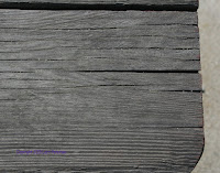
even taken time in class for you to practice a new or difficult technique before you try it out on your paintings, about half go straight to their painting and of those who actually do take more than a minute to get the feel of the brush and paint, I would say half of those only practiced for a minute or two before going to their paintings. I can see who practiced and who didn’t. It does make a difference, just as drawing a simple sketch can help you understand what you are looking at. The sketch I did below took all of maybe 10 minutes but it lets me see detail in the wood I may not understand in my painting but when I get to the ends of the chair parts, I know what to expect. This is important and I don’t know how to convey that message so you will understand, just give it a try for a few months and see if you paintings don’t improve, you might just surprise yourself.


Do as much as you can to get to where I am in the painting, I really don’t want to take more than another class to finish this. keep painting and I will see you in class.

Saturday, October 17, 2015

ACRYLIC 2015 FALL CLASS Project: Cool Refuge Week 4

This week I started working on some of the detail of the chair, this will be a process and will take more than one layer to do it correctly. The first thing I did was too darken the mold behind the chair using my Hooker’s green, some ultramarine blue and a little touch of burnt sienna to make a dark, ugly green color. If you look at the reference photo you will see that the chair is lighter than the wall behind it so that is what I'm trying to accomplish.


Most of the rest of the class was spent doing dry brush. I had to dry brush texture on the chair, I also dry brushed some of the highlights and details on the window frame and the planter box. If you have not mastered dry brush I would hope that you would practice before you started on your chair. It is much easier to practice on an old canvas or a separate canvas even on paper before trying to work on your masterpiece because if you mess up on an old scrap of canvas it won't matter but I will hear a lot of crying and pleas for help if you start working on your project first. I make doing dry brush look easy but if you attempt to do this you will find out that it is not as easy as I make it look because I've been doing this for nearly 30 years and I know what I'm doing, so please, I encourage you to practice at least for a few minutes so you can get the feel of the brush and how the paint is supposed to go on.

The key to dry brush is, obviously, a dry brush but that also means that your paint should not have a lot of water in it as well. If you rinse your brush and clean it be sure that you dry it out completely and when you pick paint up off of your palette be sure to squeeze near the bottom by the metal ferrule and squeeze out any extra water you may have picked up when you were picking up paint, then squeeze the bristles to widen them and lightly at first, go across the canvas remember to follow the grain of the wood. If the wood is horizontal your strokes will be horizontal; if the wood is at an angle your strokes will be at an angle. This is important so that your wood looks like it has wood grain, your eye picks up a lot of information and your brush strokes are critical to conveying the right information to your viewer.


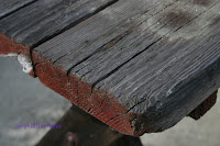
I did a demo on how to create old wood but I have also taken some photographs of an old picnic bench I have in my yard so that you can see what I'm talking about. I know I tell you to look and to take pictures of your own for reference but I know from experience that most of you will not do this, I cannot teach you what you cannot see in your head and if you can't see it in your head you need to have some reference in front of you, that is where photographs are important to your art education.

Look at the photographs as well as the demo I did for wood: When you have a piece of wood that is cut and you can see more than one edge the grain and any cracks that are in the wood will change direction when they get to the end of the board. Note this on the reference photos I have posted and understand what you are seeing. If you must, and I do encourage this, do some sketches, this will cement it into your head. Also I've included some photos of looking down on the wood so that you can see it at a flat angle, notice the grain of the wood and also the texture and the cracks in the wood the cracks are much darker than the grain which are the dark in the light streaks that runs through the wood. The texture is caused by weather, wear and tear so there are several values and colors that you use to create old looking wood.


When you are working on the chair please look at the reference photo and noticed that the back of the chair is darker then the front of the chair, this is critical show the difference between the front and the back it gives it depth. If you are having problems seeing this, squint at the photograph and then squint at your chair if the front does not come forward or the back recede you need to get lighter in the front and darker in the back.

Try to get your painting as close to what I have from our last class and we will continue working on the chair and we should start getting into the detail in the flagstones and the background next class so keep painting and I will see you in class.


Saturday, October 10, 2015

ACRYLICS FALL 2015 Project: Cool Refuge Week 3

We had a lot to do on the project this week: First thing I wanted to do was start filling in some of the spaces in the back like the windows, plants in the pot... any little thing that I can do. I'm not trying to finish it but I am trying to get it closer to finished before I base in the shape of my chair.

For the window frame and the planter box underneath it I mixed up my burnt sienna with a little touch of blue and a little touch of purple to make a darker brown color this is the underpainting for the window frame and planter box. I should have added a touch of white because it is a bit too dark so we will have to make it lighter to fit the plane that it is in on the painting.


Remember when you are painting something that is supposed to be straight up and down, the  vertical lines must be parallel to the sides of your canvas so that they don't angle, only the horizontal perspected lines go at an angle, the angles of the window are a little bit confusing because the street goes up and the angles of the window and planter box go down slightly because of their position below and above the horizon line respectively, but the vertical sides will always be straight. I'm not looking for perfection but you do want them to look believable.

The plant in the pot by the front door is painted much the same way as the pot was except instead of using warm colors like orange and burnt sienna you'll be using greens. The first thing I did was I mixed my sap green with a little touch of yellow and orange to make it lighter and warmer then I tapped that color on the sunny side of the plant. As I moved around the plant I picked up sap green and Hooker’s green and mixed it into that warm green color, tapping and blending into the first green – wet into wet – to the sides and back of the plant. When I say tapped I was using my flat bristle brush and I was using the corner of it to create little roundish shapes that overlapped and were very congested, I could blend the colors as I went. Going into the shadowed side of the plant I added blue and a touch of purple into my green to create cool shadow color. Remember when you were painting your plant, you want the outside edge to be a regular, more organic, looking shape because it is a living thing and it grows in irregular shapes this is not a piece of topiary sitting by the door.


I hope everyone has their reference photo out so they can look at it as they are sketching in the outline of the chair. If you don't have a way to enlarge drawing that I provided you will have to do this manually and you must have photo in front of you to see the angles. Again, it does not have to be perfect but you do need to be very aware of the angles. This photo is not straight on the chair its slightly at an angle away from the viewer, there is some definite foreshortening in both the arms in the back slats are angled as they come into the rest of the chair. Do the best you can and don't worry about the small stuff. Look in the side bar for the page on enlarging an image for suggestions.

Once I got the chair sketched in I looked at my reference photo to see where the values changed on the chair. If you notice, the back of the chair is darker than the front of the chair and the legs are a warmer color than the rest of it. These are the things you need to look at before you start mixing paint or painting. The more you can see these values and color changes the more life you will be able to paint into your future paintings as well as this one.

I mixed up a base color of burnt sienna, blue and purple keeping it towards the sienna side because I want it to be a warm dark brown color. I mixed up a lot of paint because I will use this as the base color of the chair I will mix into it other colors to change either the value and/or the color but this will be my base. I suggest you mix up enough so you won't have to remix every few brush strokes.

I put this dark, warm brown color on the back slats and in the dark support under the bar armrest. There is also a very dark part of the leg in the front that is under the chair where I used this color, then I added just a little bit more sienna, which will slightly lighten the color, and I painted in the lower support that goes into the back leg. I also used a little bit darker version for the outside of the left leg. Please look at your reference to see what I'm talking about.

The front of the chair is not only a little bit lighter it is also a little bit cooler so I took some of my base color added a little touch of white and a little touch of blue to make it a lighter color. I don't want it white light, I just wanted at least one value change lighter than what the back of the chair is. If the back of the chair is an 8 on the value scale the front of the chair at its lightest would only be a 6, so it's not a real big value change, however, it is necessary.

I like to work wet into wet so while I had this lighter color on my brush I worked some of that lighter color into both of the arm rests and then I picked up some of the darker color - my base color - and worked that into parts of the arms as well. Again, look at your referencephoto you will see that the arms have light and dark areas on them, that's all I'm painting. I like to do it while the paint is still wet because it gives me a more even blend.

The front legs of the chair about the same value as the front of the chair but they are a little bit warmer so to the color that I mixed for the front of the chair I added more burnt sienna in a little more white to make a warmer gray color and I painted in the legs of the chair. They extend from the armrest down to the ground in places and where there was a value change, I added just little touches of white and blended it in because to create the illusion they have three dimensions. This is where your value system comes into play, use it to your advantage.

We probably have at least another couple of weeks on this project so please try to get as much of this done as you can. If you need help I will help you in class, I know this is a challenge but you will learn a lot about light and dark, cool and warm, and how to do dry brush to create some beautiful old wood. Keep painting and I will see you in class.


Saturday, October 3, 2015

ACRYLIC CLASS 2015 Fall Project: Cool Refuge

You should have your entire canvas under painted at this point, now we're going to start working on some of the details.

First I wanted to add another layer of color to the shadowed wall it's very similar to what is there but just slightly lighter than the original shadowed yellow color. Remember that color started out with the yellow and white and a little touch of orange plus a little touch of purple to gray and cool the yellow color. If it gets too dark you will want to add just a bit more white so that the color is lighter than the wall is now and maybe a little more yellow, you just wanted a little bit lighter than what it is.

I was using a number 6 flat bristle brush and I had very little paint or water on my brush, this is called dry brush. The key part of this is very little water. If you can squeeze the bristles and see moisture it's too wet and you need to take your paper towel and dry it off even more before you pick up paint, even after you've picked up paint if your paint was rather soupy you will have to squeeze at the base of the bristles with your paper towel to get off any excess moisture.

Using a scumbling stroke I lightly went over my stuccoed wall with this new color it will make it just a little bit lighter but I don't want to cover up everything that is already there I just want to add a lighter color to help create the texture of stucco do not cover everything you want some of that underpainting to show through.

While this was drying, I did a demo on how to paint the little pot by the door. Working either way from light to dark or from dark to light, it’s your choice, (I have done it both ways on many occasions) for this purpose I will start with the light colors and move to the shadows I will be working wet into wet, but this is by no means the ultimate in how to create this effect.


Starting on the light side I used orange with a touch of burnt sienna and even a little yellow and scrubbed in the color starting at the outside edge and working to about a third of the way across and about two-thirds the way down the pot. While the paint is still wet you pick up more burnt sienna then starting just at the edge of the area you just painted start blending in the burnt sienna to the previous area and about another third of the way across all the way down and back up the bottom of the first area blending in that lighter area to make the bottom part of it darker. Next, along with the burnt sienna pick up a little dioxazine purple and mix that starting at the edge of the burnt sienna blending the darker color in and blending blending it all the way around to the shadowed sided and also blend that color on the bottom of the pot to create the shadow on the bottom side of the pot. At the very edge of the pot, pick up a little more purple and a little touch of blue for your darkest areas which will be the backside of the pot and where the pot is sitting on the walkway. This should give you the illusion of a round pot. Remember, I didn't paint this like a wall, my brush strokes were very irregular, more like dabbing and scumbling but I followed the curves of the pot, this is as important as the gradation in color. If you want to put a little highlight on the pot, just used a little touch of yellow and white into the light area of the pot where you want the highlight to be.

I want you to look at your reference photo, that is the actual photo of chair not anything we have done in class or the prototype I did before class, but the actual photograph. I want you to notice right behind the chair there is some nasty looking mold or something growing on the side of the building, things like this add character to your painting and while you do not have to do this if you don't want to I like to do it because it creates a more natural looking environment. It's very organic in shape and nature, also note that it is not a nice solid evenly spaced square on the wall it is very irregular, that is our goal when we paint this.


With hooker’s green as my base I added touches purple, blue, Sienna, orange, yellow… just anything to make a really nasty looking green color that is perfect mold color. Again this is going to be a dry brush technique so once you load your brush up make sure that there is little paint on it and no water, you're going to scumble this on as well. You want breaks and irregular sides to this shape and darks and lights, it's not a solid thing it's a living thing, some of it's been there a long time some of its been there only months and has not covered completely so don't feel that you have to cover completely when you are painting.

Once you have the mold on your wall we are next going to start putting in the idea of cobblestones or flagstones in the walkway. This is by no means the finished look to this walkway we're just starting to create the effect of a rough cobblestone walk we will do this in layers as with everything else.

Starting in the back by the stairs I was using my number for flat bristle brush which has morphed into more of a filbert because of all the scrubbing that just means it has more of a point than being flat it's perfect for this if you want to use a round brush it might help you create this effect but use a bristle brush not a Sable brush at this point.

Using the yellow and white I had mixed earlier - that is gesso with just enough yellow in it to tint it - add a little touch of orange, you want a nice bright sunny color. You will be making small flat strokes that will be closer together in the back and as they come forward they will become a little longer and a little further apart. Remember: When things go into the distance they get smaller and closer together and grayer in color. Right now we are just going to concentrate on the smaller and closer together. Make the shapes irregular and don’t line them up in perfect little rows, if these are cobblestones or flagstones they are not going to be nice, even well-spaced tiles, they are going to be random in size and shape so you want your brush strokes to also be random in size and shape.

There is a shadow being cast by the shadowed wall on the left hand side so you will have to be aware of this and when you come to the shadowed area, you're going to be adding more orange, touches of red, touches of Siena, and the more you come into the shadows you will add touches of blue and purple to your color. You want a gradation of value and color starting in the lightest area and then transitioning to the cool shadows. Also, as you are coming forward remember to make your strokes a little bit longer a little bit further apart, they're still flat so you don't want to make them to round, you do want to make the more oval shapes or long so they remain looking flat.

In the shadow areas you're going to continue this textured pattern, but start adding some other colors as you go. You can add green; you can add some blues or purples; you can even add reds and oranges and sienna, you're just going to make shapes in this dark part of the walkway, we will come back later and define the stones better, for now all we're doing is creating some interesting shapes and textures again this is not the final look to this just part of the under painting.


Try to get your painting to this point because next class we may be sketching in the chair we need to get as much of this done now so that the chair can go on in the next lesson or two do the best you can keep painting and I will see you in class.