Sunday, May 31, 2015

Acrylic 101 – Landscape Scene

For our final 2 weeks we started a simple landscape scene using all the techniques we learned during this past semester so here is the step by step:

1.     With your soft vine charcoal or chalk draw your horizon line approximately 2/3s from the bottom of the canvas. This is all the drawing you will need to do for now.

2.     Lightly mist the top portion of your canvas, this will help the gesso to go on your canvas. If you have runny gesso you may not need to do this step.

3.     With a larger bristle brush and your gesso cover the upper section with the gesso so the entire sky area has a light coating of gesso with a scrubbing type stroke. To check to see if you have too much or too little lightly touch the canvas you should be able to see your skin color through it: Too little and there won’t be much on your finger too much gesso and you will have a thick coating and possible peaks of paint of gesso on your finger, if this happens, scrap some of the gesso off with our brush and spread the remaining out to cover, test again. We need the gesso to blend the colors of our next step if there is too much gesso the colors will become too light. Remember you can always add the gesso if you need it as you blend, it is hard to remove once you get started.

4.     While the gesso is still wet, wipe out the brush you were using and pick up a generous amount of your ultramarine blue on one corner and a touch or sienna and purple on the other corner you will brush blend these colors by streaking the brush across the top of the canvas until most of the color is off your brush, wipe the brush again then using long crisscross strokes starting at the top and working across then down, move and blend the color down to the horizon line and be sure that you take the color a little beyond the line you drew so you will be sure that the sky is behind everything. You may need to wipe your brush often and don’t over mix these colors, you want what is called a “graded color” so that it is darker at the top than it is at the bottom. If you want a nice smooth blended sky you can use your soft blending brush using long crisscross strokes and a very light touch, if you want a more “painterly” sky you can blend with the bristle brush but again use a very light touch, you just want to skim the surface of your canvas.

5.     Without stopping to let it dry and using the same brush, down in your palette take some gesso (white) and mix into it the same colors you just used (ultramarine blue, sienna and purple)and mix a color that is just slightly darker than your sky. Keep it to the blue/purple side but don’t get it too dark, you want a distant mountain color so your mountains will look far away.

6.     Load your brush by pulling it through your color on both sides to shape the end so it looks flat and even. If your bristle brush is too fuzzy at the end, you can use a similar sized sable brush, just don’t break out the small brushes yet. You sky should still be a little wet at this point and that is what you want, using the whole end of the brush starting a bit above the horizon line put the whole edge of your brush where you want to start the top of your distant mountains and pull down. This creates a soft edge and if a bit of the sky colors blends in, that is a good thing, it will soften that edge even more. Do this across the canvas creating an interesting and varied mountain ridge. The base of the mountains can be filled in with any stroke you want and be sure to go past the horizon line again and just scrub the bottom edge out into the blank canvas so there are no hard lines of paint at the bottom, it won’t hurt anything. I did use this color to add some clouds to the sky along with touches of white if you want clouds. Now you can let it dry. (You can make as many distant mountain ridges as you want, just remember that as they come closer they get a little darker and bigger as they come forward.)

7.     Once your paint is dry we need to mix a distant tree color and you can use a smaller brush if you want. Again, we start with the same mix we had for the mountains, if you have some left you can mix into that existing pile of paint by adding a bit more of the first three colors and now a forth color of Hooker’s green. Please do not get this too dark! It should be a couple shades darker than the mountains and be a very grey/green color, add a little gesso back into to change the value if it is too dark. Test it on your canvas where you are going to put the trees to be sure it is just slightly darker than the mountains. This takes practice but you do need to be aware before you go applying paint.

8.     Now that you have your tree color, IF YOU NEED TO use your charcoal or chalk to sketch in a tree line at the base of the mountains in the distance, just don’t be married to it as you paint. Any sketching you do is just a suggestion or guide, this is paint not stone. I have my tree line small and indistinct across the middle third of the canvas getting a bit bigger, hence a bit closer, on the sides, I was using the corner of my #6 flat bristle brush to shape the top of the tree line by pulling down, filling in the bottom with various strokes. As I came across to the (my) left side of the painting, and the trees were getting bigger I added touches of green and blue to SLIGHTLY darken the closer trees, they are still in the background so don’t get them too dark. On the right side I started with the slightly darker color for those trees. The thing to keep in mind is the top edge of the trees. Make sure that you have a varied heights and distance between the tops and don’t line them up like a planted orchard, at least not this time, they are supposed to be wild growing trees so no one prunes them. You can let this dry if you want but it is not necessary.

9.     I lightly sketched in a road but painted over most of it so you do not need to do any drawing but if you do, the road comes in from the right, goes at a bit of a diagonal then curves back to the right behind the right side tree line. You can sketch it in later just remember that as the sides of the road go into the distance they get closer together until they are almost a line in the distance.

1. Finally we based in the field in the foreground. This will all be brush mixing and you will need all your colors before you start because if you don’t have them out you will not stop to put them out and your painting will suffer for it. Use the bigger flat bristle brush again, pick up a touch of yellow, sienna and gesso on your brush an in the areas that is in front of the very distant trees, just pull down the color and lightly mix them. If you have a drawing there, just forget about it for now you can draw it in later. Do this across the back part of the field, this is under painting so we are mostly trying to cover the canvas but keep in mind that we are painting wild grasses and not a wall or water so vary your strokes so there is no one direction.

1. As you move down into the closer field, now the fun begins and you need to be brave and just do it. Pick up color any color on your palette though it will be primarily the sienna, yellow, orange and gesso but mixed into those colors anything on your palette keeping the darker colors in the corners. You are going to pat these colors on and there is a couple ways to do this either by just putting some color on then doing a pat and push (more on that in a minute) or just go straight into the pat and push, the results will be the same. What I mean by the pat and push is you will be using the whole flat side of your bristle brush and it will be at a very flat angle to the canvas when you start. You will touch the canvas with the flat side and as you touch you will slightly push and you pull your brush up and off the canvas. This gives a wonderful texture for grassy areas so practice this stroke.

Please try to have your paintings to this point for our next and final class, I hope we can get this done in the time we have left, you all have been doing great so I do hope you have been practicing at home. I will see you in class.


To be honest, I wasn’t liking this much at all so if I screwed it up I didn’t have much to lose, I would paint it out and do something else later but as I worked on finishing it enough so you can see where I was going with this project, the more I did, the more I liked it. It still may get painted out but I think I will hold judgement for a while anyway.

 
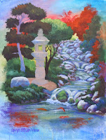
As I said earlier, I had to paint out and fix the top part of my pagoda and I like it better. I also needed to separate the pine tree from the tree behind it visually so I added a bit of a lighter green behind the pine tree and I also put in some plants to the right of the pond that seem to be coming in from off the canvas, then the fun began.

In the water of the front pond I took my thalo blue, purple, ultramarine, some alizarin crimson and sap green and just scrubbed in some deeper, darker, richer colors and while they were still wet I took my spray bottle and spritzed the area so the paint would run like it did when we first started. I liked this so much, I waited for it to dry and did a similar thing on the sides and top even letting some of the drips run over parts of my painting. I chose similar colors to what was there and just had some fun with it. I also re-glazed part of the pond around the rocks and that is how I finished my painting.

I hope you were able to finish your paintings but if you still have some work to do, don’t be afraid to try something new. It is a bit scary but you just might like it. I will see you in class.


Sunday, May 24, 2015

Acrylics 101 – Creating Distance Using Values

As painters we have a built in problem when it comes to creating distance and depth in our paintings because we are trying to represent a 3 dimensional world on a 2 dimensional surface, this is where perspective comes in and there are a couple variations of perspective that are important to understand whenever you are drawing or painting. There is linear and atmospheric perspective.


Linear perspective means that objects need to be in proportion to the things around them depending on where they are in your painting. Look at the figure standing on the perspected lines. The lines look like they are going off into the distance while the figure looks like a giant and one end and a child at the other then thing is, the figures are all the same size. This is an optical illusion because our brains know that as things go into the distance they become smaller, when the figure stays the same size our brains go by visual clues – the perspected lines – and obviously there is a giant walking down the street.

A “rule of thumb” whenever you are drawing your design is “as things go into the distance they become smaller, closer together, less detail, less intense in color and greyer.” The last 2 “less intense in color and greyer” are part of the next aspect of perspective and that is atmospheric perspective. Atmospheric perspective is caused by all the dust, smog and water vapor in our air, it scatters the light and certain parts of the spectrum are absorbed in the atmosphere only the blue/violet end of the spectrum survives causing things in the distance to take on a soft blue grey.


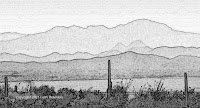
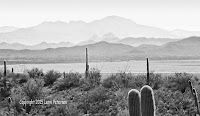
Look at the desert photos. The black and white photo shows how distant mountains almost blend into the sky and as they come forward they become darker until you get to the
foreground where you can see detail, the outlined version will help you find the different layers. The color version of the same photo shows you how those distant mountains have only soft gray colors, no detail until you get to the foreground. If you have not taken a basic drawing class you might want to take one because you will learn more about perspective and it will make a big difference in your paintings.

In the study we did in class, we created a mountain landscape but the rules will apply if it is a desert or prairie or seascape, if you want to have distance in your painting you need to follow the rule of thumb I quoted above.

I started with the sky because the sky is the furthest thing from us. Using my #10 flat bristle brush because I wanted to cover my canvas quickly, I first applied a thin coat of gesso over the whole sky area. The gesso will help me blend my colors and it doesn’t dry as fast which I want because I will be working wet into wet from this point until I get my first layer or two of mountains, so you will need to work quickly.


While the gesso is still wet, I took a little touch of yellow and red on each corner of my brush and streaked it across where my horizon will be and lightly blended it into the gesso but only going up about a quarter of the way to the sky. This is optional the horizon can be almost any color depending on time of day, location and weather; this is just for practice purposes. I quickly rinsed and dried my brush then picked up my ultramarine blue with a touch of purple and sienna on the corners of my brush and applied these colors across the top of the sky area. Using a long crisscross stroke, I started blending the blue color down toward the yellow/red but stopped just short of the warmer colors, then I rinsed my brush well and dried it off, then going back into the yellow/red color and same long crisscross strokes I blended the lighter color up into the blue color using very little pressure on my brush. What I want is a soft blend so you do not see where one color stops and the other begins. Wipe your brush out often but blend the both from the lighter color to dark and dark into light. If you need to spray your painting with water so the colors will blend, hold the spray bottle out about a foot and lightly spray once or twice and be sure that you work the water into the paint or it will leave dots.

Get your sky blended as best you can and if you want to you can use your soft blending brush and VERY LIGHTLY go over the sky to soften the colors even more. 3 hairs and some air as Bob Ross would say, you barely want to skim the surface.

The next thing I did was to put in my first layer of mountains so on my palette with my #10 bristle brush I took gesso, ultramarine blue, a touch of purple and a little touch of sienna to grey the color to make a soft blue/gray that is slightly deeper than the sky. To create the top edge of my mountains (look at the desert photo again and see what a mountain top looks like), I used the whole flat edge of my brush and pulled down as I went across the canvas. This will create a soft edge and by working in the wet sky color it will further soften the edge. Don’t worry if it blends slightly with the sky that is a good thing. The body of the mountains you can scumble or use crisscross strokes to fill it in.


The next layer of mountains, while the paint is still wet from the first layer, in the same pile of paint you mixed for the first layer you want to add a bit more blue and sienna to darken it, you color should just be a shade or two darker from the first layer and it goes on exactly the same using the edge of the brush and pull down. Then let it dry when you are done.

The next layers are done wet on dry and since they are much closer you will be adding some Hooker’s green to your mix. Remember, you can do as many layers as you want or need but each layer as it comes closer not only gets a bit darker, but also starts to show color. Look at reference photos and when you are out in nature and observe when the colors start to show. For our study we only did 4 layers.


To create the closer mountain range, I wanted to suggest tops of trees in the distance so this time instead of using the whole edge of the brush, I used the brush with the corner at the top to create the ridge and the suggestion of trees using a very vertical stroke and filled in the rest of this layer with this vertical stroke.

This was basically the lesson though I did put in a few closer trees, I think we will do a lesson on how to create life-like things and pine trees will be one of them. Try to get these layers down so you understand them and have a canvas ready for trees and rocks, maybe some flowers and wooden buckets. See you in class.


Acrylics – Garden Fantasy Week 7

These last couple of weeks was for finishing up your project so you are happy with it and to fix things you may not be so happy with and I found something I was not real happy with so I changed it.


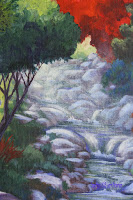
I didn’t like the rocks in the upper part of my stream because to me they seemed too hard edged for where they were I the painting but rather than painting them out and doing them over again I chose to go over them with dry brush and create a mist or haze over them like sunlight coming through the trees and this did what I needed it to do.

Using my #6 flat bristle brush, I took gesso and a little touch of yellow to tint the white and enough water to thin it down so it was just a glaze, making sure I didn’t have too much water in my brush, and starting at the tree top next tothe stream I first started with small circular scrubbing strokes and I moved away from the tree it was a combination of the circular strokes and diagonal strokes like a sunbeam coming through the trees. I went all across my stream, rocks and parts of the plants on the other side to soften what was there and create more depth in my painting. I did this about 3 times, letting it dry in between each application so I could see what it actually looked like because it looks totally different when it is wet than when it is dry. YOU DO NOT HAVE TO DO THIS only if you feel your painting needs it.

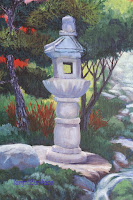
I also worked on brightening some of my highlights and I started detailing the pagoda looking for the highlight and shadow areas. Whatever color you painted your pagoda with the shadow color will be that color plus some blue and purple just don’t get it too dark because there is a lot of reflected light, the only real dark area is the shadow on the inside of the window and at the very bottom where it sits on the rock.

Unfortunately, as I was working on mine, I saw that I had a really bad distortion in the upper part of my pagoda so I needed to paint it out to get pine tree color behind and will try to get it painted back in before our next class.

Another thing I did is at the base of the pagoda and behind it I added some spikey
red/orange plants. There are some types of flax that are near that color but mostly I wanted to repeat tome of that color I have in other places in my painting.

On some of the rocks near the front of the stream I added some ground cover coming in between and over some of the rocks to soften and settle them down.


I do have some work to do to finish up my painting but at this point in time it will be your choice as to how you want to finish yours. Do the best you can and I will see you in class.

Sunday, May 17, 2015

Acrylics 101 – Apple

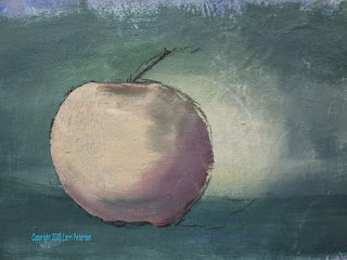
Last week we under painted our apple using the wet into wet technique with our bristle brush. We used this technique to create our background and when the background was dry, we used the wet into wet to under paint the apple and establish light and dark sides. This week we finished the apple using our flat sable brush and a dry brush technique to add color, light and dark and texture.

Some things to keep in mind when you are painting: Color is going to be effected by where it is in relation to the light source. If it is getting direct light it is going to be warmer color-wise and lighter than if it is on the shadowed side where it will be darker and cooler color-wise.


Color “temperature” is a logical concept. What colors do you associate with heat? What colors associate with cold or cool temperatures? You may never have thought of it before but if you were to see a painting or a photo with a lot of reds, yellows and oranges you would think warm and sunny if you saw that exact image in blues, greens and purples you would think cool or cold because you instinctively know the difference, now as an artist you will need to tap into that knowledge when you want to paint.

I will give you the basic colors mixes I used for the light side, middle and shadowed side and then concentrate on the technique. In acrylics we start in the middle of our value (light to dark) and work our way to the ends of the value scale. So the first colors I mixed were my middle tones – middle meaning the light or darkness of the color and tone meaning the color itself.

For this apple the middle tones are going to be the colors almost straight out of the tube or slightly mixed together. This will be your napthal red, orange or a combination of the two. You can also use yellow in your mid-tones but you will need to add some gesso because yellow is a very transparent color, the gesso will give it some body.

The shadowed colors start out with the same red and orange, but you will be adding blue, touches of green as you go. If you need the color darker add more blue. If you have alizarin crimson, this is a great shadow color for apples straight out of the tube in the areas just before the darkest shadows, then mix with blue for darker colors.


The highlight colors you start with the napthal, orange and yellow and add touches of gesso to it to lighten as well as adding more yellow to any of the combinations or the red, orange and white. The technique for using these colors is going to be the same on the whole of the apple but the color will change from one side of the apple to the other.

I was using a flat sable brush because it holds together a bit better than a bristle brush giving me better control, but you can use a bristle brush if that is all you have. I loaded my brush by dragging at least the lower half of the brush through the paint I was going to use, flipping it over and dragging that side through the paint to give my brush a sharp edge. Be sure that you do not have any excess water in your paint or in your brush or your paint will be too thin. Your paint should be the consistency of soft butter and your brush should not have any visible water on it. You can squeeze your brush a little to make the bristles fan out a bit before you start applying paint look for water when you do.

Key things to remember before you start: consider the shape of the object you are painting you want your brush strokes to follow the shape in this case slightly rounded or curved. Do not use a lot of pressure on your brush you just want to just glaze the surface of the canvas and it will take more than one pass to achieve your goal. Overlap your strokes so you don’t make stripes on your apple. Lastly, look where you are painting so you are picking up the correct value and tone of the area you are working in.

The curve part of the strokes may be the hardest to figure out but a good rule of thumb is to follow the curve of the side closest to your brush. The right side of the apple will curve to the right the left side will curve to the left, as you work around the apple only the area right in front will look straight up and down then will start curving the other way.


For the finishing touches I did a couple of things: I added the highlight on the apple and also a reflected light into the shadow. Reflected light is light that bounces off surfaces and into shadowed areas this color is usually a lavender/blue color and that is where I started with blue and purple and a little gesso. It is not a bright highlight like in the sunny area but a soft light just slightly lighter than the area you are painting and it will be on the underside of the apple. Just streak on a few strokes, you do not want the whole side to be lavender, just a suggestion.

In the highlight area after I cleaned my brush so I could be a clean color, I took gesso and a very tiny touch of yellow just to slightly tint the gesso so it wasn’t so white and starting in the center of my highlight I patted on the color working in a circle and wiping my brush so I was just moving what was there out from the center. By patting the paint on you create texture, you want this color to fade out into the rest of the apple. I went back a second time again starting in the center of the highlight but not going out too far from the center to keep the color bright.

I added a stem using a mix of sienna and blue to make a dark color – I’m still using the same brush by the way – and making the stem with several little strokes pulling across where I wanted the stem so I didn’t have a hard line, then I took some of the highlight color from the apple and touched the light side of the stem to create its highlight.

This is where you can stop if you want because you have covered the basics however, if you want you can try to make it look more finished as I did. And all I did was to enhance the colors that were already there. I brightened the light area behind my apple so there was more contrast between light and dark, I did switch to a bristle brush for this part because it was a lot of scrubbing and still a dry brush with some wet into wet as I went into the corners with darker shades of green with blue. I lightened the area in front of the apple on the surface it was sitting and darkened the area behind the light side of the apple again working the contrast between light and dark. And I darkened the corners, this is called a vignette it focuses the viewer into your painting. And I am done.

Finish this the best you can and next class we will start learning how to start a landscape.


Acrylics – Garden Fantasy Week 6

With only a couple weeks left in the semester, we still have a lot to do to finish up our project, we should be to the point where we are putting on the final highlights and shadows in our next class but before we can do that we need to be sure everything else is up to where we need it to be.

I needed to add the needles to my pine tree starting out with a dark green made from Hooker’s green, blue and a touch of both sienna and purple and used my #6 flat bristle brush. You can also use a flat sable brush if you want. The outside edge of the clumps of the pine tree needs to be very irregular and not hard edges. These trees are sculpted so a natural shape isn’t going to be an issue here because of the hand of man but you do need to get the soft edges so it will look like needles. You also need to remember that there are many branches within the clumps of needles that the needles grow out of so they will be going in many directions. One of the things I saw as I walked around is that some of you had the strokes for your needles radiating out from the central trunk of the tree so that all the needles looked like they were coming out of the trunk. Only certain kinds of plants and tree start from the central core and those are things like palm trees, ferns, types of flowers, bamboo, things like that but not other trees, their leaves and needles grow off of branches and twigs so they may come off at any angle. Check your painting and look at the direction of your strokes, if they all lead back to the trunk, you will need to fix it.

Also, if you have painted in your pagoda and need to put things like the pine tree behind it, do not be afraid to go over the edges of it to get the pine tree color behind it. You won’t lose very much and it will prevent “halos” around the pagoda and will make it look like the pine tree is behind it. Remember, you can always paint it back in.

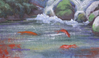
The other thing I did to my painting is to up a glaze on my water. Before I did that, I needed to put in my koi so they would look like they were under the water. Once again, many of you are putting the warts on the fleas when you are doing your fish, when all you need/want are fishy shapes. You do not need eyes, fins, tails, gills or anything else, just a general koi shape using your orange or red or dirty white with red or orange, go out and look at koi in a pond but stand back and view them from a distance. You will not see much detail, just color. Keep the fish up near the falls and not out to the edges to keep them where you want the viewer to look which is in the pagoda area. When you paint in the fish, slightly smear the color with your fingers to soften the edges. They are just shapes.

glaze was gesso with a little touch of blue to tint it and a lot of water. This is going to be one of those oxymoron type situations because you need the water to thin down the color but you will be applying the glaze using the dry brush technique so once you get your glaze mixed you will want to lightly squeeze the base of your brush with a paper towel to remove some of the excess water. Use a bigger brush like a #10 bristle brush, this will cover more area and get this done quicker.

To glaze means just that: we are not putting on a thick coat of paint, on the contrary, we are adding a very thin coat of paint so the color underneath will show through, what we are adding is the sheen to the surface of the water. We are also going to be using very parallel horizontal strokes – this is one of those exceptions. If you have a shaky hand the better because it will look like ripples in the water. Use very little pressure on your brush and pull it straight across the surface of your water area, let it dry before you do it again because you won’t know what it actually looks like until it dries. In the bigger pool with the fish, go right over the fish because they are under the water not above it.

Get you painting as far along as you can, I really do want to finish up mine in this next class. Keep painting.


Sunday, May 10, 2015

Acrylics 101 Apple Study

We are now putting together the techniques we have been learning to create an actual subject. I handed out some small apples so that you had something to look at and understand process of going from a blank canvas to the finished apple.

In most cases when you start an acrylic you start with what's in the background or what’s furthest away first because you can paint on top of acrylic. You don't need to worry about covering something up or the colors mixing so you start in the background and work forward.

I wanted a soft mottled green background to go with my red apple because green is the compliment (or opposite color on the color chart) to red and they go very well together. I first started by covering my canvas with a thin coat of gesso, the gesso is just to help the paint blend. I don't always use gesso to start a painting but I do quite often because it helps extend the time the paint is open or workable and that gives me time to blend. I was using my #10 flat bristle brush so I could work quickly and get the canvas covered.

Once I had the canvas covered with the gesso I started slightly to the right of center with yellow still using my #10 bristle brush. This is going to be my bright spot in the background to contrast with the shadowed side of the apple. My light source is coming from the front left upper side so as it travels it will hit on the right side of the canvas. You need to really look at things before you paint them including how light travels it goes in a straight line, so when you look at light coming in from a window look to see where it starts and were it hits and where the shadows are in relationship to the angle of the light.

While the gesso is still wet, I applied the yellow with my large number 10 flat bristle brush using small crisscross strokes (wet into wet blending) and I worked my way out to about 4 or 5 inch diameter. Without rinsing my brush I went into my hooker’s green and starting just outside the yellow I started to work the green into the gesso and then into the yellow. The more pressure you have on your brush the more paint you will get off so if you want to lightly blend you need to have less pressure on your brush otherwise when you blend into the yellow you will blend in too much green and lose your light spot.

I continued around the yellow spot with my green working wet into wet and I went out almost to the corners with the green when I got near the corners I picked up some ultramarine blue along with the hooker’s green then starting in the corners I blended those colors into the green already on my canvas. Remember you need to work quickly so that your paint does not dry out this is wet into wet blending, you can't take a half an hour to do this because the paint will dry and you will not be able to blend using the wet into wet technique. Always use crisscross strokes either little short ones or long flat ones but do not paint like it is a wall, brushstrokes tell your viewer a lot so be sure unless it is a specific reason you should use either crisscross strokes or a scumbling stroke to give your painting more interest.

Once I had all of my canvas covered I switched to my soft 2 inch blending brush this brush, it is very soft and feels like a blush brush, if you use it correctly you will get an almost airbrush effect with it remember pressure is everything in this one the lighter your pressure the lighter and more gradual your blending will become. I started in the lightest part of my canvas and lightly blended the colors together still using the crisscross stroke. It is better to blend from the light to the dark so your area stays light. I was barely skimming the surface of my painting as the later Bob Ross would say “Three hairs and some air”.

Before I finished with this brush and before the paint was dry I wanted to create the impression of a table top or some flat surface for my Apple to sit on, this is one of those times when you can use horizontal strokes to create the look of a flat surface so I was using just straight horizontal strokes with my blending brush with more green and blue on my brush,  I went across the bottom with horizontal strokes to create a flat looking surface then I let it dry completely.

Once your background is dry then you need to draw your apple on your canvas but before you do look at the apple note its shape its color and any other little detail before you start to draw it and especially before you start to paint it this will give you a better understanding of the apple and it will help you along as you are painting the apple.

Using either chock or your soft vine charcoal, sketch your apple onto your canvas. Be sure that you draw the apple large enough to fill the space, if you, for instance, have an 8 by 10 canvas you want to make sure that your Apple is a good 4 inches or so in diameter. Your apple is the subject not the background, so you want it big enough so that it is important in your picture. Also you do not want to center your apple, that light spot is off center for reason so when you are sketching your apple sketch it slightly off center so that at least part of it will be in front of the light spot and also be sure it is sitting on the flat surface that we painted in.

Once I had my sketch on my canvas I was ready to mix a base color for the apple and it's not red. Because the apple was a gala apple and it tends to be a green yellow apple with red streaks on it so my base color for the apple is going to be a medium yellowish color. I start with my gesso and my yellow add a little touch of Sienna and a very tiny touch of purple just to grey the color slightly. What I am looking for is an ochre color for the base color.

Note the brush strokes
You can use either a flat bristle brush or flat sable brush the sable brush may work better for you in this instance because it has more spring in it and the bristles stay together better than a bristle brush. Find size that is not too small but big enough to cover quickly, I was using my number 6 flat sable brush to show you that you can use a larger brush to fill in things quickly. Always save your small brushes for the detail work at the end.

Starting in the middle of the apple and using small crisscross strokes I applied the base color paint I have just mixed and working out towards and remembering that I'm working on a round subject so that I follow the curves of the apple. Just like when I started painting the yellow spot behind I painted the base color in in a small circle in the center of the apple and then added other colors like touches of green, orange or red into the base color as I painted.  I then mixed purple, a touch of blue and Sienna into a portion of my base color to create a shadow color. Using some of that shadow color I started just outside the base color on the apple and blended into the lighter color using very little pressure on my brush to blend the edges of the two colors together, then I wiped my brush out and picked up some more shadow color and worked out toward the edge of the shadowed side of the apple. When I got near the edge rather than trying to draw a line with my brush, for the outside edge I used the whole flat edge of the brush against the sketch line I pulled in with my color so that I didn't create a hard line of paint along the outside edge. This is important because once the paint dries if you have a little rim of paint the only way to get rid of it is to sand it so you're saving yourself some precious time and major reconstruction.

I also mixed a dark shadow color for under the apple and for the cast shadow, this color was my ultramarine blue, a little touch of purple, and a little touch of Sienna to create a dark blueish shadow color, this color went on underneath the apple where it sitting on the table and to the right where is casting a shadow you will dry brush the shadow in.

Remember you need to work quickly because we are working wet into wet, so after I had the shadows on my apple I rinsed my brush well and dried it off to get all excess water out of the brush before I went back to my base color and added a little more white and started on the sunny side of the apple. Do the edge the same way as you did in the shadowed side by pulling in using the very end of your brush and working around the curve of the apple use crisscross strokes in the body of the apple but pulled in when you're around an edge and fill in the rest of your apple. At the top of the apple where the stem comes out, there is a shadow for the indent so you can put that in as well. Don't be afraid to pick up a little green while you're mixing on your apple or a little orange or a little blue this will give texture to your apple and make it look much more natural, the key word here is little.


Try to get your painting to this point. Don't be afraid to try this on your own with other fruit or cups so you can practice the wet into wet blending technique. We will continue working on the apple we started in our next class, unfortunately, the apples are gone so if you want to bring your own apple feel free. Keep painting and I will see you in class.

Acrylics Garden Fantasy Week 5

I have a couple of weeks’ worth of notes to give you so the first thing you need to know is that the previous week I filled in the pagoda and I started the highlighting process ofthe rocks I also worked a bit more on the ground cover and water.

The pagoda is a rather warm tone so I started with my gesso, yellow, a little touch of Sienna and some purple to gray the color. You want a warm ocher gray color for the bass tone of the pagoda you can pick up touches of blue and purple and mix in with it as you paint but don't mix to completely leave dark areas you can add touches of orange or red to it as well let those colors show it will make the rock look more natural. Look at your reference photo and you will see that the pagoda has both rounded surfaces and flat surfaces so watch how your brush strokes are going on in those different areas.


To start the highlighting process of the rocks you want to mix a soft gray color, this is going to be gesso, ultramarine blue, a touch of Sienna and purple but it will be lighter then what you already have so add white in it you want a light bluish grey for now we will get to the final highlights later. Look at how I started the highlighting process of my rocks. Rocks are a random type of thing and you need to think less like a human and more like a rock when painting rocks. I know that sounds silly but if you don't you'll end up with a herd of turtles: everything the same size, the same shape, the same everything. Rocks are not like that so you will have to make a conscious effort to vary the shape and size as you are creating your rocks don't be afraid to create little rocks from your big rocks it will make it look a lot more natural.

You may also want to have a dark color for the darker shadows of the rocks. You mix that color by using the three previous colors less the gesso, this is in case you need to add some shadows between or under rocks, this is what I did the following week to create some darker shadows in my rocks, in between the rocks, behind rocks  and under the rocks, there just a lot of places where you will need have some darker shadows.

What I did the following week was start adding some of my lighter highlights to my rocks I didn't add them to all of my rocks because some of those rocks are in shadows of the trees so they won't have bright highlights,  just select a few especially the ones in the foreground and in selected places going up the stream where there may be a break in the trees above them and the high lights are brighter. Your highlight color is going to be white with a touch orange to tint the white and a little bit of that mud color from the previous highlight you put on the rocks just to slightly gray the color it should be much lighter this only goes on in selected areas and only on the top where the Sun will be hitting directly it does not cover up everything else that you just did just little hints along top edges or where the Sun may be hitting it directly. You can use a small sable brush like a #4 to do these highlights.


I also used that light gray color I used as the mid tones of the rocks to base in the trunk of the pine tree it should be a bluish gray color about the same value as that first highlight you put on the rocks.

One of the things I did in the last class session was to make that one tree directly behind the pagoda extend a little bit out over the stream I didn't like the shape of it and I wanted it to be a little more over the stream and covering up some of that light area in the very back so I did make some changes using the same colors that I had when I made the tree before which started with my hookers green with some blue little touch of purple and as I went up to the top, I use sap green and then finally sap green and yellow for the highlight working wet into wet.

Also on the right side of my painting I added in some more suggestion of some bushes or trees along that side of the stream using reds and oranges along with my green I also worked in my ground cover in between a lot of my rocks to settle my rocks down and create more interest. Remember that ground cover will hide behind rock and then pop up at some other point so don't try to create little fingers all the way down the cracks of the rocks make it pop out and look more natural that is the goal here.

I also suggested that there was some moss growing on some of the rocks that were either in the stream or right next to the stream I just use little touches of sap green with yellow for the brighter suggestion of moss, a little bit of the hooker’s green for the most it might be in the shadows, just dry brush it on to the rocks and smooth it out with your fingers so that it doesn't have any start or stop to it. Other than that I didn't have many in class so I didn't work a whole lot on making this more complete I didn't want to get too far ahead of everybody so we will continue from there and maybe finish this up, not making any promises but we are getting close. Until next time keep painting and I will see you in class.