Perspective:Vanishing Point and Atmospheric
It
you want to be a better painter learning and understanding perspective and
composition is a must. It doesn’t matter if you are an impressionistic painter
or a realist, knowing how to suggest a third dimension to your paintings will
bring them to a new level. It doesn’t matter what medium you are using or even
if you are using color, perspective is as important in close-up still life as
it is in a landscape.
There
are 2 kinds of perspective: The visualperspective we are most familiar with that involves a horizon and a
vanishing point, and then there is atmosphericperspective which usually isn’t covered in basic art classes but it is just
as important as learning about the vanishing point, maybe more so if you want
to do mostly landscapes. Atmospheric perspective involves what is going on in
the atmosphere between the foreground and the distant background. Even on a
very clear day there will be dust particles and water vapor in the air and any
more you will have pollutants as well, all these things in the air scatter and
absorb the light that has bounced off objects in the distance until only the
blue/purple end of the light spectrum is left, more of that in a minute, first
I’ll go over visual perspective.
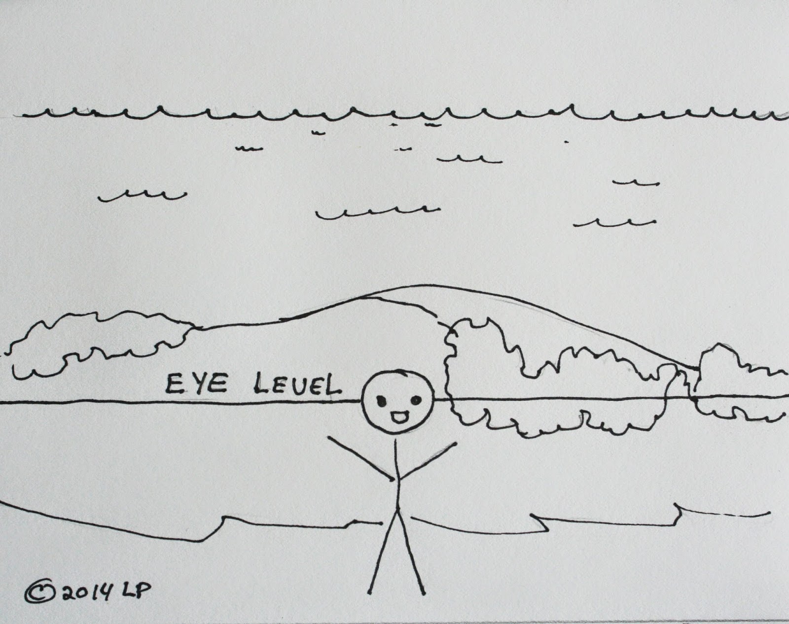
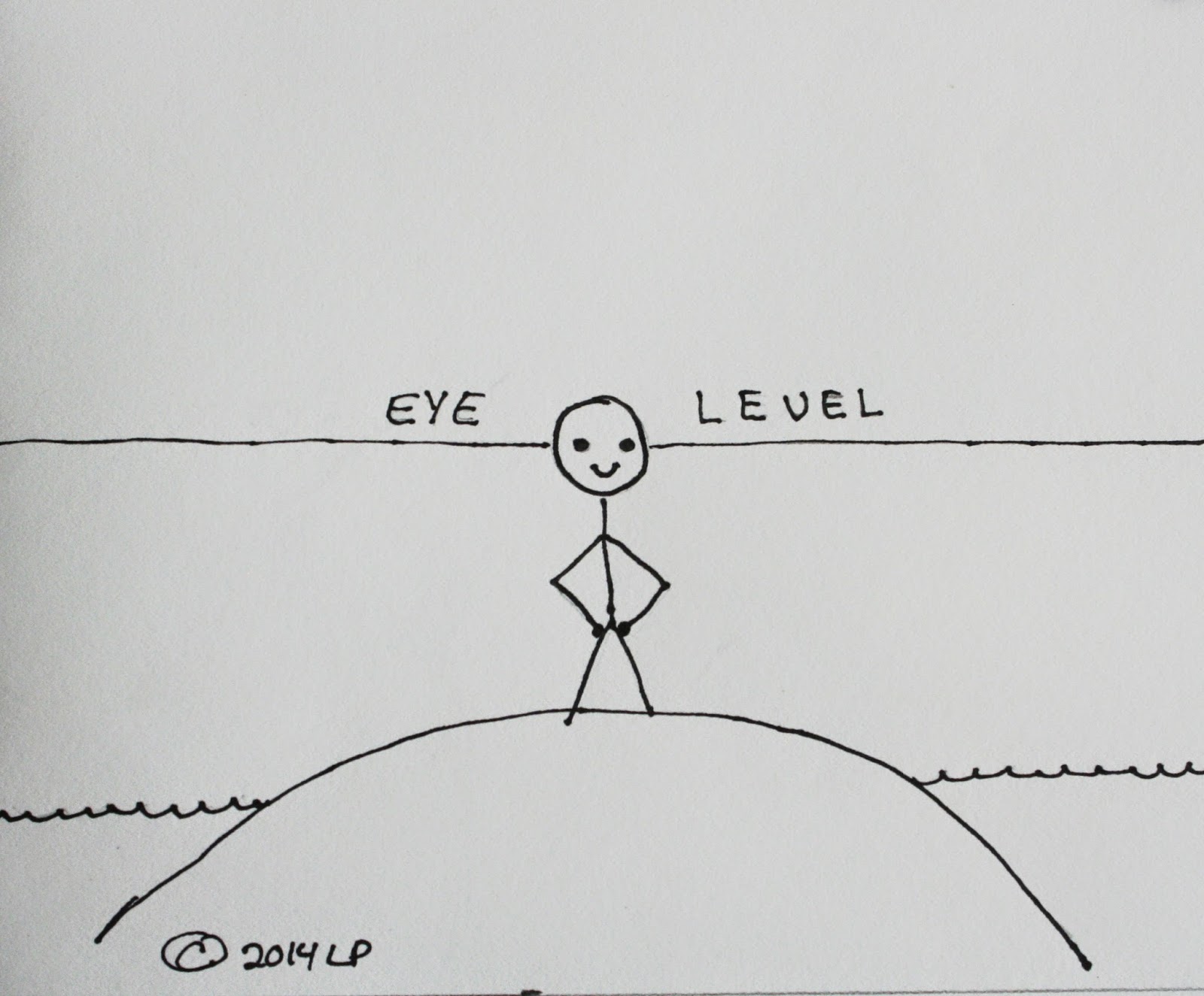 From
basic art classes, even in grade school, you learn about the horizon line and
the vanishing point but most of the time you don’t learn how to determine the
horizon line in the first place and it is an important factor when you are
planning your drawing or painting. There will be many things to burn into your
brain for easy access and this is one of them. The horizon line is straight out
from the viewer’s eye level. For instance, if you are standing on the top of a
hill overlooking the ocean and take a photo of the scene keeping the camera
level with the eye, the level of the water will be along the lower part of your
photo. Now, doing the same thing but you are standing near the waterline of the
ocean and you took a photo looking straight out, the image will be of probably
the breakers and if there is the edge of the distant ocean, it will be near the
top of the photo. In either scenario, if there are objects which will have
perspected lines, their vanishing point will be somewhere along the eye level
horizon line NOT what looks like the obvious choice of the water level.
Remember, your eyes will lie to you especially when it comes to perspective.
A
basic problem I see – and I have been guilty of this as well – is as humans we
like to have things all neatly spaced and lined up, this is great when it comes
to a sock drawer or putting the dishes away but in art, not so much. This next
statement should go on the mental quick list: As things go into the distance,
they become smaller, closer together, less detailed and less intense in color.
We will deal with the color aspect when we get to the atmospheric part of
perspective but they all go together.
If
you have ever been on a very straight road or stood on a railroad track you
have experienced both kinds of perspective in a dramatic way. If there were
phone poles, they got smaller and closer together as they went off into the
distance until they “vanished” somewhere along the horizon, the train tracks
did the same thing and the tracks “converged” (came to a point) off in the
distance, the ties, got smaller and closer together until you couldn’t tell one
from the other. This is visual perspective and it is everywhere. It is how we
know how far something it from us, the problem, once again, is all in our head when
we try to paint or draw perspective.
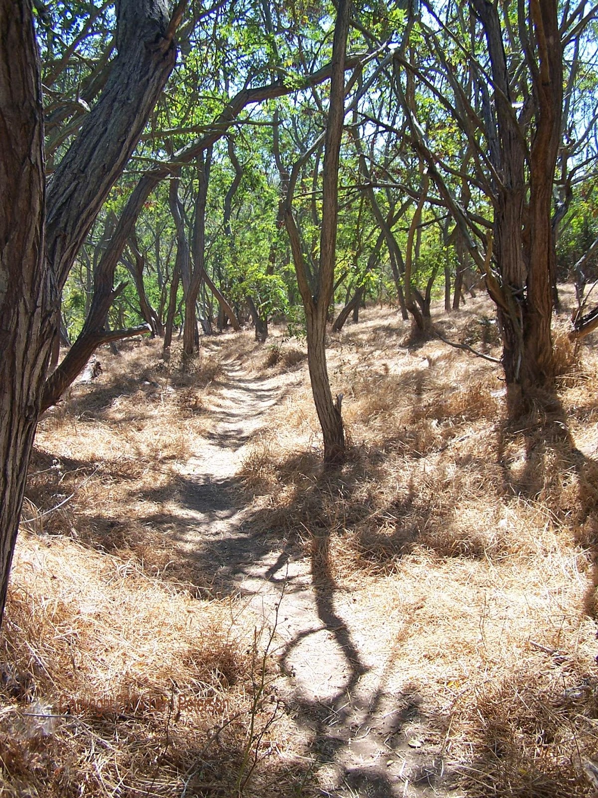 This
photo I took of the trees up in PV is a good example of what I am talking
about. All of the trees in the photo are probably roughly the same size if you
walked up to each tree in the image, maybe 30’ – 40’ tall and a couple feet
around more or less and your brain knows this. You have all seen trees before,
it is stored in your memory the problem comes when you try to draw or paint
them, more often than not, I will see students struggling because all their elements
are the same size or they are putting way too much detail or color into distant
objects because they are listening to their brain tell them “It’s a 40’ tree!”
In this photo, you can see that the closest tree goes off the page (yes, I did
plan that), the next trees you can see the base on up to the top of the photo
where they go out of the image. As you go back into the image, the trees get
smaller, they get closer together, there is less detail and they are less
intense in color. All these things give depth to the image.
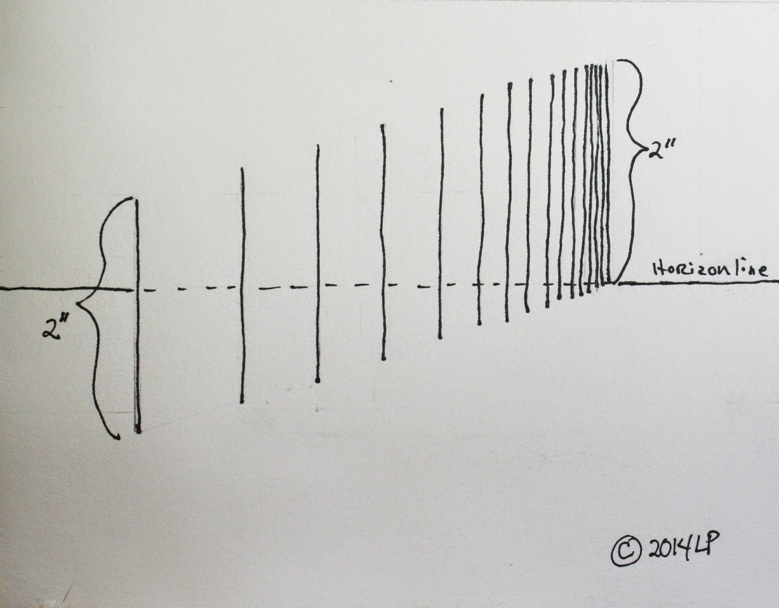
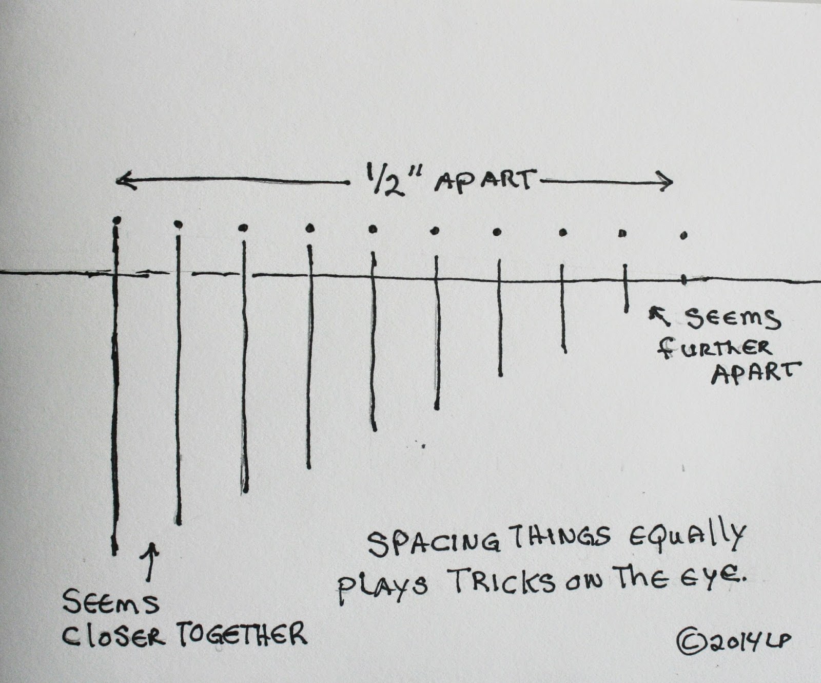 In
my first figure I drew my horizon line and my first line, then I put dots at the top ½” apart and drew the lines
getting smaller going to the horizon line. If this were a fence line or
telephone poles in a painting, it would look very odd because they are evenly
spaced. It is a trick of the eye, but the taller lines look closer together and
the smaller lines look further apart but they are all evenly space apart.
Conversely, in the next figure, by applying that things get closer together as
they go into the distance, lines of similar height look smaller in the front
and taller in the back because our brains are applying the rules of perspective
whether we are aware of it or not. The third figure is how using the rules of
perspective can create the illusion of distance on a 2 dimensional surface.
You
need to be aware of this and look for it in your everyday surroundings, the
more you see the better you will understand and the better your paintings will
become. Now we will go on to atmospheric perspective which works in conjunction
with the visual perspective to create depth in your painting.
As
I said above, there is a lot of particles in our air and it does affect how wesee things in real life. Some days there are so many particles like smog or fog
that distant things are barely visible if at all as artists, we need to figure
this element into our work to create depth. The atmosphere is the “…less detail
and less intense in color (softer and grayer)” aspect of the rule of
perspective. As light comes through the atmosphere it is scattered and absorbed
by these particles until only the blue end of the spectrum is left, it is why
the sky is blue and since the sky is usually the furthest thing in our painting
we will start there.
If
you look at a clear blue sky starting at the horizon and pan up, you will see
that near the ground the sky can be almost any color from a milky white to
pinks, light blues, browns depending on how clear the day is, time of day and
what is in the air. As you look up the sky will get bluer until it becomes a
rich, deep blue in color. The reason for this is most of the air and what’s in
it exist in a very thin layer around the earth when you are looking at the sky
near the horizon you are looking through the thickest part of the atmosphere
which could be several miles of thick atmosphere, when you look up you are only
looking through what is directly above you and the air thins out within a few
thousand feet which creates the blue sky above you but the darker color comes
from the dark of space behind that thin layer. Sorry about the science but
knowledge is power especially for the artist.
You
can do this with shades of gray to practice however, if you are using color, I
started out applying gesso to my canvas then I picked up mostly blue with a
touch of both sienna and purple – a very tiny touch of purple, it goes along
way. The sky, being the furthest thing in a painting will be lighter than earth
bound things like mountains and trees, so that is our first distant plane which
is why I used the gesso to help me blend my colors. I first streak the 3 colors
across the top of the sky areas (I’ usually do this on the canvas rather than
the palette) and with big crisscross strokes, I work the colors together down
the canvas letting it blend and get lighter with the gesso. This makes a very
simple sky. It should be a graded blue with the darker blue at the top and
blending down to a lighter blue at the bottom.
Our
next distant plane would be any mountains in a landscape. If they are very
distant, they will be about one value darker than the sky (remember the values
we did in our previous class?). You can mix this color on your palette but you
do not need to wait for the canvas to dry. Again, you will be using the same 4
colors – the blue, the sienna a tiny amount of purple and white to lighten. You
want the color to be just a value or so darker than the sky, it will be a soft
blue gray. Using the end of your brush, pull down to create the edge to your
distant mountains, you don’t want a hard edge. And keep in mind what you are
trying to paint they are distant mountains not a bunch of humps or “m’s”. The
next layer will be much the same as the first but the color will be darker so
you will add more blue, sienna and purple (please watch the purple, it is very
strong) and paint another layer of mountains. It is fine if they overlap
because that is what they do in nature.
After
a couple of layers of these “purple mountains” you can start to gradually add
color. Depending on your landscape you can add some green like distant trees or
more sienna if it is desert, the key thing here will be your values. Don’t jump
too far up the value scale, this is still distance. Do as many layers as you
want to do, each time adding more value, color and finally suggested detail.
When you are done you should see depth in your painting.
This same idea works for water and flat land as well. Rather than me doing a blow by blow descriptive of each of these two studies (one is an acrylic the other a watercolor) I would rather you look at them and figure out on your own how to accomplish the same thing for yourself. I won’t always be there to guide you so you need to learn to not just “look” at a scene but to actually “SEE” the scene whether it is a photograph, real life or even another painting, you need to figure out how to accomplish something similar when you are painting. This even works for close up still life, maybe not as dramatic, but if you can keep the things in the back softer and grayer and the things in the foreground more detailed and colorful, you can create great depth in a still life like it is popping off the canvas or paper.
I
stress again that what I am covering in the time we have is just the tip of the
ice burg, it is up to you to practice what we cover and if you want more
information it is out there usually with just a click of a mouse or a visit to
the library. Have fun and I will see you next time for composition.


No comments:
Post a Comment