Video Lessons Through YouTube
Edit: If you are new to my posts you might want to check out the side bar where you will find equipment lists for the things I use in class and the videos as well as some of my other favorite links. The YarnellSchool link is to Jerry Yarnell's website and if it weren't for him I wouldn't be teaching acrylics. He has a lot of good info on his site as well as another source for equipment.
Also, if you need more to keep yourself busy, you can scroll down through the years of posts that I have been doing for my classes, they are written posts with photos but there is a lot of information there.
You will find the links to my YouTube channel as well as the link to the video reference material and my email contact at the bottom of this post.
Also, looks like You Tube has redesigned the way the page looks and that band of videos at the top only revels 12 posts even if there are more. If you look at above the thumbnails you will see "Home Videos etc..." and if you click on the Videos you will see all of my posts.
Stay Safe. - L
_____________________________________________________
We are all painfully aware of the circumstances we all find ourselves in during this unprecedented time in our history. I know how hard it is to stay home and not get together with family and friends but it is what we need to do to keep ourselves, our families, friends, neighbors and people in general, safe, the problem is we need something to do while we are sheltering at home so we don't pull our hair out.
Many of my students contacted me asking, sometimes desperately, when we were to have classes again, my answer is: I don't know. Maybe there will be summer classes, it really depends on this virus and if we can turn the corner, the City of Torrance will let me know.
Videos were something I was thinking of doing though this is not quite the way I had planned to do them. I just wanted to do some basic techniques or studies, nothing real elaborate so I could figure out how to do them, then Covid19 reared its ugly head and my plans changed.
I have been working on lessons for all 3 mediums of my classes (watercolor, acrylic and pastel) and to say there has been a steep learning curve would be an understatement but it has kept me busy and kept my mind focused on something besides a World in a panic. I hope that you find them interesting or, at least distracting, even if they are a bit "rough" right now, I am finding my way and doing it all myself, I have no one else to blame. Like I said it has been a steep learning curve but I think I am figuring it out now so the next ones will get easier.
Since there will be a videos I won't be posting a written blog until classes start up again but there is a pause and rewind button if you need to review.
So for now, stay home, stay safe, call your neighbors and friends and keep painting, I hope to see you in class again real soon.
You Tube: http://www.youtube.com/channel/UCwdVD-1V3-xKZup98pqtpZw?feature=guide
Reference photos for videos - https://photos.app.goo.gl/hixy9rKsfzgmSzNL7
New Email - Lerrisartstudio@gmail.com
(Old one still works but its getting a lot of "junk")
Wednesday, April 15, 2020
Saturday, February 29, 2020
Winter 2020 Acrylic Class
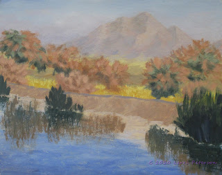
Project: Desert Refuge Final
I only had a few things left to do on my painting before calling it done, you need to decide for yourself how you want to finish you painting. As I always say: If you like your painting the way it is, leave it alone! You DO NOT have to finish it the way I do, if you like it, leave it. At least set it aside for a few days or a week then look at it with fresh eyes, if you can't find anything that jumps out at you, you are done.
 To the bank of the levee, I added some quick little grasses or weeds with my liner brush along with a few rocks which were just added with a small sable brush: A light color for highlight, and a mix of blue, alizarin and gesso to make a shadow color. Don't sweat bullets making these rocks, the are too small to be more than blotches.
I also took my #4 flat bristle brush and added some shadows from the trees down the bank. Look at the photo to see where the shadows fall and remember they must follow the contours of the thing it falls on. Study shadows when you see them, it will help you paint them later.
 I also took my liner brush and added some individual reeds to the dark shapes I had made earlier. I added light and medium colors of green and gold and even some very dark ones near the bottom.
Remember you need to add enough water into your paint so that the paint is very ink-like, that way it will flow off your brush. You might want to practice before you get to your painting.
I also added some cattails to the tops of some of the reeds with the liner or you can use a small sable. I just used burnt sienna and remember to vary the height so they aren't all in a row.

This is where I will leave my painting for this class. I could come back in and work on it if I feel I want/need to but for a project, I think I am done.
Keep painting and I will see you in class.
I only had a few things left to do on my painting before calling it done, you need to decide for yourself how you want to finish you painting. As I always say: If you like your painting the way it is, leave it alone! You DO NOT have to finish it the way I do, if you like it, leave it. At least set it aside for a few days or a week then look at it with fresh eyes, if you can't find anything that jumps out at you, you are done.

I also took my #4 flat bristle brush and added some shadows from the trees down the bank. Look at the photo to see where the shadows fall and remember they must follow the contours of the thing it falls on. Study shadows when you see them, it will help you paint them later.

Remember you need to add enough water into your paint so that the paint is very ink-like, that way it will flow off your brush. You might want to practice before you get to your painting.
I also added some cattails to the tops of some of the reeds with the liner or you can use a small sable. I just used burnt sienna and remember to vary the height so they aren't all in a row.

This is where I will leave my painting for this class. I could come back in and work on it if I feel I want/need to but for a project, I think I am done.
Keep painting and I will see you in class.
Sunday, February 16, 2020
Winter 2020 Acrylic Class
Project: Desert Refuge Week 4
 This week we fine tuned our under painting before starting on detail. I wanted to add a bit more haze to the bottom of my mountain before I got started on the trees. I used my #6 flat bristle brush and did a dry brush glaze of blue, a touch or sienna and a touch of alizarin and water to make it thin and glazed right across the bottom of the mountain. You do not have to do this if you don't want to, I just felt mine needed a little more.
Next, I made a gray in that same batch of color I just made adding more blue and sienna along with some gesso to make a light gray to add to the top of the levee, this creates the asphalt path on top of the levee. You can add this with a sable brush if you want.
 I then added some more highlights to my trees with my bristle brush. The light tan colors are sienna, a touch of orange and white the light green color is Hooker's green, a touch of sienna and/or orange and white.
Be very light with pressure on your brush when you are adding the highlights, this is a dry brush technique.
 If you have to, you can go back and add some darks. You can get carried away with highlights then lose the darks, but you do need the dark to show the light.
 Next I added detail to the dirt of the levee. Near the water, the dirt is darker because it is getting wet from the water. I started out using burnt sienna, a touch of ultramarine blue and I little gesso to make a cool gray brown. This went all along the levee next to the water.
I was using a wet into wet technique so I was working rather quickly, picking up touches of white and blending it into the darker brown as I moved up the levee with my brush as well as picking up more color from my palette and mixing touches or orange and white as I painted, this gives a variation of color and a more natural look to the dirt. near the top it is very light because the dirt is very dry. And remember to follow the angle of the dirt when you are working on the levee.
The dark color right at the waterline is blue, sienna or umber and only a very little gesso so it stays dark. This I added with a round sable brush to create the "overhang" where the water erodes the dirt. This is not a straight line, it follows the curves of the way the dirt falls from the levee and it will even be hidden in places where dirt has fallen in front of another part of the levee.
 This is where we left off in class. Please take the time off to get caught up because from this point we will be starting on the detail so we can get this finished before the end of the semester.
Keep painting and I will see you in class.
 This week we fine tuned our under painting before starting on detail. I wanted to add a bit more haze to the bottom of my mountain before I got started on the trees. I used my #6 flat bristle brush and did a dry brush glaze of blue, a touch or sienna and a touch of alizarin and water to make it thin and glazed right across the bottom of the mountain. You do not have to do this if you don't want to, I just felt mine needed a little more.
Next, I made a gray in that same batch of color I just made adding more blue and sienna along with some gesso to make a light gray to add to the top of the levee, this creates the asphalt path on top of the levee. You can add this with a sable brush if you want.

Be very light with pressure on your brush when you are adding the highlights, this is a dry brush technique.


I was using a wet into wet technique so I was working rather quickly, picking up touches of white and blending it into the darker brown as I moved up the levee with my brush as well as picking up more color from my palette and mixing touches or orange and white as I painted, this gives a variation of color and a more natural look to the dirt. near the top it is very light because the dirt is very dry. And remember to follow the angle of the dirt when you are working on the levee.
The dark color right at the waterline is blue, sienna or umber and only a very little gesso so it stays dark. This I added with a round sable brush to create the "overhang" where the water erodes the dirt. This is not a straight line, it follows the curves of the way the dirt falls from the levee and it will even be hidden in places where dirt has fallen in front of another part of the levee.

Keep painting and I will see you in class.
Saturday, February 8, 2020
Winter 2020 Acrylic Class
Project: Desert Refuge Week 3
 In our last class I started by sketching in the outside shape of my rows of trees with my soft vine charcoal to use as a guide as I paint. The charcoal will wipe off with a damp paper towel if I want to make changes.
 I under painted the trees using my #6 flat bristle brush. This will be a dry brush technique so be sure to get any excess moisture out of your brush before you start painting.
The brown color was burnt sienna, ultramarine blue and a touch of white (gesso). The green was Hooker's green, UM blue and either the mud on my brush from the brown color or a touch of the gray I have saved from last week (UM blue, burnt sienna and gesso) to gray the green.
The stroke is a scumbling stroke. What that means is your brush is going in all directions. I was mostly using the side of my brush which was very dry, and sometimes the flat part of the brush if I wanted to fill in the area quicker. Look at the photo to see where you are going with your colors and don't forget to leave ragged edges and sky holes. You can put them back in if you need to but do try to leave them first.

Both sides get the same treatment the lighter bushes in the front is just the brown with a bit more white in it.
 Adding the reeds and the reflections are similar dry brush strokes using and still using the #6 flat bristle brush.
Use the same colors as you used in the trees for the trees, the reeds are a bit darker and greener than the tree green: Hooker's, UM blue and a touch of the gray.
 When creating the above water reeds, it is a quick "flip" stroke. Place the edge of the brush on the canvas then pull and flip. The longer you pull before you flip the longer your reeds will be and don't be afraid to overlap things that will be behind the reeds, that will create depth in your painting.
The reflections are the same but you pull down instead of up and when you have the reeds reflected, lightly pull straight across to create movement.
This is where we left off and I think we now have all of our under painting finished. From here we will start to refine our painting so I hope that you can get your painting to the same point.
 Keep painting and I will see you in class.


The brown color was burnt sienna, ultramarine blue and a touch of white (gesso). The green was Hooker's green, UM blue and either the mud on my brush from the brown color or a touch of the gray I have saved from last week (UM blue, burnt sienna and gesso) to gray the green.
The stroke is a scumbling stroke. What that means is your brush is going in all directions. I was mostly using the side of my brush which was very dry, and sometimes the flat part of the brush if I wanted to fill in the area quicker. Look at the photo to see where you are going with your colors and don't forget to leave ragged edges and sky holes. You can put them back in if you need to but do try to leave them first.


Both sides get the same treatment the lighter bushes in the front is just the brown with a bit more white in it.

Use the same colors as you used in the trees for the trees, the reeds are a bit darker and greener than the tree green: Hooker's, UM blue and a touch of the gray.

The reflections are the same but you pull down instead of up and when you have the reeds reflected, lightly pull straight across to create movement.
This is where we left off and I think we now have all of our under painting finished. From here we will start to refine our painting so I hope that you can get your painting to the same point.

Saturday, February 1, 2020
Winter 2020 Acrylic Class
Project: Desert Refuge Week 2
This week we were still working on the background - the distant mountain and plains.
As I stated when I started this painting, I want to keep it soft and light which can be a challenge for a painter like me who tends to be bold and bright when it comes to color but I am always up for a challenge when painting because at the end, I feel like I have accomplished something as well as learned something along the way.
 I needed to add some shadows and highlights to the distant mountain and this proved to be more of a challenge than I expected. Colors I thought were light enough for what I wanted yet dark enough to say shadow tended to be darker than I expected even taking in the fact that acrylics dry darker. I had to modify it adding more white (gesso) but finally got the look I wanted. The colors were white (gesso), a touch of blue, a touch of alizarin, and a touch of burnt sienna so it was just a little bit darker than the color from last week. The highlight color was gesso, burnt sienna with a touch or orange and a bit of the "mud" from my brush to gray the color.
The challenge for most beginners is subtlety not only with color but also applying the color. Before you start adding either color randomly, look at what you are painting and try to understand it. All mountains and cliffs have erosion patterns that form with mostly water. Water washes dirt and rocks down the sides of the hills to form fans at the bottom and washes down the sides. If there are other ridges, the water will flow around those ridges or over cliffs, look for these patterns and the shapes them make in the mountain. They don't come just straight down. Your brush strokes need to follow the direction of the thing they are painting so watch for changes in direction. I was using a #4 flat bristle brush and applying the paint in short choppy strokes to create the terrain of the mountain for both the highlight and shadows.
 Next came the desert floor. Again a terrain change. The desert is flatter as it comes off the mountains it does have some hills and dips, for that I used the dame brush but did a series of overlapping long curves strokes.
The color in the back near the bottom of the mountain is yellow, gesso, a touch of orange and some of that mud from the mountain to gray the color.
Because everything we have been doing so far has been in the distance we need to remember that as things go into the distance they become softer and grayer in color and value (darkness) so adding a touch of some of the mud from before will mute the yellow so it isn't so bright.
 As you come forward, add touches of the shadow color if you still have some on your palette if not, little touches of blue, burnt umber and a little gesso to keep it from getting too dark, though less gesso as you come into the foreground. Let this dry.
Once this was dry I wanted to push the mountain even further back so I did a dry brush glaze using gesso a tiny touch of blue and alizarin and lots of water to make a very thin mix. Using a #10 flat bristle brush, I loaded it with this thin mix then wiped off most of it from the outside, This will be a dry brush technique so you don't want a lot of color on the brush. Start at the bottom of the mountain, very little pressure on the brush and make a series of circular strokes and work your way up the mountain even going into the sky. This is a good technique to not only push things back but also to add some atmosphere into your painting like dust and moisture. It looks a bit strange when you first apply this color but when it dries it should just leave a hazy look. If it looks way too heavy, you can wipe it off with a damp paper towel while it is still wet then try again.
 Once the glazing is dry we added the reeds behind the levee. The golden part is a mix of yellow, a touch of orange and a touch of burnt sienna and a tiny touch of gesso. Should look a bit like mustard.
I used the #4 flat bristle brush. The stroke is a combination of a pat, a push and a lift. Pat the color onto the canvas then push and lift. This will give a ragged edge to the top of the stroke like the tops of the reeds. For the lighter tops, it will be the same stroke but using gesso with a touch of the reed color to make it lighter.
The last thing we did was to under paint the levee. I used the same bristle brush with a mix of blue, umber with a touch of alizarin. Remember what I said about following the shape of the thing you are painting, the sides of this levee are at a slight angle so remember to angle your strokes as you apply your paint.

This is where we stopped for the day, try to have your painting to this point by the next class. Keep painting.
This week we were still working on the background - the distant mountain and plains.
As I stated when I started this painting, I want to keep it soft and light which can be a challenge for a painter like me who tends to be bold and bright when it comes to color but I am always up for a challenge when painting because at the end, I feel like I have accomplished something as well as learned something along the way.

The challenge for most beginners is subtlety not only with color but also applying the color. Before you start adding either color randomly, look at what you are painting and try to understand it. All mountains and cliffs have erosion patterns that form with mostly water. Water washes dirt and rocks down the sides of the hills to form fans at the bottom and washes down the sides. If there are other ridges, the water will flow around those ridges or over cliffs, look for these patterns and the shapes them make in the mountain. They don't come just straight down. Your brush strokes need to follow the direction of the thing they are painting so watch for changes in direction. I was using a #4 flat bristle brush and applying the paint in short choppy strokes to create the terrain of the mountain for both the highlight and shadows.

The color in the back near the bottom of the mountain is yellow, gesso, a touch of orange and some of that mud from the mountain to gray the color.
Because everything we have been doing so far has been in the distance we need to remember that as things go into the distance they become softer and grayer in color and value (darkness) so adding a touch of some of the mud from before will mute the yellow so it isn't so bright.

Once this was dry I wanted to push the mountain even further back so I did a dry brush glaze using gesso a tiny touch of blue and alizarin and lots of water to make a very thin mix. Using a #10 flat bristle brush, I loaded it with this thin mix then wiped off most of it from the outside, This will be a dry brush technique so you don't want a lot of color on the brush. Start at the bottom of the mountain, very little pressure on the brush and make a series of circular strokes and work your way up the mountain even going into the sky. This is a good technique to not only push things back but also to add some atmosphere into your painting like dust and moisture. It looks a bit strange when you first apply this color but when it dries it should just leave a hazy look. If it looks way too heavy, you can wipe it off with a damp paper towel while it is still wet then try again.

I used the #4 flat bristle brush. The stroke is a combination of a pat, a push and a lift. Pat the color onto the canvas then push and lift. This will give a ragged edge to the top of the stroke like the tops of the reeds. For the lighter tops, it will be the same stroke but using gesso with a touch of the reed color to make it lighter.
The last thing we did was to under paint the levee. I used the same bristle brush with a mix of blue, umber with a touch of alizarin. Remember what I said about following the shape of the thing you are painting, the sides of this levee are at a slight angle so remember to angle your strokes as you apply your paint.

This is where we stopped for the day, try to have your painting to this point by the next class. Keep painting.
Sunday, January 26, 2020
Winter 2020 Acrylic Class
Project: Desert Refuge Week 1
Surprisingly, we had all returning students this time so we were able to start the project on the first day. I did have to prepare a canvas because I left mine sitting on the floor, but that was okay, some of you don't know what to do with canvases you have with paintings you don't want and you think you have to throw them away - don't. Gesso and a little color can wipe that unwanted painting away and give you a new surface to work on.
If you have an old canvas that has a surface with a unwanted bumpy brush strokes, you can take a sanding block to it and smooth it down before you gesso over it, or leave them for the texture, your call.
I like to work on a toned canvas, many artists do. It kills that stark white of the gessoed canvas you buy and it can give an overall tone to your finished painting if you paint thin or miss some spots it isn't a bright white glaring out at you. This is an option, it is not carved in stone. If you don't want to tone your canvas - don't. This is my preference but I do like to show you options.
I use the heavy gesso (thinner gesso can be used but it may take a couple of coats) and a lima bean sized amount of yellow ocher for my 16 x 20 canvas board. No, yellow ocher is not on my list, it is one I only use occasionally, you can get a close color with cad yellow light and a touch of burnt sienna, just don't use too much of either because you want to keep this rather light. I used a #10 flat bristle to spread the gesso and color out and I was not worried about variations in color, just getting the canvas covered. Then let it dry.
While we were waiting for my canvas to dry, I went over the value of sketching and drawing. I know I go over this often but I wanted people to understand how important even a simple sketch can be.
A sketch can be nothing more than a small thumbnail with lines and shapes that allow you to figure out where things go, what you can leave out, what to put in, where are your values or you can figure out if you are going to work vertical (portrait) or horizontal (landscape) as some subjects will work better if the canvas is in a certain direction.
 It is also a good practice when you are learning, to add a grid so you can place main elements into better positions on your canvas. The grid on these example indicate the Rule of Thirds where you put importnt elements on or near third lines or in the intersections of the lines for best visual affect. If you have a grid in your camera or phone, turn it on and use it when you are taking photos, this will improve your photography as well.
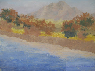
While these sketches look a bit simplistic, they are very important when designing the painting I am going to start.

When you are taking a photo, you are constrained by many things such as trying to find the right angle to take the image. In the photo I took, this was the only angle where I could get the "V" of the trees and reflections with the mountain in the back because if I moved one way, I lost what I wanted the other way I was behind a tree and if I moved forward I would get wet so I had to take the photo you see, but as an artist, I am not confined to this image. I can virtually move mountains if I want to to make for a more interesting composition. On this project, I am going to move the mountain a bit over to the right and the gap between the trees a bit to the left, this will create a visual path that will help the viewer's eye wander back into my painting, keeping them there wondering what is behind the trees. With the mountain "dead center" the eye goes straight to the mountain and stops, it has no reason to look further so I need to encourage the eye to explore my painting.
A sketch can also be the ground work for a more detailed drawing and drawing is a good thing. If you can render an image in just pencil - black and white - painting it will be a piece of cake. You get more intimate knowledge of your subject when you draw and the better you can create the shapes when drawing the better you will create them with paint. I encourage everyone to just site and draw, it is very meditative and it will make you a better painter.
Once my canvas was dry, I started with the sky. I want to keep this painting soft and light which was what attracted me to this image when I took it. There are no real dark darks in this photo and for someone like me who like the drama of light and shadow in a painting, this will be a challenge.
I was still using the #10 flat bristle brush to paint my sky using crisscross strokes. I also want this painting to be a bit more impressionistic to I am not going to try and make things perfect, I want those brush strokes. I did not worry about the mountain and painted straight across.
In my palette I mixed gesso, for the white, and added touches of ultramarine blue and a tiny mount of burnt sienna to gray the blue for my sky color. Then I started at the top, working across and down about a quarter of the way with this color. If you look at the photo, you will see that near the horizon the sky has a slight lavender color to it, so to the blue, sienna and white, I added a little alizarin crimson. I want to keep the same value as the blue, just change the color a bit.
If you feel you need to wait for this to dry, that is okay but you can start the mountain while the sky is still wet and it will help create a soft edge to your distant mountain. If your paint is still wet, you can lightly draw the edge of your mountain with to handle of your brush if you need a guide to paint, if it is dry, you can use your chalk or charcoal to sketch in the edge.
In either case - wet into wet or wet on dry - you need to create a soft edge so I use a flat brush and use the very edge to create the edge by pulling the brush down along the edge letting the bristles naturally soften the edge. In the interior of the mountain, I want to make my brush strokes follow the natural erosion paths you see in the mountain, it is not a wall so follow its shape. I used the same color I had in my palette but to it I added a touch more alizarin and sienna and just enough gesso to keep it light but only about a value darker than the sky.
The plains at the bottom of the mountain was gesso, cad yellow light and burnt sienna, same brush but this time I made long flat "X's" to suggest the flatness of the desert floor.
This is where we left off, if you need some time to catch up or review because of the time off, not to worry, I won't get you lost. Just keep painting and I will see you in class.
Surprisingly, we had all returning students this time so we were able to start the project on the first day. I did have to prepare a canvas because I left mine sitting on the floor, but that was okay, some of you don't know what to do with canvases you have with paintings you don't want and you think you have to throw them away - don't. Gesso and a little color can wipe that unwanted painting away and give you a new surface to work on.
If you have an old canvas that has a surface with a unwanted bumpy brush strokes, you can take a sanding block to it and smooth it down before you gesso over it, or leave them for the texture, your call.
I like to work on a toned canvas, many artists do. It kills that stark white of the gessoed canvas you buy and it can give an overall tone to your finished painting if you paint thin or miss some spots it isn't a bright white glaring out at you. This is an option, it is not carved in stone. If you don't want to tone your canvas - don't. This is my preference but I do like to show you options.
While we were waiting for my canvas to dry, I went over the value of sketching and drawing. I know I go over this often but I wanted people to understand how important even a simple sketch can be.
A sketch can be nothing more than a small thumbnail with lines and shapes that allow you to figure out where things go, what you can leave out, what to put in, where are your values or you can figure out if you are going to work vertical (portrait) or horizontal (landscape) as some subjects will work better if the canvas is in a certain direction.

While these sketches look a bit simplistic, they are very important when designing the painting I am going to start.

When you are taking a photo, you are constrained by many things such as trying to find the right angle to take the image. In the photo I took, this was the only angle where I could get the "V" of the trees and reflections with the mountain in the back because if I moved one way, I lost what I wanted the other way I was behind a tree and if I moved forward I would get wet so I had to take the photo you see, but as an artist, I am not confined to this image. I can virtually move mountains if I want to to make for a more interesting composition. On this project, I am going to move the mountain a bit over to the right and the gap between the trees a bit to the left, this will create a visual path that will help the viewer's eye wander back into my painting, keeping them there wondering what is behind the trees. With the mountain "dead center" the eye goes straight to the mountain and stops, it has no reason to look further so I need to encourage the eye to explore my painting.
 |
| Work in progress |
 |
| The yellow at the bottom was the color I painted the whole canvas to begin with. |
I was still using the #10 flat bristle brush to paint my sky using crisscross strokes. I also want this painting to be a bit more impressionistic to I am not going to try and make things perfect, I want those brush strokes. I did not worry about the mountain and painted straight across.
In my palette I mixed gesso, for the white, and added touches of ultramarine blue and a tiny mount of burnt sienna to gray the blue for my sky color. Then I started at the top, working across and down about a quarter of the way with this color. If you look at the photo, you will see that near the horizon the sky has a slight lavender color to it, so to the blue, sienna and white, I added a little alizarin crimson. I want to keep the same value as the blue, just change the color a bit.
If you feel you need to wait for this to dry, that is okay but you can start the mountain while the sky is still wet and it will help create a soft edge to your distant mountain. If your paint is still wet, you can lightly draw the edge of your mountain with to handle of your brush if you need a guide to paint, if it is dry, you can use your chalk or charcoal to sketch in the edge.
In either case - wet into wet or wet on dry - you need to create a soft edge so I use a flat brush and use the very edge to create the edge by pulling the brush down along the edge letting the bristles naturally soften the edge. In the interior of the mountain, I want to make my brush strokes follow the natural erosion paths you see in the mountain, it is not a wall so follow its shape. I used the same color I had in my palette but to it I added a touch more alizarin and sienna and just enough gesso to keep it light but only about a value darker than the sky.
The plains at the bottom of the mountain was gesso, cad yellow light and burnt sienna, same brush but this time I made long flat "X's" to suggest the flatness of the desert floor.
This is where we left off, if you need some time to catch up or review because of the time off, not to worry, I won't get you lost. Just keep painting and I will see you in class.
Saturday, October 26, 2019
Fall 2019 Acrylic Class
Project: Alaskan Fishing Village Week 6
This is the last post for this project. We (I) finished the painting with all the necessary things then some added in some of the decorations to make the painting more to our individual liking. I will go over both.
 Along the shore I pulled up some grasses using my #6 flat bristle brush. I used several shades of green using the sap green and adding yellow to make it lighter or a little orange to soften the color or a little blue to darken. I also used some orange and yellow with out the green. Grass is not just one color, it has many colors in it if you look closely to it and adding these colors makes your grass look more realistic.
The technique is a dry brush technique so after loading your brush with used your paper towel to squeeze by the metal ferrule to not only soak up some of the excess water in your brush but also to spread the bristles of your brush. Place the end of the brush where you want to start a clump of grass the "flip" it up with a quick snap of the wrist. Practice this before going to your painting if you are unsure and don't forget to over lap your strokes so it looks like a very grassy slope. Don't be afraid of pulling some of the grasses over the boat or the bottom of the posts of the building, this will settle them down into your painting.
 On the other side of the painting I added a tree in front of the walkway so the straight line of the railing and walkway wouldn't take the viewer off the canvas.
I used the same brush and it is a dry brush technique but when I loaded the brush I pushed straight down into the paint to load the brush, this will force the bristles out in an irregular pattern, then, starting from the outside of the tree, I pulled in making clumps of leaves and giving the outside edge of the tree an interesting shape. It is not a Christmas tree, don't make it perfect.
First I used my Hooker's green and blue to make a dark green for the under painting and shaped my tree. Then into that same color, I added some yellow and a little touch of white to highlight the top edges of the branches doing wet into wet. the key here is not to lose all of the dark under painting - that becomes shadows and texture. Again practice on something else if you are unsure.
Don't forget to add the grasses to this side as well.
 Finally, for those who want to stop and consider the painting done, I put a glaze on the water to give it a shimmer. This is done using the 2" blending brush and a very thin glaze.
Mixing the glaze you need a little white (gesso) and a touch of blue with a lot of water, you want this to be very transparent like skim milk.
Load the blending brush with this glaze then use your paper towel to such out most of the water on your brush, this is also a dry brush technique. With very little pressure on your brush - 3 hairs and some air as the late Bob Ross might say - go straight across the water are of your painting, slightly wiggling as you go. I may take 2 or 3 passes to cover all of the area but once you have it covered, let it dry before having a heart attack. It should look milky at this point but you should still be able to see what is underneath the glaze, if the glaze you put on has obscured the reflections you may need to lightly wipe off some of the glaze but wipe it off going straight across with a slightly damp paper towel, this should be enough without having to do it over again.
When this glaze dries, it should look like a shimmer on the water just remember to use a lot of water when mixing the color and using a very light stroke when applying the color.
I also used a thicker mix of the white and blue to add some "dots and dashes" to the shoreline right where the land and water meet to make a sparkle like rocks and sticks that pile up at the waterline.
This is where you can stop if you want the following is what I did to finish my painting.
 I added the phone poles using similar colors I used in the house, a light gray for some of the fixtures on the poles and the wires and and even lighter gray for the smoke.
Dry brush again with the bristle brush, using little circles around the top of the smoke stack then little circles and less pressure as I made the smoke rise and disappear into the sky. I repeated this in the water. I also added the ladder you can see in other photos above and the final image below.
This is the final post for this project, from what I heard in class everyone was having fun and learned a lot which is always my goal. Until next time Keep painting and I will see you in class.

This is the last post for this project. We (I) finished the painting with all the necessary things then some added in some of the decorations to make the painting more to our individual liking. I will go over both.

The technique is a dry brush technique so after loading your brush with used your paper towel to squeeze by the metal ferrule to not only soak up some of the excess water in your brush but also to spread the bristles of your brush. Place the end of the brush where you want to start a clump of grass the "flip" it up with a quick snap of the wrist. Practice this before going to your painting if you are unsure and don't forget to over lap your strokes so it looks like a very grassy slope. Don't be afraid of pulling some of the grasses over the boat or the bottom of the posts of the building, this will settle them down into your painting.

I used the same brush and it is a dry brush technique but when I loaded the brush I pushed straight down into the paint to load the brush, this will force the bristles out in an irregular pattern, then, starting from the outside of the tree, I pulled in making clumps of leaves and giving the outside edge of the tree an interesting shape. It is not a Christmas tree, don't make it perfect.
First I used my Hooker's green and blue to make a dark green for the under painting and shaped my tree. Then into that same color, I added some yellow and a little touch of white to highlight the top edges of the branches doing wet into wet. the key here is not to lose all of the dark under painting - that becomes shadows and texture. Again practice on something else if you are unsure.
Don't forget to add the grasses to this side as well.

Mixing the glaze you need a little white (gesso) and a touch of blue with a lot of water, you want this to be very transparent like skim milk.
Load the blending brush with this glaze then use your paper towel to such out most of the water on your brush, this is also a dry brush technique. With very little pressure on your brush - 3 hairs and some air as the late Bob Ross might say - go straight across the water are of your painting, slightly wiggling as you go. I may take 2 or 3 passes to cover all of the area but once you have it covered, let it dry before having a heart attack. It should look milky at this point but you should still be able to see what is underneath the glaze, if the glaze you put on has obscured the reflections you may need to lightly wipe off some of the glaze but wipe it off going straight across with a slightly damp paper towel, this should be enough without having to do it over again.
When this glaze dries, it should look like a shimmer on the water just remember to use a lot of water when mixing the color and using a very light stroke when applying the color.
I also used a thicker mix of the white and blue to add some "dots and dashes" to the shoreline right where the land and water meet to make a sparkle like rocks and sticks that pile up at the waterline.
This is where you can stop if you want the following is what I did to finish my painting.

Dry brush again with the bristle brush, using little circles around the top of the smoke stack then little circles and less pressure as I made the smoke rise and disappear into the sky. I repeated this in the water. I also added the ladder you can see in other photos above and the final image below.
This is the final post for this project, from what I heard in class everyone was having fun and learned a lot which is always my goal. Until next time Keep painting and I will see you in class.

Subscribe to:
Comments (Atom)
