Sunday, May 4, 2014

Spring 2014 Acrylic Class

Acrylic Class Project: From My Garden
Week 4

Our project is getting into its final stages when we refine the shapes, get the colors to the intensity we want, finish our background then, when all that is done, we start working on the finishing detail.

Your painting should be to the point where you can wipe off any charcoal or chalk; this will give you a better idea of how your painting will look. The charcoal lines have done their job but at this point can be a distraction when you are deciding what needs to be done next. You can always put some lines back in if you need them, however, by now you should be able to do without them.
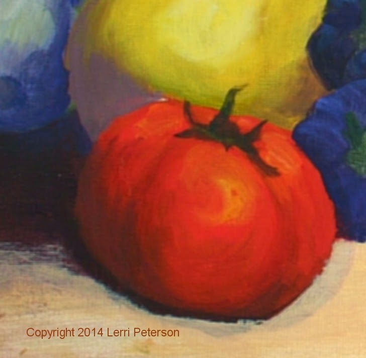
I did show how I can change something I didn’t like because I thought it was too big, without going through all the trouble of painting it out and starting over, which many of you do. I thought that my large tomato was way out of proportion to the things around it so I needed to trim it down a bit. Using my charcoal I sketched in where I thought I wanted the outside edge of my tomato, made a couple of adjustments with the charcoal to get the tomato the size I wanted then went back in to the areas that needed to be painted out with a color that was similar to what it was going to become, for instance: Some of the tomato I needed to erase was going to become part of the zucchini behind it. I took my #4 flat bristle brush mixed yellow, white (gesso) and a touch of purple to match the color that was already there and painted the part of the tomato that was too big to  match. Was it a perfect match? Probably not, but it doesn’t matter, I still had some work to do on the zucch so it was close enough.

When you paint something out with gesso the problem becomes not only matching thecolors you had but also just painting the part you gessoed out, the key to “fixing” anything on your painting is to not only paint the area you want to change with the color you want it to be, but work the new color into the surrounding areas to make any slight change of color or value look like it belongs there. Dry brush the color to blend areas and no one will ever know unless you point them out. The old Masters did a lot of corrections on their paintings before they called it good and people didn’t know until scientists x-rayed them and found different versions as well as corrections, so don’t worry about things that need to be fixed or changed, you are in good company, you just don’t ned to start over in an area, just go with what’s there.
I like dramatic light, if you want a lighter look to you painting or want to put in some other kind of background, you do not have to make your background with as much contrast as I have in mine but now is the time to be sure that your background is where you need it because from here out we will be finishing up the veggies and you don’t want to make things harder for yourself if you have to paint around things.

You will be working to get shadows on your veggies, the light is coming from the front upper right as if there is a window opposite the veggies and the sun is coming in. The things with the brightest highlights will be the yellow zucchini, peppers, big tomato, to a lesser extent the tops of the melon, pumpkin and the tops of the garlic. Everything else will have highlights but they won’t be as intense as the aforementioned elements.
I can write pages and pages on how the light is falling on each thing in our painting but unless you can see this for yourself, my words will be wasted. If you can set something up in your own house, find a window that has light  coming through it, put some things on a table where you have a “sun spot”, it doesn’t even need to be veggies, just things with different shapes, turn off the interior lights and look at how the light plays on the objects. Find the brightest highlights, the darkest shadows, note the colors in the light and away from the light but not necessarily in the darkest shadows. Take a photo of the scene for reference so you can try to understand this play of light: Where does it come from? Where does it fall? Where are my shadows? You will find sun spots everywhere if you just look. As I have said in the past, the more observant you become the better an artist you will become.

That said, there are a few things to be aware of as you are getting ready to finish this painting. First, even though we think of tomatoes as red, there is a lot of orange in the color. If you get the color too red or crimson the tomatoes will look like apples or cherries and when you are making the highlight areas of your tomato, lighten the color with yellow and/or orange because white will make the color pink.

Be sure to have all the stems in place and when you are doing your shadows use blues and purples in your color. In areas where one veggie is in front of or goes behind another, there is a cast shadow that is very dark and where you have dark, you can add a bit of light in front of it to separate the veggies.

Do as much as you can, I will probably finish up my painting this next class so you might want to start looking for your own project to start working on but if you need more time to finish this one, don’t rush we still have 4 weeks before the end of the semester. See you all in class.


Saturday, April 26, 2014

Acrylic Project: From My Garden
Week 3

By this time you should have your background done and veggies based in. Some of you have created your own designs with different fruit or vegetables you will have to get your own reference as far as color and highlights just keep in mind that the light is coming from the front, upper right hand side as if there was a window opposite from the set up illuminating the veggies.

Once you have things based in you can start bringing shape and life to your veggies with more color and shading. This is not the final shading so please do not try to finish as you go, you want to try and keep all of your painting to the same degree of effort throughout the painting process so you don’t overwork one area and under work other areas, so move around your painting and you will like the results much better.

All of the veggies have a base color such as orange or yellow or green, this will be where you start with your color and to that you will add color to darken and slightly gray the colors for now, like I said, this is not the finished painting, we still have some work to do to establish our values.

To gray a color or to create a shadow or form shadow color, you will need to add a form of the colors compliment color. For those of you who are unfamiliar with the color wheel there are 3 primary colors: Blue, yellow and red and they are on the thirds of the wheel. If you mix equal parts midway between each of the primary colors you get secondary colors: Green, orange and purple. Green is between blue and yellow, orange is between red and yellow and purple is between blue and red, these secondary colors are directly across from a primary color: Red – Green, Blue – Orange, Yellow – Purple. This is the simple version, there are whole courses on color and color theory and volumes of books if you want to know more, but for our purposes this is what you need to remember. So when I say to create a shadow color or a grayed color, what I mean is to add its compliment or some form of its compliment.

Most of you don’t have any trouble mixing mud, it is very easy to do your color just needs to have all 3 primary colors present and they cancel each other out creating a muddy gray color, usually not the color we want. The way to create a softer grayer color is to start out with the color
you want – say green – to gray the color you will need to add red or something with red in it like sienna or purple, depending on what you need. The red or sienna, which is in the orange family, or orange these will gray the color but not change its value too much (values is the lightness or darkness of a color), purple will not only change the color but can change the value to a darker form of green. Conversely, if you are working with red, you will add some form of green to gray the color.

The key to color mixing, especially when you are learning, is to sneak up on the color you want. Some colors like sienna and purple or pthalo blue or pthalo green are very potent colors and little amounts go a very long way, for instance if you were trying to add purple to gray the yellow for the zucchini you would NOT want to mix them in equal amounts or you would get a grayed purple, even 10 yellow to 1 purple may be too much but it is a much better place to start than 1:1.

I’m not going to give a stroke by stroke description for each element in the painting, you will have to look at what your are painting and mix paint accordingly but do keep in mind that where
the shadows are. I was using a synthetic sable flat brush because it gives me more control, I started in the shadowed areas with a darker color and on some of the veggies they have grooves where they are darker in the recesses, then as I worked up to lighter areas, I added the lighter version of the color I was using and in some cases just a little gesso to lighten. I am nowhere near the highlights so this is just to create the form. My brush strokes followed the shape of the object and all of these things are rounded so watch your strokes.

The last thing I did was I darkened the background corners even more. This is a personal choice, I like dramatic light, however, if you don’t want it as dark, you do not have to make it as dark as mine. Finishing up a project is always up to you to fit your needs and your likes, I just show you how I finish a project like this to show you one option in an infinite world of options, you will make your own choices.


There is a possibility we/I could finish this project in our next class or possibly the following class, in either case we are getting close to the finish line so you may want to start looking around for something you want to work on for the rest of the semester and I have help you get started. See you all in class.


Friday, April 18, 2014

Acrylic Class Project : From My Garden
Week 2

Once you have your background in you may sketch in the veggies or whatever you have decided to paint. For now we have stopped working on the background but that is not to say we are finished with it, as your painting progresses you may or may not want to go back in and “fine tune” the background as needed.

I am not going to go with a blow by blow narrative of every veggie on there because besides the color, everything will be pretty much the same for each thing you paint, I will point out the things you need to keep in mind.

First off your brush, the size of your brush will depend on the size of your canvas. I was using my #6 flat bristle brush and was working on a 16 x 20 canvas, however, if you are working on a smaller canvas you might want to go to a #4 flat bristle, the general rule of brushes especially when you are just basing in your painting is to use the largest brush you can comfortable use for the size canvas you are working on. At this stage you want to cover things quickly and without too much fussing, so put away the smaller brushes and save your sable brushes for later and get out the bristle brushes and find one at a size that will cover quickly.

Next your paint. I am still seeing some of you put out just the paint you think you might need, then you struggle to mix your paint because the paint you need isn’t on your palette and you try to find an alternative but it doesn’t exist because the colors just aren’t there. If you can’t find meat tray, get some cheap plastic plates at the $.99 store and a plastic bag to store them in and put ALL your paints out! There are many times when I will add almost every color on my palette just to change the “flavor” of something so I don’t have just one boring color and in this case, every color will be used at some point when painting the veggies because they run from purple on through red with every color in between, so put out your paint. If you keep it moist and sealed in between uses it will stay good for weeks.

Watch the water you add to your paint. Your paint should be the consistency of soft butter to go on smoothly, if it is too thick, it is as much a problem then if it is too thin, you just use a bit more. If your paint is too thin, it won’t cover well, it will run it will cause you problems galore! Get into the habit when you rinse your brush that you dry it out completely. If you need to add a bit of moisture to your paint, look on your palette for drops of water or get it from another wet brush before you dip the brush you are working with into the glass of water. It takes very little water to get the results you need so it is better to sneak up on it than having to add more paint to thicken up paint that is too wet.


Keep in mind your brush strokes when you are painting. Everything in this painting is basically round, some have multiple curves, your brush strokes need to follow the curves of each thing you paint. This is not a wall, nothing is flat, you need to follow the shapes you are painting. Watch the outside edges of things as well so you don’t have hard edges with ridges of paint, these are very hard to get rid of without the use of sandpaper. It is better to use the end of your brush and pull in to form the edges than to try and do the whole edge in one fell swoop of the brush. On the insides of the shapes, you can use a scumbling stroke which simply means your brush can go in all direction, just not all in one direction.

The color of the veggies to start will be basically the middle tone of each veggie. In acrylic, we start with a medium dark and work to the dark and the light areas. It will look pretty bad when you get this stage done so don’t be discouraged. This is what I call the “terminal ugly” stage when you think there is no hope to salvage the painting but in reality, it is a good under painting.

You can start almost anywhere but I do like to start in the back and work forward so I will start with the pumpkin in the behind the yellow zucchini:

Note: I will be working in the same pile of paint and just adding or adjusting the color as I move from shape to shape I also did not wash or rinse my brush until noted.

Pumpkin – Orange with a touch of red and green for a burnt orange color.
Table queen squash – to the above color add some yellow and a touch more green.
Yellow onion – I added some burnt sienna and a tiny touch of purple to the color.
Cantaloupe – Added back in some more green and yellow with a touch of blue
Green Zucchs – added more hooker’s green and blue for a muddled green color

Purple peppers – I did rinse out my brush well and dried it off before I changed to this new color.

I mixed purple with either the ultramarine blue or if you have cobalt that will work as well.
Garlic – to the purple mix I added a touch of white (gesso) and a little of the orangish color from before to give me a soft grayed lavender color.

Rinse out your brush completely for the tomatoes and be sure to dry your brush well.

Using either the cad red (if you have it) or the napthol red, add some extra orange and a touch of either green to slightly darken and gray the color.

The cherry tomatoes can be easily done by loading your brush with paint, put the whole brush on the canvas with one corner at the center of the tomato, then pivot the rest of the brush around the centered corner. Be sure to overlap the small tomatoes, they will look more natural if you do.

I did not put the stems in yet, I will do that probably next class but I did add the green sprouts coming off the yellow onion with a bit of Hooker’s green and a bit of blue.

If you are painting other veggies or fruit, look for a middle valued tone  and that will be what you use to under paint your painting.

Good luck, I will see you all next week.


Sunday, April 13, 2014

SPRING 2014 ACARYLIC CLASS
Week 1: Project – From My Garden

For my new students and for my returning students who forget, the best way to start an acrylic painting is from what is behind the subject and move forward so for this painting the background and the table the veggies sit on are behind everything that is where we start.

At this point in time you really don’t need to do any drawing other than maybe a horizon line about a third of the way up from the bottom and that is only to let you know when to change from background color to table colors. When we are done, our whole canvas will be covered. This will prevent the “cut and paste” look that can happen when you try to avoid painting where things are in your painting, this can be done even in oils where the oil paint scraped away where things will go or wait for it to get tacky, with acrylics, we just let it dry and then paint right over it. It creates a much smoother, coherent background.

This is the watercolor version

We haven’t used our blending brush too often though this is a great place to use it. The blending brush is the big, soft bristled brush we use to create almost airbrush-like backgrounds and is perfect for this background. However, I know that many of you have not found a blending brush yet so not to worry, you can use the largest bristle brush you have and while it may not be as smooth as using a blending brush, you can get a very nice “painterly” background following the same steps, and/or you can start off with the bristle brush then soften the brush marks with the blending brush, it all depends on what equipment you have or what look you are going for.

The background color here can be any color you want or need it to be, I just used green because everyone seemed to like the green version I did in watercolor but if you have an area where you think you might like to hang this when you finish or if you want to give it to a friend who has a certain color in their home, you can modify the color to fit your needs, the technique will be the same, the colors will very.

I will warn you now that you need to work quickly once you start because all of the following narrative only covers about 5 minutes worth of time, otherwise, the paint dries and it becomes a different technique.

The first thing I did was to wet my canvas. This will help the paint go on easier and will give you a bit more blending time. Keep your spray bottle handy just in case you need a bit more water to finish your blending. Next, IN THE AREA THAT WILL BE THE LIGHTEST I applied gesso to that area and just a bit beyond. The gesso will help make the area light as well as help blending but I don’t want it in the dark areas because it will make them too light then you will have to go back over with darker colors when this layer has dried. It isn’t a problem to fix, it just makes another step.

I start in the gessoed background area with yellow or a touch of the color you want to use, and blend it out from the center using crisscross strokes – big “x’s” – or scumbling, which is going every which direction with your brush whether you are using a bristle brush or a blender. The worst thing you can do here is to paint it like a wall with flat strokes, mix it up, put some life into it. This color should go down into the table area.

You don’t need to rinse your brush yet, just pick up a bit of sap or Hooker’s green or whatever color you are choosing , start on the outside of the light area and work your way in towards the center, blending and lightening the pressure on your brush as you get closer to the center. This is the tricky part because most of you over blend because you are either going over it too much or using too much pressure or both, you goal is to make a nice graded transition from the darker outside to a lighter inside so you don’t see where one starts and the other ends. This takes practice and trust in yourself. If you get the center too dark, wipe out your brush, pick up some gesso and start in the center and blend out to make it lighter. Everything can be fixed so don’t panic, just do your best.

Now rinse your brush out really good because you will want to get out all the white gesso. Be sure that you dry it completely so you don’t have any excess water in your brush or it will thin your paint too much.

I usually double or triple load my brush when I am doing this and you may want to as well, even if it seems a bit scary at first, it gives a much more interesting background when you blend colors on your canvas. for my painting I picked up Hooker’s green, a touch of blue and purple, if you are using a different color scheme, you will want to use the darkest version of the color you have and add blue and/or purple, then start in the corners away from the light area blending the color just up to the light area but not going into it yet, you want to get all the darker areas painted in first, then rinse your brush out good and dry it.

Starting at the edge of the lighter area, using crisscross strokes and a very light touch (no pressure on your brush) start blending into the dark area. Wipe off your brush often especially when you go back into the light area. You want a gradual transition of color but in the process you don’t want your light area to become dark or your dark area to become too light. Practice make perfect, this will come in time.

You will do a similar thing where the table will be but you will use some different colors. Once again, if you want it to be a table cloth instead of a wooden table, the choice is yours, I’m doing the wood because I like wood.

It has taken you longer to read all this than it should take you to get to this point, if your light area is a bit tacky lightly spritz the area with water then quickly blend it in. Depending on what you decide to make this area, you might want to add a bit of yellow or warm color into the light area to add a bit of sunlight, rinse your brush and starting on the outside edges of the table area and this time using long flat crisscross strokes (this CAN be painted like a wall) start in the dark area and blend across until you get to the light area and do just what you did above when blending the 2 areas together. I was using sienna and purple in the corner adding sienna as I got closer to the light area.

This will come easier each time you do this. If it is not perfect this time, don’t worry, mine isn’t either but I’m not worried about it. I know I am going to have things in front of it so no one will notice anyway. This is a great background technique for many things beyond still life such as portraits or when you want a vignette, even starting a landscape, I can see in mine coming out from a dark forest into a light meadow, the possibilities are limited only to your imagination. It is a good thing to learn.

For next class, if you can draw your veggies on with your charcoal or chalk that would be a good thing, be sure that you fill the canvas with the subject, if you have problems, wait for class and I will help you, I want to see your drawing before you start painting because I have been seeing a lot of 8 x 10 drawings on a 16 x 20 canvas. See you soon.


Thursday, March 13, 2014

ACRYLIC WINTER 2014 CLASS

Acrylic Project: Arizona Color
Week 6


At this point in your painting it is all about finishing up. We have built the house, put in the plumbing and wiring, painted the walls and now we are adding the furniture and the decorations. Furniture is the necessary things like bushes and rocks and highlights that give a sense of time and place to our painting, how much you put in is up to you the artist, the decorations are the amount of detail you want to put in whether it is more rocks, or detail in the rocks and trees or dead grass or whatever you want to add to your painting, in both cases it can quickly go from just right to clutter if you add too much of either. Remember, if you are looking for areas to work on and are having trouble picking the spot, you are probably done. Set you painting aside and don’t look at it for a few days then look at it with new eyes. If you can’t see anything that jumps right out at you, you are probably done.

We did a lot of work on rocks in class and one of the things I am still seeing is most of you are being to particular when painting rocks. It is a challenge for me to try and explain how to do rocks that don’t look like turtles or paver stones because random is hard to explain. Rocks in their natural state are vary random in size shape and placement especially when water is involved because the water not only shapes the rocks, but it also moves them and piles them up. The best advice I can give is to move quickly through your painting. Think more of size and shape and where you are visually in your painting (foreground, background, water or land) and make random series of marks. Overlap some of the marks or make a few singles or connections between groups, you can define the individual rocks with your highlights and shadows. You can take one generic shape and create a pile of rocks with just a few brushstrokes of highlight color. This takes practice! I cannot stress this enough, you need to find an old canvas and practice painting rocks or get a piece of paper and pencil and practice drawing rocks and by all means, take photos of rocks or cut them out of magazines to use as reference when you are practicing.

I mention Jerry Yarnell quite often because he is a good teacher and he does amazing rocks. You can look him up on the Internet or find him on PBS (KVCR and the Create network have
good art shows) and just watch what he does. The camera gets in close so you can see his brush strokes, something I just don’t have access to in class. The more you can see how it is done, the better you will understand it when you practice. Rocks aren’t as difficult as most of you make them and if you are going to be a landscape painter you will need to learn to paint rocks.

When you highlight your rocks remember where the sun is coming from: The right hand side. Don’t bring your highlight color (white a touch or yellow and orange with a bit of mud from your brush or palette) all the way around your rocks. This color can also be used to highlight the trunks of your trees, I used a #4 flat sable and by using the very edge of the brush, I made a series of short choppy marks along the edge of the trunks, leaving some of the dark under painting for shadows and texture.
 
Another thing I did was to add some reflected highlights into the shadows of the tree trunks and some of the rocks. In our atmosphere, light is scattered and will bounce around especially if there are reflective surfaces like water around, but light will also bounce off the ground, walls, rocks and anything else and to add some reflected light into your shadows makes them look more three dimensional. Shadows are cool so you will use your purple and blue and a touch of white to lighten it enough so it will show in the shadow. This is not a bright highlight, it is reflected light, it should only be a shade or two lighter than the dark shadow and you just need to add it to the larger things like the tree trunks or large rocks.


Our next class will be our last class and I think I will have to have one more demo on this painting then it will be up to you to finish it up on your own. Remember to get registered for the next semester as soon as you can so you don’t miss out on our next project. Keep painting and I will see you soon.

Saturday, March 8, 2014

WINTER 2014 ACRYLIC CLASS

ACRYLIC CLASS PROJECT: Az. Color
Week 5

The last class we started working on some of the finishing details that will make the water look wet, give the leaves trunks and branches to support them so we can finish this up maybe next week.

I made a larger section of the water and bank so it would be easier to see during the demo. In the painting things are so small and people tend to stand at the back of the room, it makes it hard to see what I am doing. Practicing elements of your painting is a good thing when you are learning because you can make them big enough to see what you is happening on your canvas so if you are having problems with the water, you might want to just do a section of the water and rocks like I did and it will help you.


Remember how we put in some rock shapes before we started adding the reflections? Well for most of you your rocks may have disappeared or are barely visible, which in some cases may be a good thing because now you have a chance to correct any rocks you didn’t like. To make the reflections look like reflections and the water to look clear, we need to see the rocks under the water, to do that we are going to mix some grayed colors that are a bit lighter than the water is now. These can and should be any color you have: yellows, oranges, reds, greens, blues and purples and scatter the colors liberally around in your water, If you can see the previous rock shapes, use the color as a highlight color, if you can’t see the rocks from earlier, just put them in. Please do not try to avoid the reflections you actually want these rocks to show in the reflection areas because the more they do show, the better your reflections will look.

Be careful of creating distinguishable patterns with your rocks, change the size, shape and color as you move around through the water area. You don’t need as many in the water that is furthest away from you but have most of them in the water that is closer to the viewer. I was using my #4 round sable for this step, BTW.

If you want to have some of the rocks stick up out of the water, mix a dark color – sienna, blue and purple is a good standard – and just create some dark shapes in the water in random places. There might naturally be more rocks around the banks of the river or embedded into the sandbars but don’t be afraid to put some in the middle of the water. We will highlight later.

The next thing we did was add the tree trunks and branches to our trees. If you have not been
using your liner brush, I strongly suggest that before your attempt this on your painting that you practice it on a scrap canvas or paper or something you don’t care about because this brush is a bit tricky if you don’t know how it works. The first thing you need to learn is how to get the correct consistency for your paint, it needs to be like ink with enough water so it will run but not so much that it won’t cover. If you tilt you palette, it should move slowly like warm syrup.

When you get the right mix of water and paint, get ALL  of the bristles down in the paint all the way up to the metal ferrule to get the paint into the entire length of the bristles, then as you lift it off your palette, roll the brush  between your fingers as you lift to form a nice point on your brush. There should be no drips if the paint is just thick enough and you loaded it properly.

Next, hold the brush at the very end and at a slightly downward angle. If you sit when you paint you might want to get your painting a bit lower and move your chair back so you aren’t all scrunched up in your shoulders and arm. You will be using your arm more than your hand and it needs to be free to move.


To start the tree, press the brush on the canvas so it slightly flattens out and then start to pull up. Keep the angle to your brush and as you pull up pull the brush away from the canvas until you are on the tip of the brush. If you have a natural shake to your hand, that is a good thing, it creates a more interesting branch, if you have a steadier hand like I do, you may have to put in a bit of a shake to get the same results. Lift off the brush to finish the limb.

When you want to start another limb or branch, start your stroke within an existing part of the trunk or branch, your branches will look more natural and you won’t have as many odd connections. It is also easier to start from a thicker part of the branch and go to the thinner end than the opposite direction. Practice this until you feel more comfortable before moving to your painting.

When you finally do put in the tree trunks and branches on your painting, use the same dark mix as we usually use – sienna, blue and purple - and paint the trunks. I do want you to note that the trunks and branches ARE NOT STRAIGHT. Many of you when I looked at your trees had painted telephone pole straight trunks on these trees and they lose a lot of character when you put in straight lines. These are desert trees, deciduous trees and they have had a hard life where they live. They have earned every twist and turn of their branches, don’t take that from them. Also remember that the trunks and branches go behind some of the clumps of leaves so skip over or come up through some of the holes in the trees, just keep it interesting.


We should be getting to the finishing touches during our next class so please try to get your paintings up to this point if you can. I will see you all in class.

Thursday, February 27, 2014

Winter 2014 Acrylic Project: Az Color
Week 4


This past week we worked on the river bank, the sand bars, the trees and the reflections by putting brighter highlights on them. One thing I do want to make clear is when you are putting layers of paint on your painting, you DO NOT cover up all of the under painting. The under painting becomes the subtleshadows or texture in your painting and it is the subtle things like this that help bring interest to your painting otherwise what you end up with is something very flat and lifeless. Protect and use your under painting to its best effect and your paintings will literally take on a different dimension.

When you highlight in acrylic, you will use a dry brush technique. That means there will be little paint on your brush and you will use little pressure on your brush. You will also use various parts of your brush from the long side to the flat edge so do not grip your brush like it was your life line, use an overhand grip and keep that brush moving from edge to side to edge again. My brush is constantly rolling between my fingers and I am holding it so lightly I have occasionally dropped it, as painters we are like sculptors only we sculpt paint instead of stone or clay.

The highlight color for the river bank is white/gesso, cad yellow light, teeny, tiny touch of purple to grey it and a tiny touch of sienna to warm it. You should have a very light warm grey, like beach sand. Be sure to wipe off any excess paint from your brush (I was using my #4 flat bristle brush) and using the small side of the brush I lightly dry brushed on my highlights. Keep your strokes going mostly in a horizontal direction as you go from one side to the canvas to the other while making a series of overlapping, flat “u” shapes and upside down “u” shapes. Just like the water, when you want something to appear flat, your strokes need to be parallel to the top and bottom of your canvas. If you remember the old Etcha-Sketch you only had up and down or side to side, yet with a bit of patience and practice you could make a curved line using a series of parallel marks, that is kinda the same thing here except you can slightly curve your strokes. Remember to leave some of the under painting to create the texture of the sand/dirt.

The brightest part of the river bank is from just behind the trees to the water, when you go back towards the dark hillside, lighten the pressure on your brush even more and fade the color into the dark color, you will be letting a lot more of the under painting show and it will visually look like the sand is going back into the darkness. You can suggest shapes of rocks or paths or whatever, with just a few light strokes. One thing to be very aware of on both sides of the river bank is to not have straight lines, remember about being human, we want to have nice organized spaces the problem with that is it doesn’t look natural so be sure that you have a lot of variation to the edges where it goes into the dark hillside and also where it meets the water.

For the sand bars and the ends of the river bank, I added a bit more sienna to create a slightly darker color. On the river bank, I blended it into the lighter color so there was no abrupt color change and on the sand bars my strokes were mostly slightly rounded upside down “U” shapes so that the sand bars look like they are just above the water line.

The sun in this photo is behind and to the right of the trees so there is a lot of back lighting and light coming through the leaves to illuminate them so you can use pure color from your palette: Yellow, orange and even red or touches of green. Please note that I have NOT put in the trunks or the limbs at this point, I will do it next time, if you have already added your trunks and limbs, do not be afraid to paint over some of them because chances are you have not skipped areas that make it look like there are leaves in front of the branches so you will need to do that any way.

I switched to my #6 bristle brush because I wanted to cover the area quickly, however, if you are working on a smaller canvas you can stick with a #4. Don’t get too small with your brushes because you become too obsessed with it and your work will look overworked and you won’t be happy.

To load my brush I went straight into the paint and worked it into the bristles by jamming the bristles straight down on my palette. This is why we use bristle because they will take a lot of abuse to get the effects we want. The end of your brush should have and interesting – for lack of a better term – shape to it. You want this interesting shape so that your trees don’t have a cookie cutter look, one of the reasons I do not use a fan brush, it is way too easy to have trees with perfect little fan shapes all over rather than a more natural trees shape.

You want to tap the color straight on in slightly rounded shapes for these trees. Every tree has a unique shape but in general for these deciduous trees they will have a rounded “clump” look to them. The harder you tap, the more paint will come off your brush, the lighter you tap, less paint will come off so in areas where there is a lot of leaves, tap harder, around the edges tap lighter. Leave some of the under painting and keep the brightest colors to the outsides of the clumps. Keep an interesting shape to your trees and try not to fill them in. However, if you do manage to put too many leaves into your trees, do not panic!, Just mix a dark color similar to what you painted the hillside behind the trees with and just like you were adding the bright colors, tap some dark holes back into your trees.

While you have the bright colors on your brush, you need to scrub these colors into your water. Remember to scrub them in with horizontal and vertical strokes and PLEASE don’t try to go around the rocks you painted! Most of the rocks are under the water and they need to have these colors on top we will go back and bring some of these rocks out later but for now, just trust me and paint right over
them. Remember this is dry brush so you should still be able to see at least some of the rocks when you are done.

Try to get your painting up to this point by next class we only have 3 more weeks before the end of the semester. I will see you all in class.