skip to main |
skip to sidebar
Spring 2018 Acrylic Class Project: Magnolia Week 5
This was my final week on this project. I think it is done as far as I am concerned you will need to finish your projects to you own liking.
To the center of the flower I added some lighter pinks and yellows along with so darker shadows. This is the stage where you look to see where you can add some brighter highlights and some dark shadows, just keep in mind these are subtle additions - dots and dashes - not huge swaths of color or darkness.
On the petals I did a couple of things: one was to add my brightest white to the sunlit edges with my white (gesso) with a teeny, tiny touch of orange to warm it up. This color went on the edges that got the most sunlight so not all edges got this color.
I also added "bug bites" or those damaged areas all flowers have. First I mixed orange and yellow for the dying part of the petal and softened the inside edge of this color a bit. Then I took just burnt sienna to make the next darkest color and finally a little burnt umber for the really dead part (sienna and blue will make a good dark color if you don't have umber).
When I did the dying area on the shadowed petal, I didn't use the yellow and orange mix just the sienna and umber.
On the branches I added a little sienna and blue to the white to make a very light warm gray for the brightest highlights on the branches. This color hits the tops of some of the bumps to suggest the bumps a bit more. I also used a mix of yellow with a touch of sap green and white for a bright green highlight for the mossy parts.
This is the final image for this project. Remember this was about negative space (the background spaces around the flower) and how to paint white by starting with a soft lavender under painting. If you look close you will see that even though this flower looks white, there is very little - if any- actual white on this flower, it is mostly light lavenders with even less warm whites.
Next time you can start your own painting as we have a few weeks left so you can get started and I will be doing some short demos on various things. Keep painting and I will see you in class.
Spring 2018 Acrylic Project: Magnolia Week 4
This week we really got into some of the finishing detail of this project, I think one more week should finish this up.
This week I started adding a warm white to the sunlit areas. Note I said WARM white, not white out of the tube because white out of the tube can look cold and chalky if you use too much of it so you want to be careful how much pure white you use in a painting. For this I used my gesso and a tiny amount of orange. The orange warms up the white just enough to give it a warm, sunlit look.

This warm white only goes into the brightest areas of the flower so look at the reference photo to see where the bright areas are. Most of what you will be doing is the dry brush technique - little paint or water and scrubbing the color on. Start in the brightest area to start your scrubbing (I use the side of my bristle brush) and as you move away from the brightest area, lighten the pressure on the brush until the color just fades into the shadow colors. If you look close, you will see how if you are doing the dry brush correctly, it is only hitting the top of the canvas threads, leaving the darker previous color in the deeper parts of the canvas, this is what gives you the soft blends in acrylic.

I added the center cone and some detail to the stamens coming up from the center. In the photo, the center cone seems to be lighter in the middle and darker top and bottom. Most important when you are adding centers to flowers be it cones or other structures, they need to follow the direction of the stem that the flower is growing off of, if you have to, use your chalk or charcoal to continue the line of the stem up through the flower so you know where all those inside structures need to go to. Also note that the stamens are longer than you might think and they curve up and around the cone radiating from where they all attach at the bottom of the flower.

I added a brighter highlight to the tops of the sunlit parts of the branches and filled in the new buds and the ends of the new growth. I used the warm white and added a touch of sienna for the stem color and for the moss I added yellow to my sap green and a little touch of the warm white. There is also some highlights on the new growth that are yellow, orange and sienna.
Do as much or as little detail as you want such as the scar marks on the branches (round things on the branches), if you don't want to put them in - don't. Do try to get your painting close to where I am so we can all finish this up next class.
Keep painting and I will see you in class.
Spring 2018 Acrylic Project: Magnolia Week 3
 This week we started adding some of the detail and brighter highlights to our flower and stems and it is really starting to take shape now. I should be finished with this in the next session or two but you take all the time you need to finish to your painting.
Just as I was doing last week I was using the center lavender and adding white to it to make a lighter color, I am STILL not using white, just a very, very light lavender.
With my reference photo in front of me (some of you are still not using your reference photo and it has all the information you need on it) and using my #4 flat bristle brush (it is old and looks more like a filbert with a rounded end), I start in the lightest area of a petal, such as the bump in the top petal, and blend using the dry brush technique (little paint or water on the brush and scrub it on). By lifting the brush to lighten the pressure I can control the amount of paint that comes off the brush so I can blend it into the darker parts of the petal.
The one thing you want to be aware of is you are not going to go over all of the petal with each new layer. What we did before becomes shadow and texture so you do want to save some of those colors to give you flower a 3rd dimension. Work you way around the petals this way starting in the light area and blending them into darker areas.
The light branch color has a bit of the lavender in it plus more sienna and white to crate a brighter highlight, this color goes on the top with slightly rounded strokes. the green is sap green, yellow and a touch of white and any mud on my brush and using rounded strokes when painting. the new growth is sienna, orange and yellow.
Try to get you painting to this point by next class because we are nearing the finish line and it will come faster than you think.
Keep painting and I will see you in class.
Spring 2018 Acrylic Project: Magnolia Week 2
I probably should have thought to show this last week but since I am still using this color, it is still relevant. Even though I am starting the highlighting process, I am not going to go straight to white. There is actually very little "pure" white on the flower.
The color in the middle is the base color for the flowers. I mixed white (gesso) with ultramarine blue and a little purple to make a soft lavender color. To make the dark color I added more blue and purple to make it lighter, I added white. I worked back and forth between these three variations of color as I added lighter areas and shadows.
Note: ALL shadows have blues and purples in them so when you are painting shadows you should add blue and/or purple to the color you are working with, it is it white, blue and purple or a cool grey will be the bulk of your painting for white so when you add the white, it will look white. If you are working from a photo remember the camera has limitations some of which are built in such as the UV filters that turn the cool shadows into shades of grey to black.
When you start doing detail you should have your photo in front of you where you can look at it often.
Look more to the shape and the value of that shape (light or dark) before you start painting. I was using my flat sable brush and the color you see above as I worked my way around the flower. There is no white on the flower yet but you can already see the dimensions coming out.
Remember to follow the direction of growth with your strokes, it will look like the veins in the petals if you do.
This is detail of the turned back petal with the other petal underneath it. I'm not sure this is correct but because it was so confusing I made as good of a guess as I could to sort that area out.
Still using the flat sable brush and rounded strokes, I started the highlighting of the branches as well.
I made a light grey using gesso, ultramarine blue and burnt sienna, same as the under painting but lighter. The shadows were just the blue and sienna with a little bit of the flower lavender to lighten it slightly, this should be a dark color.
I also added touches of green with a bit of orange or yellow and sienna alone to add texture and color variation to the branches. Near the ends of the ends where the buds are, the new growth is a reddish brown color so sienna with napthol for those parts and a mix or green (Hooker's or sap) with a touch of orange for the buds.
Another thing I did before stopping for the day was I needed to lighten some of the background so the branches would stand out from the back ground.
This time I used my flat bristle brush using the dry brush technique (very little water or paint) and used sienna, gesso, yellow green, using the side of the brush, making little circles with very little pressure on my brush, I added some lighter areas around the shadowed part of the branch near the flower but I blended it out into the existing area using less and less pressure until it faded out. I may need to do more later, but this is good for now.
This is where I stopped, try to get your painting close to this if possible, I will start getting more detail into the flower next class.
Keep painting and I will see you in class.
Spring 2018 Acrylic Project: Magnolia Week 1
This semester we will be learning about making a soft muddled background, negative space and creating the illusion of rounded tree branches.
Learning how to create a soft muddled background is very useful to any painter because many times you really do not want a busy background but you need something besides a stark white canvas. These kinds of backgrounds are good for still life, portrait even some landscapes need to have a soft out of focus background at times.
In acrylics we work from what is furthest away to what is closest. In this painting the out of focus tree branches, leaves and flowers are what is furthest away, that is where we start before we ever put a drawing on our canvas. You can paint right over acrylics so we do not need save areas like you would in watercolor or even oils, just paint all of the background.
You do need to work quickly to create this soft effect, to help keep your paints wet and to move them around the canvas, take your spray bottle and lightly spray the canvas, then, using a big brush such as a #12 flat bristle or your blending brush (we will use this brush shortly), pick up colors and start putting them on. I had my reference photo right in front of me so I could basically see where I had light and dark changes in the background and I loosely followed what I saw in the photo.
I am often ask "What colors will be be using?" to that I answer "All of them!" In the background you see above I think I used every color I had on my palette. I did use a lot of blue, bunt sienna or burnt umber for the dark areas, but I also used white (gesso), yellow, orange, red and green. Don't limit yourself when it comes to color, have all your colors out and ready to go when you start painting because you can save your paints from week to week if you store them properly, if you only put out what you think you might use, if you need something else, you won't stop to put it out, I know because I do it myself. Put out all your colors, problem solved.
Once you get the canvas covered - and it should all still be wet if you worked fast enough - get out your soft blending brush. You may want to lightly mist your canvas with water, just be sure that you work the mist in with your blending brush or you will get spots. Make sure that your blending brush is mostly dry if you have rinsed it out before using it on your painting. You will be making long crisscross strokes with your brush almost parallel to the canvas using very little pressure as you go.
Most students use their brush too upright with too much pressure and have problems making it work for them, you just want to skim the surface of the canvas, as the late Bob Ross would say "Three hairs and some air". Mist your paint if you need to, again, remember to work it in.
You can overwork this and end up with mud so stop when things look blurry, you are done. Let it dry then add your drawing. Because this is a dark background you can use white chalk so you can see it better, the chalk doesn't hurt anything.
Note that I have filled my canvas with the subject (see first image), I did this on purpose because it is the flower which is the most important, the branches are next, the background is just there for support. If I had made my design smaller the background, which is now the negative space, would over power what should be the most important part of my painting and make my painting much less interesting. By breaking the negative space up into interesting shapes with the flower and branches I use the negative space to my advantage,
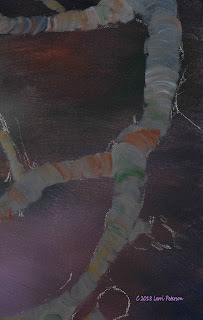 Now that the background is dry and I have my drawing on I can start the process of under painting the branches and the flower.
Using my #4 flat sable brush, I mixed a gray using my ultramarine blue, burnt sienna (burnt umber will also work) and white to change the value. I used the width of the brush to make a series of slightly rounded strokes to form my branches. This as opposed to one solid brush stroke which can leave hard lines and look flat.
You want to always follow the shape of the thing you are painting with your brush strokes, in this case rounded branches.
In the flower petals I drew lines on some of them to show the direction, and in some cases directions, of my brush strokes.
To under paint the flower I was still using my #4 flat sable brush and I mixed my ultramarine blue with a tiny touch of purple to get a lavender color and gesso to make it light for the base color. Where the petals go in towards the center of if they go behind another petal and are darker, I added just a bit more blue to darken the color right on my canvas then blended it in with the base color.
Like the branches above, I used the edge of my brush and pulled in from the petal edge to form the edge with a series of strokes, on the inside of the petal my strokes followed the curves of the petal.
Now it might seem strange to start out with this lavender color for a white flower but it needs to happen this way so you have someplace to go with your highlights. Whenever you are painting white, you should start out with some form of light blue, lavender or gray so when you start highlighting the lighter colors will look light and your subject will have shape so it doesn't look flat, there is actually very little actual white on a subject.
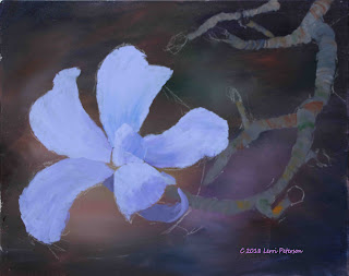 Try to have your painting to this point for our next class if you can, I will be finishing up the under painting for the flower and branches then start working on some detail.
Keep painting and I will see you in class.
Acrylic Study: Rocks
This week we did a study on painting rocks. All rocks are different depending on where they are, the kind of rocks they are, if they are natural or chiseled by humans so your best reference is the rocks themselves but the process to paint them is pretty much the same.
Since we will be doing a small painting using the rocks in the photo near Pelican Cove that I took, I used them as an example.
If you need to drawn in a sketch with your charcoal before you start, do so. This is a good idea because you can be sure that you haven't created a herd of turtles or a Stonehenge, you want the rocks to be of various sizes and shapes and it is easier to wipe off the chalk than try and paint out something you don't want.

The first thing I did was to under paint the rocks by picking up sienna, blue and/or umber and mixing these colors ON THE CANVAS with my brush, this is call "brush mixing". I also added other colors during this process like orange, red and green because those colors could very well be in the rocks.This is a good thing especially for rock because you get a variation in the color of the rock as long as you don't mix it too much. I was using a #6 flat bristle brush and doing a lot of scumbling which is moving your brush in all directions with the exception of shaping the edges of the rocks with the end of my brush and pulling in. This keeps you from creating a ridge of paint along the edge that could cause problems later.
I also showed that you can start some of the highlighting process while the under painting is still wet by picking up lighter colors and start finding rock shapes in the strokes I see. I used the same brush but picked up orange and yellow to go with the sienna and touches of green. I just want to find rocks with quick strokes, I don't want to think too much about what you are doing, just dibs and dabs, dots and dashes where you think the lighter sides of the rocks are. Remember that the dark under painting becomes shadows and texture so don't cover it all up. You can also wait until the dark under painting dries to do this step.
The water I added just so the rocks didn't look like they were floating in air.
I continued shaping the rocks with some lighter colors adding a bit of white or yellow to change the value and using this more on the areas where the sun may be hitting (sun is on the left). This gives you a chance to make more rocks if you need them or combine rocks if you don't like the shape or think you have too many.
The next thing I did was add a REFLECTED HIGHLIGHT into the shadows. Most things have some kind of reflected light in the shadowed side if you just look for it especially if there is water, snow or some other reflective surface like a building, the difference between a regular highlight and a reflected highlight is the highlight caused by the sun is bright and warm whereas the reflected highlight is very cool. you want the reflected light to be a medium value, lavender color which is ultramarine blue, a touch or purple or alizarin crimson and just enough white (gesso) to lighten the value to a middle tone. Again, just used this color to shape the form of the rock but don't labor your efforts. This reflected light with give your rocks dimension.
The last step was final highlights and I added the "decorations" left by the birds.
The final highlights on these rocks are not real bright because they are dark rocks but I did take my sienna, a touch of orange and some white for the brighter areas of the rocks. This is where the sun is hitting, so basically the left sides of the rocks and I used a #4 flat sable to give me a bit more control. If you need to, you can add some dark back into the rocks if you got carried away with the highlighting process. It does happen, or you might want to adds some cracks. It is up to you.
The bird decorations were done by dabbing on the gesso tinted with a teeny, tiny touch or orange on the light side, and some light gray (gesso a touch of blue and sienna) on the shadowed side.
Next class we will start putting all of the things we have learned together and paint the rocks at Pelican Cove. Keep painting and I will see you in class.
Acrylic Class: Sky and Water
This is a combined post for both the sky lesson and the water lesson. They both start off very similar but end up being two different things.
In the first example for both the sky and the water I stated off coating the canvas with a layer of gesso. The gesso has several qualities you use to your advantage 1, it is an opaque medium and the heavier the gesso the more opaque it is so it can cover in one coat what might take several coats of a thinner gesso or straight paint (paint tends to be transparent). The gesso gives your paint more body so you don't need to go over the area a second or more times to get the look you want.
2, gesso is a great blending agent because it dries slower than you paint will which give you more time to work traditional acrylics.
3, gesso lets you do nice graded color when you are doing skies because gesso is white and as you blend your color down it blends with the gesso and becomes lighter.
If you spray the canvas lightly with your spray bottle first, then coat the canvas with gesso it will go on smother. Do not let this dry, you will be working wet into wet.
Use a large brush to do this step, either your blending brush or the largest flat bristle or sable brush you have then starting at the top with your ultramarine blue and a tiny touch of purple and sienna, streak it across the top of the sky, you may need to add more to get it dark enough. Using the bristle or sable brush you won't get as soft a sky as you would with the blending brush and you may have brush strokes showing but with light pressure it will be okay.
Once you have your paint across the sky, using long, flat "X" strokes with very little pressure on your brush, work the color down the sky area. If you need more color, wipe your brush and go back into the dark area and work the color down or pick up some more color but start in the dark area and work the color down. Remember you want a graded color.
This alone gives you a nice graded sky that is dark at the top and lighter near the horizon which is perfectly fine or you can add some color like yellow red or orange at the bottom and blend those colors up to meet the blue to give you a more colorful sky depending on time of day or weather conditions. This is up to you, but no matter what you decide, the technique is still the same: Long, flat "x" strokes with little pressure.
Another way to work which will give you a more "painterly" sky is to add gesso as you go.
In this example I started in the center with with just yellow and gesso (white) and with smaller, "x" strokes I worked my way around in a circle then I picked up some orange and a little gesso and working just inside the edge of the yellow I blended the colors together as I worked my way out, picking up a bit more orange as I went. From there I picked up a little red and gesso and starting just inside the orange I blended the colors together then picked up more red as I worked away from the center. Remember, when you add the gesso you will be changing the value of the color making it lighter so if you want the color to be darker and more vibrant don't use as much gesso or no gesso at all as you work your way to the darker edges. Blue was my final color and I really only had what gesso that was left in my brush at that point.
Clouds we really didn't have a lot of time for but basically you will always start out anything white with a darker under painting. Remember you need dark to show light so to give the clouds shape you start out with gray. My go-to gray mix is ultramarine blue and burnt sienna, more blue than sienna, if it looks too brown add more blue, then use the gesso to change the value. Have a couple of different values of gray before you start.
Use a bristle brush for your clouds because with all the scrubbing you will be doing you can ruin a sable brush in no time.
You don't want a lot of paint on your brush and you also want to think about clouds before you start. Clouds are moving and boiling in slow motion as they form in the sky so as you paint, that is how your brush strokes need to go. They are light circular strokes almost a dry brush technique, shape your clouds. As you shape them you can add some darker or lighter gray or gesso to create the different puffs you see in clouds. Clouds can take on any shape but you might want to create a file of just clouds to give you ideas for your painting.
Water
Water can be started the same way, either wet into wet or mixing color and gesso on the canvas it is just the colors you use that will give it a more water look.
If you are going to work wet into wet, start by coating the area with gesso before you add the color.
One mistake most beginners make is they think that water is just blue but water can have all kinds of color depending on weather, what is around it and what is under it. For this demo I used ultramarine blue, sap and Hooker's green, a touch of purple and sienna and gesso to lighten areas. I kept the sienna in the area that would be near the shore, the were used like patchwork and then blended together.
You can blend this to any degree you want, it can be smooth like the example or leaving more of the color show, what you are trying to accomplish will determine how you will approach this under painting.
On your under painting you can now start adding lighter and darker colors. I usually use a bristle brush because it makes it easier to blend because water doesn't have hard lines but you can use a sable if you remember to blend the edges. Also be sure that your strokes are mostly horizontal because if your strokes are angled your water will look like it is going downhill.
The above two examples are just a couple of ways to create calm water from that basic under painting.
This example was done by picking up color and occasionally gesso and mixing on the canvas with the "x" strokes and a bristle brush.
Again, you don't want to create a stripped look but a soft blend of colors. Notice how this version looks the water looks like it has more action, that is all brush strokes.
This is what I did in class adding lighter colors for the breaking parts of the wave and adding foam, like everything else, the foam is under painted with a light blue or lavender color before putting on the highlights. Add just a tiny touch of orange to your white to warm it up rather than using white by itself.
This is another version I did at home just to show you what you can do with a similar under painting.
Practice these techniques so you can understand what your paint and brushes will do for you and don't be afraid to experiment when you are doing these studies, they are as important as a finished painting because you can work out problems without the pressure of "being perfect".
Keep painting and I will see you in class.


