Saturday, February 14, 2015

Acrylic Safe Harbor Week 3

You should have all of your water under painted and the buildings on pier in the back under painted as well.


I have said many times in class when I'm looking at my painting when I bring it home I see things I don't really care for and in this painting I was looking at the sky and I really didn't like the blue part of the sky so before I got started on painting in the boat or anything else, I wanted to correct the things that were bothering me.

I took some ultramarine blue, a little touch of white or gesso and a tiny touch of purple (should be a medium dark blue) and using my #4 flat bristle brush and the dry brush technique I scrubbed in the medium blue. Now this blue is not a light blue it's still dark but it is more blue than what was there and I liked it a lot better, I also went back over the tops of the red orange clouds and scumbled some color into the sky to soften any hard edges.

Another thing I wanted to do was to soften that horizon line. I thought what I had was too dark and rather than paint it out and do it again, instead, I used the dry brush technique with my bristle brush, I mixed a little white touch with a touch of yellow and a little mud from my palate with water to make a thin wash, then I worked this color into my brush but before going to my canvas, I wiped most of it out of my brush. Using the small side of my brush in a circular motion and lightly scrubbing this thin, light color across the horizon line, I covered the shapes that were there, softening them and lightening them as well. I also went down into the water to create a bit of atmosphere between the boat in front and the background, this is a very useful technique it creates dust, it creates mist, it can create fog or clouds so it is something you should learn and practice.


And yet another thing I had noticed was that my buildings were not straight so I needed to correct those before I got to the boat. When you are painting a building, the horizontal lines can be going in at angles but the vertical lines need to be parallel to the sides of your canvas otherwise your buildings look like they're falling down. This rule goes for any vertical lines such as windows, doors, poles, columns - anything that is going to be vertical.

Once I had all my corrections made then I wanted to paint in the under painting for the boat. I checked my drawing and with my number four bristle brush I mixed blue, sienna, a little touch purple and a tiny touch of white to create a very dark, gray color. I used this to under paint the hull of the boat. There were a couple of places - mostly at the back of the boat, where there is a space for that gray panel that is darker than the rest of the boat, so to that same dark color I added a little more blue, a little more sienna and a little tiny touch of purple to create a darker version of the color and that works as the shadow in that area.


While you have this dark color on your brush, very lightly with horizontal strokes go across the water with this color for the reflection. When I say lightly, you should be able to see bits and pieces of the underpainting show through and the edges are going to be very soft and uneven. Be sure that when you get to the ends of the boat where the bow, stern and top edge that the angles go in the same direction as the object above it. For example, bow of the boat goes to the right of the picture the reflection will also go to the right it just will have a soft, uneven edge. We will be doing more on the reflection to make the water look more like water, this is just a start. I'm also not worried that the bottom of my boat is not flat there could be waves and swells that come in and it is basically horizontal and that is all I need to suggest that the boat is sitting in the water.

The cabin of the boat is white but when we paint white first we need to under paint the area with a soft blue grey. This can be on the blue side or little on the lavender side but whenever you are painting white you need to start with a blue grey. I used white, a little touch of the ultramarine blue and tiny touch of the purple and the color I was looking for should be bit darker then the water behind the cabin. This color goes on the outside part of the cabin, for the inside of the cabin which is in shadow, add more blue more purple and make a color that is 1 to 2 values darker for the inside of the cabin.

These lighter colors you can also reflect into the water. One way to see how much will show is to measure the area with a brush or your fingers and measured top to bottom of the cabin area move the top measure down to the bottom of the cabin area and the bottom mark you measured where it comes to in the water is where the top will show in the water. It won't be much because the reflection in the water is looking up and part of the boat is going to be getting in the way but you can suggest some of that lighter color. Remember to keep your strokes horizontal when you're in the water.

The tarp on the back of the boat I don't know what it is or what its covering and that is unimportant all that matters is the color that is there and the shape of the color, Again use your blue, a touch of white and to that you can add little touches of green or purple you want it just a bit darker then the inside of the cabin.


I also took some of the dark boat color and put it under the dock because it will be very dark under there, however, again I got home and I'm not happy with it so I will probably change it first off when we meet again, remember we are not meeting next week because of Presidents Day so you have plenty of time to get caught up.

When you come to class please be sure to have the actual reference photo with you, that is what we are working from for the boat, the other images from the watercolor sample I made or the previous week's class are irrelevant. It’s okay to have them but please don't work from them and I will see you in a couple week's, keep painting.


Saturday, February 7, 2015

Acrylic Safe Harbor: Week 2

This week we started working on the water and on the buildings on the pier. The first thing we need to do is to get the water in because the water will go behind the buildings and behind the boat and we need to put the things that are behind in first so that when we do put the boat in and the buildings they will look like they belong there and not just cut out and stuck on.

Starting at the horizon we need to create a soft blue color we do that by using our ultramarine blue and gesso and run it along the horizon line being mindful that the horizon must be parallel to the top and bottom of the canvas. Any time you have a body of water like a lake or an ocean the water level needs to be parallel to the top and bottom of the canvas so that it looks like its flat if it is angled it will look like its running downhill so be sure that your horizon line is flat work your across your canvas and that your brush strokes are horizontal as you work your way down your canvas.

Using the blue and the white to start you can then add touches of sap green or Hookers Green and the gesso as you work your way down the canvas to about where the top of the boat is going to be then start adding more color and less white continue working down towards the bottom of your canvas adding in more blue, more greens and adding touches of purple, however, if it gets too dark you can add some white it would not hurt if you add other colors into the foreground water, such as burnt sienna, touches of other blues if you have them even, touches of orange or yellow lightly blended in, this is up to you as the artist, just be sure that you blend your colors so that they have no hard lines and there is a gradual transition from the soft gray color in the background to the more intense colors in the foreground, this will suggest there is distance in your painting and when you are doing landscapes or seascapes you need to create the illusion of distance.

Let your water dry. Once you painting is dry then you can sketch on the buildings and the boat if you want to we covered various techniques of getting your sketch on your canvas so look in the sidebar and you will find the pages and go to the one that says transferring your design all you need right now really is the buildings on the dock behind the boat once you have those sketched in you need to choose a color for your buildings.


Your buildings can be any color you want, it’s totally up to you but what you will do is under paint them with a darker version of the final color. For instance, my buildings are going to be red, blue and green so I am under painting with darker versions of the color that I want them to be. For the red building I used burnt sienna and a touch of purple for the shadowed side of the front building, then into that mixture I added orange and a bit of yellow for the sunny side of the building. For the roof I just added some mud that was on my pallet and some white to make a warm gray and I based in the roofs of the buildings. The blue building was under painted with a blue grey and that was my blue with a touch of purple and a little white and the mud on my brush. I then added a little more white to the mix for the lighter side of the building. For the green building I added more purple and some Hooker’s green to blue mixture for the shadowed side and added more white and yellow for the sunny side.

This is where I left off for the week. Please try to get your painting to this point before class and have the basic outline of the boat on your canvas you and have your reference photo of the boat, not the finished watercolor from the picture page. You don't need to have all the netting or masts or pipes sketched in, just the boat and we will start from there be sure to have your reference photos with you because you do need them at this point in the painting. Keep painting and I will see you in class.


Friday, January 30, 2015


I am using a toned canvas for this project. This was a canvas that I had previously had something else on and I didn't want it anymore so I took some gesso a little bit of ultramarine blue and some burnt umber and painted it out to get rid of what was on there before. Your canvas doesn't need to be toned, however, if you want it to be toned that's fine and just use neutral color or a warm color like a raw sienna then let it dry. This is totally a preference of the artist and you do not need to tone your canvas for this project.


Using my #10 flat bristle brush I applied gesso the upper third of my canvas above the horizon line, this will help me blend my colors so while it was still wet I picked up some yellow and painted it along the horizon line blending it lightly in with the gesso. Next I picked up a little bit of orange and painted the orange at the top of the yellow blending it slightly with the yellow. Next, I picked up some red and at the top of the orange added the red and blended it slightly with the orange. What this will do is give us a buffer between the yellow at the horizon and the blue at the top so we don't mix green.

Now I clean my brush, up to this point I have not cleaned my brush, I only wiped it out but because I want to have a nice clean color I needed to rinse my brush well. On my now clean brush I picked up my Ultramarine blue, a tiny touch of purple and a little touch of burnt Sienna and I painted across the top of the canvas lightly blending into the gesso. When I got down to the red area I lightly blend the two areas together then I rinsed my brush well again, and then I started to blend the areas together to create a nice gradual transition from the yellow at the horizon to the dark blue of the sky, wipe and/or rinse your brush often especially if you have been in the dark blue before you go into the lighter yellow area. If you want, you can take your blending brush - the one with the soft hairs - and lightly go over the sky area to blend the colors, the key to this brush is a very light touch. If you want to, you can also put some clouds in the sky (you may need to do this if your sky is dry and the bands of color to distinct) or some mist, this is totally up to you.

While the sky was still a little wet I mixed a blue gray color that color is made with ultramarine
blue, a touch of burnt sienna, a little bit of purple and white or gesso. You want color that its value is just slightly darker than the sky and it should be on the blue side, then using your flat bristle brush or a flat sable brush you just want to make shapes right along the horizon line. They don't have to be distinct shapes just stuff. They can suggest trees or buildings or a harbor in the background and what I did on mine was at the left side of my canvas I made the shapes smaller and less distinct and as I came across my canvas I made the shapes a little larger a bit more distinct such as the suggestions of masts or buildings, that way it gives some suggestion of distance to my background as things go into the background they become smaller softer and color and less distinct.


That is where we ended our lesson for Monday I hope everyone can get their own paintings to this level. Keep painting and I will see you in class.

Sunday, October 19, 2014

FALL 2014 ACRYLIC CLASS WEEK 5

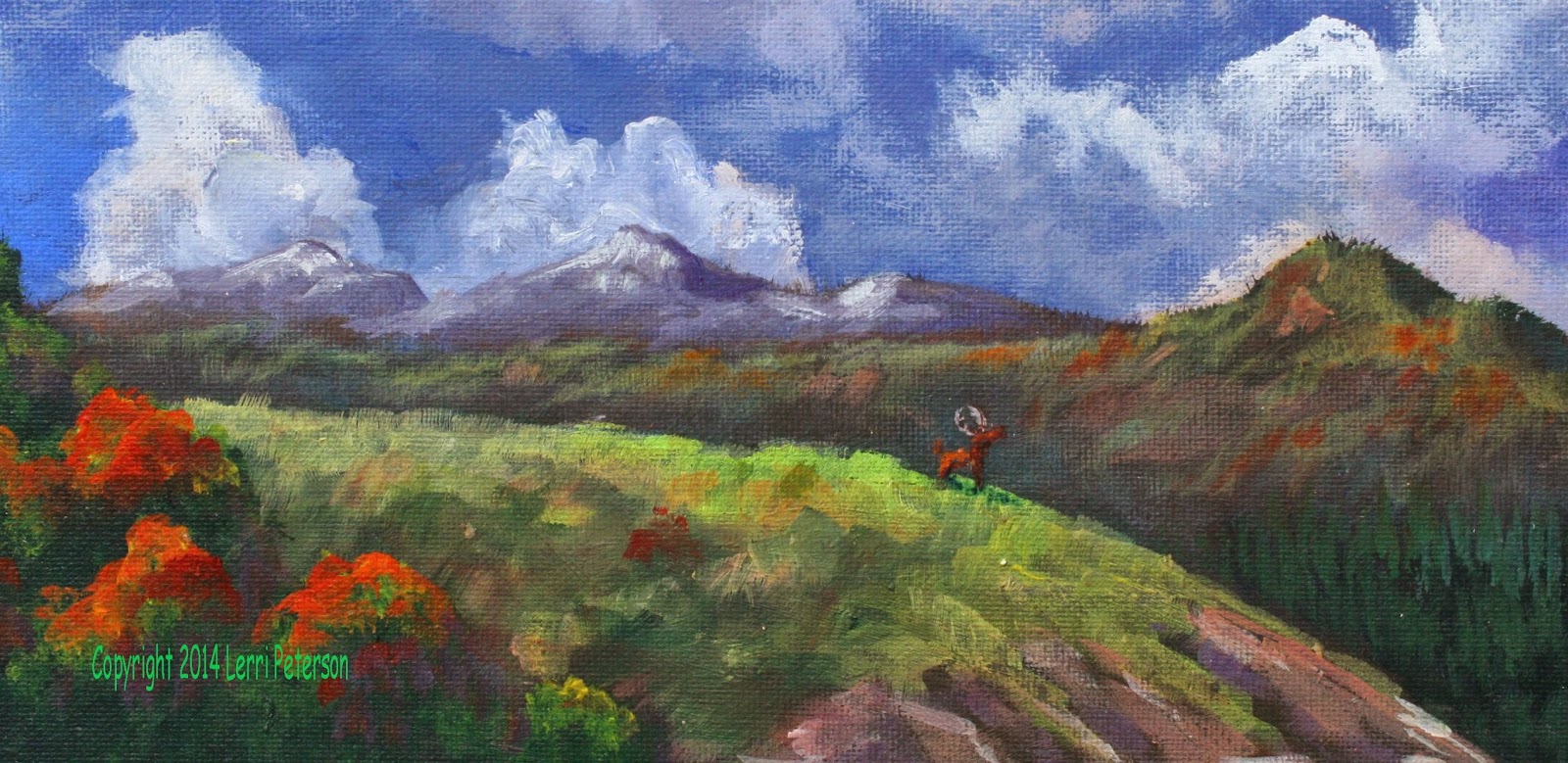
Acrylic Class Project: Cloud Study Finale

In our last class I basically finished up our cloud study and how you finish up your own painting is as important as how you start a painting. You have all heard me say many times over to stand back and look at your painting especially when you are getting close to the finish. You cannot judge how your painting will look when you are standing right on top of it. Some things that look horrible close up actually look great when you stand back and see the overall effect to your painting and visa versa.

When you stand back and look at your painting and you see something you really don’t like, now is the time to change it before you go thru all the work of adding highlights and detail then have to do them over again, check your reference photo to see if there is anything else you need to change to make it the way you want. I had this problem with my painting with one of the distant mountains that I thought I made too tall and I didn’t like the shape where I had it and I didn’t really like the color of that ridge either. Rather than painting it out with gesso and starting all over again, I just re-sketched my mountain so I had a size and shape I liked better then I went into that gray mix (yes, I still have some of that original gray I mixed on the first day left over) to that I added in some more blue and purple do darken it to a value close to what was behind the mountain and painted out the part of the mountain I didn’t like, blending that color into the existing color with dry brush. There were also some clouds behind the mountain that I needed to put back in so I worked wet into wet adding touches of my white with a touch of orange (that was a left over as well) and touches of gray to re-create the clouds then let it dry before re-shaping the tops of the mountain and changing the color a bit.

While that was drying, I did a similar thing up in my clouds to re-shape some areas I didn’t like, adding some of the dark color to create separations between clouds and also to create pockets of dark where I can put contrast when I am detailing the clouds. These things need to get done so I can finish my highlighting.

With the mountains and the clouds more to my liking, I could start some of the highlighting of the mountain ranges that weren’t affected. The next closest ridge I used a mix of sap green, a touch of yellow and a bit of the gray to dull the color. Remember, it is still in the distance so I don’t want my colors too intense or bright which is why I added the gray, it should be a much lighter color than what you have – at least 3 values lighter -  and you can use either your #4 flat bristle brush or a #4 flat sable brush, which ever you feel more comfortable with then thing about what you are painting: you are painting the tops of ridges and shelves and rocks and bowl that are up where the sunlight can hit them. Don’t cover up all of your dark color, that becomes the shadows of crevasses and dips or the back side of the mountain, it is a good thing. Remember, the light is coming in from the upper left hand side so it will be the left sides of things that get the highlight.


The closer meadow I used sap green, yellow touches of white (gesso) and touches of orange  along with some of the mud that was on my brush for the color that was on the top of the hill and as I went to the sides and down the side, I added some Hooker’s green and touches of blue to create shadows. There is some dirt on the right hand side I used some burnt sienna with touches of purple and orange, you don’t want this too bright because it is in the shadow of the hill. Once again don’t cover everything, you want to leave the darker under painting as the shadows for the crevasses and texture created by erosion, you can even suggest rocks and out crops by just highlighting a shape and leaving the dark.

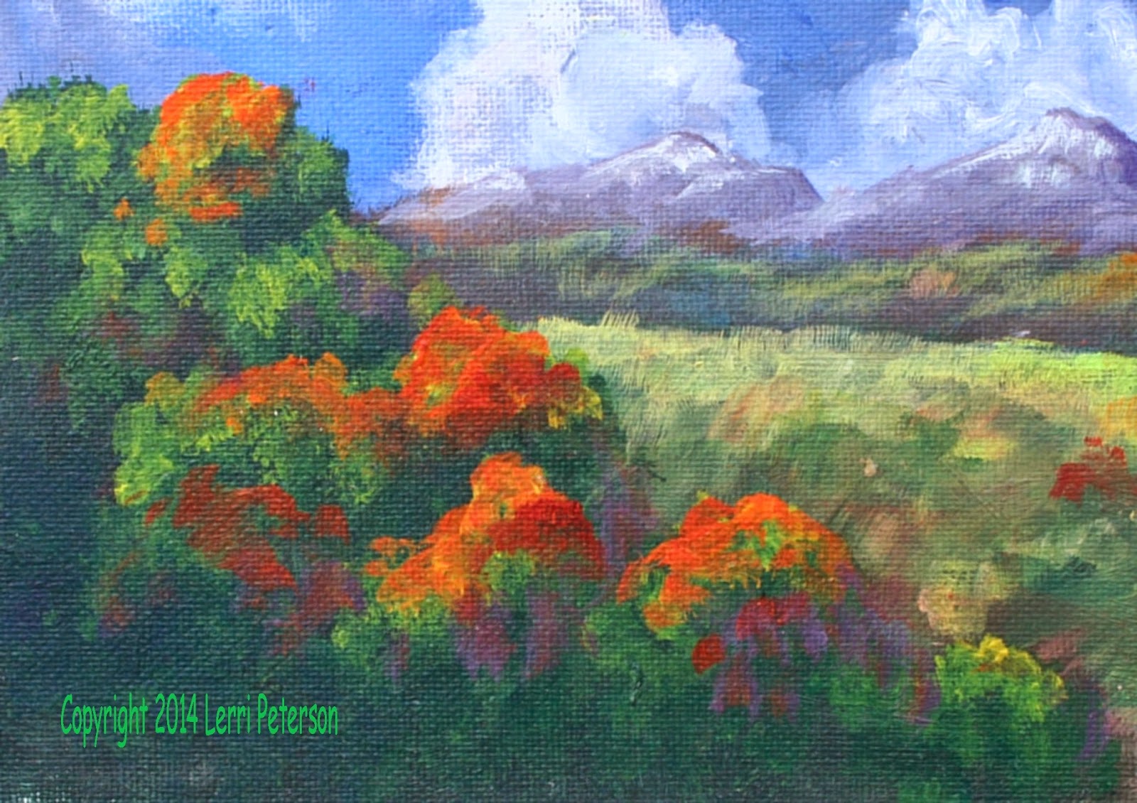
The dark corner with the pine trees on the right don’t need a lot of highlight to suggest a forest of trees, you can use the green mix you were just using add a bit more Hooker’s green and maybe a touch of yellow then using the sharp edge of your brush, make a series of overlapping, vertical strokes. If this dries to dark, you may have to go over it again with a bit lighter color but as always, don’t cover everything, the colors that are underneath act as trees in the shadows and gives texture and depth to your painting.

While all of that was drying, I went back in and to the mountains I re-shaped and cleaned up the top edge with a mix of the gray, a little burnt sienna, purple and a touch of white to lighten it just a little. I wanted a soft purpley gray. To make the highlight for it I added a bit more white and it was done.

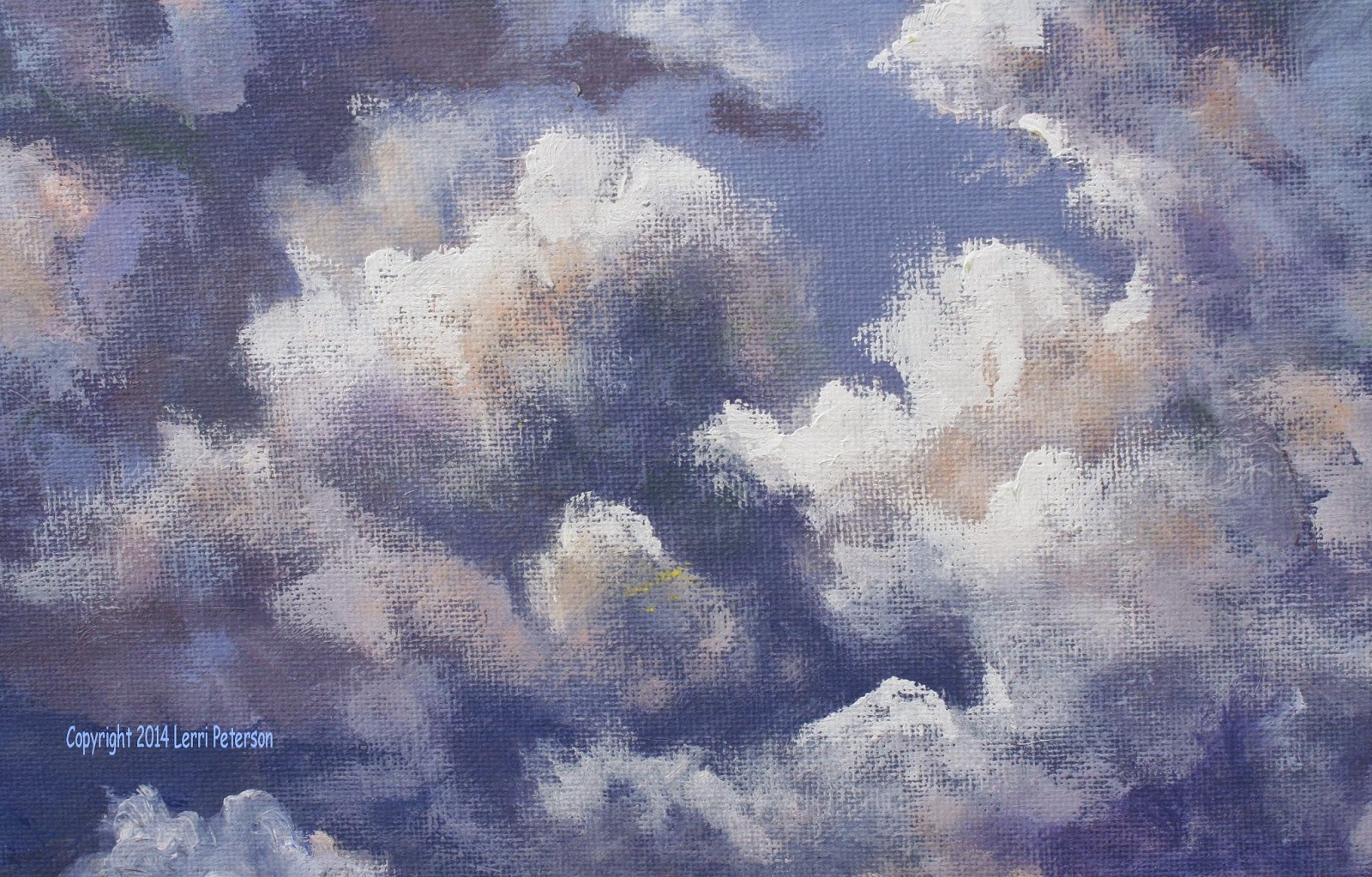
Now to finish the clouds. If you don’t have any of the gray mixed, re-mix it same goes for the soft white (white with a tiny touch of orange in it), you are also going to need some clean pure white, if you use the titanium, you may have to go over the white areas again because titanium can be a bit transparent and dry darker which is why I use gesso. I also finally cleaned my brush out as best I could so I didn’t have any other colors to contaminate the white.


I was using my #4 flat bristle brush and my reference photo was right where I could see it and I referred to it often during this process. Knowing where your light source is at this point is critical: Upper left and slightly behind the clouds, that is what give it the dramatic rim lighting. All of my highlights will be either on the top or coming down part of the left side, not everything is going to have a highlight, please look at the reference photo before you start this process and really LOOK at where the very brightest parts of the clouds are.

I picked up a good dollop of straight gesso starting at the top of my clouds I started creating the top shapes of the clouds, as I worked this color back to the grayer areas, I picked up touches of the soft, orange white and gray to blend it into what is already there. This was wet into wet so you need to work on one section at a time. Please don’t just line the clouds with white, think about how the clouds are bubbling and churning as they build up, the shapes are very irregular. Sometimes it is only a little sliver of bright white, other places soft, puffy white tops, the reference photo will have all the information you will need to finish up, just don’t overdo the white because you don’t want to lose all the deep grays.

The last thing I did was highlight the trees in the corner. They are closer to us so we may see more color. The area should have been under painted with a dark green color, but we can highlight with yellows and oranges even some reds if you want to make it look like early fall. Trees are a lot like clouds in that they have clumps that give the tree its shape, the photo didn’t show this very well so you may have to do some of your own research to see the clumps and how they connect with other clumps or stand out on their own.

I did clean the brush again so I would get clean color (#4 bristle still) and I mixed a bright green with sap green, yellow and a touch of white then I smashed my brush into the palette to make the bristle fan out. I do this instead of using a fan brush because a fan can give you too regular a shape and make you trees look stenciled in. By just gently tapping the brush to the tops of where I want clumps I can create highlights in the trees. Don’t forget to join clumps together it shouldn’t look like colored cotton balls stuck to the tree. If you want to suggest that the trees are changing color you can tap in pure yellow or orange or red just don’t get too carried away, the clouds are the feature and the bright colors can distract the viewer from all your hard work in the clouds.

Finish this up the way you want to. If you want to add a deer or a bear on the meadow that would be fine just remember that it won’t be a big animal because of the distance, there also won’t be much detail in it. You can also put in some closer trees if you want to frame in the right side. Whatever you do, don’t overdo it, it needs to support the rest of the painting. Sketch it in with your charcoal first, it you don’t like it you can wipe it off and try again, the choice to add something else is yours, you do not need to do any more if you don’t want to.


At this point the purpose of the project is done though I may finish up my painting in class as I see things I would like to add to it. Please have something you want to paint ready for class I can help you get started and I will do mini demos as needed. See you in class.


Thursday, October 9, 2014

2014 Fall Acrylic class Week 4

FALL ACRYLIC CLASS PROJECT: Cloud Study

We are getting close to the end of this project so we can start to be a bit more choosey about what we are doing. First we still need to brighten the cloud tops and get the final shapes to our clouds (remember: Nothing is done unless you think it is done. If you need to change something at any point, you are allowed) and to get our foreground under painted. I will finish mine up next week as many in the class are still working on getting their clouds in, I don’t want to be too much ahead of all of you.

If you don’t have any of the medium dark gray mixed you will need to mix some more gray, you are also going to need some more of the tinted white/gesso. I mixed my gesso about 2 tsp worth to a drop about the size of 3 grains of rice to get a soft warm white. I had started out with just about a tsp of gesso but even that small amount of orange made it too orange so I had to add more gesso. You just want a tint. I worked back and forth between these colors, if I wanted it lighter I used the white, if I wanted to blend into other parts of the clouds I added gray but these were not the only colors I used another reason to have a palette that you can put ALL your colors out on because you never know when you will want to use say a touch of red or green. Yes, these colors are in the clouds and yes, you can add them carefully.

I started out using my #4 flat bristle brush, I picked up some of the soft white I mixed and worked it into the bristles then slightly wiped the excess off, this will be a dry brush technique so be sure that all excess water is off your brush as well as excess paint. Starting near the top edge of the cloud using overlapping circular strokes, create the top sunlit tops of the clouds. Pressure on your brush will mean everything at this point: More pressure means more paint comes off your brush, lighter pressure will give you soft wispy edges and blends.

As you move back towards the darker parts of the cloud you can pick up some gray and lightly blend it into the white, just don’t blend so much you ruin the white top or you will have to do it again. Also, you need to know when to stop. I saw many of you continuing to blend until you lost all the dark and the light so you had a gray blob in your sky. Or you used too much white and lost all the shape. PLEASE. PLEASE. PLEASE, LOOK at your reference photo while you are doing this, understand what you are painting BEFORE you start painting, this will save you a lot of time and frustration correcting your painting later.


You can add colors while you are doing this part of the clouds but think about what you are doing first (I know, again with all the thinking), think about the colors you associate with the temperature of light. When you think of warm things you think red, orange and yellows when you think cool or cold you think blues, greens and purples this will help you decide what colors go where. We already know that blue and purple are our natural shadow colors but you can also add some Hooker’s green (it is a cooler green than sap), or some soft lavenders or pale blues in the grayer and darker tones of the clouds, even touches of crimson in the shadows might be present. In the sunlit areas more touches of orange or yellow or pink. When you add these colors it is very dry brush with very little pressure. You just want a hint of color to add more life to your clouds so they don’t look so monochromatic.

Take your time finishing your clouds and look at your reference photo often. Keep the lighter areas to the top and left sides of the clouds, vary the size of the lighter areas, I saw a lot of stripes around clouds and if you look at the photo you will see a different story. Good luck.

The last thing we did was to under paint out foreground mountain tops. I sketched in my mountain ranges with my soft vine charcoal and I had about 4 layers of ridges from back to front, these ridges just need to have an interesting shape, you do not need to copy what is there exactly because it is hard to see unless you are on a computer, if you have some other mountains you would rather put in that is fine, you may have to adjust your colors a bit but they will be painted just the same as I am doing on mine.

When I mixed my first color, again, I started with the gray I mixed on the first day. I used it as a base so to part of it I added more burnt sienna and a touch of orange because I wanted a softer, warmer gray for the first, most distantridge. Using my #10 flat bristle brush and using the length of the flat edge, I did a series of strokes by placing the end along the top edge of where I wanted to create my ridge top and pulled down. Using the end of the brush gives you a soft edge rather than outlining by running you brush along the ridge line, that can cause problems by leaving a visual hard line as well as an actual hard line in a ridge of paint both of which are hard to get rid of once they dry, best to avoid them in the first place. Below the ridge line I just I just scumbled and scrubbed to fill in the mountain and made sure that I went well below the charcoal lines of my sketch of the other closer ridges to be sure I got enough area covered so when I put in the next ridge I won’t have any white canvas behind it. If you need to, just re-draw your sketch if you need to.


The next ridge I went back to the same color I used for the previous ridge but this time I added Hooker’s green and a touch of blue to it. It is closer and will have more color and will be darker in value. The stroke I used was exactly the same as I used on the first ridge, just a different color.

On the right side of the canvas on the next ridge, I created a deep green color using more of the Hooker’s green with a touch or blue and purple mixed into the same pile of paint I started the first ridge with. The reason for this is I still want a grayed color and this “mud” pile I am making helps me keep my colors softer and grayer, buy adding more color and little or no gray, I create a new softer, more colorful color without being too much of a colorful color. I want a greenish color but I don’t what GREEN! All this is still in the distance so it still needs to be on the gray side. (Yes, I know it is a bit confusing, just trust me).

This time, using the same brush, I used it straight on end so I was using its length perpendicular to the top and bottom making a series of OVERLAPPING vertical strokes to fill up the area. This will give the illusion of trees off in the distance, remember to create an interesting top edge to the trees so you have a lot of ups and downs, tall against short, this is a ridge of wild trees not a perfectly groomed hedge.

The next ridge was like a mountain meadow that went into a bit of a cliff the top part I added some sap green and yellow to – yes – the same pile of paint. I wanted a bit greener green for the top and as it went down the side I mixed in some burnt sienna and orange to create a dirt color. The top part is grass so use the brush flat again with overlapping vertical strokes (think grass) and when you add the burnt sienna and orange it will be more of a scumble strokes – think cliff.

In the left corner of the painting is a clump of tree tops, this time you will mix in a new pile, your Hooker’s green, blue and a touch of purple to create a very dark green. You and use a scumbling stroke to fill in the trees but use the corner of the brush to create an interesting outside shape. That should have your canvas covered and we will start doing the highlighting of the clouds and mountains in our next class.


I hope you have learned a lot about how to use dry brush to create clouds and how to blend using acrylics. We will be done with this project in the next class so start looking for something new to paint for the rest of the semester. See you next time.


Saturday, October 4, 2014

Acrylic Class Project Week 2: Cloud Study

We are making good progress on our cloud study and we should be close to finished with it this next class so I want you all to start looking for something you would like to paint for the rest of the semester and I can help you get started on you own projects.

While some of you may not really be into clouds, there is a lot to learn from doing a study like this. You are learning how to mix wet into wet (wet paint into wet paint) to create subtle blends, wet on dry and dry brush blending when working on a dry surface. These techniques are used in a variety of situations not just for clouds. You can use these techniques on everything from rocks to distant trees to soft backgrounds and everything in between. You are learning how to use your brush, how to use different pressures to get different effects, creating shapes as you blend between different colors and you are learning how to use value – dark against light – to create drama and excitement in your painting. There is a lot more than just clouds being created here, you are learning a lot of valuable lessons that you can use on other projects. Will you make perfect clouds this time out? Probably not, I don’t expect anyone to create their masterpiece in class, but you will learn so the next ones you do, in a project you want to paint, will be better and that is the point of taking classes so you can learn and improve, it is a lifetime challenge and I know you are all up to it.


I can only give you some general instructions again this time because the nature of clouds is very fluid and that is how you need to be when you are painting your clouds. You should all have the darker underpainting for the clouds based in and if you have some of that medium dark gray left over that is great if not you will need to mix some more (ultramarine blue, burnt sienna and a tiny touch of purple with white to lighten it). Try to keep the gray in the medium value range because it will be easier to make it lighter if you need to or darker if you need more dark. You will also need to mix up a light color consisting of white (I use gesso) and a very tiny amount of orange, you just want a tint to the white. This tinted white will look softer and less chalky than using just straight white; remember that there are a lot of colors in clouds so we may be adding more colors as we create the shapes in the clouds.

Use a #6 to #10 flat bristle brush and use the side of it. The strokes will be mostly dry brush but there will be some wet into wet and a lot of brush blending, meaning that you will blend the paint on the canvas no on your palette. Remember pressure on your brush will be important: The more pressure you use on your brush them more paint will come off it. The lighter the pressure the less will come off. To get soft edges and soft blends you need to use less pressure.

We are not going for the bright whites just yet, we are still working on the lighter gray areas
of the clouds so pick up a bit of the white color and a bit of the gray at the same time (this is called double loading), starting near the top left sides of the clouds using a scumbling or circular motion with the side of your brush apply the paint creating soft interesting edges and shapes in the clouds.

Please have your reference photo in front of you so you can see where you are going with your paint. I saw a lot of same sized outlines all around the clouds and that is not how the clouds are and you need to see that so you can paint it. The light is coming from the upper left hand side so the left sides of the clouds will be lighter than the right sides. Some parts of the clouds are more in the sun than other parts so the light areas will be bigger than in other areas. Little wisps of lighter clouds may be in front of darker parts of clouds all these things help create interest in your clouds.

Don’t be afraid to pick up touches of other colors to mix in with your gray and white. Touches of red or green, blue or purple in the darker areas and touches of yellow or orange in the lighter areas will bring life to the clouds. It is best if you can see this in real life, so the next time we have some big puffy clouds go out and really look at them and you will see all kinds of color in them from pale greens to lavenders to pinks…Even in the middle of the day those colors are there. If you have polarized sunglasses, that is even better, the more you see what is going on in the world around you the better you will be able to paint it.


Keep looking at your reference photo and do the best you can. We will be finishing up with the highlights and the foreground probably in our next class so try and get your painting up to the same point as where I left off with mine. I will see you all in class.


Friday, September 26, 2014

Fall 2014 Acrylic Class

ACRYLIC CLASS PROJECT: Cloud Study


The first thing I had the class do is pre-mix a medium gray color. We will be using a lot of this base gray so mixing a pile of it if you have a way to seal your acrylics when you are not using them, this is a good way to go so you don’t have to stop and remix each time.

I used my standard gray mix of ultramarine blue, burnt sienna and a tiny touch of purple for the color and gesso (white) to change the value. The color should be on the cool side (more blue than sienna) and should be in the mid-value range (about midway between white and black), no, mixing white with black will not get you this color, it will get you a lifeless gray, this mix gives you a more dynamic gray.


Once you have prepared your gray, we now start on the canvas by first wetting the surface either by misting it with your spray bottle or using your 2” blending brush, you just want the surface to be damp not drippy. Using your blending brush, make sure you have gotten all the excess water out of it, squeegee it between your fingers if you have to, you don’t want all that excess water diluting the gesso or the paint as you apply it or you will get very thin colors (you will see the canvas thru the paint). Pick up some gesso on your brush and roll it on to your canvas in a circular motion starting at the top and working your way down so you have a thin coating of gesso over your entire canvas. Work quickly so the gesso doesn’t dry, all of the sky is down while gesso and paint are wet, this is called wet into wet blending so don’t dap at it. Wipe out your brush, you don’t need to clean it, just wipe out some of the gesso before going to the next step.

Next, on one corner of your brush, pick up a good portion of your ultramarine blue and on the other corner just a dab of sienna and a smaller dab of purple, it will be mostly blue. Starting at the top again and holding your brush horizontal, just drag it across the top of your canvas to get the color on, if you need more – usually blue – pick up more paint and repeat the process, you want a good amount of color to start the blending process. This is why I tell you to put out at least inch long amounts of paint when you set up your palette, some of you don’t even put out a decent brush full then you try to stretch it across the whole canvas, not going to work, so put out paint!

When you have the paint striped across the top of your canvas, you will be using big “X’s” and start blending the color down the canvas. The color will lighten as it mixes with the gesso you just put on and that is what you want. Keep working quickly going across then down with this “X” stroke and barely touch the canvas. The harder you touch the canvas the more likely you will leave brush marks, the lighter you touch the canvas it will look seamless. Work your way down about 2 thirds of the canvas, if you need to add more color, wipe out your brush, reload start up in the darker area and work your way down. This takes practice but you can get some beautiful skies with this technique.

Only a matter of a couple minutes have passed since you put on the gesso, it takes me longer to write this out than it does to do it. Please keep this in mind as you work.


You do not need to wash your brush but you can wipe it out if you want for this next step, I probably didn’t. Pick up some of that gray that you mixed streak it across the bottom of the blue you just put on, wipe out your brush then start blending up the same way you blended down, if you need to, you can turn your canvas upside down if it makes it easier to blend. As you move up the canvas, pick up some gesso or white on your brush and blend it into the gray. With both colors you want what is called a gradation – going from dark to light without indications of separations between values. You should have a light gray up to the top third of the canvas. Just lightly blend the edges of the blues and gray, look at the reference photo to see how those high clouds just seem to disappear, which is what you are going for. Now you can let this dry completely.

When your canvas has completely dried, use your chalk or soft vine charcoal to sketch on your clouds and foreground. This is not etched in stone this is more of a guideline so you know where you need to put paint the key thing is to get interesting shapes and edges, if it is not exactly like the sketch, don’t worry about it.

You MUST have your reference photo in front of you because it is going to tell you where you are going to put color and change color within each cloud. I was using my #10 flat bristle brush, if you are working on a smaller canvas a # 6 or a #8 will work for you but use a bigger brush, not a small one. We will be doing what is called brush blending which is where you add colors to your canvas and blend them together with the wet paint already there to create other colors or values. We will be mostly using the gray we mixed up before we started and to it we will add blue and touches of purple to deepen the color and white or gesso to lighten, however, if you feel brave, you can throw in touches of red or green even orange because if you really look at clouds you will see all colors in them.

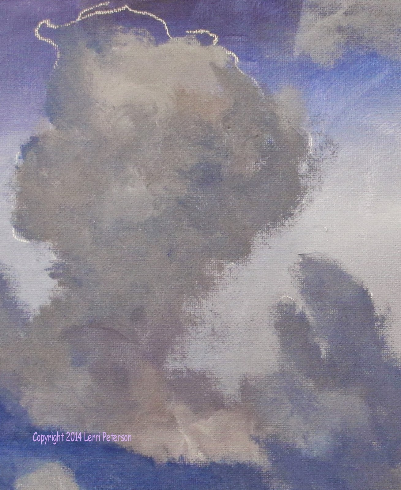
Load your brush with the gray color but not too much, work the paint into the bristles this will be a dry brush type technique, then start in the middle of one of the clouds. Look at the reference photo before you paint so you can pick a place to start, then using the small side of the brush and a circular motion, start shaping your clouds. As you shape your clouds add
touches of white to create lighter areas of the clouds (not the bright white areas yet just some of the lighter grays) and add the blue and purple to the darker areas.

It doesn’t matter if it is perfect because clouds are constantly changing but you need to get these darker grays on as the foundation for the lighter, brighter areas which we may get to next week. Best instruction I can give you here is to look at the photo and follow it the best you can, don’t put too much paint on your brush, use a circular motion using the side of the brush and keep the outside edges of your clouds soft. Be sure you get the cloud color down far enough on your canvas so that the clouds look like they are behind the mountains which we will do in a week or two. Good luck and I will see you in class.