Sunday, October 23, 2016

Fall 2016 Acrylic Class Week 4

Acrylic Class Project: Windblown Final Week

This final week I added more detail by adding more branches and twigs both light and dark and adding more highlight to the tree trunks. I also added more grasses around the bottoms of the trees to seat them into the grass.


Using my flat sable brush I was able to pull up clumps of grasses around the base of the tree and over the roots using the dry brush technique (little paint or water on the brush). I added both light and darker grasses with the dry brush, then I switched to my liner brush and pulled up some longer grasses (light and dark) remembering to bend them to match the bend of the trees to help create the effect of being windblown.


Pumpkins on Parade

I am working on a black canvas this time. I used black gesso on a regular stretched canvas, you can also buy black canvases at the store.

Using white chalk, I sketched in my pumpkins. If I need to change anything I don't like I can take a wet paper towel and wipe it off and redo my sketch.


I was using a #6 flat bristle brush to start the under painting for the pumpkins.

The orange pumpkins were under painted using burnt sienna with a touch of orange in the lighter areas them mixing wet into wet as I moved into the shadowed areas I added ultramarine blue to the sienna and finally in the darker areas I also added the blue with alizarin crimson instead of purple (I was out)

The blue pumpkin I used pthalo blue instead of ultramarine blue, and a little touch of orange to dull it and white to lighten it. then added more pthalo blue and burnt umber (sienna will work) as I moved to the shadows  and also a bit of the alizarin. The bumps will come later.

The light small pumpkin was shades of grey blue using my ultramarine blue and sienna to make a gray, more white to make it lighter and more blue and alizarin for the darker colors. 

Remember that this is only the under painting, this is where we start and your under painting should be in the mid tone range so you can go darker or lighter as you progress to the finished painting. Do not try to finish as you go or your painting will look flat not round.

This painting is going to go faster this time so I am sure that you have enough information so you can finish it up if we don't have enough time until the end of the semester.

Keep painting and I will see you in class. 

Sunday, October 16, 2016

Fall 2016 Acrylic Class

Acrylic Class Project: Windblown Week 3


This week I added the foreground tree using a cool, grayed brown (ultramarine blue and burnt sienna white to change the value). I based in the trunk, larger branches and roots with my #6 flat sable brush. On the edges of the trunk and branches I used the flat end of the brush to pull in to create soft edges and in the body of the trunk and branches my strokes followed the angles of the tree.

I used the wet into wet technique to change the value of my color (lighter add white, darker add more blue and touches of purple), and I made a series of dabbing strokes with my brush to create texture, all the time being aware of the curves and angles of what I was painting.

The smaller thinner branches were done with my liner brush. Be sure to have enough water to make your paint ink-like and add both dark and lighter branches and twigs to your tree.


Around the base of the trunk and roots, you can use either your flat sable or flat bristle brush to pull up some of the shorter grasses to set the tree down into the ground.

Then use your liner brush to add longer grasses. Remember to lean them in the same direction as the tree to give the windblown look to the grasses as well.

I have a bit more work to do on mine, I need more smaller branches and grasses but I may also get started on my next project of the pumpkins. I will have black gesso with me if you want to try working on a black canvas, though a white canvas is fine, you will just have to decide what kind and color you want for your background.

Keep painting and I will see you in class.


Saturday, October 8, 2016

FALL 2016 ACRYLIC CLASS WEEK 2

Acrylic Class Project: Windblown Week 2

This week we added the background tree. I used a #6flat sable brush to block in the trunk and main branches and roots switching to a liner brush for the smaller finer branches and twigs.

I used a medium blue which was a mix of the ultramarine blue and a touch of white. 


To create shading I added a bit more white to the color, to create shadows I added more blue and a touch of purple or you can use a touch of alizarin crimson. Notice that even the "highlight" area is still darker than the background. I am using the contrast to create a silhouette effect. (the black line are from the sketch for the front tree).


When you switch to the liner brush continue to use that medium blue color while you are in the lighter areas, then when you are moving into the darker areas of the background, add a little white to the color so the branches will stand out against the dark background.


Be sure that you make enough of the smaller branches and twigs when doing both trees and do not be afraid to cross over branches that are already there, it will look more natural in your finished painting.

Remember to practice loading the liner brush - the paint should be like India ink so use enough water - then pressing and lifting the brush to create thicker and thinner branches and twigs. Do this before you go to your painting and make a lot of the finer twigs at the ends of the branches it helps break up the  negative space and will make your trees look more natural.

Try to have your painting to this point on Monday, we will start working on the main tree and some of the finishing touches. Keep painting and I will see you in class.

Sunday, October 2, 2016

Fall 2016 Acrylic Class Week 1

FALL 2016 ACRYLIC CLASS PROJECT: Windblown Week 1

I am working on a12 by 24 inch canvas, basically it is twice as long as it is tall. I am using a longer canvas to emphasize the image I will put on my canvas. If you have a more rectangle size canvas this will still work through your sky area will probably be larger so you will need to add something to your sky to make it more interesting like a sun or moon, you still want the trees to be the dominant focus of your painting.

This project can be any combination of colors that you want if you have someplace you think you might want to hang it you can match the color theme of the room, this is the beauty of this painting is that when you change the color it changes the mood of the painting, this is a fun thing to do.


I saw these trees down in front of the Redondo Beach Library in Veterans Park near the pier and I really liked their shape but I didn't like what was around and behind them but I'm an artist so I get to do whatever I want and I decided to just use the trees as inspiration and to create my own work of art from them.

You as an artist need to learn how to do this. Too often I find students bring in photos that have a lovely subject with a horrible background and what do they do they spend all their time sweating over? Creating this horrible background that their lovely subject gets lost in then they aren’t happy with the results. If you look at the photo of the trees that I took, you can see all kinds of unimportant stuff in the photo. There are apartment buildings, there are park benches and trash cans and who knows what else that do not need to be a part of my painting. I tell my students that as artists we are the ultimate in Photoshop we have an artistic license and we need to use it and this subject is a prime example.

During this painting we are going to be using a couple of brushes that we don't normally use, 1 will be are blending brush that is the 2-inch soft bristle brush that we use for covering large areas. With this brush you can make some very soft blended backgrounds so it is good practice to use this. That said I think that you will find that it is not as easy as I make it look just remember that I have been doing this for about 30 years so I kind of know what I am doing, you will need to practice.

The other brush we will be using will be the liner brush or script liner brush. With this little brush we can make some amazing trees and grasses, again I will make it look easy you will need to practice, I do suggest that you find an old canvas or even a piece of paper that you can paint out and practice these two techniques for this painting before you start working on your painting.

The first thing I did to my canvas was too wet the surface, I use my spray bottle and then I used my big blending brush to evenly coat the surface of my canvas with the water. This will help when I apply the gesso which is next. Using the gesso I put a thin, even coat over the entire canvas. Using the gesso in this way lets me blend my colors and it also dries slower than the acrylic paint giving me more blending time, the water I sprayed on will also help increase the blending time which you will need for this stage. You must work quickly this is not going to be a half an hour project that should only take you 5 minutes or little more to complete most of you will fail at that but that's your goal because you need to have the paint still workable throughout this process so that you can blend your colors.


I picked up a tiny amount of ultramarine blue and a little bit more gesso, starting in the right hand third of my canvas I started adding this blue and gesso in a circular fashion with criss cross strokes blending outward to form a circle of a very light blue. I want the color to be a very pale blue in this area because this is where my trees will be.

Next I picked up some more ultramarine blue with a little bit of white and just on the outside of this pale blue area I just painted, I applied the next layer of color blending it all the way around the outside of the light area and about to the half way point of the canvas, remember, I am working very quickly. Next I again go to the ultramarine blue but this time I add a little bit of purple but no white this time, be sure that it is more blue than purple, again I start just outside the layer that I had just put on and added this new color working it all the way to the corners, you can add blue and little touches of purple as you go to make the color dark.

Then I rinsed my brush out good, it needs to be clean for this next step also squeegeed out all of the excess water so that it was damp but not dripping wet. You may want to lightly mist the canvas at this point before you start blending to give you a bit more time, remember that you need to work quickly and work this extra moisture in or it will cause spots. Starting in the light area with crisscross strokes and a very light touch, I blended my colors, blending the light color out into the next color and working my way around until one blended into the other and the lines disappeared, then working out through the next band of color and out to the darkest band of color. You may need to mist with a little bit of water if your paint feels dry, your brush will drag if it is too dry, and it won't blend, take you're mister bottle and lightly mist with two or three squirts of the bottle of water then quickly work and blend them in with your blending brush, this will give you more blending time you want to make sure that you do blend this spray in or it will cause polka dots on your canvas.

You will find that you may be leaving brush marks as you are trying to blend, this will happen when your brush is 1, too perpendicular to the canvas, the brush needs to be almost parallel with the canvas surface as you paint and 2, you may be using too much pressure on your brush, as the late Bob Ross used to say: “It's two hairs and some air” you're barely skimming the surface of your canvas very lightly blending these areas together. It does take practice, however, once you have mastered this you can create some wonderful backgrounds for all sorts of projects: it can become tall grasses off in the distance, it could be a soft blended background for a portrait, it could look like out of focus leaves for flowers… the choice will be yours and it will make a wonderful addition to your artist’s skill set.

Once you have blended across you can start on the foreground which is divided into two separate bands, the bands will be of a medium blue color or a medium color of whatever color scheme you have chosen. You can do this while the background is still wet or wait until it dries as I have done.

I switched from my blending brush - though I could have used it as well - instead I used my number 10 flat sable brush to block in the first layer of ground which will be the background layer starting with this medium color, using the whole edge of my brush and pulling down to create my top edge of my background. I added more blue and purple as I went down the canvas to create a darker color and right under the lighter area I added a little bit of gesso to make the blue a little lighter. I am doing this so when I put the next layer on I will have dark behind the top edge of the new layer so that I can use is contrast by using a lighter color against the darker color.

The top edges of these layers do not need to be perfectly even, these are supposed to be grasses or uneven terrain, so while it might basically be flat it doesn't need to be perfect.

This is where stopped for the day, please try to have your paintings to this point when we meet again. Remember, I've had 40 years of practice and you're just getting started so it may take you more than once to get this done to you liking, keep painting and I will see you in class.


Sunday, August 21, 2016

Acrylic Project: Working the Steps - Final Week

While we didn't get the project completely done in class, you should have enough information to finish the project up the way you want.If you feel you are done then don't fuss with it, better if it is a bit under worked rather than over worked.

The following are a few things that we did in class as part of the finishing process:

Under painting the foam. Whenever you have something that is white you need to under paint it with a darker color, usually blues and lavenders, because it won't look white ir light without the contrast of values - white on white is a polar bear in a snow storm, it will just look flat and lifeless. I under painted my foam with a light blue violet using my gesso for white, a touch of blue, purple and a bit of mud from my palette to create a soft grayed color. Remember to follow the shape of what you are painting so if the foam is suppose to be flat, so will your strokes, if it is a crashing wave it will be a series of circular strokes.

The highlight for the foam is not white straight out of the tube because white can look chalky unless you mix it with something else like a tiny touch of yellow or orange. A word of caution here: both of these colors will be stronger than you think so take what you think is a tiny amount of color, cut it in half then use half of that particularly the orange, you just want to tint the white to warm it a bit. Add this light color just to the tops of the foam, leave some of the under painting it will give your foam depth.


Making sand. If you want to give your sand and rocks more texture you can use your toothbrush and splatter color into the areas  where you want it to look like little rocks and pebbles. Use all the colors on your palette and splatter lightly. Let it dry before highlighting a few of the larger dots. It's just quick touches, don't fuss with it.

Also get the bigger rocks under painted and highlighted, again it is best to work this quickly just making various sized strokes like upside down "U's". This is a mass of rocks so you won't be seeing individual rocks more like areas of texture, so paint it as an area not as individual rocks.

Highlighting the wet rocks. You can use the same highlight color that you used on the foam, just don't do what I did and put too much on. These are just supposed to be little sparkles on the wet rocks so you might need to get out a smaller brush. I am going to have to go back in and add dark until I get what  I am looking for but that is part of the process: If you don't like it, paint it out! don't be afraid of making adjustments as you are finishing up your painting.


Each of you will finish your paintings different from each other and different from mine and that is a good thing. I am here to teach you how to use the paint and the equipment so that you as an artist can develop your own style. Don't be afraid to experiment with brushes, colors, palette knives or styles. This is your painting and you need to own it and as you do you will find that painting becomes a lot more fun.

Keep painting and I will see you in the next class.

Saturday, August 13, 2016

SUMMER 2016 ACRYLIC CLASS

ACRYLIC CLASS PROJECT: Work the Steps Week 5


We are winding down on this project and with any luck at all we should finish up in our next class, you should have your under painting complete and your first, even maybe your second layer of intermediate highlights. These intermediate highlights create the forms and shapes of the rocks and cliffs, they are not the bright final highlights we hope to get to in our next meeting.


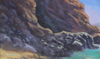
I added another layer of these intermediate highlights to my cliffs using colors that were just a shade or two lighter than what was there, for instance: Near the outside edge I used a combination of sienna, white and little touches or either/or yellow orange with a dash of blue to gray the color slightly and using my #4 bristle brush I shaped the outside edge to the cliffs and worked my way in towards the dark cave, I was only using this color on the top and outside edges where the sun might be hitting, not on the underneath part of the rocks which will be in shadow.

The brightest of this color is on the outside where the light will be the strongest (the sun it overhead and slightly to the right of the painting). As I worked my way toward the cave I added more blue and purple even sienna and umber to darken the color though if I needed to lighten it slightly I would add tiny touches of white but only enough to make it just a bit lighter that the dark that is already there. By the time I got into the cave area my color was a very blue/gray to lavender/gray.

I do want to mention also that each time I add color and highlights to my rocks and cliff, I am leaving some of the previous colors. Those darker colors become the shadows and texture of the rocks. Another thing I do to create these textures is to lighten the pressure on my brush and use little color – dry brush – as I add shapes into the cliffs.

I am also looking at the brush marks in my paint as well as the reference photo to help me decide where to add the highlights to shape rocks and other features of the cliffs. I do not paint blindly. I have my reference photos to guide me: the photo of the scene to help me with the detail and my watercolor to help me with color.


One of the beauties of acrylic is you can paint over it if you need to adjust your shapes or your color. For instance: If you have gotten carried away with your highlighting until everything is all the same value, you can go back in with darker colors and put the shadows back in. I do this all the time. There are areas in this painting that I am going to need to add back some darker colors or to reshape some areas but it is no big deal, it is just part of the process. Learn to use this trait of acrylics to your advantage.

I will work back and forth between lights and darks at this stage of a painting as I refine the look I am going for and I will have several colors ready to go on my palette so I don’t have to stop and mix too much. I will have a larger pile of a mid-tone color then add blues and purple to one side for darker tones and white and warmer colors to another side for lighter colors and I can work back and forth between these colors.

At the bottom of the closer cliff, the rocks are grayer than they are higher up which are more ocher. I still had some of my original gray I mixed at the very beginning of this painting so that was my middle value for the bottom rocks. I added more blue and umber to make it darker and white to make it lighter. I also added touches of purple to create lavender colors for the more shadowy rocks and white and a touch of yellow for the rocks out in the sun. You really need to look at the reference photo to determine where your colors need to go but a rule of thumb is if something is in the sun it will have a warmer color (warm colors are red, orange and yellow) when they are in the shadows they need to be cool colors (mostly blues, purples and some blue/greens), keep this in mind as you are painting.

The other area that seems to be causing a lot of problems is the areas of rocks on the
beach. These are rocks that are partially in the sand and are all very close together. You really don’t see individual rocks, you see a mass of rocks which are basically just a bunch of overlapping shapes. I used a series of inverted “U” shapes – some bigger some smaller; some rounder some flatter – all overlapping to SUGGEST rocks. The under painting was dark which becomes the shadows between the rocks, I used a lighter gray for the mid-tone form of the rocks and I will later highlight the rocks but I am not going to necessarily make individual rocks because I still want it to look like a bunch of rocks. You may have to trust me on this one.

The sand and the eroded road on the left side was a mix of yellow, sienna, white and a touch of mud from my palette or brush, it just needs to be a bit lighter than what you have there already. Remember to follow the angles on the surface with your brush: If it is flat, your brush strokes should be flat, if rounded your strokes need to follow the curve. The sandy area on the beach angles down so your brush strokes also need to angle down.

We will work on the water and finishing this project up in our next class so you need to have your painting to this point.

Keep painting and I will see you in class.

Sunday, August 7, 2016

Acrylic Class Project: Working the Steps – Week 4

This week in class we started working on some of the elements that will help us finish this painting. Keep in mind that we work in layers, building on what is there with new colors and/or values that bring life to our paintings.

I want to keep emphasizing the word “Layers” because I want it to stick into your minds. Just because I call something “under painting” doesn’t mean that we are going to totally paint over it, no, under painting means it is the layer you need to put down first and in acrylics it is usually a medium dark color that we add other lighter AND darker layers to as we create the depth in our painting. Some of that under painting and parts of the next layers are going to show. They become the shadows and the form of your object, they are important to your final painting so learn to leave parts of each layer showing.

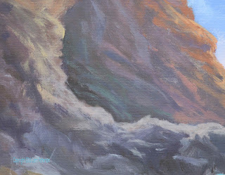
My entire painting has been under painted so last class I started adding lighter layers to start forming my rocks and cliffs. I was using my same basic colors – ultramarine blue, burnt sienna an little touches of purple and white – but to that base color (which was to the warm, sienna, side) I also added touches of orange and red when I was to the outside edge of the cliff where it might be getting a bit more sun, to greens, lavenders and blues where it goes into the dark cave. LOOK AT YOUR REFERENCE PHOTOS to see where the shadows are and what colors you should be using.These colors are just a shade or so lighter than what was there and a scumbled the colors on often times picking up color on my brush and mixing it in with what was there on my canvas, this is called brush mixing, and it leaves bits of unmixed color and that is a good thing especially with rocks where you might see several spots of color mixed in with the overall color of the dirt and rocks.

If you can, enlarge the images on the picture page to really look at my strokes. They are not neat, they are a bit haphazard but they do follow the idea that this is sedimentary rock, I was purposely going at angles with my strokes.

If you need to add more dark into the cave area, use that opportunity to shape the front side of the cliffs to give them a rougher shape – lots or ins and outs, rocks and divots – and use that dark color to make some shadows in the far cliff. Just be sure to soften those shadows in the cliff with either your brush or finger, you don’t want any hard lines.

I still have some of the original gray color I mixed in the first week, I took some of that gray and added a bit of yellow and a touch of white to create my next layer for the closer cliff, again, I was looking at my reference photos BEFORE I started painting. Using that same controlled, scumbling stroke, I created shapes that will become rocks. This IS NOT the final layer, just another of several as I start the shaping process for my rocks.

I also added more color to my water. Still not the final color and I have not started on the foam yet, this is just more underpainting for the water.

If you have other shades of blue such as pthalo blue, turquoise, cobalt or other blues, you can use these in your water as well as other greens, the colors I have on the equipment list is just a basic list to get you started, not a list to end all lists. Most artists find colors and brands they like or need to use occasionally and add them to their palette as needed, in this instance I had 2 colors I usually don’t have on my everyday palette but I had been doing something at home that required them, they are turquoise deep (a Liquitex color) and pthalo green. Both of these are very strong colors and hard to mix with other colors but adding a bit of white to them and using them that way on my painting brought some life to my water. That is not to say that I didn’t also add more of my ultramarine blue, purples greens and sienna, I just included these new colors to my painting.

Remember what you are painting when you are doing the water: It is moving water so use long, flat banana strokes, overlapping these strokes where the water is supposed to be flat and where it is bumping up against the rocks or forming a wave, follow the direction the wave would be going with your stroke with a little up turn at the end.


This is where we left off and we have a ways to go and only 3 classes to finish this in so please try to get your paintings to this point and we will continue the shaping and highlighting process next time.

Keep painting and I will see you in class.